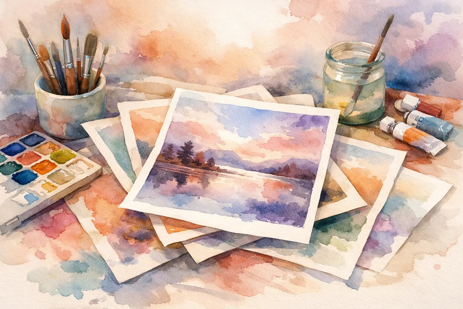
A print can look beautiful on a screen and feel flat the moment it arrives. The color is a little thin. The paper is too bright, or too flimsy. The surface catches light in the wrong way. When buyers look for high quality giclee art prints, they are usually trying to avoid that quiet disappointment and find something that carries presence, depth, and lasting integrity in the room.
That distinction matters more than many people realize. A giclee print is not simply a decorative reproduction. At its best, it is a carefully produced art object – one that preserves tonal subtlety, honors the original image, and lives gracefully in a home, studio, or hospitality setting. For collectors, designers, and anyone shaping a thoughtful interior, quality is not a technical footnote. It is the difference between an image that fills a wall and one that alters the atmosphere around it.
What makes high quality giclee art prints different
The word giclee is often used loosely, which can blur the real standard. In its proper sense, a giclee print is produced with archival pigment inks on fine art paper or canvas using high-resolution inkjet printing. That sounds straightforward, but the result depends on a chain of choices, and every choice leaves a visible trace.
A high quality giclee print usually reveals itself first in the transitions. You see it in soft gradients that do not band, in blacks that feel deep rather than muddy, and in color that has complexity instead of surface brightness alone. Fine abstract work, atmospheric landscapes, and minimal compositions especially benefit from this precision because they rely on restraint. When a print process is poor, subtle art is often the first to suffer.
Material quality also changes the emotional effect of a piece. A textured cotton rag paper can add quiet tactility and softness. A smoother paper may sharpen line and modernity. Neither is automatically better. It depends on the artwork and the setting. The point is that quality production supports the character of the image rather than forcing every work into the same generic finish.
Paper, pigment, and permanence
If there is one place to look first, it is the material specification. Museum-quality language should mean something concrete. Archival pigment inks are central because they offer excellent color fidelity and long-term stability. Dye-based inks can appear vivid at first, but they generally do not hold up as well over time.
Paper matters just as much. High quality giclee art prints are commonly made on acid-free, lignin-free fine art papers. Cotton rag is often preferred for its durability and refined surface, though premium alpha-cellulose papers can also perform beautifully when chosen well. What matters is not only thickness, but how the paper receives ink. A good paper gives color depth and tonal nuance without turning the image glossy, brittle, or over-processed.
Brightness is another detail worth noticing. Very bright white papers can make some contemporary works feel crisp and graphic, but they can also introduce a coldness that does not suit every image. Slightly warmer papers often flatter earth tones, monochrome work, and art influenced by wabi-sabi sensibilities. The right base can make a print feel more grounded, more lived with, more at ease.
Why color accuracy is not just technical
Many buyers focus on sharpness first, but color accuracy is often the truer measure of quality. A print can be detailed and still feel wrong. If the shadows are blocked, the highlights are chalky, or the neutrals lean too blue, the emotional register of the artwork shifts.
This is especially important in interiors built around calm and restraint. In a serene space, small imbalances become visible quickly. A dusty beige that prints too pink, or a charcoal that turns flat black, can disturb the harmony of a room. Good giclee production preserves not just hue, but mood.
This is one reason trusted curation matters. Galleries and printmakers with a strong visual point of view tend to be more attentive to how a work should feel in person. They are not only reproducing files. They are translating an artwork into an object that must stand in natural light, against plaster, wood, stone, linen, and shadow.
How to evaluate a print before you buy
Buying online requires a different kind of confidence. Since you cannot always inspect the work in person, the details around the print become part of the artwork’s credibility.
Start with the production description. Look for specifics rather than broad luxury language. Archival pigment inks, museum-grade paper, edition details, and framing information are more useful than vague promises of premium quality. If the seller describes paper type, surface, weight, and print method clearly, that is usually a good sign.
Next, consider the imagery itself. Close-up views can reveal whether tonal transitions are smooth and whether texture has been preserved naturally. Mockups are helpful for scale, but they should not replace honest detail shots. If every image is heavily staged and none show the actual print surface, caution is reasonable.
Editioning can also matter, though not always in the same way. Limited editions tend to carry greater collector appeal and a clearer sense of intentionality. Open editions can still be beautifully produced and perfectly appropriate for many interiors. The right choice depends on whether you are buying for collection, decoration, project specification, or a mix of all three.
Framing and presentation change the final experience
A strong print can lose presence in poor framing. This is not only about style. It is about protection, proportion, and how the work meets space.
Archival matting and backing help preserve the print over time. Glazing choice also affects the viewing experience. Standard glass may be sufficient in some settings, while higher-grade glazing can reduce glare and better protect the surface from UV exposure. In bright rooms or commercial spaces, this difference can be significant.
The frame itself should support the language of the artwork. Minimal black, natural oak, or restrained metallic finishes often suit contemporary prints because they allow the image to breathe. Overly ornate framing can overpower quiet work. On the other hand, a very thin frame on a large print may feel visually underweight. Balance matters.
For designers and project buyers, scale is part of quality too. A high quality giclee print should hold its detail and tonal structure at the size it is offered. Not every digital file or scanned artwork expands gracefully. Larger is not better if the image begins to lose coherence.
The trade-off between accessibility and rarity
One of the most appealing things about giclee printing is that it makes sophisticated art more accessible. You can collect meaningful work, live with museum-quality production, and shape a refined interior without entering the pricing structure of one-of-one originals. That accessibility is part of the medium’s value, not a compromise in itself.
Still, there are trade-offs. If you want the singular aura of an original painting, a print will offer a different experience. If you want a visually resonant, carefully made work that brings depth and concept into a room at a more approachable price, a giclee print can be exactly right. The key is to buy it for what it is – not as a substitute, but as its own category of collectible object.
This is where a curatorial approach becomes meaningful. A well-chosen print does more than decorate. It can hold stillness, tension, memory, or spaciousness in a way that changes how a room is felt. Taygeta Gallery approaches prints with that understanding, treating production quality and aesthetic context as inseparable.
Choosing art that lasts in more than one sense
The best prints endure physically, but they should also endure emotionally. Trends move quickly. Rooms evolve. Taste deepens. A work worth living with tends to reveal itself slowly rather than all at once.
That is often why buyers return to art with restraint – abstract compositions, meditative palettes, forms shaped by imperfection, silence, or balance. These works do not exhaust themselves on first glance. In high quality giclee art prints, that quiet depth becomes visible when the production is good enough to hold nuance without forcing it.
If you are deciding between several pieces, ask a simple question: which one continues to feel alive after the first impression fades? The right print is rarely the loudest. More often, it is the one that leaves a little space around your thoughts and makes the room feel more fully itself.
Choose with care, and the print will do more than fill a wall. It will keep offering something back.
Leave a Reply