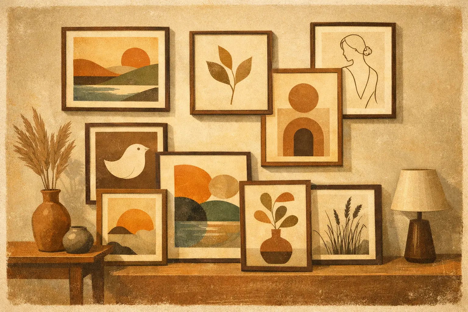
A minimalist room can look finished and still feel incomplete. The furniture is restrained, the palette is quiet, the light is doing its work – yet the walls remain undecided. This is where the best prints for minimalist homes earn their place. Not as filler, and not as trend pieces, but as the visual anchor that gives simplicity its emotional weight.
Minimalism asks more of art than crowded interiors do. In a layered maximal space, almost any image can disappear into the whole. In a pared-back home, a single print has to carry atmosphere, proportion, and meaning. It has to hold the wall without disturbing the room’s sense of calm. That is why choosing art for minimalist interiors is less about finding something subtle and more about finding something precise.
What makes the best prints for minimalist homes work
The strongest prints in minimalist interiors are rarely empty or generic. They are edited, not anonymous. They tend to use space well, avoid unnecessary visual noise, and create tension in a controlled way. A quiet print still needs presence.
This often comes down to composition first. Clean lines, balanced asymmetry, restrained palettes, and considered negative space all translate beautifully in minimalist settings. The eye should be able to rest, but also return. A print that reveals itself slowly will usually live better in a calm home than one that announces everything in the first second.
Scale matters just as much as style. Small art can feel precious, but in minimalist rooms it can also feel timid if it is undersized for the wall. Larger works often suit these spaces because they create confidence and reduce the need for multiple competing elements. One substantial print over a sofa or bed can feel far more serene than a cluster of smaller frames.
Material quality also becomes more visible in minimal interiors. When the room is stripped back, poor paper, flat color, and weak framing stand out immediately. Museum-quality Giclée prints, thoughtful framing, and refined surface finish matter here because minimalism heightens attention. There is nowhere for mediocrity to hide.
The print styles that suit minimalist interiors best
Abstract prints with restraint
Abstract art is often the first instinct for minimalist homes, and for good reason. It can bring movement and emotion without becoming overly descriptive. But not all abstract work serves a minimal interior equally well.
The best abstract prints for these spaces usually have disciplined energy. Think gestural forms with room to breathe, tonal fields with subtle texture, or compositions built around a single dominant shape. A print in soft black, stone, sand, or muted earth can deepen a room without interrupting its stillness. If your interior leans warm, clay, umber, and off-white often feel more human than stark monochrome. If it leans cooler, charcoal, fog, and mineral gray can feel architectural and composed.
There is a trade-off here. Very restrained abstraction can feel timeless, but if it becomes too polite, the room may read as emotionally flat. A small point of disruption – an unexpected brushstroke, an imperfect edge, a shift in density – often gives the piece life.
Minimal line drawings
Line drawings have an ease that suits contemporary minimalism beautifully. They are graphic without being heavy, expressive without excess. A single figure, botanical contour, or intuitive line composition can create intimacy in a bedroom, hallway, or reading corner.
The appeal lies in their lightness. They do not block the wall or dominate natural light. Instead, they add rhythm. Black ink on a warm white ground is a classic choice, though sepia and softened charcoal can feel more nuanced in rooms built around natural woods and tactile fabrics.
That said, line art can become cliché if it is too decorative or mass-produced in feeling. The difference is often in the quality of the line itself. It should feel intentional, fluid, and human rather than merely fashionable.
Quiet landscapes and atmospheric horizons
For minimalist homes that need softness, landscapes are often more effective than pure abstraction. The right landscape print introduces depth, air, and a sense of distance. It opens a room rather than filling it.
Misty horizons, reduced seascapes, desert expanses, winter fields, and tonal mountain forms all work especially well. These images carry the contemplative quality many minimalist interiors seek. They also connect the home to the natural world, which helps prevent a sparse space from feeling too controlled.
Look for landscapes that are edited in feeling as much as in composition. If there is too much detail, contrast, or saturated color, the print can pull the room into narrative. Sometimes that is welcome. More often in minimalist interiors, a landscape works best when it leaves space for silence.
Wabi-Sabi inspired prints
Some of the best prints for minimalist homes draw from Wabi-Sabi sensibility – asymmetry, imperfection, weathered texture, and quiet transience. These works are especially compelling in interiors that favor natural materials, low contrast, and a lived-in kind of refinement.
A print with softened edges, organic forms, or a patina-like surface can bring warmth to a room that might otherwise feel too exact. This is particularly useful in homes with plaster walls, linen upholstery, oak, walnut, travertine, or handmade ceramics. The artwork does not need to match these materials literally. It needs to share their philosophy.
This is where a gallery with a strong curatorial point of view makes a real difference. Taygeta Gallery, for example, approaches contemporary prints through stillness, abstraction, and Eastern aesthetic influence, which naturally aligns with minimalist interiors that want depth rather than decoration.
Black-and-white photography, used sparingly
Photography can be striking in minimalist homes, but it requires discernment. Black-and-white images often fit more naturally than color because they preserve tonal harmony and reduce distraction. Architectural studies, quiet landscapes, shadow-based compositions, and restrained portraiture can all work.
The caution is that photography tends to introduce a more specific reality into the room. That can sharpen the mood, but it can also make the space feel less open-ended. If the rest of your interior is very calm and abstracted, a literal photograph may shift the balance. Choose images with ambiguity, negative space, and atmosphere rather than documentary detail.
How to choose prints for your specific room
Minimalism is not one look. A downtown apartment with polished concrete asks for something different than a coastal home full of limewash and linen. The print should answer the room, not just the style label.
In living rooms, larger works usually create the strongest result. A substantial abstract or atmospheric landscape can establish a center of gravity without adding clutter. In bedrooms, softer tonal prints tend to feel more restorative than high-contrast graphics. Hallways and transitional spaces can handle more distilled work – line drawings, monochrome studies, or quieter pieces that reward close viewing.
Dining spaces can support art with a little more structure or tension because these rooms benefit from energy. Home offices often do best with prints that are calm but alert – pieces that hold focus without becoming sleepy. Hospitality and commercial projects follow similar principles, though durability, scale repetition, and broader audience appeal also come into play.
Framing, palette, and placement
A minimalist home notices framing. Thin black frames feel crisp and architectural. Natural oak introduces warmth. White frames can disappear elegantly in bright interiors, though they need enough contrast against the wall to avoid looking insubstantial.
Matting changes the emotional tone of a print. A generous mat gives the work room and formality, which can be beautiful in sparse interiors. Full-bleed framing feels more contemporary and immediate. Neither is universally better. It depends on whether you want the art to feel contemplative or more integrated with the architecture.
Color should echo the room’s atmosphere rather than copy it exactly. A beige room does not need a beige print. It may need charcoal, smoke blue, oxidized rust, or a muted olive to create depth. Repetition can flatten a space. Resonance is usually more interesting than matching.
Placement should feel deliberate, not merely centered by habit. Art hung a little lower often feels more intimate and grounded, especially in minimalist rooms where every alignment carries weight. If you are styling one piece, let it breathe. Empty wall space is not a gap to fix. It is part of the composition.
The common mistake: choosing art that is too safe
Many people assume minimalist homes require art that nearly disappears. The result is often a room that feels tasteful but forgettable. Minimal spaces need edit, not absence. The right print should create a subtle charge – enough to hold attention, not so much that it fractures the calm.
This can mean choosing a larger scale than you expected, a darker tone than your palette suggests, or an image with more emotional ambiguity. Minimalism becomes memorable when simplicity carries feeling.
A well-chosen print does more than decorate a pared-back room. It gives stillness a shape, and turns restraint into presence. If your home already knows how to be quiet, choose art that knows how to speak softly and remain unforgettable.
Leave a Reply