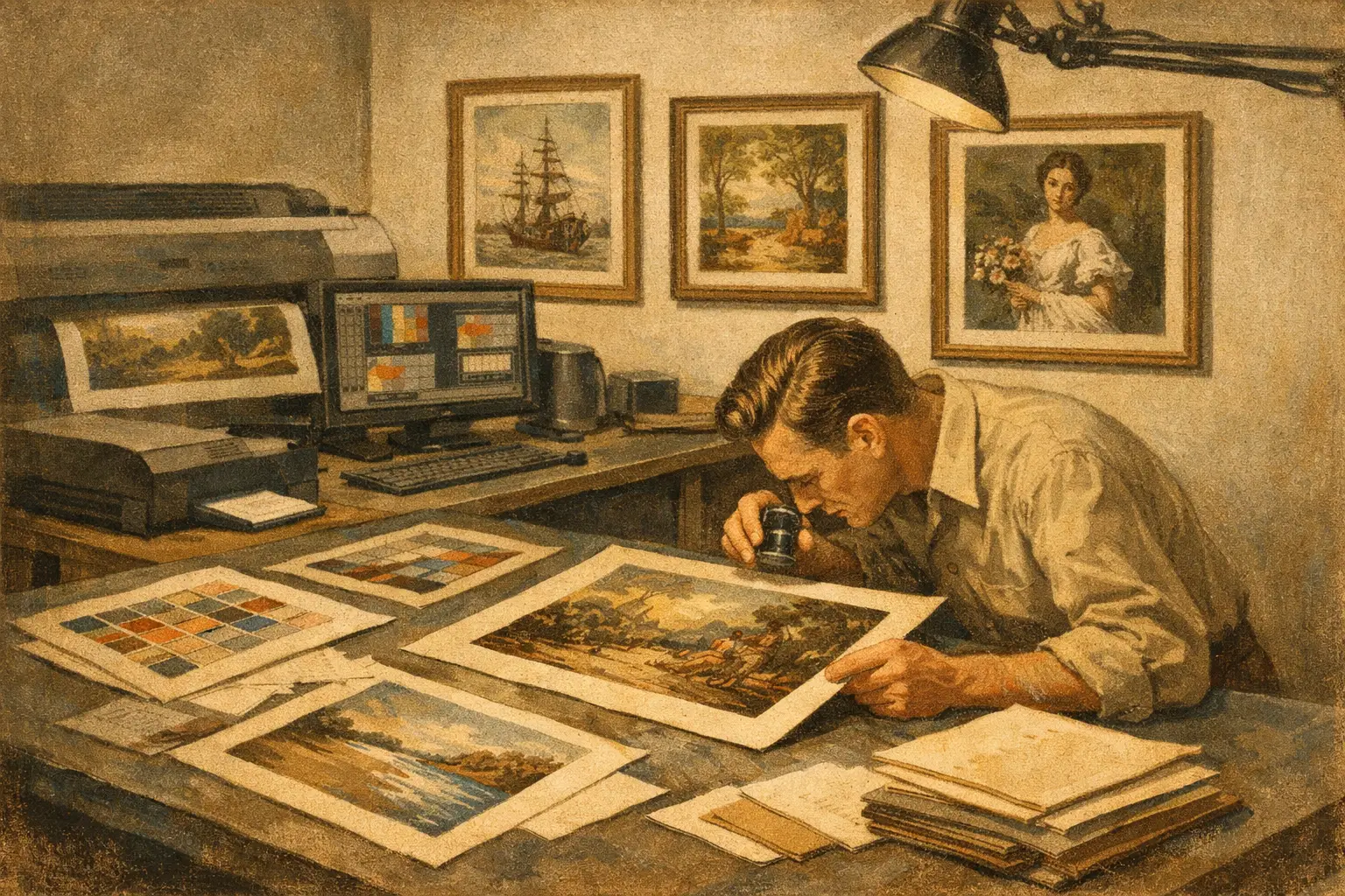
A print can look beautiful on a screen and still feel flat, brittle, or short-lived in person. That gap is exactly why people ask, what is museum quality printing? They are not asking for a marketing phrase. They are asking whether a work will hold presence on a wall, whether its tones will stay true over time, and whether it carries the visual dignity of art rather than the finish of mass decor.
Museum quality printing refers to a standard of fine art reproduction built around longevity, accuracy, and material integrity. It is not one single certificate or universal label. Rather, it describes a print made with archival methods, high-resolution image capture, pigment-based inks, and carefully chosen fine art paper or canvas. The goal is simple – to honor the artwork with a print that feels substantial now and remains stable for years to come.
What museum quality printing really means
At its core, museum quality printing is about permanence and fidelity. A museum does not collect prints because they are merely attractive in the moment. It values works that can be preserved, studied, and exhibited without rapid fading, yellowing, or surface breakdown. When that same standard is applied to contemporary fine art prints, the emphasis moves beyond appearance into craftsmanship.
This is why the term is often closely tied to Giclee printing. Giclee is a high-end inkjet printing process that uses microscopic droplets of pigment ink to reproduce detail, tonal depth, and subtle color transitions. When done well, it can capture the softness of a watercolor wash, the texture of a painted surface, or the atmospheric depth of digital art with remarkable sensitivity.
Still, not every Giclee print is automatically museum quality. The printer matters, but so do the inks, the substrate, the source file, and the way the final print is handled. Museum quality is the result of a whole chain of decisions, not one machine setting.
The materials behind museum quality printing
The easiest way to understand what separates a premium art print from a standard poster is to look at its materials. Museum quality printing depends on components chosen for both beauty and endurance.
Archival pigment inks
One of the clearest markers is the use of archival pigment inks rather than dye-based inks. Pigment inks sit more stably on the printing surface and are valued for their fade resistance. They also tend to produce richer blacks, more nuanced shadow detail, and a wider tonal range.
For collectors and interior designers, this matters in practical terms. A work exposed to ambient daylight, seasonal humidity, and the rhythms of everyday living needs more than surface beauty. It needs resilience.
Fine art paper or canvas
Paper is not a neutral background. It changes how an image breathes. Museum quality prints are usually produced on acid-free, lignin-free fine art papers or archival canvas. These materials are designed to resist yellowing and deterioration over time.
The surface itself shapes the experience of the artwork. A smooth cotton rag paper can feel quiet and refined, ideal for minimal compositions and delicate tonal transitions. A textured paper may add warmth and tactile depth. A baryta-style surface can create deep contrast and a more photographic richness. There is no single best option. It depends on the nature of the image and the mood one wants in the room.
Acid-free standards
Acid is one of the quiet enemies of longevity. Over time, acidic materials become brittle, discolored, and unstable. Museum quality printing avoids this by using acid-free substrates and, ideally, archival mounting and framing components as well. A beautiful print can still age poorly if the backing board, tape, or matting materials are cheap. Quality has to continue beyond the print itself.
Why image quality matters as much as printing
Even the finest paper and inks cannot rescue a weak source file. Museum quality printing begins before the print stage, with the image capture or digital master.
If an original painting is being reproduced, it should be scanned or photographed at a high enough resolution to preserve detail without introducing noise or softness. If the artwork is digital, the file should be created at a resolution that supports the intended print size. Edges should remain clean. Gradients should remain smooth. Colors should be managed carefully from screen to print.
This is where many inexpensive prints fall short. They may look acceptable from a distance, but close viewing reveals banding, muddied color, oversharpening, or weak blacks. A museum quality print should reward proximity. It should feel composed, not stretched.
What museum quality printing looks like in person
The phrase can sound technical until you stand in front of the work. Then it becomes physical.
A museum quality print has depth. Dark tones do not collapse into one heavy block. Light areas retain subtle variation. Colors feel intentional rather than loud. The surface has a quiet confidence. It does not glare like a laminated poster, and it does not feel disposable.
There is also a difference in emotional effect. Fine printing allows an artwork to hold silence, nuance, and atmosphere. In a minimalist interior, where every object carries more visual responsibility, that difference becomes even more visible. A poorly made print fills space. A well-made one shapes it.
Is museum quality printing worth it?
Usually, yes – but the answer depends on why you are buying art.
If you need temporary decor for a short-term setting, museum quality printing may be more than you need. But if you want a piece that lives with you for years, moves from one home to another, or becomes part of a thoughtful interior scheme, quality matters. It protects both the visual experience and the investment.
For collectors, the value is obvious. For designers specifying art across hospitality or residential projects, it is also a matter of consistency. Better prints hold up under scrutiny, photograph more elegantly in finished spaces, and age more gracefully in client environments.
The trade-off is cost. Archival papers, pigment inks, color-managed workflows, and careful production all cost more than mass-market poster printing. But that higher price reflects material honesty. You are paying for permanence, not just image transfer.
Common misconceptions about museum quality printing
One misconception is that thicker paper always means better quality. Weight can suggest substance, but it is not enough on its own. A heavy sheet with poor coating or non-archival composition may still perform badly over time.
Another is that bright color equals high fidelity. In reality, museum quality printing often favors balance over exaggeration. A print should feel true to the original artwork, not artificially intensified to impress quickly.
There is also the assumption that “museum quality” is tightly regulated language. In retail, it is often used loosely. That means buyers should look past the phrase itself and ask what supports it. Are the inks archival? Is the paper acid-free cotton rag or another fine art substrate? Is the print produced with professional color management? Are longevity standards part of the production process? The answers matter more than the label.
How to judge museum quality printing when buying online
When you cannot see a print in person, confidence comes from transparency. The best art sellers explain their process clearly and without inflated language.
Look for specific information about pigment inks, archival paper, and print method. Check whether the edition is described as Giclee or fine art archival print rather than simply “premium print.” Notice whether the paper type is named. Cotton rag, alpha cellulose fine art paper, or archival canvas each tell you more than vague luxury wording.
It also helps to consider the sensibility of the gallery or artist. A curated art business that treats the print as an extension of the artwork is more likely to care about tonal integrity, material harmony, and presentation. At Taygeta Gallery, for example, museum-quality production is part of the curatorial experience, not an afterthought added for sales language.
What museum quality printing means for the home
In a well-considered interior, art is not filler. It sets emotional temperature. It introduces stillness, tension, softness, or clarity. Museum quality printing supports that role because it preserves the artwork’s full voice.
This matters especially for buyers drawn to minimal spaces, natural materials, and contemplative design. When a room is built around restraint, every texture becomes more visible. Every color decision carries more weight. A print that is poorly produced can disturb the harmony of the whole environment. One that is made with archival precision can settle into the space with grace.
Museum quality printing is, in the end, a form of respect – for the artist, for the image, and for the person who chooses to live with it. If a work is meant to stay, to gather meaning over time, and to remain visually alive as the light changes across the day, then quality is not an extra. It is part of the art itself.
A good print decorates a wall. A museum quality print keeps its presence, quietly and for a very long time.
Leave a Reply