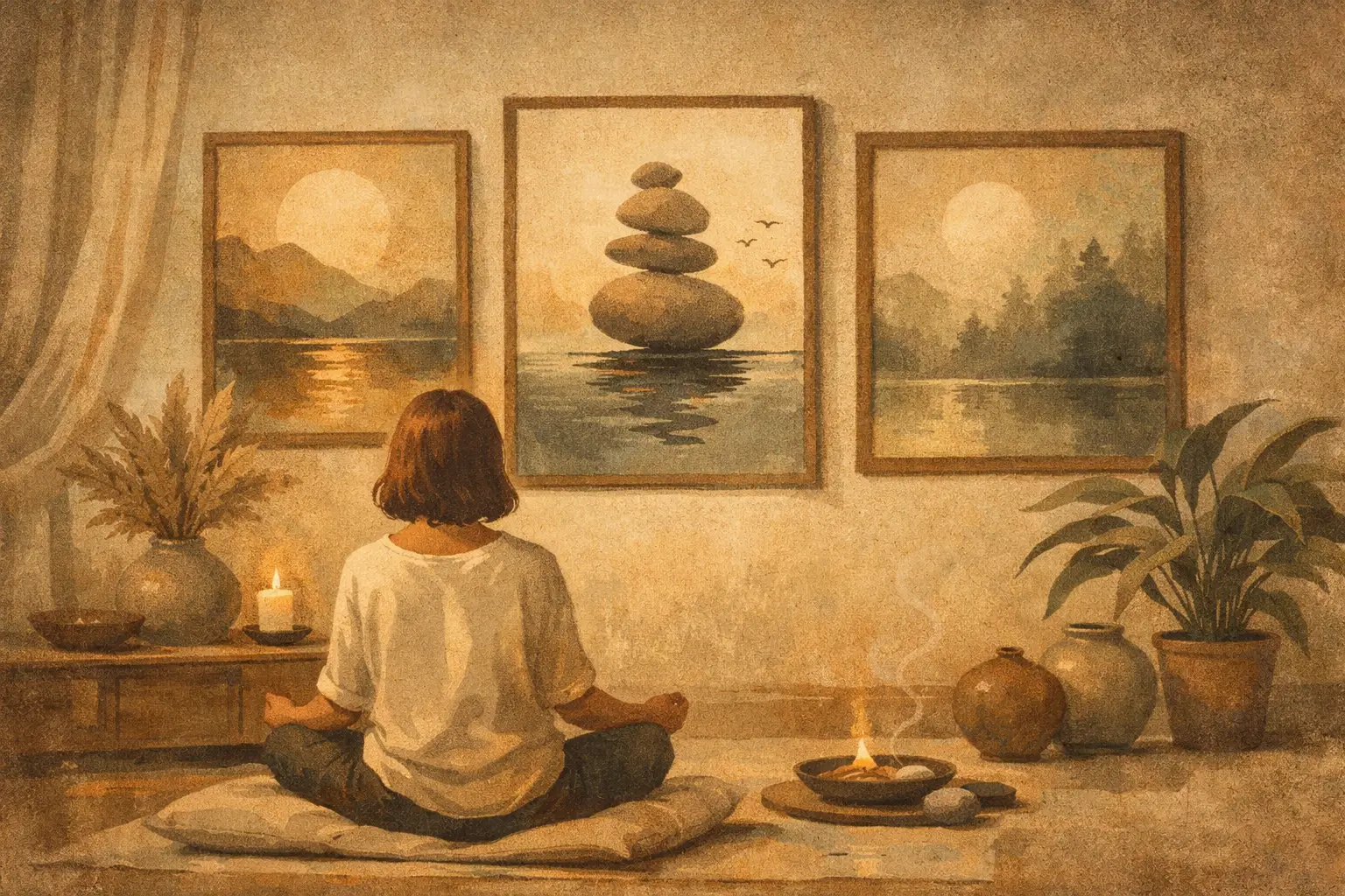
A room can be beautifully furnished and still feel restless. Often, the missing element is not another object but a visual pause: an artwork that lowers the temperature of the space, gathers the eye, and makes quiet feel intentional. Meditative wall art serves this purpose. It is not simply decoration with a calming palette. It is art selected for its capacity to create attention without demanding it.
For those drawn to minimal interiors, Wabi-Sabi sensibility, and rooms with emotional clarity, the right work can become a daily point of return. Its presence may be subtle, yet it changes how a room is inhabited. A pale field of pigment, an imperfect line, a distant horizon, or an abstract form held in generous negative space can make an interior feel less styled and more alive.
What Makes Meditative Wall Art Different?
Meditative art is defined less by subject matter than by atmosphere. A landscape can be meditative, but so can an architectural abstraction, a monochrome composition, or a work built from weathered-looking marks. The common thread is restraint. There is enough complexity to reward sustained looking, but not so much visual noise that the work competes with the mind.
This distinction matters because calm is not the same as blandness. An empty-looking print may disappear into a room, while an overly literal image of serenity can feel like a prescription. The most resonant pieces hold a tension between stillness and movement: a broken edge against a quiet ground, a deep indigo interrupted by a fine line, a raw texture that suggests time passing.
In Japanese aesthetic thought, beauty is often connected to impermanence, irregularity, and incompletion. A work does not need to resolve every question. It can leave room for reflection. That quality makes it especially suited to contemporary homes, where many people are seeking relief from visual overload without surrendering personality or depth.
Choose Art for the Pace of the Room
Before choosing a work, consider what happens in the room rather than beginning with the color of the sofa. A bedroom is a place of withdrawal. A dining room gathers conversation. An entry creates the first emotional impression of the home. Each calls for a different register of quiet.
In a bedroom, artwork with softened contrast and an open composition can support rest. Think muted mineral tones, misted landscapes, slow gestures, or forms that seem to hover rather than advance. Place the work where it can be seen from the bed, but avoid an image that feels overly active at waking and sleeping hours. The goal is not to make the room sleepy. It is to give the eye a place to settle.
A living room can carry greater visual presence. Here, a larger abstract work with layered texture or a more decisive field of color can anchor the space without becoming theatrical. If the room contains sculptural furniture, patterned textiles, or a collection of books, choose art that offers visual breathing room. If the furnishings are very spare, a work with tactile detail and tonal variation can prevent minimalism from feeling sterile.
An entryway benefits from a piece with composure and a clear internal rhythm. A narrow vertical composition, an atmospheric photograph, or a restrained geometric work can set a considered tone before the rest of the home is revealed. In hospitality settings, the same principle applies at a larger scale: calm art helps guests arrive before they are asked to engage.
Let Negative Space Do Its Work
Negative space is not unused space. In art, it is an active part of the composition, allowing forms, colors, and textures to resonate. In an interior, it creates a similar effect. A work with generous open areas can make a compact apartment feel less crowded and give a richly furnished home a needed moment of relief.
This does not mean every wall should be white or every print should be pale. Dark art can be deeply meditative when its composition is spacious. A charcoal field, a midnight blue expanse, or a nearly black photograph can create a feeling of depth and enclosure. What matters is whether the work feels grounded rather than visually congested.
Material and Finish Shape the Experience
The material presence of an artwork affects how its stillness is felt. A museum-quality Giclée print can preserve nuanced tonal transitions, fine grain, and delicate textures that might disappear in lower-grade reproduction. This is especially meaningful in quiet work, where a faint shift in color or a small irregular mark may carry the composition.
Framing should extend the work rather than compete with it. Natural wood can warm cool abstractions and echo an organic, Wabi-Sabi-informed interior. A slim black frame can give pale compositions definition in a more architectural room. Float mounting, wide margins, and restrained matting often create a sense of visual space around the image itself.
There is also a practical trade-off. Highly textured original paintings offer a physical immediacy that prints cannot replicate, while limited editions and fine art prints make distinctive work more accessible across multiple rooms or larger projects. Neither is inherently more meaningful. The question is what kind of encounter you want: the singular material history of an original, or the precise, lasting presentation of an edition selected for its image and atmosphere.
Scale Is a Form of Quiet Confidence
Small art can be intimate, but it is often asked to do too much when placed alone over a large sofa or bed. A work that is undersized for its wall can create unease, as though the room is waiting for the rest of the composition. Scale should feel settled.
For a major wall, one generously sized piece often creates a more meditative effect than several smaller works competing for attention. A single composition gives the gaze one destination. It also allows the room’s materials, light, and architecture to remain part of the experience.
A smaller piece can be powerful when it is deliberately placed. Hang it beside a reading chair, above a low console, or within a quiet passage between rooms. In these locations, intimacy becomes an invitation. The viewer has to approach, and that closer looking is part of the work’s value.
Build a Palette Around Feeling, Not Matching
The safest approach to art buying is to match every color already present in the room. It is also the approach most likely to produce a space that feels overly coordinated. Meditative wall art works best when it belongs to the room emotionally, even if it introduces a new note.
Earth tones, stone grays, softened greens, ink blues, warm whites, and oxidized reds naturally suit contemplative interiors because they feel connected to landscape, mineral, wood, and weather. Yet a restrained flash of saturated color can be equally effective. A rust-colored mark in a neutral room, for example, may bring warmth and human presence without disturbing the atmosphere.
Look at the undertones already in the space. A room with creamy plaster and oak needs different art from one with cool concrete and chrome. Then consider light. North-facing rooms often benefit from work with warmth or contrast, while sun-filled rooms can hold paler, more evaporative tones. Art is never seen in isolation. It is seen through the room’s changing day.
Buying With Attention Rather Than Urgency
A meaningful art purchase begins with a question that is more personal than, “Will this match?” Ask instead: what do I want to feel when I enter this room? Clarity, restoration, intimacy, spaciousness, or quiet energy are all useful answers. They point toward an artwork’s emotional temperature.
Give yourself time with the image. Notice whether your eye returns to it after the first impression. Notice whether the work continues to reveal small relationships of shape, line, and texture. Art that supports contemplation rarely announces everything immediately.
At Taygeta Gallery, this way of looking is central to curation. A work may be contemporary in medium and design, yet still carry an older awareness of silence, imbalance, and the beauty of what cannot be made perfect. That awareness gives an interior more than polish. It gives it presence.
The best choice may not be the loudest piece in the room or the most obvious expression of calm. It may be the one that changes slightly with morning light, asks for another look in the evening, and makes a familiar wall feel like a place to pause.
Leave a Reply