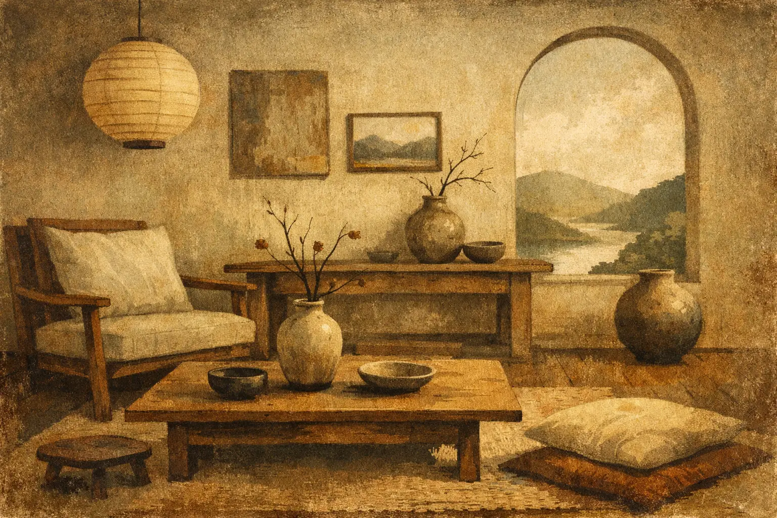
A room can be exquisitely furnished and still feel restless. Often, the missing element is not another object but an image that slows the eye down. The most compelling wabi sabi interior art trends respond to that need with work that honors texture, silence, weathered surfaces, and the quiet beauty of things that do not ask to be perfect.
This is not a trend toward neglect, nor an excuse for filling a home with imitation antiques and beige abstractions. Wabi-sabi invites a more attentive relationship with space. In interiors, art becomes a point of stillness: a visual presence that makes room for shadow, irregularity, and time.
Wabi Sabi Interior Art Trends Move Beyond Minimalism
Minimalism has often been interpreted as absence: white walls, clean lines, and as little visual interruption as possible. Wabi-sabi interiors can be spare, but they are not empty. Their restraint is softened by evidence of the human hand, natural materials, and forms that resist strict symmetry.
The art chosen for these rooms is changing accordingly. Rather than highly polished decorative prints or images designed to match a color scheme exactly, collectors and designers are seeking work with atmosphere. Think mineral-like fields of pigment, faded gestural marks, fragmented landscapes, ink forms, or compositions where the surface seems to hold its own history.
This shift matters because contemporary homes are increasingly asked to do emotional work. A living room may also be an office, a retreat, and a place to gather. Art with a wabi-sabi sensibility does not compete with those functions. It gives them a more contemplative frame.
Texture is becoming a visual language
Texture is central to this movement, even when the artwork itself is a museum-quality Giclée print. A convincing work can suggest dry plaster, oxidized metal, handmade paper, charcoal dust, clouded stone, or a wall touched by years of light. The appeal lies in visual depth, not in a literal attempt to make every surface look old.
For art buyers, this creates a useful distinction. Choose texture that feels integral to the artist’s language, rather than a decorative filter applied to a generic image. The former continues to reveal itself over time. The latter can feel dated once the surrounding trend moves on.
Earth tones are broadening
Warm neutrals remain foundational, but the palette has become more nuanced than sand, cream, and taupe. Smoky blue-gray, muted clay, moss, ash black, faded indigo, rust, bone, and deep umber are appearing in rooms that want calm without visual flatness.
Art is often where this restrained color enters most confidently. A single print with an inky black form or a low, burnished red field can ground a pale room more effectively than a collection of small accessories. The contrast should feel settled rather than dramatic, as though the color belongs to the architecture of the room.
Art That Holds Imperfection With Intention
Wabi-sabi is frequently reduced to an aesthetic of flaws. That simplification misses its depth. The philosophy is connected to impermanence, incompleteness, and humility, but it does not romanticize damage for its own sake. In art, the relevant quality is not imperfection as a style cue. It is an awareness that beauty can be quiet, transient, and unresolved.
This is why abstract art has a natural place in wabi-sabi interiors. It can leave space for interpretation rather than supplying a fixed narrative. A broken line, a soft erasure, or an off-center shape may carry more emotional weight than an image that explains itself immediately.
Figurative work can belong here as well, especially when it is spare and contemplative. A solitary vessel, a softened architectural study, a distant horizon, or a botanical form rendered with restraint can create the same sense of pause. The subject matters less than the work’s pace.
Avoid the staged version of rustic
There is a trade-off in translating a philosophy into a decorating style. A room can become overly literal: too many distressed finishes, too much faux patina, or an accumulation of objects meant to signal authenticity. The result may feel theatrical rather than lived in.
A more convincing approach pairs one or two visibly tactile elements with art that has emotional depth. A hand-thrown ceramic lamp, linen upholstery, aged wood, and a considered artwork are often enough. Let the art carry ambiguity. It does not need to match every material in the room to belong there.
Cultural sensitivity matters, too. Wabi-sabi has roots in Japanese aesthetic and spiritual traditions, not in a universal permission slip for disorder. Engaging with its principles thoughtfully means valuing restraint, material honesty, and attentiveness rather than borrowing a label to market a look.
How to Choose Art for a Wabi-Sabi Room
Begin with the room’s existing silences. Notice the negative space around furniture, the direction of daylight, and the surfaces that already have character. A plaster wall, oak table, or woven rug may suggest a color or feeling that the artwork can deepen.
Scale is especially important. In a room with low furniture and generous blank walls, one substantial work can create a stronger sense of calm than several small pieces. It gives the eye a single place to rest. Conversely, a compact work can feel intimate above a bedside table, in an entry, or beside a reading chair, where close looking is part of the experience.
Do not assume that wabi-sabi art must be monochromatic. A quiet room can hold a surprising color if the composition remains disciplined. An ochre line against a field of gray, or a small pool of cobalt within a muted composition, can introduce life without breaking the atmosphere.
Frame for presence, not perfection
Framing should support the work rather than overstate it. Natural oak, dark walnut, matte black, and softly toned frames tend to suit this aesthetic because they establish a clear edge without demanding attention. A generous white border can give an image air, particularly when the work has fine marks or a delicate tonal range.
The choice depends on the interior. A pale wood frame may echo warm, organic materials, while a black frame can lend structure to a room full of soft surfaces. For hospitality and larger design projects, repeating one framing approach across related works can create cohesion without making every space feel identical.
Placement benefits from the same restraint. Hang art where it can be encountered, not merely where a wall looks vacant. Near a window, consider how changing light will alter the image. Across from a seating area, choose a work that sustains attention without becoming visually loud. A wabi-sabi room should feel composed, but never over-managed.
The Return of the Singular Artwork
One of the quieter wabi sabi interior art trends is a move away from the perfectly coordinated gallery wall. Collections still have their place, particularly in hallways and layered homes, but many interiors are returning to the singular artwork as an anchor.
A single large abstract can give a room emotional gravity. It also allows buyers to choose something less obvious. When a work does not have to coordinate with seven others, it can be more enigmatic, more personal, even slightly difficult at first glance. Those are often the pieces that remain meaningful.
This does not require original art at every scale. Carefully produced collector editions and archival prints can bring an artist’s visual language into a home with clarity and substance. What matters is that the image has presence, the print quality respects its tonal detail, and the framing feels considered.
At Taygeta Gallery, the wabi-sabi perspective is not treated as a passing décor category. It is a curatorial way of seeing: an invitation to live with art that values stillness over spectacle and resonance over instant certainty.
The most enduring choice may be the work that asks for a second look. Place it where morning light can find it, where a conversation can pause beneath it, and where its small mysteries can become part of the life of the room.
Leave a Reply