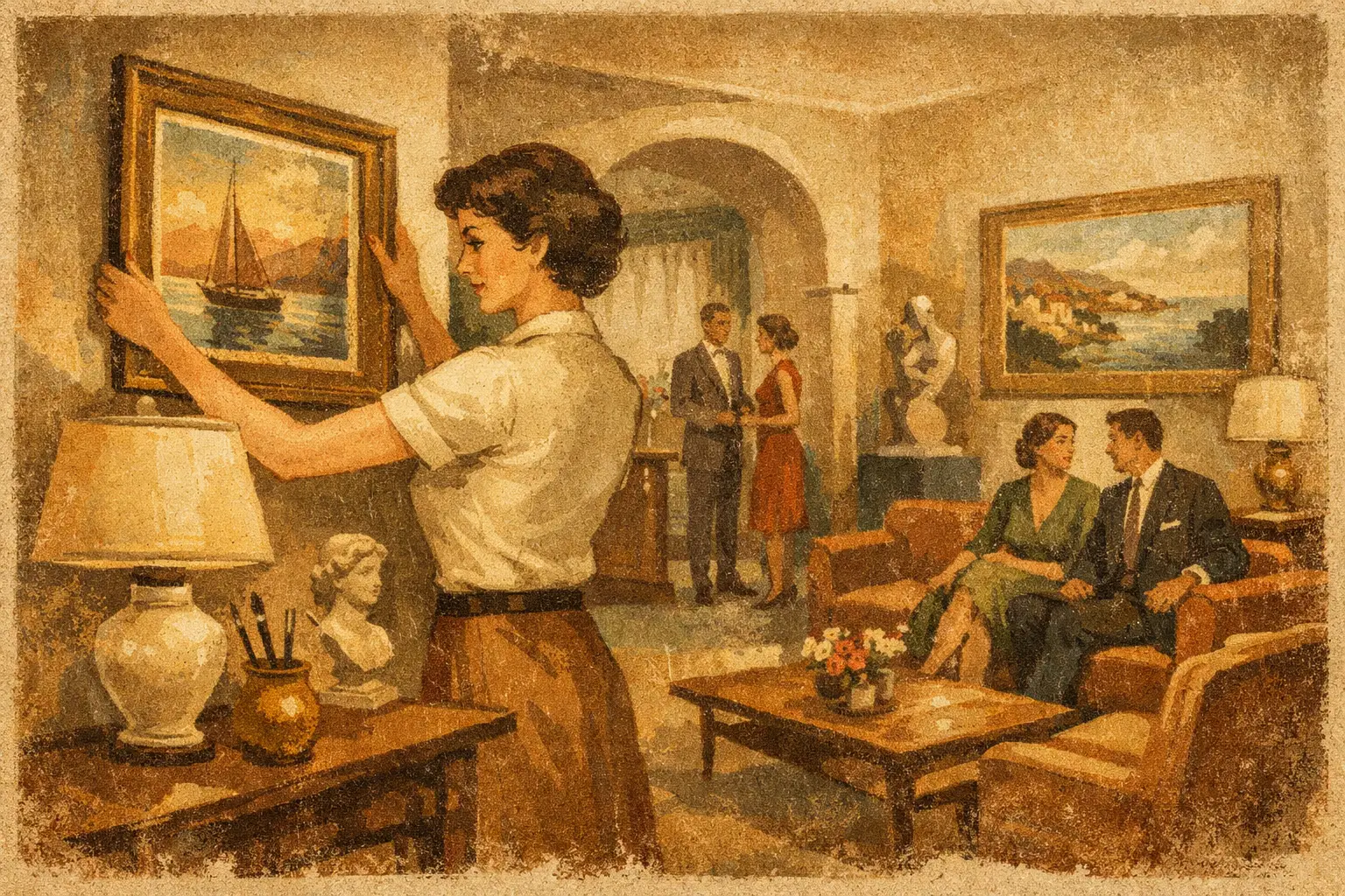
A guest enters a boutique hotel carrying more than luggage. They arrive with the residue of a flight, a meeting, a long drive, or an unfamiliar city. Before the room key is handed over, the visual atmosphere has already begun to shape the stay. This boutique hotel art curation example considers art not as a finishing touch, but as a form of orientation: a quiet signal that tells guests where they are, what to notice, and how slowly they are allowed to move.
The strongest hospitality collections do not attempt to impress at every turn. They establish a point of view, then give it room to breathe. A work in the lobby might hold the emotional center of the property; smaller works in corridors can extend that feeling without repeating it. In the guest room, art should feel less like branding and more like a private encounter.
A Boutique Hotel Art Curation Example: The Tidal House
Imagine a 34-room boutique hotel on the Pacific coast. The building is contemporary, but its materials are deliberately weathered: pale oak, hand-finished plaster, darkened bronze, woven linen, and stone with visible mineral variation. Its identity is not nautical in the literal sense. There are no shell motifs, blue-striped cushions, or framed photographs of crashing waves. Instead, the hotel takes its visual language from erosion, fog, tide pools, and the slow softening of edges.
The curatorial premise is simple: the coast is never still, yet it gives the impression of calm. That tension becomes the thread connecting the collection. Abstract artworks in washed grays, mineral greens, muted rust, and deep ink create a measured dialogue with the interiors. A few pieces introduce a concentrated red or electric cobalt, like a signal seen through mist. These moments matter because they prevent serenity from becoming blandness.
The collection includes original works for the public spaces, limited-edition prints for guest rooms, and a small number of commissioned pieces that respond directly to the building. This mix is both creatively and financially intelligent. Original art gives the hotel distinct cultural weight. Museum-quality editions allow the visual language to continue through every room without forcing the budget toward sameness or compromise.
The lobby: one work with real gravity
Behind the reception desk hangs a large, gestural abstract painting. Its surface suggests a shoreline without illustrating one: layered fields of ash white and soft charcoal are interrupted by a dark vertical passage, almost architectural in its stillness. The work is large enough to hold the space, but it does not compete with the people moving through it.
This is a crucial distinction in hotel art curation. The lobby artwork is often asked to do too much. It becomes a logo-sized declaration, a photo backdrop, and an attempt at instant luxury. A better choice has visual authority without demanding constant attention. It rewards a second glance from a returning guest and leaves enough silence for the architecture to speak.
At Tidal House, the artwork is lit with a warm, focused wash rather than a bright gallery beam. In daylight, its texture changes with the coastal light. At night, it becomes more intimate and shadowed. The art is not fixed in one mood, which makes the arrival experience feel alive.
Corridors: sequence rather than repetition
Hotel corridors can easily become visual dead zones. Filling them with identical framed prints may solve a practical problem, but it rarely creates memory. Here, the corridors are treated as a sequence of pauses. Each floor has a related group of smaller works, united by palette and material but varied in composition.
On the second floor, softly layered monochromes evoke fog and salt. On the third, graphic works with imperfect geometric forms recall breakwaters and harbor structures. On the fourth, more open compositions introduce negative space, allowing the eye to rest as guests approach their rooms.
The frames are consistent in finish, but not overly decorative: ebonized wood for pale works and natural oak for darker ones. This small decision creates continuity without turning the collection into a retail display. The aim is not to make every hallway photograph identical. It is to allow a guest to sense that each level has its own rhythm while remaining part of one larger atmosphere.
Why place matters more than theme
A sense of place is often misunderstood as literal local imagery. A desert hotel does not need cactus photography in every room; an urban property does not need a wall of skyline prints. Those choices may be appropriate in certain concepts, but they can flatten a location into a souvenir.
A more thoughtful approach begins with local conditions. What is the quality of light? Which materials age beautifully there? Is the landscape severe, lush, industrial, or open? What does the city sound like at night? Art can respond to those impressions through color, texture, scale, and mood.
For the coastal example, the works echo atmospheric conditions rather than depict a destination. This makes the collection feel rooted but not predictable. It also gives the property a longer visual life. Literal themed art can become dated quickly, particularly when a hotel refreshes its furnishings or expands its audience. Art built around an emotional reading of place tends to remain relevant.
Guest rooms: intimacy over spectacle
In each guest room at Tidal House, a single framed edition hangs where it can be seen from the bed or the sitting area. The work is modest in scale, usually 24 by 30 inches or 30 by 40 inches, depending on the room. It is not positioned above the headboard by default. If that wall is visually crowded, the piece moves to a quieter wall where it can have its own field of space.
The selected works are less dramatic than the lobby painting. They hold softer tonal shifts and a more contemplative pace. A guest room is not a public gallery, and it should not feel as though it is competing for attention. The art should support the experience of retreat.
This is where print quality becomes inseparable from curation. A poorly reproduced image can undermine even the most sensitive selection. Fine art Giclée printing, archival papers, and carefully considered framing give editions the depth and presence required in a hospitality setting. For properties working across many rooms, this consistency is not merely operational. It protects the feeling of the collection.
The trade-offs behind a coherent collection
There is no single formula for boutique hotel art. A high-contrast, maximalist property may need bolder work than a quiet coastal retreat. A historic inn may call for portraiture, vernacular photography, or material-rich works that acknowledge the building’s past. The point is not minimalism for its own sake. The point is coherence.
Commissioning only original works creates rarity, but it can stretch timelines and budget. Relying entirely on editions improves scalability, but may leave public spaces without a singular focal point. A blended strategy is usually the most effective: invest in a few original or commissioned anchors, then build a family of editions around them.
There is also a practical question of durability. Art in a hotel encounters changing light, cleaning routines, luggage traffic, humidity, and frequent guest turnover. Framing, glazing, placement, and lighting should be decided early, not after the works arrive. A piece placed too close to a busy service route may need protective glazing; a work near strong sun may require ultraviolet-conscious materials. Curatorial sensitivity and operational thinking belong in the same conversation.
Let art leave a residue
The measure of a successful hotel collection is not whether every guest can name an artist before checkout. It is whether the property feels difficult to confuse with another one. A guest may remember the dark painting behind reception, the small green composition near the elevator, or the unexpected quiet of the work beside their bed. Those fragments become part of the stay.
For designers and hospitality teams, this is the opportunity. Art can move a property beyond good styling into genuine atmosphere. Taygeta Gallery approaches project curation with this balance in mind: art should be visually assured, materially considered, and open enough for a guest to bring their own meaning to it.
Choose works that do not simply fill the wall. Choose works that make the room feel as though it has been waiting, calmly and deliberately, for someone to arrive.
Leave a Reply