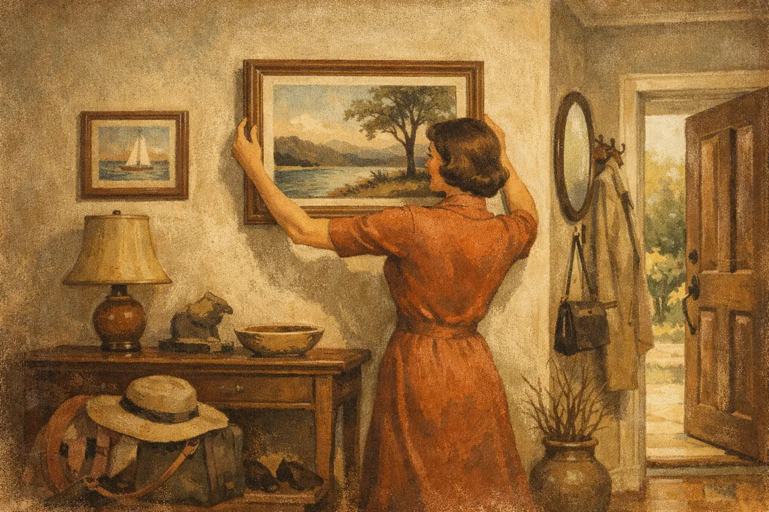
The entryway is a threshold, not a pass-through. It is the first pause between the public world and the private one, and the art placed there quietly establishes the mood for everything beyond it. Learning how to place art in entryway spaces is less about filling an empty wall than choosing an image, object, or composition that gives arrival a sense of presence.
A well-considered work can make a narrow hall feel more expansive, lend a new apartment a feeling of rootedness, or bring stillness to a busy family home. The best choice is rarely the loudest one. It is the piece that creates a clear emotional note, then leaves enough room for the architecture, the light, and the people entering the space.
Begin With the Feeling You Want to Welcome
Before measuring the wall, consider the atmosphere. An entryway offers a brief encounter with art, often repeated several times each day. This makes it an ideal place for work with a distinct inner weather: a contemplative abstract, a landscape reduced to gesture, a quietly surreal composition, or an edition whose texture rewards a closer look.
For a serene interior, a Wabi-Sabi sensibility can be especially persuasive. Imperfect forms, softened neutrals, visible grain, and asymmetric balance bring warmth without visual noise. In a more architectural home, a high-contrast geometric work may introduce focus and confidence. Neither approach is inherently better. The question is whether the art feels like an invitation into the rooms that follow.
Avoid treating the entry as a showroom for every style you enjoy. Its role is to set a first note, not tell the entire story. One deeply felt work often has more authority than a crowded arrangement of unrelated images.
How to Place Art in an Entryway at the Right Height
The familiar guideline of hanging art with its center around 57 to 60 inches from the floor remains useful because it corresponds roughly to eye level. Yet entryways often complicate this rule. A console table, bench, radiator, wainscoting, or unusually high ceiling can shift the visual center of the room.
If a single artwork hangs above a console, leave approximately 6 to 10 inches between the furniture and the bottom of the frame. The distance should feel connected, not precarious. A small work hung too high over a substantial console can seem to float away; a large work hung too low may feel crowded by lamps, flowers, or daily objects placed below it.
When the entryway is narrow, stand at the door and look toward the wall from the first natural viewing point. This is more revealing than measurements alone. You want the composition to register as intentional at a glance. Adjust the height slightly if needed, but resist the temptation to chase a perfect numerical rule at the expense of the room’s actual proportions.
Let scale answer the wall, not just the room
A large blank wall can absorb a surprisingly substantial artwork. As a general visual principle, art above a console works best when it occupies roughly two-thirds to three-quarters of the furniture’s width. This does not mean every piece must be oversized. A smaller framed drawing may be exactly right if its negative space is part of the composition and the entryway is quiet by nature.
What matters is visual weight. A dark, densely layered piece can hold a wall at a smaller size than a pale, airy image. A wide horizontal work may calm a long hallway, while a vertical composition can bring lift to a low-ceilinged foyer. Consider the frame as part of this equation. A slim oak frame feels lighter than a deep black one, even around the same image.
Work With What the Entryway Already Holds
Entryways are practical places. Coats arrive, shoes gather, keys are dropped, and doors open onto changing light. Art should not have to compete with disorder, but it can bring a useful counterbalance to it.
Above a console, choose a piece that relates to the tabletop without becoming decorative background. A single painting or museum-quality Giclée print can be enough, with a low vessel or one branch beneath it. If the console is crowded with storage, simplify the art rather than adding more visual activity. The eye needs a place to rest.
Opposite the front door, art often becomes a destination. This is an excellent placement for a work with depth, especially one that reveals itself gradually as a guest approaches. Beside the door, however, be mindful of swing clearance and accidental contact. Keep framed work away from areas where bags, umbrellas, or an opening door may strike it.
Stair landings deserve their own consideration. They are transitional spaces, but they can support a more narrative sequence. A pair of related works, hung in rhythm with the ascent, can create movement without the formality of a traditional gallery wall.
Choose Light That Honors the Work
Natural light is beautiful, though direct sunlight can fade paper-based work and affect pigments over time. If the entry receives strong afternoon sun, use UV-protective glazing and consider placing the art on an adjacent wall rather than directly in the light’s path. Preservation is part of collecting with care.
At night, a directional picture light or an adjustable ceiling fixture can give the work a quiet presence. Aim for even illumination, avoiding a harsh hotspot in the center or glare across glass. Warm light generally complements natural materials, nuanced neutrals, and textural abstractions; a cooler temperature can suit sharper contemporary interiors. The goal is not theatrical brightness. It is enough light for the work to retain its depth after sunset.
When a Gallery Wall Belongs in the Entry
A gallery wall can bring character to a generous foyer or long corridor, particularly when it reflects a genuine collection rather than a staged formula. It works best when there is a unifying thread: a shared palette, a recurring subject, a consistent frame finish, or a dialogue between old and new images.
The trade-off is energy. Multiple works create visual conversation, which may be welcome in an expressive home but can feel restless in a compact entrance. If the space is already animated by patterned tile, a dramatic rug, or architectural detail, a single artwork may offer the more refined answer.
For a gallery wall, lay the arrangement on the floor first and begin with the strongest or largest piece. Keep the gaps between frames consistent, usually around 2 to 3 inches, then treat the full grouping as one composition. Its center, rather than the center of each individual frame, should sit near eye level.
Frame for Continuity, Not Uniformity
Frames can bridge art and interior without making them match too literally. In a warm, minimal entryway, natural wood, linen mats, or softly brushed metal can echo materiality elsewhere in the home. Black frames create definition and work beautifully with monochrome photography, expressive line work, and bold contemporary art.
Uniform framing lends calm to a collection of varied images. Mixed framing can feel more collected and personal, but it requires a sure hand. Repeat one element, such as a shared mat color or similar frame depth, so the arrangement feels edited rather than accidental.
For unframed canvas or sculptural wall pieces, consider the shadow they cast. A little depth can be compelling in an entryway, where changing daylight emphasizes surface and form. Just ensure the projection is practical in a tight corridor.
Give the Artwork a Little Silence
The most common placement mistake is not choosing the wrong art. It is refusing to give the chosen work enough space. Let the piece breathe. Do not crowd it with hooks, signage, excessive accessories, or another frame placed inches away simply because the wall is available.
Art in an entryway should feel discovered, even when it is seen every day. A work selected for its emotional clarity can turn the ordinary act of coming home into a small moment of recognition. Hang it where your gaze naturally lands, let the light change around it, and allow it to say what the room does not need to explain.
Leave a Reply