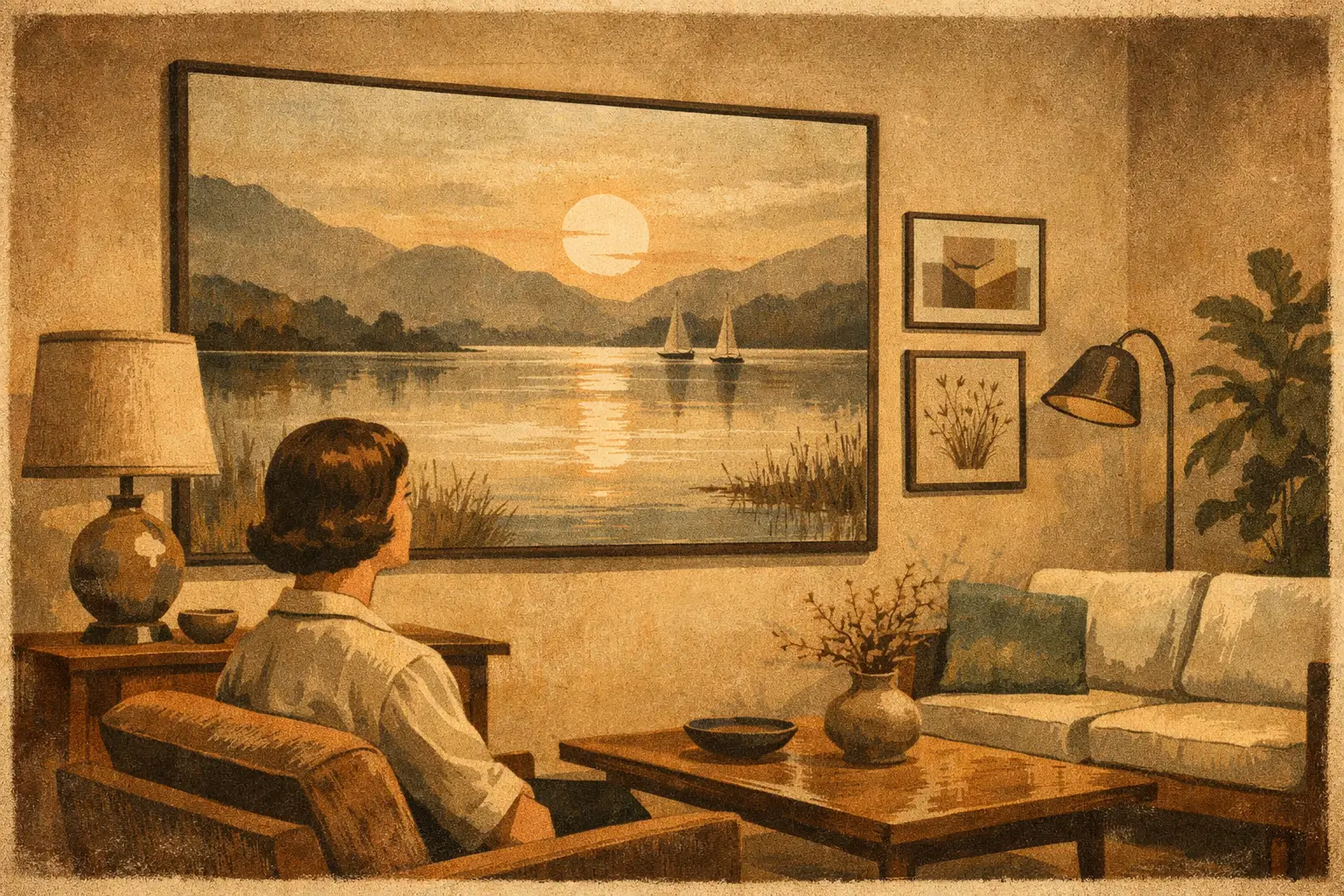
A large blank wall is not necessarily asking to be filled. Often, it is asking for one image with enough conviction to hold the room in stillness. The best large scale wall art does more than cover square footage: it creates a focal point, establishes emotional temperature, and gives furnishings a sense of relationship rather than arrangement.
For a collector, homeowner, or design professional, choosing art at scale is an act of editing. The work must carry from across the room while continuing to reward a closer look. It should feel proportionate to the architecture, but never merely obedient to it. A generous wall can accommodate a bold gesture, yet the most memorable choices often leave room for air, silence, and interpretation.
What Makes the Best Large Scale Wall Art?
Scale alone does not make an artwork powerful. A large piece can feel strangely timid when its composition is crowded, its colors are overly literal, or its presence depends on a passing trend. Conversely, a restrained abstract can command an entire living room through a single field of ink-like black, a weathered neutral, or a horizon that seems to recede beyond the frame.
The strongest large-format works have visual rhythm. They offer a clear first impression from a distance, then reveal texture, gesture, tonal variation, or conceptual tension as the viewer approaches. This is particularly true of abstract art, Wabi-Sabi-inspired work, and contemporary digital compositions, where an imperfect edge or shifting surface can make a space feel more human.
Material and production matter just as much. Museum-quality Giclée printing preserves nuanced color and fine detail, allowing a work to retain its depth at a substantial size. For framed prints, a considered frame can either sharpen the artwork’s architecture or soften it into the room. The goal is not visual noise. It is a finished presence that feels intentional from every angle.
Begin With the Wall, Not the Empty Space
Before selecting an image, read the wall as part of the room’s composition. Its width, height, surrounding openings, and proximity to furniture will tell you what kind of artwork it can hold. A tall, narrow wall beside a staircase calls for a different gesture than the broad plane above a low sofa.
Over furniture, art generally feels most settled when it spans roughly two-thirds to three-quarters of the furniture’s width. A 90-inch sofa, for example, often welcomes a work between 60 and 72 inches wide. These are not rigid laws. A quiet room with a low-profile sectional may benefit from a slightly larger piece, while an ornate antique sideboard may need more breathing room around the art.
Height shapes the experience as much as width. In most residential settings, place the center of the artwork near 57 to 60 inches from the floor, adjusting for ceiling height and the furniture below. Above a sofa, leave approximately 6 to 10 inches between the top of the furniture and the lower edge of the frame. Too high, and the art begins to drift. Too low, and the room can feel compressed.
For hospitality and commercial projects, sightlines deserve special attention. Art in a lounge must register while guests are seated; art in an entry must hold its own against movement, light, and architectural scale. One well-chosen large work can often do more than a crowded salon wall, especially where calm and clarity are part of the desired atmosphere.
One monumental work or a considered pair?
A single large artwork creates concentration. It is ideal above a sofa, bed, mantel, dining console, or reception seating area where the room needs a visual center. Choose this approach when the artwork has enough internal complexity to sustain the expanse, or when you want the wall to feel contemplative rather than decorative.
A diptych or pair creates a slower rhythm. It can soften a long wall, echo the symmetry of a room, or introduce a gentle sense of movement. The space between the two panels is part of the composition, not an accidental gap. Keep it consistent, usually 2 to 4 inches, and treat the pair as one visual field when measuring placement.
Choose Mood Before Matching Color
It is tempting to select wall art by pulling the exact blue from a rug or the exact terracotta from a cushion. This can produce coordination, but not always resonance. A more enduring approach begins with mood: Do you want the room to feel hushed, expansive, elemental, energized, or slightly mysterious?
For calm interiors, earth pigments, mineral grays, softened blacks, bone whites, and atmospheric blues bring depth without demanding constant attention. These tones work especially well with natural wood, linen, stone, and tactile plaster walls. They support the Wabi-Sabi understanding that beauty can be irregular, weathered, and incomplete.
If the room is mostly neutral, a large work with one decisive color can be transformative. Deep ultramarine, oxidized red, saffron, or an unexpected acid green may give an otherwise quiet space its pulse. The trade-off is permanence of feeling. A vivid artwork should be chosen because its energy feels true to the people who live with it, not because it briefly enlivens a photograph.
Monochrome art is often misunderstood as the safe option. In reality, a black-and-white or tonal piece makes demands of its own. Without color to carry the composition, line, contrast, texture, and negative space must do the work. When successful, monochrome wall art can feel almost architectural, bringing structure to rooms with layered materials and subtle palettes.
Let the Artwork Change the Room’s Pace
Large art has a physical effect on how a room is read. A horizontal composition can widen a compact living room and suggest rest. A vertical work can draw attention upward, lending grace to spaces with high ceilings or narrow proportions. A central form gives the eye a place to land; an open field of color or texture encourages it to wander.
Consider the pace already present in the interior. A room with patterned textiles, sculptural lighting, and varied objects may need an artwork with broad, quiet passages. A more minimal setting can receive a work with stronger visual tension, layered imagery, or surreal detail. Neither choice is universally better. The art should provide either a counterpoint or a continuation, depending on what the space lacks.
This is why original-feeling abstract work is so valuable in interiors. It does not dictate one story. Over time, it can meet changing light, changing seasons, and changing states of mind without becoming fixed as a piece of décor.
Framing Is Part of the Artwork’s Presence
At a large scale, framing cannot be an afterthought. A thin black frame can lend a crisp contemporary boundary to an expressive composition. Natural oak often brings warmth to quiet palettes and organic forms. White frames can make a light-filled work appear to float, although they may disappear against pale walls if contrast is needed.
A frame should support the artwork rather than compete with it. Highly ornate molding can be beautiful in the right historic interior, but it may pull attention away from contemporary digital art or minimal abstraction. For works with especially immersive color or edge-to-edge imagery, a frameless or minimal-profile presentation may preserve the feeling of openness.
Also consider surface finish. Matte presentation reduces glare and is especially helpful opposite windows or beneath direct lighting. A slight texture can enrich artworks inspired by paper, pigment, erosion, or imperfect natural forms. In a sunlit room, test the intended wall at different times of day before committing to placement.
Avoid the Common Scale Mistakes
The most frequent mistake is choosing a work that is technically large but visually too small for its wall. A 24-by-36-inch piece can be substantial in a hallway yet look isolated above a long sofa. If a single work feels undersized, do not try to rescue it with excessive accessories. Choose a larger format, a pair, or a more deliberate grouping.
Another mistake is filling every available wall. Large art needs distance to speak. A room with one significant work and a few quieter objects often feels more collected than a room in which every surface competes for attention.
Finally, do not sacrifice emotional connection for easy coordination. The artwork will outlast the throw pillows. Choose a piece that continues to hold your gaze after the practical questions have been answered.
At Taygeta Gallery, the most compelling large-scale choices are often those that bring an interior back to its essential qualities: light, proportion, texture, and feeling. Let the work be generous in scale, but restrained in intention. When a wall carries the right image, the room does not simply look finished. It becomes a place where attention can settle.
Leave a Reply