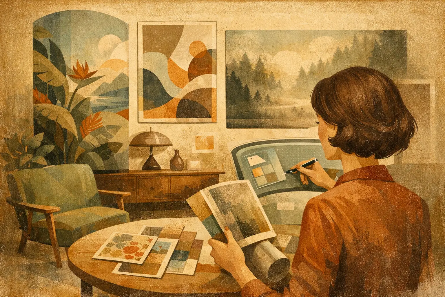
A room can be exquisitely furnished and still feel unresolved. Often, the missing element is not another object but an image: a work with enough presence to hold the eye, soften the architecture, and give the space an inner life. The most compelling digital print trends for interiors respond to this need. They move away from generic decoration and toward prints that feel authored, tactile, and emotionally specific.
For collectors and design-minded homeowners, digital art is no longer a compromise between originality and budget. Museum-quality Giclée printing, considered framing, and limited-edition formats have made it possible to live with visually ambitious work at many scales. What matters is not whether an image began on a screen. What matters is the quality of the artistic language, the material finish, and the atmosphere it creates once it enters a room.
Digital print trends for interiors favor atmosphere over novelty
The strongest shift is away from loud trend cycles and toward visual longevity. Interiors are becoming quieter in palette yet richer in feeling. Rather than asking art to merely match a sofa or fill a blank wall, designers are choosing work that introduces tension, silence, movement, or a sense of memory.
This is why abstract digital compositions, softened surrealism, and restrained figurative work are finding a natural place in contemporary homes. A print may suggest a landscape without describing one. It may hold a face at the edge of recognition, or use a single field of mineral blue, faded sienna, and charcoal to alter how a room is perceived. Such work leaves space for the viewer, which is particularly valuable in interiors designed for rest.
The trend is not minimalism for its own sake. A sparse image can feel cold if it has no depth, while a layered composition can remain calm when its colors and gestures are carefully balanced. The distinction lies in emotional temperature. The best pieces create pause rather than demand constant attention.
Texture is returning, even in digital work
A digital print does not need to look digitally slick. One of the most persuasive directions in interior art is the translation of tactile processes into printed form: grain, erased marks, weathered surfaces, gestural brushwork, paper-like fibers, and softly imperfect edges. These qualities bring warmth to rooms dominated by smooth plaster, glass, stone, or lacquered finishes.
This return to texture reflects a wider desire for materials that feel lived with rather than manufactured. Wabi-Sabi has influenced this sensibility, not as a decorative formula, but as an appreciation for irregularity, restraint, and time. A print with a hazy wash, a fractured line, or a slightly distressed field can make a highly finished room feel more human.
Production matters here. Fine details should remain visible without becoming harsh, and deep blacks should retain nuance rather than flatten into a single dark mass. Museum-quality Giclée printing is especially suited to works with subtle tonal shifts, because it can preserve the faint layers that give an image its contemplative character.
The frame is part of the image
Framing is increasingly treated as an extension of the artwork, not an afterthought. Thin natural oak, dark walnut, muted black, and warm off-white frames continue to suit contemporary interiors because they establish a boundary without competing with the composition. A pale wood frame may draw out the calm in an atmospheric abstract, while black can give a delicate image needed definition against a light wall.
For more architectural spaces, oversized prints with generous matting remain persuasive. The empty margin gives the work room to breathe and can make a modestly scaled composition feel deliberate. Conversely, an edge-to-edge framed print can create a stronger, more immersive statement in a hallway, entry, or hospitality setting.
Quiet color is replacing perfect coordination
The familiar instruction to coordinate art exactly with a room’s palette is losing authority. Contemporary interiors often feel more collected when the art introduces a color that is present only faintly elsewhere, or not at all. A rust-toned print in a room of limestone and cream can add gravity. A muted violet in a largely neutral bedroom can create an unexpected note of intimacy.
The colors gaining ground are not necessarily bright. Think smoke blue, clay red, moss, ink, soft butter, washed lavender, and the many near-neutrals that change with daylight. These shades work well with natural materials and give digital art a more enduring relationship with furniture, textiles, and architecture.
There is still a place for bolder chromatic work. In a restrained interior, one saturated artwork can act as a visual pulse. The trade-off is scale and placement: a vivid large-format piece often needs surrounding quiet, while a small, intense print can disappear if it is crowded by patterned furnishings and competing objects.
Surrealism is becoming more intimate
Surrealist imagery is returning to interiors in a softened, poetic form. Instead of spectacle, the emphasis is on ambiguity: floating forms, altered botanicals, dreamlike figures, impossible horizons, and scenes that seem to belong to a private mythology. These images offer narrative without becoming literal.
This direction suits spaces where personal expression matters. A bedroom, reading room, or apartment entry can benefit from a work that feels slightly elusive. It gives the room a point of view. In commercial settings, particularly boutique hospitality, surreal digital art can create a memorable identity without relying on overt branding.
The key is to choose work with visual discipline. An image may be strange, but it should still have compositional calm. Too many symbols, high-contrast effects, or obvious references can date quickly. The most lasting surreal prints maintain mystery because they do not explain themselves all at once.
Editions and scale are shaping how people collect
The growing interest in limited and curated editions speaks to a desire for distinction. Buyers want confidence that a piece is not simply an image reproduced without context. Editioning introduces a sense of care, while curatorial framing helps viewers understand why a work belongs in a collection and how it may relate to a wider visual conversation.
This does not mean every interior requires rare art at intimidating prices. Accessible collecting can still be thoughtful. A carefully selected print, produced beautifully and placed with intention, may have more impact than an expensive work chosen only for status. Taygeta Gallery approaches this space through art that carries both decorative clarity and conceptual weight.
Scale is equally expressive. Large art is no longer reserved for expansive houses or corporate lobbies. One generous print above a low sofa, a dining banquette, or a bed can simplify a room by removing the need for many smaller gestures. It is a useful strategy for apartments, where a single strong image can create depth without adding physical clutter.
Smaller works have their own intimacy. A pair of prints beside a bedside table, a quiet image leaning on a bookshelf, or a small framed work in an entry niche can reward close looking. The decision depends less on room size than on viewing distance and the role the art should play.
How to choose a print that will stay with you
Begin with the room’s feeling, not its color scheme. Ask whether the space needs stillness, energy, warmth, strangeness, or a sense of openness. Then consider what the image does at different distances. From across the room, it should create a clear silhouette or tonal presence. Up close, it should offer detail worth returning to.
Also consider light. A work with delicate pale tones may need a wall with enough contrast and a place away from direct glare. Darker, more saturated prints can anchor sunlit rooms, yet they may become heavy in a dim corner. Before committing, picture the print at the time of day when you use the room most.
Above all, resist the pressure to make art behave like an accessory. The right print may complement an interior, but it should also retain its own world. Choose the image that continues to ask something of you, quietly, after the room has gone still.
Leave a Reply