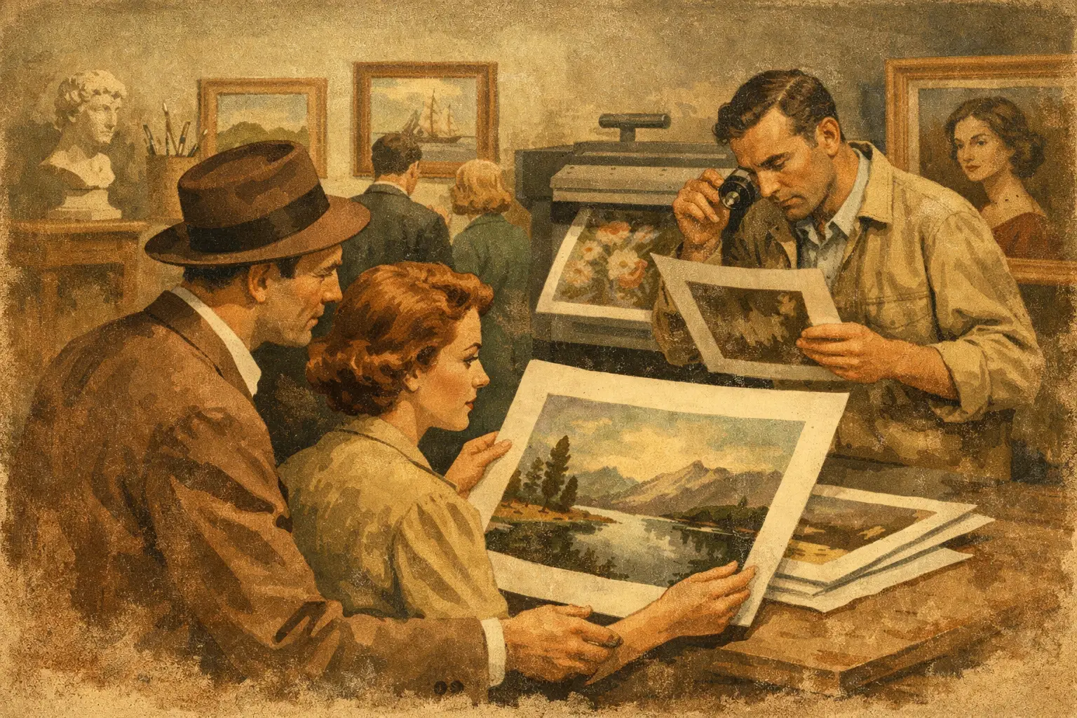
A print can appear luminous on a screen and feel strangely flat when it arrives. The difference is rarely a matter of image alone. It lives in the density of the paper, the depth of the ink, the calibration of the printer, and the care taken to preserve the artist’s intended color. This guide to museum quality giclee prints is for collectors and design-minded buyers who want artwork with presence – not simply decoration that fills a wall.
A well-made giclee print offers a compelling way to live with contemporary art. It makes nuanced, visually distinctive work more accessible while retaining the tactile and tonal qualities that give an image its authority in a room. Yet “museum quality” is not a single material or a guarantee printed on a product page. It is a standard created through a series of considered decisions.
What museum quality means in a giclee print
Giclee, pronounced zhee-clay, comes from the French word for a spray or jet. It refers to a high-resolution inkjet printing process in which extremely fine droplets of archival pigment ink are placed on a chosen substrate. The process is capable of rendering subtle shifts in tone, intricate texture, and a broad range of color that conventional poster printing often cannot hold.
Museum quality describes the ambition behind the finished piece: faithful image reproduction, archival materials, careful handling, and a presentation suited to long-term display. It should not be used to suggest that every giclee is identical, or that a print automatically has the same cultural history as an original painting. A giclee is a reproduction or editioned work, and its value rests in the quality of the production, the integrity of the edition, and the strength of the image itself.
For an abstract work, this distinction is especially visible. A warm gray may carry a trace of violet; a deep black may reveal a soft, velvety texture rather than a uniform field. In a work influenced by Wabi-Sabi, a quiet imperfection or weathered edge may be the emotional center of the composition. If the print process compresses those details, the atmosphere changes.
The four elements that shape a lasting print
Archival pigment inks preserve subtle color
Pigment-based inks are central to fine-art giclee production. Their color particles sit on or within the surface of the paper in a way that creates rich density and strong resistance to fading when displayed and cared for properly. Dye-based inks can look vivid at first, but they generally do not offer the same archival stability.
Longevity still depends on conditions. Direct sunlight, humidity, smoke, and extreme temperature changes can affect almost any work on paper. A museum-quality print is made to endure, not to be immune to its environment. For a sunlit living room, consider placement away from intense, prolonged rays or choose glazing with UV protection.
Fine-art paper changes the character of the image
Paper is not merely a carrier for an image. It is part of the artwork’s visual language. Smooth matte papers tend to bring clarity and restraint to crisp digital compositions, graphic forms, and minimal palettes. Textured cotton rag papers can introduce softness and depth, making them especially beautiful for painterly marks, organic gradients, and images with a meditative, imperfect quality.
Look for acid-free, lignin-free fine-art paper. Acid-free materials are less prone to yellowing over time, while lignin-free papers avoid a component found in wood pulp that can contribute to discoloration. Cotton rag is often favored for its tactile quality and archival reputation, though a premium alpha-cellulose paper can also produce an excellent result. There is no universal winner. The right paper should serve the work, not overwhelm it.
A glossy finish can intensify saturation and sharpen contrast, but it also reflects more light. In a calm, layered interior, matte or softly textured paper is often easier to live with. It allows the image to remain present without turning every window and lamp into part of the composition.
Resolution protects detail, but it is not everything
A high-resolution source file gives a printer enough visual information to reproduce an image cleanly at its intended size. Fine lines stay defined, areas of color remain smooth, and photographic or digital textures do not break into visible pixels. For collectors, the practical question is simple: does the artwork look deliberate at viewing distance and rewarding up close?
Resolution alone cannot make an image compelling. A technically sharp file can still feel lifeless if its color is poorly managed or its paper choice is wrong. Conversely, an artist may intentionally use grain, softness, or digital distortion as part of the work. Quality means reproducing that choice with fidelity, not polishing it away.
Color management is where fidelity is won
The colors on a backlit monitor are not the colors that live on paper. Screens emit light, while prints reflect it. A conscientious production process accounts for this difference through calibrated displays, professional printer profiles, and proofing. This is how a restrained sand tone remains warm rather than yellow, or a near-black retains its blue undertone instead of becoming a heavy, empty block.
Some variation between a screen and a finished print is natural. The goal is not mechanical sameness. It is an honest translation of the artist’s visual intent into a physical object. When buying online, it is reasonable to expect clear descriptions of materials and a gallery that treats color as part of the work’s meaning rather than an afterthought.
How to evaluate a museum quality giclee print online
When you cannot hold a print before purchasing, begin with specificity. A trustworthy listing should identify the paper type, ink system, available sizes, and whether the work is open edition or limited edition. Broad phrases such as “premium paper” are less useful than a clear statement about archival pigment inks and the precise fine-art stock used.
For limited editions, ask how the edition is defined. Is the print numbered? Is it signed by the artist, hand-signed or digitally signed? Does the stated edition size include every format, or are there separate editions by size? These details do not automatically determine whether you will love the piece, but they provide context for collecting and help distinguish intentional editions from unlimited reproduction.
Examine the imagery with the room in mind. A small print with expansive negative space can create a pause in a narrow hallway. A larger, textural composition can anchor a seating area, particularly when its tonal range echoes natural materials such as linen, oak, stone, or brushed metal. Size is not only a measurement. It determines how the work holds silence, movement, and visual weight.
Taygeta Gallery approaches giclee prints as collectible artworks made for lived spaces, where the material finish and curatorial context are as meaningful as the image on screen. That perspective matters when choosing work for a home, a hospitality setting, or a design project: art should belong to the atmosphere, not merely match the palette.
Framing is part of preservation
Even an exceptional print can be diminished by casual framing. A frame gives visual structure, but it also protects the paper from dust, handling, and environmental change. Whenever possible, choose acid-free matting and backing materials. The print should not rest directly against standard cardboard or adhesive surfaces, which can cause staining or damage over time.
Glazing deserves equal attention. Standard glass is economical and suitable in many lower-risk settings, while UV-filtering acrylic or glass offers added protection where light exposure is a concern. Acrylic is lighter and shatter-resistant, which can make it practical for large-scale works or commercial interiors. Glass often has a more traditional visual feel and can be more resistant to surface scratching. The best choice depends on scale, placement, budget, and the desired finish.
A float mount can reveal the deckled edge of a paper and emphasize its object quality. A window mat creates a quiet border that gives an image room to breathe. For bold digital art with full-bleed color, a clean frame without a mat may feel more immediate. None of these approaches is inherently more refined. The frame should extend the work’s sensibility.
Caring for prints over time
Handle unframed prints with clean, dry hands and support them from beneath rather than gripping the corners. Keep them flat in archival sleeves or tubes until framing, and avoid basements, attics, or other areas with pronounced humidity and temperature shifts. Once framed, dust the exterior lightly with a soft cloth. Do not spray cleaner directly onto glazing near the artwork.
A museum-quality giclee print is an invitation to look slowly. Choose the image that continues to reveal something after the first impression – a texture that shifts with the afternoon light, a form that steadies a busy room, or a color that makes the surrounding space feel more like your own.
Leave a Reply