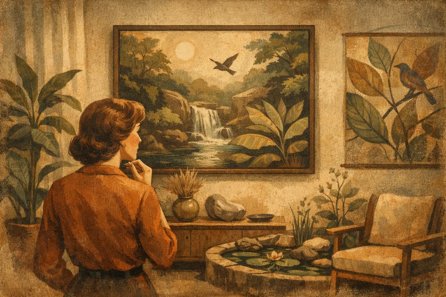
A room can contain every expected gesture of comfort and still feel strangely airless. The difference is often not another plant, a larger window, or a new paint color. It is the visual relationship between the interior and the living world beyond it. This guide to biophilic art design considers how art can carry that relationship into a space with more permanence, subtlety, and emotional depth.
Biophilic design begins with a simple human instinct: we feel restored by forms, materials, and patterns that recall nature. In art, this does not require a literal landscape above the sofa. A field of mineral tones, an abstract gesture that resembles water in motion, or a print built from quiet organic lines can create the same sense of connection. The strongest choices do not imitate nature as decoration. They allow a room to breathe in its presence.
What Biophilic Art Design Really Means
The word biophilia describes an affinity for life and living systems. In interiors, it is often associated with daylight, indoor greenery, natural materials, and views outdoors. Biophilic art design extends the idea into the visual language of a room, using artwork to evoke the rhythms, asymmetries, colors, and atmospheres found in nature.
This distinction matters. A framed botanical illustration may be biophilic, but so may a restrained abstract composition in moss, clay, mist, and charcoal. Aerial photography, expressive ink work, and textured digital art can also belong in this category when they invite contemplation of natural processes rather than simply adding a leafy motif.
For a home shaped by minimalist or Wabi-Sabi sensibilities, this approach is especially compelling. Nature is not presented as pristine or controlled. It may appear weathered, incomplete, shadowed, seasonal, or softly irregular. That honesty gives an interior character. It moves the room away from polished sameness and toward a more personal calm.
Start With the Feeling, Not the Subject
Before choosing a work, consider the atmosphere you want the room to hold. The right question is rarely, “Should I buy art with plants?” Instead, ask what kind of nature belongs here.
A bedroom may call for stillness: foggy horizons, pale stone colors, watery gradients, or sparse branches against open space. A dining area can hold more vitality, perhaps through sun-warmed ochre, rich greens, and gestural forms that suggest growth or movement. In an entryway, art with a strong horizon or a quiet woodland palette can create an immediate feeling of arrival.
Subject matter remains useful, but it should serve the mood. A dramatic tropical print may bring welcome energy to a bright, eclectic room, while it can overwhelm an interior built around pale oak, linen, and negative space. Conversely, an understated abstraction can feel too recessive in a large hospitality lobby where art must register from a distance. Biophilic art is not one look. It depends on scale, light, architecture, and the emotional work the room needs to do.
Look for nature’s visual principles
Natural environments rarely rely on perfect symmetry or a single flat tone. Their appeal comes from variation: the edge of a coastline, the grain of wood, the layering of sediment, the repetition of leaves with no two exactly alike. Artwork that reflects these principles often feels more enduring than overtly thematic décor.
Look for organic contours, tactile surfaces, softened geometry, tonal shifts, and compositions with a sense of depth. A work need not be green or floral to feel alive. Sand, rust, midnight blue, cloud gray, and deep umber can be equally connected to the natural world.
Choose a Palette That Belongs to the Room
Biophilic palettes are often misunderstood as an instruction to use green everywhere. Green can be restorative, but nature offers a far wider spectrum. Consider the colors already present in the room, then choose art that either continues their atmosphere or introduces a carefully measured contrast.
In a neutral interior, a print in lichen, sage, and mineral gray adds softness without disturbing the room’s restraint. Against darker walls, art with limestone, moonlit blue, or faded sand can create a luminous counterpoint. Terracotta, ochre, and dried-bloom tones bring warmth to modern spaces that risk feeling too cool.
The most elegant option is often a palette with one recognizable natural reference and several ambiguous notes around it. Think of sea green deepened by graphite, or warm earth punctuated by a small field of muted blue. Such complexity helps artwork remain interesting after the first glance.
Be attentive to undertones. A yellow-green can feel lively and contemporary, while an olive green tends to feel grounded and quiet. Blue with a gray cast may suggest rain or stone; a clearer blue can read as coastal and expansive. These small decisions shape whether the work feels integrated or merely coordinated.
Let Scale Create a Sense of Immersion
Biophilic art works best when it has enough presence to alter perception of the room. A small image can be intimate and exquisite, particularly in a reading corner, beside a bed, or within a considered salon wall. But one undersized piece floating above a large sofa will not create the immersive effect that biophilic design promises.
For a principal wall, choose a work or paired works that occupy meaningful visual territory. Large-format art can function almost like a window onto another atmosphere, especially when its composition includes open fields, distant forms, or layered depth. Museum-quality Giclée prints make this scale more accessible while preserving tonal detail that is easily lost in lesser reproductions.
In compact rooms, scale is still possible. Rather than filling every wall with small decorative images, choose one work with a calm composition and give it room around the edges. Negative space is not empty. It is part of the viewing experience, much like a clearing within a landscape.
Frame as if it were part of the architecture
The frame should support the artwork’s relationship to nature, not compete with it. Pale oak, walnut, black wood, and softly finished metal are often reliable choices because they create a material bridge between the work and the room. A wide white mat can lend air to detailed botanical or photographic works, while a full-bleed print may better serve a contemporary abstract with immersive color.
There is no universal rule against ornate framing, but it should be intentional. An elaborate gilt frame may beautifully complicate a moody floral still life in a traditional setting. In a pared-back contemporary interior, it can interrupt the quiet that makes the artwork effective.
Build a Layered Conversation With Real Materials
Art cannot replace daylight, fresh air, or the sensory pleasure of real materials. It can, however, give those elements a visual echo. A painting with weathered earth tones may resonate beside a travertine table. A blue-black abstract can deepen the effect of linen curtains moving in a breeze. A print suggesting reeds or water may feel especially alive near handmade ceramics and a single sculptural plant.
This is where restraint matters. If every surface announces nature through rattan, pampas grass, botanical prints, and abundant greenery, the room can become overly literal. Choose a few distinct signals and allow them to converse. One work of art, one living element, and one honest material often create more atmosphere than a crowded collection of references.
For commercial settings, the same principle supports a more memorable guest experience. In a boutique hotel, wellness studio, or hospitality lounge, biophilic art can establish calm without relying on expensive architectural renovation. Consider durability, placement, and viewing distance alongside mood. Works near direct sun or high-traffic areas may need protected glazing and finishes suited to the environment.
Buy With Time in Mind
The most successful biophilic artwork is not a trend purchase. It is a work you can return to when the room is quiet. Before committing, spend time with the image at different sizes and imagine its changing relationship to morning light, evening shadow, and the seasons outside your windows.
Ask whether the work has visual room to unfold. Does it reveal texture when viewed closely? Does it retain composure from across the room? Can it live with evolving furniture and textiles? Art rooted in natural forms often ages well precisely because it does not depend on a passing color cycle or an obvious decorative statement.
A piece with this quality can become a small daily refuge: not a replacement for the outdoors, but a reminder to notice its patterns, its imperfections, and its quiet persistence. Choose art that makes the room feel less finished and more alive.
Leave a Reply