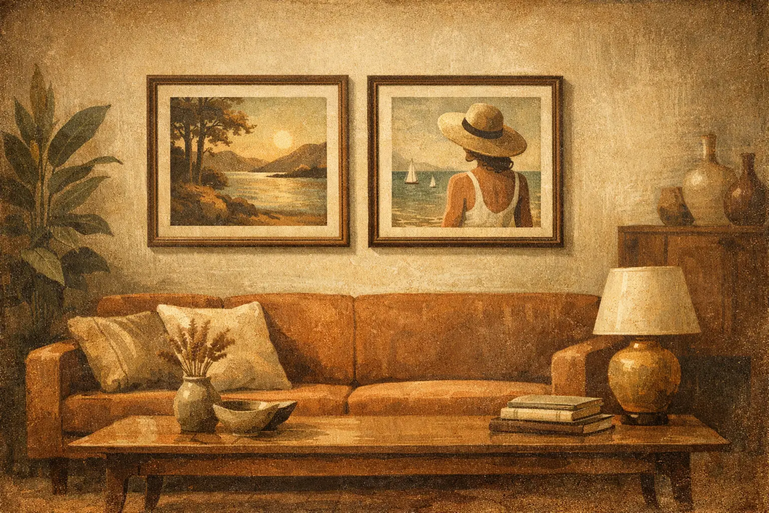
A living room rarely feels finished when the walls are silent. The sofa may be beautifully proportioned, the lighting soft, the materials carefully chosen, yet the space can still feel emotionally incomplete. Framed art prints for living room interiors solve that quiet problem when they are chosen with intention – not as filler, but as visual anchors that shape atmosphere, rhythm, and memory.
The difference lies in curation. A strong print does more than match a rug or echo a paint color. It creates a point of focus, introduces tension or stillness, and gives the room a point of view. In a well-composed interior, framed art is not the last decorative step. It is often the element that teaches the room how to feel.
Why framed art prints work so well in living rooms
The living room carries unusual pressure. It is where people gather, rest, read, host, think, and retreat. Because it serves several emotional functions at once, the artwork here has to do more than look attractive. It should hold the room together while leaving enough openness for daily life.
Framed prints are especially effective because they balance accessibility with presence. A museum-quality Giclée print can bring depth, tonal subtlety, and a highly finished look without the cost or fragility of a one-of-a-kind work on paper. The frame gives the piece structure. It signals permanence, adds architectural clarity, and helps the art belong to the room rather than float on the wall as an afterthought.
That matters in contemporary interiors, especially those shaped by minimalism, Japandi, Wabi-Sabi, or modern organic design. In these spaces, every visible object carries more weight. The right framed print introduces visual meaning without creating clutter.
How to choose framed art prints for living room spaces
The best starting point is not color. It is mood.
Ask what the room is asking for. Some living rooms need calm because the architecture is busy or the household is active. Others need energy because the palette is restrained and the furniture is low in contrast. A print with soft tonal transitions, open composition, and negative space can deepen a sense of stillness. A bolder abstract with sharper geometry or expressive movement can wake up a room that feels too polite.
This is where many people make the wrong trade-off. They shop for something that “goes” with the room, and end up with art that disappears into it. Harmony matters, but complete agreement can flatten a space. A stronger approach is to choose a work that relates to the room while introducing one subtle disruption – a darker line, an unexpected rust tone, a field of emptiness, a surreal gesture. That small tension is often what makes a room feel designed rather than decorated.
Let scale lead the decision
Scale changes everything. A beautiful image in the wrong size will always feel hesitant.
Above a sofa, the artwork should usually occupy a meaningful portion of the width, often around two-thirds to three-quarters. If the print is too small, the wall feels underdressed and the furniture overwhelms it. If it is too large, the room can feel top-heavy. In open-plan living rooms or spaces with high ceilings, larger framed works often create the grounded focal point the room needs.
There is also a psychological effect to scale. Large art slows the eye and invites immersion. Smaller pieces create intimacy and ask to be approached. Neither is inherently better. It depends on whether you want the room to feel expansive and architectural or layered and personal.
Frame choice is part of the artwork
A frame is not only a finishing detail. It changes how the image is read.
Black frames bring crisp definition and suit contemporary interiors with stronger contrast. Natural wood frames soften the transition between art and architecture, especially in rooms with linen, oak, stone, boucle, or handcrafted ceramics. White frames can feel quiet and airy, though in some cases they reduce impact unless the work itself has enough internal depth.
If the artwork carries a contemplative or Zen-inflected sensibility, the frame should support that restraint. Overly ornate moldings can interrupt the visual silence. Clean lines tend to let the image breathe. For many design-conscious buyers, the most successful framed art prints are those where the frame feels inseparable from the composition’s mood.
Color, restraint, and the art of not overmatching
Living room art does not need to repeat the exact tones already in the space. In fact, overmatching often makes a room feel staged. Better results come from working within a tonal family while allowing variation.
If your interior is built around warm neutrals, consider prints with mineral blacks, muted clay, washed indigo, faded umber, or soft ivory rather than beige on beige. If the room is cooler – gray plaster, black accents, pale ash wood – look for work with smoky blue, charcoal, olive, or off-white instead of trying to force brightness.
Muted palettes tend to age well because they leave room for materials and light to shift throughout the day. But restraint does not mean absence of emotion. A restrained print can still carry intensity through texture, mark-making, contrast, and composition. Some of the most memorable works whisper rather than announce themselves.
Subject matter and what it says about the room
Abstract art is a natural fit for living rooms because it leaves interpretive space. It can support stillness without dictating a narrative. This is particularly valuable in rooms meant for conversation or quiet restoration. Gestural abstraction, atmospheric landscapes, minimalist forms, and digital works with painterly depth all offer different emotional temperatures.
Figurative and surreal works can also be compelling, especially when the room needs more personality or conceptual edge. The question is whether the image invites return. In a living room, you will see the work every day. Pieces that continue to reveal themselves over time tend to have greater staying power than images with immediate but shallow appeal.
For buyers drawn to Eastern aesthetics, Wabi-Sabi influences, or meditative spaces, art with emptiness, asymmetry, weathered texture, and imperfect balance often resonates deeply. These qualities bring a sense of humanity into polished interiors. They remind the room that beauty does not need to be loud to be complete.
Placement shapes the experience
Even the right piece can lose power if it is hung without sensitivity to the room’s architecture.
Above the sofa is the most common placement, but it is not the only meaningful one. A large framed print opposite a window can catch changing light and create a contemplative axis in the room. A pair of vertically oriented works can add elegance beside shelving or between architectural openings. In smaller spaces, a single piece leaned on a console or low cabinet can feel less formal and more collected.
Height matters as much as position. Art hung too high feels disconnected from the furniture and from the body. In most cases, the piece should relate to the seating arrangement, not drift above it. The goal is visual conversation between art, object, and open wall.
Quality is visible, even at a distance
A living room is where quality reveals itself slowly. People notice it while seated, while passing through, while seeing the space in morning light and lamplight. This is why print method, paper, glazing, and framing construction matter.
Museum-quality Giclée printing offers a level of tonal richness and detail that cheaper reproductions rarely achieve. Blacks feel deeper, soft gradients remain nuanced, and surfaces hold their integrity over time. A well-made frame sharpens the presentation and protects the work, but it also communicates confidence. The piece feels considered.
For many buyers, this is the real threshold between generic wall decor and art worth living with. Taygeta Gallery approaches framed prints with that distinction in mind – as works meant to hold aesthetic value, emotional atmosphere, and everyday durability at once.
A curated room feels personal, not crowded
There is no rule that every wall needs art. Sometimes one framed print is enough to establish the room’s emotional center. In other interiors, a dialogue between two or three pieces creates the right cadence. The answer depends on architecture, ceiling height, furniture mass, and how much visual silence the room needs.
If your living room already contains strong elements – sculptural lighting, a dramatic fireplace, patterned stone, or floor-to-ceiling shelving – fewer works may create a more refined result. If the space is quiet and spare, a larger or more commanding print can prevent it from feeling unfinished.
The best collectors and designers understand this instinctively. They do not fill walls simply because they are empty. They place art where it can breathe, where its presence changes the room, and where it feels necessary.
A framed print should not just complete your living room. It should make the room more honest about who you are, and more generous in how it holds the people who enter it.
Leave a Reply