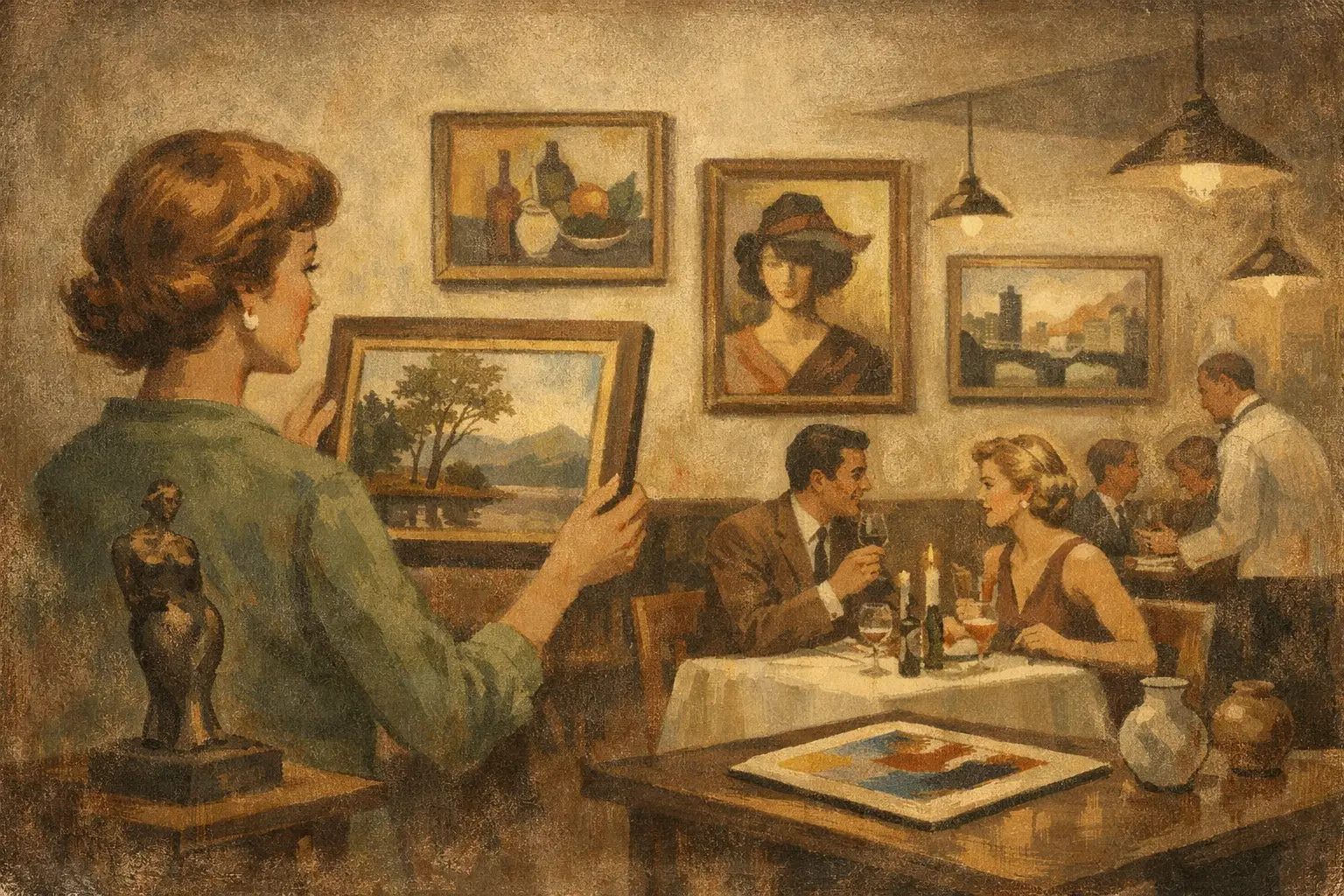
A restaurant is remembered in fragments: the light on the table, the pace of the room, the sound of glass, the feeling of being held by a space that knows what it is. Art shapes that memory more than many owners expect. A thoughtful guide to curating art for restaurants is not really about filling blank walls. It is about giving atmosphere a visual language.
When the artwork is right, guests feel coherence before they can name it. The room gains depth. Service feels more intentional. The brand becomes less of a concept deck and more of a lived experience. When the artwork is wrong, even expensive interiors can feel staged, generic, or strangely hollow.
Why a guide to curating art for restaurants starts with mood
Before style, medium, or budget, there is mood. A restaurant does not need art that merely matches the banquettes or echoes the paint color. It needs art that clarifies emotional tone. Is the room meant to feel intimate and slow, vibrant and social, restrained and architectural, or warm with a sense of imperfection? That answer should guide every curatorial decision.
A fine dining space might benefit from work with stillness, subtle structure, and layered restraint. A lively neighborhood restaurant may need art with rhythm and tension, pieces that hold their own against conversation and movement. A wellness-forward cafe or minimalist Japanese-inspired concept may call for quieter imagery, natural textures, and compositions that leave room for breath.
This is where many projects go off course. Owners often shop for art too late, once furniture and finishes are already fixed. Then the artwork is asked to solve a branding problem that should have been addressed from the beginning. The stronger approach is to treat art as part of the interior concept, not as the final accessory.
Curating for concept, not decoration
Good restaurant art is not generic “hospitality art.” It should feel specific to the identity of the place. That does not mean every piece needs an obvious theme. In fact, literal choices can flatten a room. A seafood restaurant does not need photographs of fish. An Italian restaurant does not need vintage posters of Rome. Guests respond more deeply to a visual world than to a visual cliché.
Instead, ask what the restaurant stands for beyond cuisine. Perhaps it is ritual, sensuality, play, memory, urban energy, raw materiality, or calm. Those qualities can be expressed through abstraction, photography, works on paper, limited-edition prints, or mixed media. The point is alignment.
If the menu is rooted in seasonality and restraint, the art can echo impermanence and natural variation. If the concept is dramatic and nocturnal, bolder contrast and stronger scale may be right. If the space is built around craft and provenance, original works or collector editions can reinforce that sense of integrity.
How to build the art plan room by room
A restaurant is not one visual condition. The entry, bar, main dining room, private room, corridor, and restrooms all carry different energy. Curating well means respecting those shifts.
The entrance should establish tone quickly. This is often the place for a statement piece, but statement does not always mean oversized. It means memorable. The bar usually tolerates more intensity because the space is louder, more kinetic, and socially charged. The main dining room needs balance. Guests stay there longer, so the art should reward repeated looking rather than demand constant attention.
Private dining areas can carry more personality because the viewing experience is slower and more intimate. Transitional spaces, such as hallways, are useful for sequences or smaller grouped works that create rhythm. Even restrooms deserve care. They are often where a single unexpected piece can deepen the sense that the entire environment has been considered.
Scale matters more than most people think
One of the most common mistakes in restaurant curation is timid scale. Small works on large walls disappear under commercial lighting and high ceilings. They feel apologetic. Art in hospitality spaces often needs more presence than it would in a home.
That said, bigger is not automatically better. Oversized work in a compact dining room can create visual pressure. The right scale depends on ceiling height, viewing distance, furniture placement, and how much visual texture already exists in the room. A clean, minimal interior may support a larger work with ease. A richly layered space with patterned upholstery, shelving, and decorative lighting may need fewer pieces and more visual restraint.
Grouping can solve scale issues elegantly. A salon-style arrangement can bring warmth and narrative to a more eclectic concept, while a disciplined grid can suit modern interiors. The decision should feel architectural, not improvised.
Choosing art that can live with food, light, and time
Restaurants are demanding environments. Heat, humidity, grease, sunlight, and constant occupancy all affect what belongs on the wall. A curatorial vision has to meet practical reality.
Original works can bring remarkable presence, especially in entry moments, private rooms, or lower-risk areas. But open kitchens, poorly ventilated zones, and sun-exposed walls may be better suited to museum-quality Giclée prints or framed digital works produced with longevity in mind. These can still feel elevated and distinctive when the imagery is strong and the framing is thoughtful.
Glazing choice matters. So does framing material. Works near banquettes or circulation paths should be secure and easy to maintain. In many projects, the best result comes from mixing formats: original art where intimacy and prestige matter most, editioned works where durability and consistency are more important.
The case for restraint
Not every wall needs art. Some of the most elegant restaurant interiors understand the value of pause. Negative space can heighten the impact of a single piece and preserve a feeling of calm.
This is especially true in concepts influenced by minimalism, Japanese aesthetics, or Wabi-Sabi sensibilities. A room built around natural materials, tactility, and quiet light may be weakened by over-curation. In those spaces, one contemplative work with emotional depth can do more than ten decorative ones.
Restraint is not emptiness. It is confidence. It tells the guest that the room does not need to explain itself too loudly.
Budget, editions, and where to invest
A strong art program does not require placing originals everywhere. It requires knowing where authenticity and emphasis matter most. Signature zones deserve more investment because they shape photography, first impressions, and brand memory. Secondary zones can be resolved with high-quality prints, framed editions, or series-based installations that maintain a coherent point of view.
This is where working with a gallery or curatorial partner can save both money and missteps. Instead of sourcing piece by piece from disconnected vendors, you build a visual language with consistency in quality, framing, and tone. For restaurants opening on a timeline, this matters. Delays and mismatched presentation can weaken an otherwise strong interior.
At Taygeta Gallery, this curatorial approach is central to how contemporary art enters designed spaces – not as filler, but as a considered part of atmosphere.
What guests actually notice
Most guests will not ask who the artist is. Some will. Many more will simply feel the difference between a room with presence and a room without it. Art affects dwell time, perception of quality, and how often people photograph a space. It also shapes staff experience. Rooms with visual coherence tend to feel calmer, more anchored, and more intentional to work in.
There is also a subtler benefit. Art gives a restaurant something beyond trend. Menus change. Lighting gets updated. Seating is reupholstered. But a well-curated visual identity can mature with the brand and become part of its cultural memory.
A practical guide to curating art for restaurants without losing soul
If there is one principle worth holding onto, it is this: curate from the inside out. Start with the emotional truth of the restaurant, then choose artwork that sharpens it. Let scale answer architecture. Let material choices answer real conditions. Let budget guide hierarchy, not compromise taste.
The goal is not to make every guest comment on the walls. The goal is to create a place that feels whole, where art participates quietly or boldly in the experience of being there. A restaurant at its best offers more than a meal. It offers a temporary world. The art should make that world feel unforgettable.
When the room is honest, the artwork does not compete with the food or the design. It completes the silence between them.
Leave a Reply