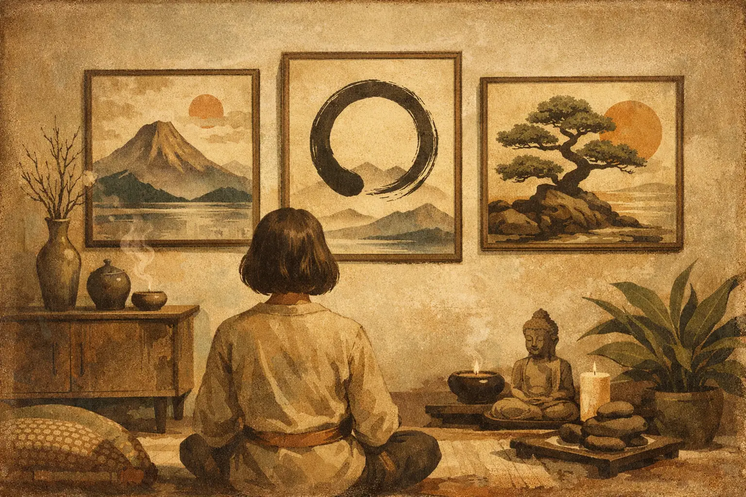
A room can be beautifully furnished and still feel unsettled. The proportions may be right, the palette restrained, the materials expensive – yet the space never quite exhales. Often, what is missing is not another object, but a visual anchor. Zen wall art for home offers that quiet center. It does not compete for attention. It changes the emotional temperature of a room.
The appeal is not simply minimalism. Zen-inspired art carries a different kind of presence. It suggests stillness without emptiness, softness without passivity, and refinement without display. For design-conscious homeowners, that distinction matters. The right work does more than fill a wall. It creates rhythm, invites pause, and gives a space an inner life.
What Zen wall art for home really means
The phrase is often used too loosely. Not every neutral print or bamboo image belongs in this category. True Zen-inspired wall art is shaped by ideas rather than motifs alone. It draws from simplicity, asymmetry, negative space, impermanence, and a respect for the unforced. In visual terms, that may appear as an abstract ink gesture, a spare landscape, a weathered texture, a meditative field of color, or a composition that leaves room for silence.
This is why the most compelling pieces tend to feel calm without becoming decorative wallpaper. They are not merely “peaceful” in a generic sense. They hold tension and stillness together. A brushstroke may be imperfect. A surface may feel raw. A composition may seem almost incomplete. Those qualities are often the point. Zen aesthetics do not chase polish for its own sake. They leave space for breath, age, and subtle emotional depth.
For the home, this makes Zen art especially powerful. Domestic space is where visual fatigue accumulates. We live among screens, hard edges, constant alerts, and too many competing messages. Art rooted in simplicity offers a counterbalance, but only when it is chosen with sensitivity.
Start with atmosphere, not subject matter
A common mistake is shopping by theme alone. People search for stones, lotuses, misty trees, or calligraphy because those images signal tranquility. Sometimes they work. Often they flatten the room into a concept rather than an atmosphere.
A better question is this: how should the space feel when you enter it?
If you want the room to feel grounded, look for works with tonal depth, earthy neutrals, charcoals, mineral blacks, clay whites, or muted browns. If you want a softer, more contemplative mood, pale washes, diffuse forms, and open compositions can bring lightness without becoming sweet. If the room already feels restrained, a more gestural abstract piece may add the right amount of movement while preserving calm.
This is where art selection becomes more curatorial than formulaic. A bedroom may call for quiet verticality and softened edges. A living room can usually hold a stronger visual statement, especially above a sofa or fireplace. An entryway benefits from clarity and immediate presence. The work should meet the architecture and the pace of that part of the home.
Size changes the feeling more than people expect
When choosing Zen wall art for home, scale is not just a technical detail. It shapes how the artwork is experienced physically. A piece that is too small can feel timid, leaving the wall fragmented. One that is too large may lose the very spaciousness you were trying to create.
In minimalist interiors, slightly larger art often works better than a cluster of smaller pieces. One considered work with room around it has a steadier presence. It allows negative space to remain active. That space around the art is part of the composition in the room, not wasted real estate.
There are exceptions. A pair of quiet works can create elegant symmetry in a dining room or hall. A grid may suit a more architectural setting. But if the goal is calm, restraint usually serves better than accumulation. Zen-inspired interiors rarely improve through excess.
Material and print quality matter
This category of art depends heavily on nuance. Subtle tonal transitions, paper-like textures, and gestural marks can disappear when production quality is poor. What looks meditative on a screen can arrive flat, glossy, or overly contrast-heavy in person.
That is why museum-quality printing and thoughtful framing are not secondary concerns. They affect whether the work feels elevated or generic. Fine Giclée printing, for example, preserves tonal softness and detail with much greater fidelity than standard mass-market reproduction. A carefully chosen frame can either support the contemplative quality of the piece or interrupt it.
Matte finishes generally align more naturally with Zen aesthetics than high shine. Natural wood, black, soft oak, or restrained gallery-style framing often complements the work without overpowering it. The goal is cohesion. You want the art to feel integrated into the room’s atmosphere, not packaged as a trend item.
Color should quiet the room, not drain it
There is a misconception that Zen art must be beige, gray, or monochrome. In reality, color can play a strong role, but it should feel intentional and balanced. A mineral blue, smoke green, rust, indigo, or faded terracotta can all belong beautifully in this visual language.
What matters is the emotional register of the color. Saturation should feel considered. Even richer tones tend to work best when tempered – softened by texture, layered with neutrals, or held within spacious compositions. Brightness is not forbidden, but overly sharp or synthetic color often shifts the piece away from contemplation and toward decoration.
It also depends on the room. If your interior already includes warm woods, linen, stone, or plaster-like finishes, art with earthy tonal complexity can deepen that material conversation. In a cooler, more architectural space, black-and-white abstraction or ink-inspired compositions may bring the clean stillness the room needs.
Original-feeling art versus generic Zen decor
This is where discernment becomes essential. The market is full of mass-produced “Zen” imagery that signals serenity but rarely creates it. The difference is usually visible at a glance. Generic decor tends to explain itself too quickly. It leans on clichés, obvious symbols, and predictable styling. It tells you what to feel.
Stronger work leaves room for interpretation. It suggests rather than announces. It may reference Eastern aesthetics without reducing them to surface-level motifs. For buyers who care about cultural sensitivity and visual integrity, that distinction matters.
A curated gallery context can help here. When a piece is presented with artistic intent, thoughtful production, and a clear point of view, it carries more weight in the home. That is part of what makes collecting from a focused source such as Taygeta Gallery feel different from buying wall decor in bulk. The work is not only styled to fit a trend. It is selected to hold meaning over time.
Placement should support quiet, not symmetry for its own sake
Zen-inspired art benefits from breathing room. That does not mean every wall must be sparse, but the placement should feel considered. Hanging a contemplative piece in a visually noisy area can dilute its effect. Whenever possible, let it occupy a zone where the eye can rest.
Above a bed, art should feel gentle enough for close daily viewing. In a dining area, a slightly more immersive piece can create atmosphere and intimacy. In a reading corner, one modest work may be more effective than a statement wall. The relationship between artwork, furniture, and empty space matters as much as the piece itself.
Lighting also changes everything. Soft natural light tends to flatter tonal subtlety, while harsh overhead lighting can flatten texture and mood. If a work has delicate details or a matte surface, place it where light reveals rather than erases those qualities.
Let the piece age with you
The best Zen wall art for home is rarely the most literal or immediately obvious choice. It is the piece you continue noticing months later. Its quietness deepens rather than disappears. It meets you differently depending on the season, the hour, or your state of mind.
That is the real measure of success. Not whether the work looks serene in a product photo, but whether it brings steadiness to the lived experience of a room. Choose art that can hold silence, complexity, and a little imperfection. A home becomes more beautiful when it does not try too hard to prove it.
Leave a Reply