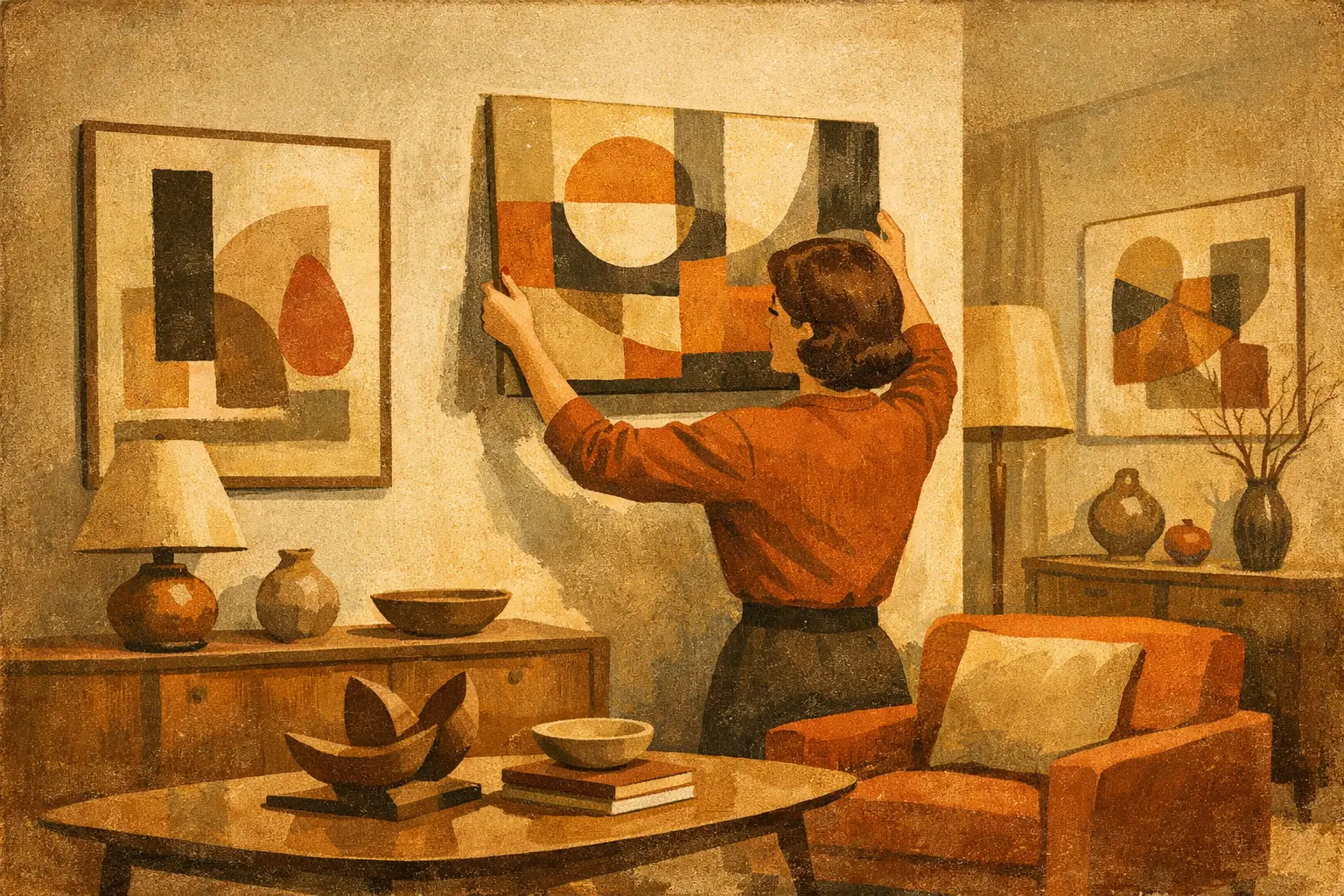
A room can be beautifully furnished and still feel unresolved. Often, what is missing is not another object but a visual presence – something that gathers the atmosphere of the space and gives it inner life. That is why so many people ask how to decorate with abstract art. Abstract work does more than fill a wall. It shapes rhythm, deepens mood, and allows a home to feel personal without becoming literal.
The appeal of abstract art lies partly in its openness. A landscape tells you what you are seeing. A portrait directs attention toward a face. Abstract art leaves more room for intuition. In interiors, that quality matters. It can soften a highly structured room, bring stillness to a busy one, or introduce tension where a space feels too predictable. The goal is not simply to match colors. It is to create a relationship between artwork, architecture, and emotion.
How to decorate with abstract art starts with mood
Before thinking about size or framing, consider the feeling you want the room to hold. This is the most overlooked step, and often the most important. A bedroom may call for quiet tonal work with softened edges and spacious composition. A dining room can carry something more dynamic – a piece with contrast, movement, or a subtle sense of drama. An entryway often benefits from art that establishes a point of view quickly, whether through restraint or boldness.
Abstract art is especially powerful because it can carry mood without relying on narrative. A pale field of layered neutrals can feel contemplative and expansive. Dense gestural marks can bring urgency and warmth. Black-and-white compositions can feel architectural, disciplined, and modern, though in some spaces they may also read as severe. It depends on the room, the light, and what is already present.
If your interior leans minimalist, the instinct is often to choose something equally quiet. That can work beautifully, especially when the aim is calm. But sometimes a restrained room needs friction, not more restraint. One vivid abstract piece can keep minimalism from feeling overly controlled. On the other hand, a richly decorated room may need a work with breathing room – not because it is timid, but because it offers balance.
Let the artwork lead, not just coordinate
Many people decorate by treating art as the finishing touch. In practice, the strongest rooms are often built around it. This does not mean everything must match the artwork. It means the piece should influence the room’s visual logic.
If an abstract painting has sweeping horizontal movement, you might echo that with a low sofa, a long console, or open negative space nearby. If the composition is vertical and meditative, it may sit best where the eye can approach it slowly, such as beside a window or at the end of a hallway. Repetition can be subtle. A curve in the artwork may resonate with the rounded edge of a chair. A mineral palette may relate to linen, plaster, oak, or stone.
This is where abstract art feels more refined than decorative wall filler. It participates in the room. It changes how furniture, texture, and proportion are perceived. When chosen well, it can make everything around it appear more intentional.
Scale matters more than most people think
The most common mistake is choosing art that is too small. A generous wall with a tiny piece centered on it rarely feels elegant unless that sense of isolation is deliberate. More often, it makes the artwork seem hesitant.
Over a sofa, bed, or sideboard, abstract art should usually occupy enough width to feel connected to the furniture below. Not exact symmetry, but visual confidence. In open-plan spaces, larger works often perform better because they can hold their own against wider sightlines and higher ceilings. In a small apartment, however, one oversized piece can be surprisingly effective. Rather than cluttering the room with many smaller works, a single large-scale abstract can create spaciousness.
There are exceptions. Small works can be deeply affecting when placed intimately – above a writing desk, in a quiet reading corner, or layered on a shelf where the viewing distance is close. But when working with small pieces, placement has to feel deliberate. Intimacy is different from under-scaling.
Color should converse with the room
When people wonder how to decorate with abstract art, they often begin and end with palette. Color does matter, but matching is not the same as harmony. A room in warm neutrals does not require beige art. A charcoal-toned interior does not need grayscale on the wall.
Think in terms of relationship. Abstract art can repeat one existing color in the room, introduce a missing note, or create contrast that wakes up the palette. If your interior is quiet – sand, ivory, clay, soft wood – a piece with muted blue, rust, or ink black can add depth without disturbing the overall calm. If the room already contains stronger color, you may want art that edits rather than amplifies.
Tone is as important as hue. Dusty rose behaves differently from bright pink. A washed green feels different from emerald. Abstract work often contains layered, shifting color, which is one reason it integrates so well into nuanced interiors. It allows a room to feel composed rather than overly coordinated.
Placement changes the experience of the art
Height, spacing, and surrounding emptiness all influence how a piece is received. Art hung too high loses intimacy. Art crowded by shelving, lamps, or competing decor loses clarity. Abstract work, especially pieces with subtle texture or tonal complexity, needs a little quiet around it.
Above furniture, keep the relationship close enough to feel connected. In a hallway or stair landing, consider how the piece will be seen in motion. Some abstract compositions reveal themselves slowly and reward passing glances. Others are more immediate and graphic, which can suit transitional spaces.
Light also matters. Natural light can animate texture and tonal shifts throughout the day, but direct sun may not always be ideal depending on the medium. In evening conditions, a dim corner can flatten even a compelling piece. If the artwork is important to the room, treat lighting as part of the display, not an afterthought.
Framing, materials, and finish shape the mood
A frame is not merely a boundary. It affects how contemporary, soft, formal, or grounded a work appears. Thin black frames can sharpen a composition and give it architectural clarity. Natural wood adds warmth and tactility. A float frame can make the work feel more gallery-like and intentional.
Unframed canvas can be right in relaxed, textural interiors, though it depends on the piece. Some abstract works gain presence through crisp framing. Others lose their atmospheric quality if contained too tightly. The finish of the print or surface matters as well. Museum-quality production has a different visual depth from mass-market reproduction, and that difference is visible in the room. It affects color fidelity, texture, and overall presence.
For design-conscious buyers, this is not a small detail. If the goal is to create a home that feels collected rather than assembled, material quality is part of the composition.
A single work or a grouping?
There is no fixed rule here. One large abstract piece can create calm, authority, and visual stillness. A grouping can introduce rhythm and layered personality. The right choice depends on architecture and intention.
If the room is already strong in shape and material, one work may be enough. It lets the eye rest. In more neutral or understated interiors, a salon-style grouping of related abstract works can bring complexity. The key is cohesion. Pieces should relate through palette, spacing, scale, or emotional tone, even if they differ in format.
Diptychs and triptychs can be especially effective when you want scale without heaviness. They give a wall presence while preserving openness between panels. That sense of pause can feel very aligned with contemporary interiors shaped by Zen and Wabi-Sabi ideas, where emptiness is not absence but part of the composition.
How to decorate with abstract art in a way that feels personal
The most memorable rooms are not designed by formula. They reveal preference, patience, and a point of view. Abstract art offers unusual freedom here because it is less about subject matter and more about resonance. You do not need to explain why a certain work stays with you. Often, that is the right reason to live with it.
Still, instinct benefits from a little structure. Ask yourself what kind of energy you want to encounter every day. Do you want stillness, movement, gravity, warmth, ambiguity? Do you want the piece to disappear gently into the room or hold your attention from the doorway? These questions lead to better choices than trend-based shopping ever will.
For some homes, the answer is a restrained composition in mineral neutrals, softly framed and placed where morning light can reach it. For others, it is a bold field of color that interrupts an otherwise quiet room. Neither is more sophisticated. What matters is coherence – between the work, the space, and the person living there.
At Taygeta Gallery, that curatorial approach matters because abstract art is not treated as generic decor, but as a meaningful visual language for modern interiors. And that is the helpful thing to remember as you choose: the right piece does not just decorate the room. It teaches the room how to feel.
Leave a Reply