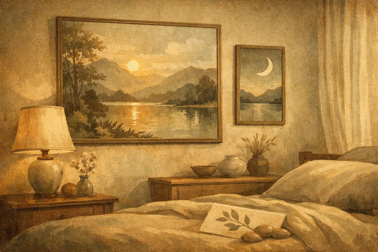
A bedroom can be beautifully furnished and still feel unsettled. Often, the missing element is not another textile or lamp, but the image that holds the room emotionally. The best calming art for bedrooms does more than match a palette. It slows the eye, softens mental noise, and gives the space a deeper sense of rest.
This is why bedroom art deserves a different standard than art chosen for a hallway, living room, or office. In a room designed for restoration, visual energy matters. Strong work can still be quiet. Memorable work can still feel gentle. The goal is not bland decoration, but a form of presence that supports stillness.
What makes art feel calming in a bedroom
Calm is not a single style. It is a relationship between composition, color, scale, and emotional tone. Some pieces create calm through emptiness and restraint. Others do it through rhythm, softness, or a sense of distance. A misted landscape, a minimal abstract, or a subtle botanical can each feel serene for different reasons.
The most reliable quality is visual breathing room. Art that leaves space within the composition tends to feel more restful than work packed with contrast and detail. Negative space, softened edges, tonal layering, and balanced asymmetry can all help the mind settle rather than stay alert.
Color also shapes the nervous system’s response. Muted earth tones, stone, sand, warm ivory, faded blue, sage, charcoal, and dusty blush often work well because they feel grounded without becoming heavy. Bright primary colors, hard black-and-white contrast, and highly saturated neon tones can be striking, but they usually bring more stimulation than most bedrooms need.
That said, calm does not always mean pale. Deep ink washes, midnight blues, and mineral greens can feel profoundly restful when the composition remains spacious and measured. The question is less about light versus dark, and more about whether the work introduces tension or release.
The best calming art for bedrooms by style
The most successful bedroom art usually belongs to one of a few visual families, though the edges often overlap.
Minimal abstract art
Minimal abstracts are often among the best calming art for bedrooms because they create atmosphere without over-explaining themselves. A restrained composition in layered neutrals or softened organic forms can give a room depth while preserving silence. This is especially effective in modern interiors, where clean lines benefit from one piece that adds emotional texture.
Look for movement that feels slow rather than sharp. Gestural works can still be calming if the mark-making is spacious and fluid. Pieces inspired by Zen aesthetics or Wabi-Sabi sensibilities often excel here because they honor imperfection, emptiness, and balance.
Quiet landscapes and horizon-based work
There is a reason distant horizons feel restorative. They imply openness, perspective, and exhale. Seascapes, desert scenes, fog-bound mountains, and abstracted landscapes with a strong horizontal line can all bring a bedroom into a more contemplative register.
Avoid scenes that are too dramatic. A stormy sky may be beautiful, but beauty alone is not the test. In a bedroom, gentler weather usually works better. Think still water, softened terrain, or a field reduced to color and light.
Botanical and nature-inspired compositions
Nature imagery can be deeply calming when handled with subtlety. The best examples feel observed rather than decorative. A single branch, reed, leaf study, or softened floral form often has more longevity than a busy bouquet or overly styled print.
For bedrooms with natural wood, linen, plaster, or stone elements, botanical art can create a refined continuity. It echoes the material language of the room without becoming too literal.
Monochrome ink, wash, and line work
Ink-based art has a meditative quality that suits private spaces beautifully. A spare brushstroke, a field of diluted pigment, or a minimal line composition can feel disciplined yet tender. These works often carry a sense of stillness because they rely on essence rather than excess.
This approach is particularly compelling in interiors that lean quiet and architectural. It offers presence without visual clutter.
Color choices that support rest
If you are choosing bedroom art from a place of uncertainty, start with temperature and intensity. Warm neutrals tend to make a room feel held. Cool neutrals often create clarity and air. Neither is better. It depends on the emotional atmosphere you want.
For a cocooning bedroom, consider art with clay, taupe, umber, soft rust, mushroom, or muted terracotta. These tones work well in spaces with creamy walls, walnut wood, and tactile fabrics. For a lighter, more meditative effect, art in foggy blue, sage, faded gray, and off-white can make the room feel quieter and more expansive.
One useful principle is to avoid introducing a new loud color through the artwork unless that color already belongs to the room in a meaningful way. Bedroom art should feel integrated, not like an interruption.
Scale matters more than most people think
Even beautiful art can feel wrong if the scale is off. In a bedroom, oversized work can be calming when the image itself is quiet. A large, minimal piece above the bed often feels more restful than a cluster of smaller frames competing for attention.
Small art can work well too, especially in intimate bedrooms or beside a reading chair, but it usually needs space around it to breathe. If several small pieces are grouped too tightly, the arrangement can start to feel busy.
Above the bed, the artwork should generally feel anchored to the width of the headboard or bed frame. It should not appear tiny and apologetic, nor should it dominate the room like a billboard. Proportion creates peace because it removes subtle visual friction.
Framing and materials shape the mood
The image is only part of the experience. Framing can either preserve calm or disrupt it. Thin natural wood, soft black, muted oak, walnut, and restrained gallery-style frames usually suit bedrooms well. Heavy ornament often pulls the work into a more formal or historical mood, which may or may not fit the room.
The finish matters too. Museum-quality Giclée prints with nuanced tonal range can retain the softness that calming imagery requires. Poor printing tends to flatten subtle color transitions, which is where much of the serenity lives. This is one reason design-conscious buyers often prefer curated galleries over generic print marketplaces. The difference is not only aesthetic. It is atmospheric.
Placement is part of the feeling
Over the bed is the obvious choice, but not the only one. A calm piece opposite the bed can be just as powerful, especially if it is the first thing seen in the morning. Art near a dressing area or reading corner can create a quieter rhythm across the room.
If the bedroom already has strong architectural elements, such as a paneled wall, dramatic drapery, or a sculptural headboard, the artwork may need to be even simpler. In a more minimal room, the art can carry a little more emotional weight. It depends on where the eye needs rest and where it can hold attention.
What to avoid when choosing calming bedroom art
The most common mistake is confusing neutral with calming. A beige artwork can still feel lifeless or tense if the composition is unresolved. Another mistake is choosing art only to match bedding. Harmony matters, but art should not disappear into the room entirely. The best pieces deepen the mood rather than merely repeat it.
Text-heavy prints, overtly motivational phrases, and highly trend-driven imagery rarely age well in bedrooms. The same goes for art that feels too performative or visually loud. A bedroom is one of the few spaces in a home where understatement can be genuinely luxurious.
For couples or shared spaces, there is another layer to consider. Calming art should not feel so personal to one person’s taste that the other feels excluded. In these cases, abstract work, landscapes, and nature-based compositions often create common ground without becoming generic.
Choosing art that still feels personal
The most compelling bedroom art is serene, but not anonymous. A room meant for rest should also feel inhabited by your sensibility. That may mean a minimalist composition with an unusual tonal tension, a landscape that recalls a place of emotional significance, or a botanical work that carries a certain delicacy you respond to instinctively.
This is where curatorial selection matters. A refined gallery perspective can help you find work that feels quiet yet distinctive, rather than mass-produced calm. At Taygeta Gallery, this kind of selection often lives in pieces shaped by simplicity, impermanence, and contemplative form – art that brings stillness without losing character.
When you choose bedroom art, ask a simple question: does this piece ask more of me, or does it give something back? The right work will not clamor for attention every time you enter the room. It will meet you softly, and over time, that may be the most lasting kind of beauty.
Leave a Reply