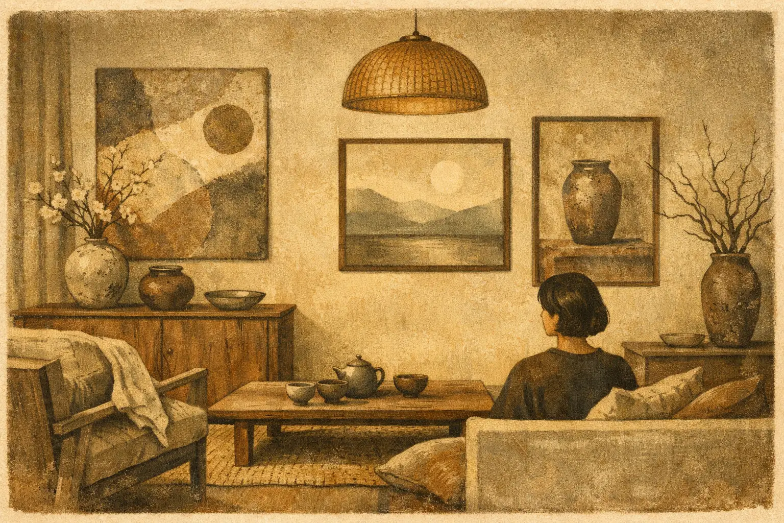
A room can be beautifully finished and still feel as though nothing has happened in it. The answer is rarely more decoration. Learning how to style wabi sabi artwork begins with allowing a work to introduce stillness, texture, and a sense of time into the space. It asks you to notice what is already present: the changing light on plaster, the grain of an old table, the quiet interval between objects.
Wabi-sabi is often reduced to a look of pale ceramics, linen, and weathered wood. Its deeper value lies elsewhere. Rooted in a Japanese aesthetic appreciation of impermanence, incompleteness, and modest beauty, it invites a more attentive relationship with the things we choose to live with. Artwork is especially powerful here because it can set the emotional temperature of a room without filling it with noise.
Begin With the Feeling, Not the Empty Wall
Before choosing a frame or measuring a wall, consider the atmosphere you want to preserve. A wabi-sabi interior is not necessarily sparse, rustic, or beige. It may be urban and architectural, warm and collected, even quietly dramatic. What matters is restraint: a feeling that every element has room to breathe.
Look for artwork that carries evidence of process. Abstract fields with softened edges, gestural marks, mineral-like tonal shifts, irregular forms, and compositions that leave space unresolved all work naturally in this setting. A piece need not depict a traditional Japanese subject to belong in a wabi-sabi-inspired room. In fact, literal symbols can feel less considered than contemporary art that shares the philosophy through materiality, silence, and suggestion.
Choose the work for its presence rather than its ability to match a pillow or paint swatch. Color harmony matters, but a slightly unexpected charcoal mark, rust tone, or off-white expanse can give a restrained room its necessary tension.
Give the Artwork Enough Silence
Negative space is not an absence of design. It is part of the composition of a home. Wabi-sabi artwork is most compelling when it is not made to compete with crowded shelving, multiple small accessories, or an overworked gallery wall.
A single substantial work above a low sofa, bench, or console often creates more resonance than several smaller pieces. Leave a visible margin around the art, especially on walls with tactile surfaces such as limewash, plaster, raw wood, or softly matte paint. The slight contrast between an expressive image and an imperfect wall can make both feel more alive.
This does not mean every piece must stand alone. A pair of related works can be beautiful when the conversation between them is quiet: two different studies in earth tones, for instance, or one image with an open composition beside another with denser marks. Keep the spacing generous and the scale intentional. If the arrangement begins to read as decoration before it reads as art, remove one element.
How to Style Wabi Sabi Artwork by Scale
Scale changes the emotional force of a work. Large art can make a minimal room feel grounded and immersive, while small art encourages intimacy and close looking. Neither is inherently more wabi-sabi. The right choice depends on how the room is used.
In a living room, a large horizontal print above a sofa can echo the calm weight of the furniture below. Aim for a work, or grouping of works, that is roughly two-thirds the width of the sofa. It should feel connected to the seating rather than stranded above it. Hang the center at a comfortable viewing height, generally close to 57 to 60 inches from the floor, then adjust for the architecture and furniture.
In a bedroom, consider a quieter scale. A vertical piece beside the bed or a smaller work above a nightstand can create a private, contemplative moment without making the room feel staged. Above a headboard, avoid a frame that is too narrow or overly high. Art should settle the wall, not hover over it.
Entryways benefit from a work with immediate atmosphere. This is a place where a textured abstract, a muted landscape, or a contemplative figure can establish the pace of the home in a single glance. In a narrow hall, choose a vertical format and let the wall remain otherwise unadorned.
Let Materials Create a Conversation
Wabi-sabi styling is less about buying a prescribed set of objects than creating a sensitive relationship between surfaces. Place artwork near materials with character: a hand-thrown vessel, a worn leather chair, an unglazed ceramic lamp, a stone table, or linen upholstery. These pairings make visual texture legible.
The key is variation without clutter. If an artwork has a highly active, layered surface, support it with simpler furniture and fewer nearby objects. If the work is spare and tonal, it can sit beside a more tactile ceramic or aged wood surface. The contrast should feel like a conversation, not a theme.
Avoid artificially distressed styling simply to imitate age. Genuine patina carries use, care, and time. A new museum-quality Giclée print can belong beautifully beside older materials because wabi-sabi does not demand that every object look old. It asks that the room feel honest. A finely produced contemporary work, chosen with feeling and framed with restraint, can bring clarity to an inherited table or imperfect wall.
Choose Frames That Support, Not Perform
Framing should extend the work rather than announce itself first. Natural oak, ash, walnut, black-stained wood, and slim matte metal frames are all useful choices, depending on the image and the room. Wood adds warmth and visual grain; dark framing gives a pale or atmospheric work definition; a simple metal profile can suit more architectural interiors.
For many abstract pieces, a generous white or warm-white mat creates a valuable pause between image and frame. It can make a smaller work feel considered rather than lost. Yet a full-bleed print without a mat may better suit a large, immersive composition. There is no universal rule. Let the amount of visual activity in the artwork guide the decision.
Be cautious with ornate frames, high-gloss finishes, and overly matching sets. They can make a room feel formal in a way that conflicts with wabi-sabi’s openness to irregularity. If you are combining framed art, let one shared detail unite the arrangement – perhaps warm wood, a similar mat tone, or comparable frame depth – rather than matching every element exactly.
Use Light as Part of the Composition
Light reveals what wabi-sabi art is often trying to hold: tonal nuance, shadow, softness, and the shifting life of a surface. Observe the wall at different times of day before committing to placement. Morning light may flatter a warm, pale work, while a darker abstract can gain depth in the low, indirect light of evening.
Avoid hanging art where strong direct sun will wash out the image or create persistent glare on glazing. If the location is otherwise ideal, consider non-glare acrylic or glass and use window treatments that soften the harshest hours. In spaces with limited daylight, a warm, directional picture light or adjustable wall sconce can reveal the work without turning it into a showroom display.
The goal is not perfect illumination. Slight shifts in light are part of the experience. A work that changes quietly from afternoon to night has a presence that a uniformly bright wall cannot replicate.
Build a Collected Room, Slowly
Wabi-sabi resists the pressure to complete a room in one purchase. Leave room for an interior to evolve. Start with the artwork that moves you most, then let its color, energy, and scale influence what comes next. Perhaps it asks for a low clay-toned vessel months later, or perhaps it makes you realize the wall needs nothing else.
For collectors and design professionals, this approach is also practical. Art can establish a visual language across a residence, boutique hotel, or hospitality project without making every space identical. Repeat an emotional quality – quiet abstraction, organic line, softened neutrals – while varying format and scale from room to room. Consistency comes from sensibility, not duplication.
A carefully chosen work from Taygeta Gallery can become that first point of reference: not an accessory to finish a room, but an image that gives the room a reason to slow down.
The most convincing wabi-sabi interiors do not look arranged for approval. They feel inhabited, edited, and open to change. Hang the work you want to keep looking at. Then allow its silence to do some of the designing for you.
Leave a Reply