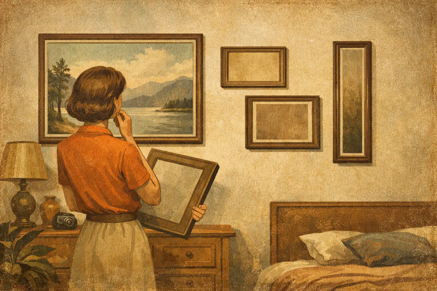
A beautifully made print can still feel strangely absent if it is too small for the wall around it. Conversely, a large work in a narrow passage can make a room feel compressed rather than composed. If you are asking, “what size wall art should I buy,” the answer begins less with a standard print size and more with the relationship between art, architecture, furniture, and empty space.
The right scale gives artwork a sense of belonging. It allows a quiet abstract to hold its own above a sofa, a contemplative landscape to create a pause in a bedroom, or a single collector edition to define the mood of an entryway. Size is not merely practical. It shapes how a work is encountered.
What Size Wall Art Should I Buy? Start With the Wall
Measure the usable wall area, not simply the full expanse of wall. Doors, windows, tall plants, shelving, radiators, and nearby furniture all reduce the visual field available to an artwork. A piece should feel intentionally placed within that field, with enough surrounding space to breathe.
For an empty wall, art that occupies roughly 60 to 75 percent of the available width often feels balanced. On a wall that is 100 inches wide, that suggests a total artwork width of about 60 to 75 inches. This can be one substantial work or a thoughtfully arranged group.
Height matters just as much. A small horizontal print may look elegant on a wide but low wall, while a tall vertical piece can lend lift to a room with modest ceilings. Before choosing dimensions, use painter’s tape or kraft paper to outline the proposed size directly on the wall. Live with the shape for a day or two. Notice it in morning light, evening shadow, and from the doorway. The wall will usually tell you whether the work needs more presence.
Use Furniture as Your Scale Reference
When art hangs above furniture, the furniture sets the visual boundary. The artwork or arrangement should generally span about two-thirds to three-quarters of the furniture’s width. Above an 84-inch sofa, a total art width of approximately 56 to 63 inches is a reliable starting point.
This proportion prevents a familiar imbalance: the small picture floating high above a large sofa. A work does not need to match the sofa’s width, but it should speak to it. The goal is a composed relationship, not a timid afterthought.
Hang the bottom edge of the frame around 6 to 10 inches above the furniture. Above a console, sideboard, or headboard, this closeness creates a visual conversation between the two elements. If the art is placed too high, the room can feel fragmented, as though the wall and the furnishings belong to different spaces.
A few common settings call for different instincts:
- Above a sofa, choose one large horizontal work, a diptych, or a gallery grouping that reads as one unified composition.
- Above a bed, select a piece around two-thirds of the headboard width. Softer palettes, atmospheric abstraction, and restrained forms often support the room’s restorative character.
- Above a dining table or sideboard, a wide work can echo the furniture’s horizontal line and create a grounded focal point.
- In an entryway, one vertical artwork often works better than several small pieces, especially when the wall is narrow and the first impression needs clarity.
Let Viewing Distance Guide the Size
Art needs room to be seen. In a living room, where people view a work from across the room, larger dimensions allow color, gesture, texture, and negative space to register from a distance. A small piece may be exquisite up close, but it can disappear when viewed from 10 or 12 feet away.
As a useful rule, a work should have enough scale to remain legible from its primary viewing point. For a wall seen from 8 feet away, a 24-by-36-inch or 30-by-40-inch piece may feel substantial. In a larger open-plan room, 40-by-60 inches or more can be appropriate, particularly when the wall is free of competing objects.
This does not mean every room needs oversized art. Intimacy has its own power. A small original, framed with a generous mat and placed where viewers naturally come close, can become a private moment of attention. Hallways, reading corners, and spaces beside a desk often reward smaller work because they invite a slower encounter.
Choose One Large Work or a Grouping
One large artwork creates stillness. It can simplify a room, especially when the surrounding interior already contains texture, books, ceramics, patterned textiles, or architectural detail. A single expansive print is often well suited to minimal interiors because it gives the eye one clear place to rest.
A gallery wall creates a different kind of energy. It can be personal, layered, and richly collected, but it needs a governing idea. The works might share a tonal palette, frame finish, subject, period, or philosophical mood. Without a visual thread, separate pieces can become decorative noise.
Treat a grouping as one overall shape when deciding on size. The spaces between frames are part of the composition. Keep gaps consistent, usually around 2 to 3 inches for a more intimate arrangement, and measure the outside edges of the entire group rather than each frame alone.
A diptych or triptych offers a thoughtful middle path. It has the scale of a larger installation while preserving rhythm and pause between panels. For wide walls, this interval can feel especially harmonious, allowing the composition to unfold rather than simply fill space.
Frame Size Is Part of the Decision
When choosing wall art dimensions, distinguish between image size and finished framed size. A 24-by-36-inch print may become several inches larger once a mat and frame are added. That extra border can materially change how the piece sits above furniture or within a wall niche.
A broad mat brings quiet attention to a smaller work, making it feel more intentional and collected. It is especially effective for drawing-based, minimalist, or contemplative imagery where negative space is part of the experience. A thin frame with little or no mat can feel more contemporary and direct, allowing a bold abstract or digital composition to extend its visual energy almost to the edge.
Frame finish also changes perceived weight. Pale oak, natural ash, and light frames tend to feel airy against soft walls. Black or dark wood creates definition and can make a modestly sized work appear more architectural. Neither is inherently better. The question is whether the room needs softness, contrast, or a clearer line.
Consider the Room’s Emotional Pace
Scale affects atmosphere. Large art is not only dramatic. In the right setting, it can be calming because it reduces visual fragmentation. One generous composition above a sofa may offer more serenity than six smaller objects competing for attention.
At the same time, leaving some walls open is a form of restraint. Wabi-Sabi reminds us that absence has value. A room does not need art on every surface to feel complete. A single well-proportioned work, surrounded by quiet wall space, can feel more meaningful than a crowded display.
If you are furnishing a rental, a compact apartment, or a room that changes often, medium-scale framed prints offer flexibility. Sizes such as 18-by-24 inches, 24-by-36 inches, and 30-by-40 inches are substantial enough to create presence yet adaptable enough to move between rooms. For a permanent focal wall or a hospitality project, a larger statement piece may be the more economical visual decision because it resolves the wall at once.
A Final Check Before You Buy
Step back and ask what the artwork is meant to do. Is it there to soften a bedroom, anchor a seating area, introduce color, create a moment of contemplation, or mark the threshold into your home? The required size becomes clearer when the work has a role.
Trust proportion, but do not let rules erase instinct. A work that gives you a feeling of spaciousness, recognition, or calm may deserve more room than a formula suggests. Give it the scale to be seen, and enough silence around it to be felt.
Leave a Reply