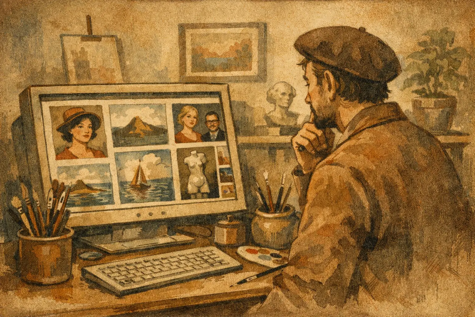
A strong online exhibition artist showcase example does more than place a row of artworks on a screen. It creates the feeling of entering a considered room: a place with its own pace, atmosphere, and point of view. For collectors and design-minded buyers, that difference matters. They are not only asking whether a piece will suit a wall. They are asking what kind of attention, memory, or stillness it may bring into a space.
An online exhibition gives an artist’s work a context that a standard product grid cannot. It allows images, words, scale, and sequence to work together. Done well, it offers the reassurance of a gallery visit while preserving the clarity needed to purchase art with confidence.
What an Online Exhibition Should Make Possible
A digital exhibition is not a substitute for a physical room. It cannot reproduce the sound of footsteps, the changing light across a canvas, or the unexpected encounter around a corner. Its strength lies elsewhere: it can give a visitor time. Time to return to an image, read an artist’s thought, compare formats, and imagine a work within the architecture of daily life.
For an artist, the exhibition should make the work feel coherent without making it repetitive. For a buyer, it should explain enough to make the art legible while leaving space for personal interpretation. The best presentations hold both needs in balance. They frame the work with curatorial intelligence, then let the work breathe.
This approach is especially valuable for abstract art, digital editions, and works informed by Wabi-Sabi. A quiet composition may initially appear simple, yet reveal a complex tension between erosion and control, emptiness and gesture. Without context, a visitor may scroll past too quickly. With the right exhibition structure, they are invited to look again.
An Online Exhibition Artist Showcase Example in Practice
Imagine an exhibition titled Rooms for Stillness, presenting twelve works by a contemporary artist whose practice moves between ink-like digital marks, weathered color fields, and restrained geometric forms. The exhibition is designed for collectors who live with contemporary interiors and want art that changes the emotional temperature of a room rather than merely filling it.
The opening image is not a crowded installation view. It is a single work, shown with generous surrounding space. Beneath it, a brief curatorial introduction sets the premise: these images consider the home as a place of pause, where imperfect surfaces and shifting shadows become part of one’s inner landscape.
That opening paragraph should be concise. It is not an academic statement trying to account for every influence. It gives visitors a way into the exhibition, much like a threshold. A useful example might read:
> In Rooms for Stillness, fractured horizons and softened forms become studies in attention. Each work holds a small interval between movement and rest, asking how a room can contain not only objects, but a state of mind.
From there, the show moves in a deliberate sequence. The first group of works is pale and spacious, establishing a sense of air. The middle section introduces denser, darker compositions, where charcoal, rust, and deep indigo create gravity. The final works return to light, though not to resolution. Their surfaces retain traces of what came before.
This sequence gives the visitor an emotional arc. It also prevents the exhibition from feeling like an inventory page. A collector may still see price, size, edition information, and availability near each artwork, but the commercial details should support the encounter rather than interrupt it.
What Each Artwork Page Includes
Within this example, every work receives its own focused presentation. The artist’s title, date, medium, dimensions, edition status, and price are visible without becoming visually dominant. A close crop reveals texture or detail, while an in-room image offers a realistic sense of scale.
The accompanying text does not need to explain what viewers should feel. Instead, it can name the formal and material qualities that give the work its presence. For a piece called Quiet Fault Line, the description might note the soft gray field, the interrupted line near its center, and the subtle pull between balance and instability. This gives a buyer language for what they are seeing without closing down its mystery.
For prints and collector editions, production information deserves equal care. Museum-quality Giclée printing, paper type, framing options, and edition limits are practical details, but they also communicate respect for the work. A buyer choosing art online wants poetry, certainly, but also precision. They need to know what will arrive, how it will be made, and how it may live in their home or project.
Curatorial Writing That Creates Confidence
The most effective exhibition writing avoids two extremes. It should not sound like a sales pitch dressed in art language, and it should not hide behind theory so dense that the work becomes distant. The goal is clarity with resonance.
Start by identifying the exhibition’s central question. Perhaps the artist is considering impermanence, urban solitude, repair, or the visual language of silence. Then connect that question to what is physically present in the works: repeated forms, faded pigments, erased gestures, sharp edges, or open fields of color.
A short artist statement can deepen this frame. It works best when it speaks from the practice rather than announcing grand conclusions. For example: “I am interested in the marks that remain after certainty has passed. The images begin as structures, then gradually allow themselves to become less controlled.” Such language invites the viewer toward process, vulnerability, and intention.
Curatorial text should also recognize that art will enter real environments. A work may bring calm to a bedroom, concentration to a study, or a moment of visual relief to a hospitality setting. Yet it is wiser to suggest these possibilities than to promise a universal outcome. A dramatic work can be ideal in a minimal interior, while a softer piece may disappear against an already-muted palette. Context changes the conversation.
Designing the Exhibition for How People Actually Browse
Online visitors rarely move through an exhibition in one perfect, linear path. Some begin with the artist story. Others go straight to available work, then return for meaning after a particular image catches them. The page should welcome both habits.
A clear exhibition page usually benefits from four distinct elements: an opening curatorial text, a visible artwork sequence, an artist section, and straightforward collecting information. When these are woven into the page with restraint, the visitor can move between emotion and decision without feeling pushed.
Image quality is nonnegotiable. Art presented online must be photographed or rendered with care, accurate color, and sufficient detail. Still, accuracy should not turn into visual noise. Too many room mockups, zoom tools, badges, and competing buttons can make a considered exhibition feel like a crowded marketplace. One excellent installation view is often more persuasive than five generic ones.
For interior designers and project specifiers, downloadable specifications would be useful in practice, but the exhibition itself should retain its visual calm. The same is true of availability. Clear labels such as “original available,” “edition of 25,” or “sold” preserve trust. A sold work does not weaken an exhibition. It can show that the presentation has a life beyond the moment of browsing.
Why the Example Works for Collectors
Rooms for Stillness succeeds because it honors the buyer’s intelligence. It does not assume that a visitor needs to be taught how to feel, nor does it assume that beauty alone will answer practical questions about size, medium, or collecting.
The exhibition creates a bridge between an artist’s interior world and the buyer’s own. A collector may first be drawn to a blue-gray composition because it recalls rain on concrete. Later, they may recognize that the work also creates the composure their living room has been missing. The purchase becomes more considered because the exhibition has given them both feeling and framework.
This is where an online exhibition can exceed a conventional sales page. It turns selection into a relationship. Rather than encountering isolated products, visitors meet a body of work with its own rhythm, references, and emotional weather.
For galleries such as Taygeta Gallery, that relationship is part of the offering. A carefully presented exhibition supports the work’s aesthetic integrity while helping collectors choose with confidence, whether they are acquiring a single framed edition or sourcing a group of works for a larger interior.
A meaningful exhibition does not need spectacle to remain memorable. It needs a clear curatorial idea, images with room around them, and language that trusts the visitor to look slowly. When those elements align, the screen becomes less of a barrier and more of a quiet place to encounter art.
Leave a Reply