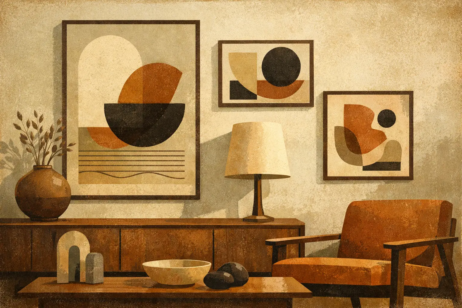
A bare wall can make a carefully considered room feel unfinished. Not because it needs more decoration, but because it needs a point of feeling: an image that gathers the room’s light, materials, and silences into one visual presence. Contemporary abstract prints do this especially well. They offer color without clutter, depth without a prescribed story, and a personal sense of culture that does not depend on obvious motifs.
For collectors and design-minded homeowners, the appeal is not simply that abstraction is versatile. It is that a strong abstract work leaves room for a life to unfold around it. Its meaning may shift with the hour, the season, or the person looking at it. A pale field can feel meditative in morning light and almost architectural at night. A restless gesture can bring energy to an otherwise restrained interior.
Why Contemporary Abstract Prints Belong in Modern Interiors
Contemporary abstraction is often mistaken for a neutral choice because it does not depict a recognizable place, face, or object. In fact, it can be a deeply specific one. Line, texture, rhythm, negative space, and color each carry an emotional temperature. A print with charcoal marks and worn mineral tones may suggest quiet concentration. Saturated blocks of red, cobalt, or citrus can create a deliberate interruption in a room built around soft neutrals.
This openness makes abstract art particularly suited to interiors that value atmosphere over display. In a minimal living room, it can prevent simplicity from becoming sterile. In an eclectic home, it can provide a visual pause between patterned textiles, books, ceramics, and collected objects. In hospitality settings, abstraction creates a memorable environment without imposing a single cultural reference or narrative on every guest.
The best work does not merely match a sofa or repeat the color of a rug. It changes the relationship between the existing elements. A print may pull the warm undertones from oak flooring, soften a concrete wall, or give a sculptural lamp a more intentional context. This is why art is often the final element in a room, yet rarely an afterthought.
Begin With the Mood, Not the Empty Wall
Choosing a print by dimensions alone is a common mistake. Scale matters, but the more useful first question is: what should this space allow you to feel?
A bedroom may call for spacious compositions, softened edges, and a palette that settles the eye. Consider washed ink-like forms, muted earth colors, or work that honors imperfection through layered surfaces and asymmetry. These qualities have a natural affinity with Wabi-Sabi: a sensibility that finds beauty in restraint, weathering, and the incomplete.
A dining area can carry more visual tension. Here, a print with bolder contrast or a more active composition can stimulate conversation without competing with the table setting. In a home office, consider whether the work should steady your attention or disrupt habitual thinking. Both are valid, but they create very different working environments.
There is no universal rule that abstract art must be calming. A room can benefit from friction. The essential point is coherence between the work’s emotional register and the life lived in front of it. If the image makes you pause, return, or notice something new, it is already doing more than filling a wall.
How to Choose Contemporary Abstract Prints by Scale
Scale gives abstract art its physical authority. A small print can be intimate and jewel-like, but it may disappear above a large sectional or expansive console. A large work can establish a room immediately, though it needs enough surrounding space to breathe.
For art above furniture, a useful starting point is to select a framed piece that spans roughly two-thirds to three-quarters of the furniture’s width. This is a guide, not a law. A narrow vertical print above a wide credenza can be striking when balanced by a vase, lamp, or grouping of objects. What matters is that the arrangement feels intentional rather than accidentally undersized.
Height is equally important. The center of the artwork generally sits around eye level, often 57 to 60 inches from the floor in a residential setting. In rooms where people are usually seated, such as a lounge or dining nook, slightly lower placement can feel more connected and welcoming.
For a larger wall, resist the instinct to fill every inch. One generously scaled print can create greater calm than a crowded gallery wall. Conversely, a series of smaller related works can be effective when each piece participates in a shared language of color, gesture, or paper. The distinction is between rhythm and repetition: the former gives the wall life; the latter can make it feel staged.
Consider the viewing distance
A work seen from across an open-plan room needs a clear silhouette, contrast, or color presence. A print viewed at close range can reward subtler details: grain, layered translucency, fine marks, and delicate shifts in tone. Before choosing a size, stand where you will most often encounter the piece. The view from the entryway may matter as much as the view from the sofa.
Color Should Converse, Not Coordinate
A palette does not need to be repeated exactly to belong in a room. In fact, precise matching can make art feel like an accessory rather than an independent work. Look instead for relationships. A muted sienna print might echo the warmth of leather, clay, or brass. Cool gray-blue forms can clarify a room with limestone, linen, and brushed steel.
If your interior is largely neutral, art can become the source of chromatic identity. This does not always mean choosing the brightest piece available. A small concentration of color within a mostly quiet composition may have more impact than an all-over saturated image. Negative space gives color somewhere to resonate.
If the room already contains strong hues, consider an abstract print that offers a counterpoint. A green velvet chair may be complemented by pink, rust, plum, or graphite rather than another green. The goal is not harmony in the narrow sense of agreement. It is a balanced conversation between elements.
Paper, Print Quality, and the Value of Presence
An image may look compelling on a screen and lose its nuance when poorly printed. For contemporary abstract prints, material quality is part of the artwork’s expression. Fine tonal transitions, textured fields, and subtle digital layers depend on careful color reproduction. Museum-quality Giclée printing, archival inks, and substantial fine art paper help preserve the intended depth, from the most delicate washed tone to the darkest concentrated mark.
Paper choice influences character. Matte paper often feels soft, tactile, and contemplative, making it well suited to muted palettes and works with an almost painterly surface. A gently textured stock can add warmth and dimensionality. Smoother papers may better serve crisp geometry, high-contrast forms, or luminous digital compositions. Neither is inherently superior. The right choice follows the nature of the image and the atmosphere you want to create.
Edition information also deserves attention. Open editions can be an accessible way to live with meaningful art at a larger scale. Limited editions add a different collector dimension, particularly when they are produced in carefully controlled quantities and accompanied by clear documentation. The decision depends on budget, collecting goals, and whether you are seeking a singular focal point or building a changing collection over time.
Framing Is Part of the Composition
A frame should not announce itself before the artwork does, but it should never be treated as an afterthought. Natural oak can bring softness to gestural, organic, or earth-toned compositions. Black frames add definition and work beautifully with graphic forms, monochrome palettes, and contemporary architecture. White frames can make a small or quiet work feel lighter, especially against darker walls.
A generous mat creates distance between the image and its frame, lending a smaller print more visual gravity. For large works or compositions intended to feel immersive, a full-bleed presentation may be more appropriate. The trade-off is simple: a mat offers contemplation and formality; full bleed offers immediacy.
Glazing choices matter as well. In bright rooms, non-glare glazing can protect the experience of the work from reflections. In a low-light space, standard clear glazing may preserve a sharper, more direct surface. Consider where windows, lamps, and pendant lights fall before making the final decision.
Let the Work Have a Life Beyond the Purchase
Art becomes more persuasive when it is allowed to remain a little unresolved. Do not demand that an abstract print explain itself immediately or perform a single decorative function. Live with it. Notice which colors appear after rain, which shapes become familiar, and how the work changes when a new object enters the room.
At Taygeta Gallery, contemporary art is approached as both a visual object and a quiet companion to daily life. Whether you choose a restrained composition for a private room or a more commanding edition for a shared space, choose the piece that leaves a trace after you look away. That lingering attention is often the beginning of a collection worth keeping.
Leave a Reply