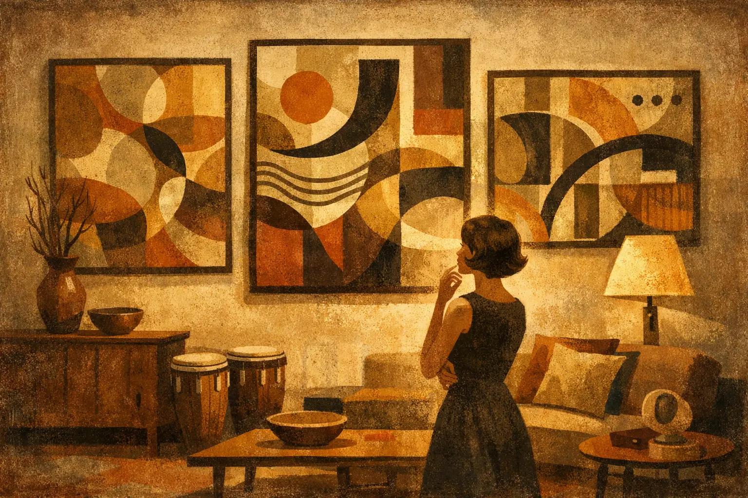
A room can be beautifully furnished and still feel unfinished. Often, what is missing is not another object but a visual center: something that gathers the materials, light, and mood of the space into one quiet statement. Abstract wall art can do precisely that. It does not ask the room to tell a literal story. Instead, it creates atmosphere through color, line, texture, gesture, and the deliberate use of empty space.
For collectors and design-minded homeowners, this openness is its strength. A landscape may tell you where to look. An abstract work leaves room for memory, feeling, and changing attention. It can be restful in the morning, architectural at noon, and unexpectedly intimate under evening light.
Why Abstract Wall Art Changes a Space
Abstract art works at the level of rhythm. A broad field of muted pigment can soften the clean geometry of a modern apartment. A gestural composition can introduce movement into a restrained room of limestone, oak, and linen. A work built from shadowy forms may give a minimal interior the depth it needs without disturbing its calm.
This is why abstraction is not simply a decorative category. It is an active part of the interior. The colors may echo a rug or deliberately resist it. A strong vertical composition can lift a low ceiling; a low, horizontal work can extend the apparent width of a wall. Even a nearly monochrome print can change how a room holds light.
The most compelling pieces do not merely match a sofa. They establish a relationship with the room’s existing character. In a Wabi-Sabi interior, an irregular mark, weathered texture, or imperfect edge can honor the beauty of age and asymmetry. In a more polished setting, precise planes of color or digital forms can bring clarity without becoming cold.
Begin With Feeling, Not a Color Swatch
It is practical to consider palette, but color alone is a narrow way to choose art. Before measuring a wall or comparing frames, consider the emotional temperature you want the room to hold. Do you want a bedroom to feel hushed and spacious? Do you want a dining room to invite conversation? Should an entry feel composed, curious, or quietly dramatic?
A calm room may call for mineral neutrals, faded indigo, soft charcoal, and open areas of unpainted space. A room that needs energy may benefit from saturated orange, electric blue, fractured geometry, or layered brushwork. Neither approach is more sophisticated. The question is whether the work brings the desired tension or release.
It also helps to notice the visual language already present. Curved furniture, hand-thrown ceramics, and natural fibers often sit beautifully with organic abstraction. Steel, glass, graphic lighting, and sharp-edged millwork can support geometric or digitally constructed work. Contrast can be equally effective, though. A rough, expressive painting above an immaculate console can make the whole composition feel more alive.
Choosing the Right Scale for the Wall
Scale is where many otherwise thoughtful choices lose their force. Art that is too small tends to drift on a large wall, no matter how beautiful the image may be. Art that is too large can press against the room, especially when furniture and architecture already carry significant visual weight.
Above a sofa, bed, or sideboard, a useful starting point is to choose a piece, or grouping, that spans roughly two-thirds to three-quarters of the furniture’s width. This is a guide rather than a rule. A room with generous ceilings can accommodate a more ambitious scale, while a compact space may need breathing room around the work.
For an empty wall, think beyond the wall itself. Consider sightlines from the doorway, the distance from which the piece will be viewed, and whether the wall receives direct sun. A small original can be profoundly powerful when placed in a narrow passage or above a reading chair, where the viewer meets it closely. In a living room viewed from across the space, a larger print or collector edition often has greater presence.
If you are uncertain, tape the proposed dimensions onto the wall with painter’s tape. Live with the outline for a day or two. It is a modest step, but it reveals whether the composition feels anchored, generous, or hesitant.
One work or a considered grouping?
A single large work creates stillness and confidence. It gives the eye a place to rest, making it especially effective in minimal interiors, bedrooms, hotel lobbies, and rooms with strong architectural lines. It also allows nuanced surfaces and subtle color shifts to be experienced at a meaningful scale.
A pair or series can introduce cadence. Two related abstractions above a long console may echo the balance of the furniture below. A salon-style arrangement can feel personal and collected, but it demands more attention to spacing, frame finish, and the conversation between works. Grouping is most successful when there is a clear connection: palette, paper, artist, period, or shared emotional tone.
Color Should Converse, Not Disappear
There are three useful ways to work with color. The first is harmony: select tones already present in the room, then choose art that repeats them with more complexity. A soft rust in a painting might draw out the warmth of walnut floors; a pale green might make an olive velvet chair feel intentional.
The second is contrast. A mostly neutral interior can be transformed by a work with one vivid, concentrated color. This does not require a loud room. A single crimson gesture, cobalt block, or luminous yellow field can create a focal point while the surrounding materials remain quiet.
The third is atmosphere. Here, the artwork does not closely match or sharply oppose the palette. Instead, it shifts the room’s mood through temperature and depth. Cool gray-blue abstraction can make a sunlit room feel contemplative. Earthy, layered pigments can give a new-build interior a sense of history.
Be careful with the instinct to match every color exactly. When art repeats a room too literally, it can recede into decoration. A slight difference in hue, value, or texture is often what gives the work its authority.
Material, Surface, and the Value of Print Quality
A digital image on a screen cannot fully communicate the character of a finished artwork. Surface matters. Paper absorbs light differently than canvas. A matte finish can deepen a quiet, tonal composition, while a carefully chosen texture can make an image feel tactile and present. Framing changes the experience again, creating either a threshold around the work or a more integrated relationship with the wall.
Museum-quality Giclée printing is particularly valuable for artworks with nuanced color, delicate gradients, and fine detail. When produced with archival inks and considered materials, it preserves the tonal range and visual integrity that made the original image compelling. For buyers building a collection with intention, a well-made limited edition or art print is not a compromise in atmosphere. It is a different, accessible way to live with a work.
The frame should support the art rather than compete with it. Pale wood brings warmth to restrained compositions. Black can sharpen graphic work and add definition in contemporary spaces. A floated presentation can emphasize the edges of the paper and make a minimal piece feel especially light. There is no universal answer, because framing is part of the work’s dialogue with its setting.
Placement Is a Form of Respect
Hang art where it can be encountered, not merely where there is available wall space. In most rooms, the center of a single work sits near eye level, often around 57 to 60 inches from the floor. Above furniture, leave enough space for connection while avoiding the appearance of the art floating too high. Usually, several inches between the furniture and the bottom of the frame is enough to create cohesion.
Light deserves equal care. Direct sunlight can overwhelm subtle tonal work and, over time, challenge even archival materials. If a wall receives strong daylight, observe it at several hours before deciding. A piece that seems understated in the morning may become luminous in late afternoon. Evening lighting matters too. Soft, directional illumination can reveal texture and make an abstract composition feel newly alive after dark.
For trade and hospitality projects, these considerations become even more precise. Art must work with traffic flow, ceiling height, material durability, and the pace at which people move through a space. A calm, large-scale abstraction may steady a busy reception area, while a sequence of smaller works can guide a guest through a corridor without becoming repetitive. Taygeta Gallery approaches this relationship between artwork and setting as a curatorial decision, not an afterthought.
Let the Work Keep Some Mystery
The pressure to explain abstract art can take away from its pleasure. You do not need to identify a subject, decode every mark, or defend your choice with art-historical language. The better question is simpler: does the work continue to hold your attention?
A lasting piece usually offers more than immediate agreement. It may contain an unresolved edge, an awkwardly beautiful form, or a color relationship that becomes clearer over time. That small resistance is often what prevents a room from feeling staged. It gives the space a private life.
Choose the work that changes the silence of the room. When you notice yourself looking at it again, without needing a reason, it has already begun to belong there.
Leave a Reply