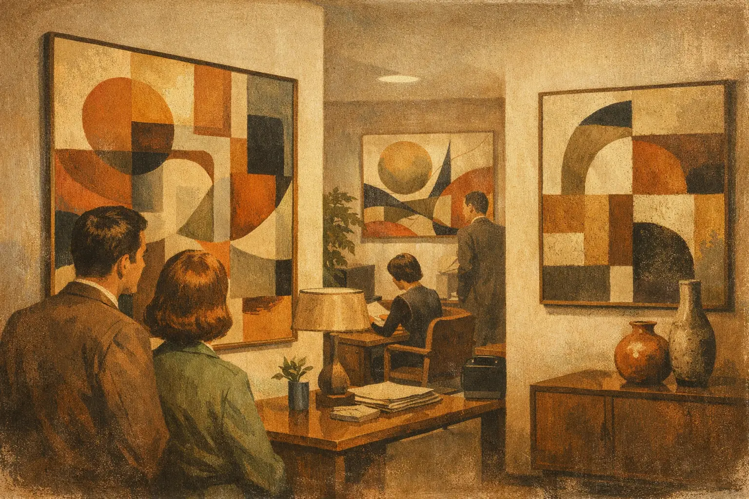
A reception desk can be immaculate, the lighting thoughtfully specified, and the furniture impeccably restrained, yet a workplace may still feel anonymous. Often, what is missing is a visual center of gravity. The best abstract art for offices does more than fill an empty wall. It gives a room a pace, a feeling, and a quiet signal that the people who work there care about how ideas take shape.
Abstract art is especially suited to professional spaces because it leaves room for interpretation. It can suggest movement without creating distraction, introduce color without dictating a brand message, and bring a sense of culture to environments built around schedules, screens, and practical decisions. The right work makes an office feel less like a container for labor and more like a setting for thought.
What Makes Abstract Art Right for an Office?
The strongest office art does not demand constant attention. It holds it. A painting with measured composition, nuanced texture, or a limited palette can remain interesting through years of daily viewing without becoming visually exhausting. This distinction matters in spaces where people must concentrate, meet, create, and recover between tasks.
Look for work with a clear internal rhythm. A field of layered neutrals, a restrained gesture in ink-like black, or a composition that balances geometry with softness can provide visual presence while preserving mental space. Abstract art need not be quiet in color, but it should feel intentional. Even a vivid work can create calm when its forms are resolved rather than chaotic.
There is also a practical advantage. Figurative art can establish a specific narrative that some viewers may find limiting or overly personal. Abstraction offers a more generous encounter. One person sees a landscape, another sees a map, another simply notices the relationship between a pale blue ground and a rust-colored mark. That openness makes it particularly valuable in shared workplaces.
Choose the Mood Before You Choose the Color
Many office art decisions begin with a paint swatch. A more considered approach begins with atmosphere. Ask what the room needs from its artwork: concentration, welcome, energy, confidence, or relief.
For executive offices and boardrooms, contemplative abstraction often has the greatest longevity. Works in mineral grays, ink, umber, chalk white, muted green, and deep indigo create authority without the heaviness of conventional corporate imagery. A composition with ample negative space can make a room feel composed, especially when paired with natural wood, stone, linen, or brushed metal.
Creative studios may accommodate more visual tension. Saturated color, expressive brushwork, fragmented forms, and unexpected contrasts can support a culture of experimentation. The trade-off is that high-energy art needs breathing room. In a studio already filled with samples, screens, mood boards, and movement, one larger work may be more effective than several competing pieces.
Reception areas benefit from art that creates an immediate emotional temperature. Here, a bold abstract can serve as an act of hospitality. It gives visitors something to encounter while waiting, and it introduces the character of the organization before anyone speaks. Rather than selecting a literal image of the company’s industry, choose a work that expresses its values through feeling: clarity, imagination, warmth, rigor, or curiosity.
Break rooms, lounges, and wellness spaces invite a different sensibility. Earth-toned Wabi-Sabi-inspired abstraction, softened organic forms, and works that honor irregularity can loosen the polished formality of office life. These are the rooms where art can remind people to pause.
Scale Is Part of the Artwork
A small print floating above a large conference table rarely feels modest. It feels accidental. Scale is one of the clearest differences between artwork that looks placed and artwork that looks curated.
For a broad, uninterrupted wall, choose a single large-scale work or a considered pair. As a general visual guide, art above a sofa, credenza, or console should span roughly two-thirds to three-quarters of the furniture width. In a conference room, a substantial horizontal composition can echo the table’s shape and create a stabilizing focal point at the far end of the room.
Narrow vertical areas, such as beside an entry, between windows, or near a private office door, are ideal for tall compositions. These works can lend height and elegance without crowding the architecture. A series of smaller pieces can also work beautifully along a corridor, but only when treated as a sequence with a shared visual language. Matching frames alone are not enough. The color, scale, or conceptual thread should create continuity.
Consider sightlines as carefully as dimensions. The most successful piece is often not the one that fits a wall most neatly, but the one revealed at the end of a hallway, across from a meeting room entrance, or from the first chair in a reception area. Art has a spatial life. It changes as people approach, pass, and return.
Color Should Support the Room, Not Merely Match It
Matching artwork exactly to a rug or upholstery fabric can make a space feel overly coordinated and strangely flat. Instead, seek correspondence. A painting may carry one echo of the room’s palette while introducing a different temperature or material feeling.
In neutral offices, warm pigments such as ochre, terracotta, faded rose, or oxidized orange can bring welcome depth. Cooler notes of slate, sea green, and blue-gray tend to sharpen a more minimal setting. Black and white abstraction remains a compelling choice for contemporary offices, particularly when the work contains visible texture, tonal variation, or a distinctive mark. Pure contrast can feel architectural; softer grayscale feels meditative.
If a business has strong brand colors, use them with restraint. A work that repeats a logo color too literally can read as décor rather than art. It is more sophisticated to choose a piece that shares the emotional quality of the brand palette – a grounded red rather than exact crimson, or an atmospheric blue rather than the corporate hue found on every presentation slide.
Framing, Finish, and Material Carry Meaning
Museum-quality Giclée prints can be an excellent choice for offices, particularly when projects require multiple works, larger dimensions, or consistent presentation across locations. Their value lies not only in access, but in fidelity: rich tonal range, durable materials, and a finish that respects the original visual language of the artwork.
Frame selection should follow the work and the room. Natural oak, ash, and light maple bring warmth to organic or minimalist abstraction. Matte black creates definition and works particularly well with graphic, monochrome, or high-contrast pieces. A slim white frame can make color feel luminous, while a float-mounted canvas offers a more immediate, painterly presence.
Glare deserves attention in offices with large windows or bright overhead lighting. Acrylic or glass can be appropriate, but the placement should account for reflections. Sometimes a canvas or matte-finish print is the wiser choice, especially opposite a window. Quality is felt in these details. Art should remain visible at different times of day, not disappear into reflected ceiling lights.
A Curated Office Is Not a Uniform Office
For larger workplaces, it is tempting to repeat one style across every room. Consistency is useful, but sameness can make an environment feel institutional. A better approach is to establish a visual family: perhaps a shared interest in organic abstraction, restrained color, or contemplative space, then allow each area its own character.
A lobby might hold a statement work with scale and presence. Meeting rooms can feature calmer pieces that reward close looking. Private offices may be more personal, with art selected for the occupant’s temperament. Corridors can become a quiet narrative through a series of related prints or editions.
This is where a curatorial perspective becomes valuable. At Taygeta Gallery, collections shaped by Zen, Wabi-Sabi, and contemporary abstraction offer a way to create coherence without reducing art to a matching exercise. The goal is not to make every wall look alike. It is to let each work belong to a larger atmosphere of attention, simplicity, and emotional intelligence.
How to Place Art With Confidence
Hang the visual center of most works around 57 to 60 inches from the floor, which generally aligns with standing eye level. In seated environments, such as a lounge or boardroom, slightly lower placement may feel more natural. Above furniture, leave enough space to create connection, usually about 6 to 10 inches, while avoiding the impression that the art is perched too high.
Do not overlook the work’s relationship to sound and movement. A quiet, detailed piece may be lost in a high-traffic corridor, where a bolder composition will read more clearly. Conversely, a loud work in a small focus room can make silence feel performative. The best abstract art for offices responds to the actual experience of the room, not only its floor plan.
Give the artwork room to be encountered. A single well-chosen composition near the place where someone pauses with coffee, prepares for a meeting, or looks up from a difficult task can change the tenor of an ordinary day. That is enough reason to choose slowly, and choose something worth living with.
Leave a Reply