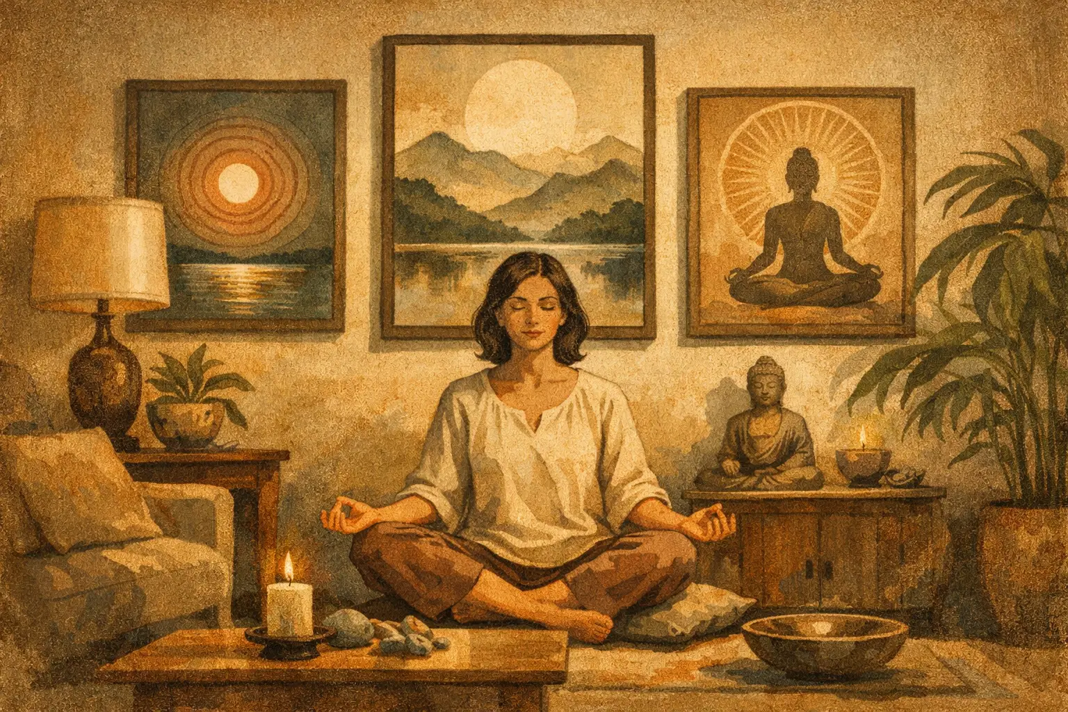
A room can be beautifully furnished and still feel restless. Often, the missing element is not another object but a point of stillness: an artwork that slows the eye, gives the room a center, and makes space for reflection. Learning how to decorate with meditative art is less about creating a themed interior than choosing images, materials, and placements that allow quiet attention to unfold.
Meditative art may be abstract, minimalist, landscape-based, gestural, or digital. What connects it is not a fixed subject matter, but a particular quality of presence. A softened horizon, a field of mineral color, an imperfect ink-like mark, or a spare composition can create a pause in the visual rhythm of daily life. Its effect is strongest when the surrounding room gives it room to breathe.
Begin With the Atmosphere, Not the Empty Wall
Before selecting a work, consider how you want the room to feel when you enter it. Calm is not always pale, neutral, or silent. A deep indigo painting can be contemplative in a sunlit living room; a warm earth-toned work can bring groundedness to a modern bedroom; a nearly monochrome print can make a busy home office feel more focused.
Look at the room as a whole: its natural light, the materials underfoot, the texture of upholstery, and the pace of activity. A space used for conversation and gathering may suit an artwork with more movement, while a bedroom or reading corner often benefits from quieter visual intervals. The goal is not to erase personality. It is to create harmony between the work and the life that takes place around it.
This approach also prevents a common mistake: buying art to match a single pillow, paint swatch, or temporary trend. Meditative art has more lasting power when chosen for its emotional temperature rather than its ability to complete a color scheme.
How to Decorate With Meditative Art: Choose One Visual Anchor
A contemplative interior does not need many focal points competing for attention. Start with one work that can hold the room. This might be a large abstract above a sofa, a framed digital artwork in an entryway, or a collector edition placed opposite the bed. Give it enough visual authority that it reads as an intentional presence rather than an accessory.
Scale matters. Art that is too small for its wall can appear tentative, especially in a minimalist room where every element is visible. Above a sofa, a work or grouping generally feels balanced when it spans roughly two-thirds to three-quarters of the furniture width. Above a console, leave some margin at either side so the composition feels poised rather than crowded.
A larger work is not automatically more meditative, however. In a compact apartment, a modest piece with generous surrounding wall space can create a more powerful pause than an oversized image. The essential question is whether the work has a clear field around it. Empty space is part of the composition.
Let Negative Space Do Its Work
Wabi-Sabi philosophy values restraint, asymmetry, and the beauty found in the incomplete or weathered. In decorating terms, this can mean resisting the urge to fill every available wall. A single work near a natural wood chair, ceramic vessel, or linen curtain may feel more resonant than a dense gallery wall.
That does not mean gallery walls are incompatible with meditative art. They simply need a quieter logic. Keep the palette limited, use consistent framing, and leave wider gaps between works than you might in an eclectic salon arrangement. Let one image lead while the others act as softer echoes.
Build a Restrained Color Conversation
Meditative art does not need to disappear into the room. A work with strong color can become a serene focal point when the surrounding palette is controlled. Instead of matching every hue exactly, repeat one or two undertones found in the artwork through textiles, ceramics, or furniture.
For example, a painting with charcoal, rust, and chalky cream may sit beautifully with oak, natural linen, and a single dark accent. A blue-green abstract can be balanced by off-white walls, smoked glass, and muted gray upholstery. These relationships should feel sensed rather than announced.
Be careful with too many decorative accents in competing colors. When an artwork carries delicate tonal shifts, a crowded palette can flatten its presence. It is often better to remove one unnecessary item than add another coordinating one.
Place Art Where Attention Can Settle
Placement affects the way a work is experienced. Art hung above a television, beside a cluttered storage unit, or in a fast-moving hallway may receive only a glance. Sometimes that is appropriate, but meditative works reward a slower encounter.
Consider locations where the eye naturally rests: across from a favorite chair, at the end of a hallway, above a low bedroom dresser, or near a dining table where guests linger. An entryway can also be especially meaningful. The first image encountered on returning home can set the emotional register for the space beyond it.
Hang work at a human viewing height. A useful starting point is to place the center of the artwork around 57 to 60 inches from the floor, then adjust for furniture, ceiling height, and the work itself. Above a console or sofa, the gap between furniture and frame should usually feel connected rather than floating – often around 6 to 10 inches.
Light deserves equal consideration. Indirect daylight reveals texture and nuance, while direct sun can fade sensitive works over time. For evening viewing, a warm, adjustable picture light or ceiling spotlight can create depth without turning the art into a stage prop. Avoid harsh, cool bulbs that make subtle colors feel clinical.
Choose Materials That Support the Work
Framing is not merely a finishing detail. It shapes the boundary between the artwork and the room. A slim natural oak frame can soften an architectural interior; black framing gives graphic works definition; a simple white frame can preserve airiness around a pale composition. For many contemporary pieces, a restrained frame is the most enduring choice.
Museum-quality Giclée prints deserve the same consideration as original works. Their pigment, paper, and production allow for remarkable depth, but poor framing or reflective glazing can diminish that quality. If the room receives strong light, consider UV-protective glazing. If reflections are a concern, non-glare acrylic or glass can make a meaningful difference.
Material contrast also adds quiet richness. A luminous digital print beside travertine, raw silk, plaster, or aged wood creates a dialogue between precision and imperfection. This is where a Wabi-Sabi sensibility becomes useful: surfaces do not need to match to belong together.
Avoid Turning Stillness Into a Styling Formula
The language of meditation, Zen, and Wabi-Sabi is often reduced to beige rooms, bamboo accessories, and generic symbols. A more thoughtful approach begins with respect for the cultural and philosophical traditions that inform these ideas. Zen is not a decorative shorthand, and Wabi-Sabi is not simply an aesthetic of intentional messiness.
Instead, let the principles guide your decisions: simplicity without sterility, imperfection without affectation, and beauty that becomes clearer through repeated attention. A contemporary abstract work can embody these values as fully as a traditional ink composition if it invites patience and has integrity in its making.
It also helps to distinguish calm from emptiness. A room can contain books, family objects, layered textiles, and expressive art while still feeling composed. The trade-off is visual discipline. Each object should have a reason to remain, whether it serves the room, recalls a meaningful experience, or deepens the atmosphere you are creating.
Live With the Work Before Rearranging Everything Else
Once the art is installed, allow it time. Notice how it changes through morning light, evening shadow, and the changing seasons. A piece that first seems understated may become the work you return to most often; one that feels dramatic online may ask for more surrounding simplicity in person.
At Taygeta Gallery, the most compelling interiors are rarely those that look completed in a single day. They evolve through attentive choices, with art acting not as a final layer of decoration but as a quiet companion to the people who live there.
Choose the work that gives you a reason to pause. Then let the room become a little less about display and a little more about how you wish to feel within it.
Leave a Reply