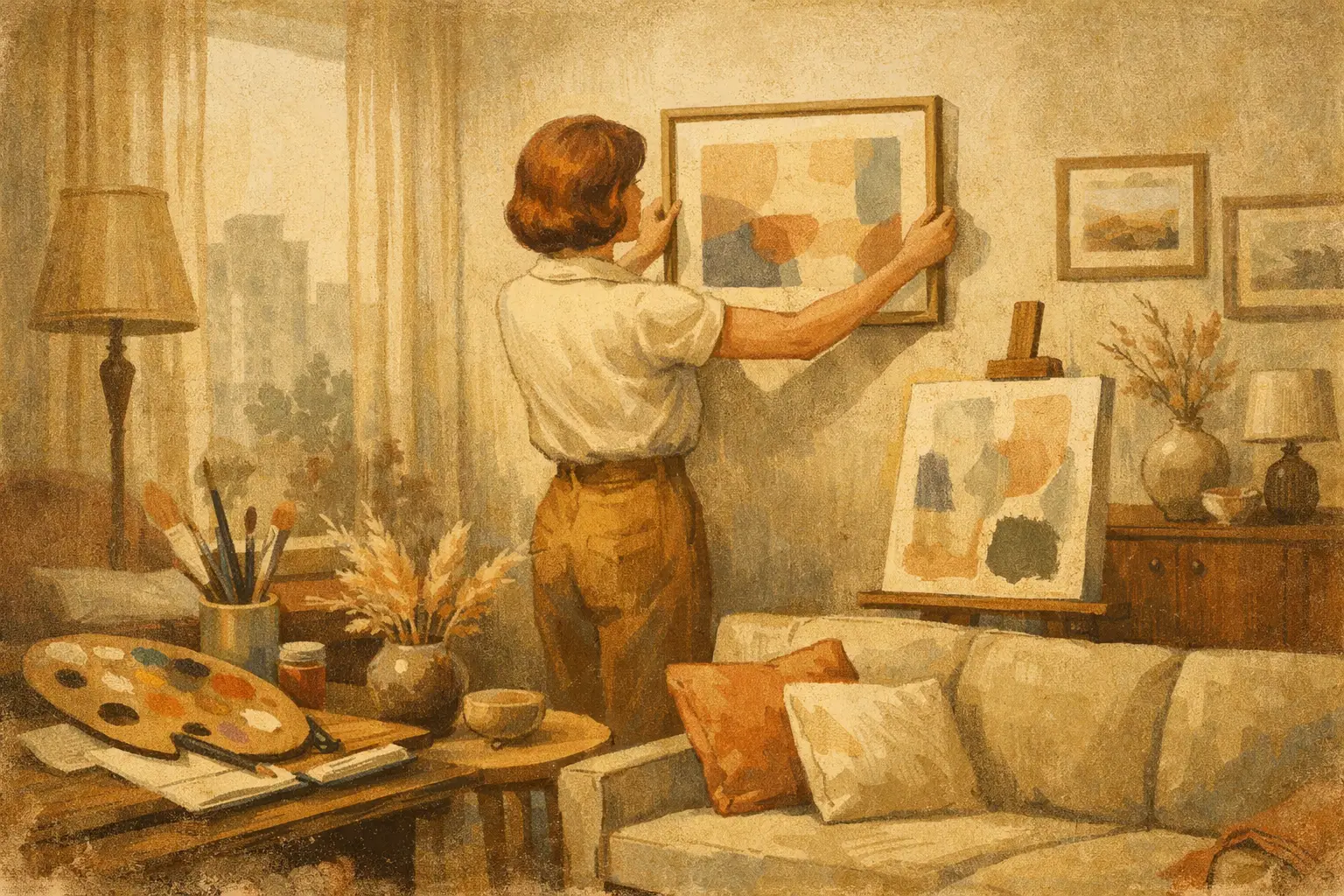
A living room can be fully furnished and still feel unfinished. In this apartment art makeover case study, the missing element was not another chair, a larger rug, or more decorative objects. It was a visual center of gravity: artwork with enough presence to gather the room’s pale surfaces, changing daylight, and lived-in textures into one considered atmosphere.
The project follows a composite of a familiar urban apartment – a one-bedroom rental with white walls, warm oak floors, a compact living area, and a tenant reluctant to make irreversible changes. The goal was not to make the space look staged. It was to make it feel inhabited by a distinct sensibility: calm, personal, and quietly memorable.
The Apartment Before the Art Makeover
The room had good bones. A low oatmeal sofa faced a simple media console; linen curtains softened a large window; books and ceramics had already introduced a sense of life. Yet every element sat at a similar visual volume. Nothing held the eye for long enough to create rhythm.
Above the sofa hung a small, generic print in a thin frame. It was pleasant, but too narrow for the wall and too literal for the mood the resident wanted. Nearby, a cluster of postcards had been taped beside the dining table. They carried personal meaning, but their scale made them read as temporary rather than intentional.
This is a common apartment dilemma. Renters often choose small art because it seems safer, less expensive, and easier to move. But undersized work can make a generous wall feel even more vacant. The answer is not always to fill every blank surface. It is to choose one or two works that establish proportion, then let the room breathe around them.
A Case Study in Apartment Art Makeover Decisions
The resident wanted an interior informed by Japanese restraint without turning the home into a themed interpretation of another culture. That distinction shaped every decision. Wabi-Sabi, at its most resonant, is not a styling formula of beige objects and imperfect pottery. It is an attention to material honesty, asymmetry, time, and the quiet beauty of what does not insist on perfection.
Rather than introduce art that depicted a recognizable scene, the curation began with abstraction. An atmospheric work in mineral gray, faded clay, and muted indigo was selected for the wall above the sofa. Its composition held open areas of pale color alongside darker, gestural marks. From across the room, it created depth. Up close, it offered changing textures and intervals of stillness.
The work was produced as a museum-quality Giclée print at 40 by 30 inches and placed in a slim natural-oak frame. This was the pivotal choice. A larger piece did not make the small room feel smaller. It made the wall feel resolved, giving the furniture beneath it a purposeful relationship to the architecture.
Scale is often more consequential than price. A modestly priced, beautifully produced print in the right dimensions can have greater spatial impact than several smaller pieces acquired without a plan. Original work has its own incomparable material presence, but a collector edition or fine art print can be the right answer when budget, availability, and a rental timeline must all be considered.
Why the frame mattered
The original black frame was replaced because it created a hard visual boundary against the room’s soft materials. Natural oak echoed the floor without matching it exactly, while a generous white mat gave the image a field of air. The frame became part of the composition rather than a merely functional edge.
This is where online art buying benefits from a little patience. Buyers should look beyond the image itself and consider final dimensions, paper quality, matting, glazing, and the profile of the frame. Museum-quality production is not a decorative footnote. It affects how color settles into a room, how the work responds to daylight, and whether it continues to feel valuable after the first week of excitement has passed.
Building a Conversation, Not a Gallery Wall
Once the sofa wall had its anchor, the dining area needed restraint. A traditional gallery wall would have competed with the new focal point and made the compact plan feel busy. Instead, one smaller vertical work was placed on the adjacent wall, visible from the kitchen and entry.
This second piece introduced a quiet note of deep blue, relating to the larger work without repeating it. Its more intimate scale rewarded close viewing. Together, the pair created a conversation across the room: one expansive and meditative, the other concentrated and almost secretive.
The postcards were not discarded. They were gathered into a shallow archival box on a shelf, where they could be handled and revisited. Not every cherished image needs to be displayed at once. Editing is not an erasure of memory. It is a way of allowing the chosen pieces to speak clearly.
The apartment also gained one unframed work on textured paper, leaned on a narrow picture ledge in the bedroom. This introduced an element of impermanence. It could be moved, reframed, or exchanged as the resident’s eye changed. A home becomes more personal when it has room to evolve.
The Shift Was Emotional as Much as Visual
After the installation, the room had not gained much more. There was no major renovation, no new sofa, and no attempt to conceal the practical realities of rental living. Yet visitors began to pause at the entrance. The art gave the apartment a mood before it offered an explanation.
During morning light, the pale passages in the larger work seemed nearly weightless. At night, the deeper indigo marks came forward, echoed by the shadows behind the curtains. The resident described using the room differently too: reading instead of scrolling, inviting friends for dinner, noticing the gradual change in light across the wall.
That response is not incidental. Art can make an apartment feel less like a temporary container and more like a place of attention. It does not need to announce wealth or follow a trend. Its role may be subtler: to offer a pause, preserve an emotional tone, or give form to a preference that is difficult to put into words.
What This Project Teaches About Buying Art for a Rental
The project worked because it began with a question of feeling rather than a search for something that simply matched the sofa. Color harmony matters, but exact matching often produces a room that is overly controlled. The stronger connection came from shared temperature: weathered neutrals, softened wood, and a blue that felt contemplative rather than decorative.
It also worked because the resident accepted one meaningful commitment. For apartment dwellers, art can feel like a risky investment when a future move is unknown. Yet a work chosen for its emotional and visual integrity usually travels well. It can take on a different role in a future home – above a bed, beside a desk, or in an entryway – while retaining its history.
There are practical considerations. Measure the wall, then mark the proposed dimensions with painter’s tape before ordering. For a work above a sofa, the outer width of the frame often looks balanced at roughly two-thirds to three-quarters the width of the furniture below. Hang the center of the work near eye level, adjusting slightly for a seated viewing position in a living room. And for renters, use suitable picture-hanging hardware rather than treating adhesive strips as a universal solution; the right method depends on weight, wall condition, and lease requirements.
Most of all, resist the pressure to complete the home in one purchase. A collection becomes convincing through intervals of looking. Taygeta Gallery approaches this process as curation rather than accumulation: choosing works with enough visual character to stand alone, while leaving space for future encounters.
The most lasting change in this apartment was not that it looked more expensive. It looked more awake. One considered image gave the room a place for the eye to rest, and from that still point, the rest of the home began to reveal itself.
Leave a Reply