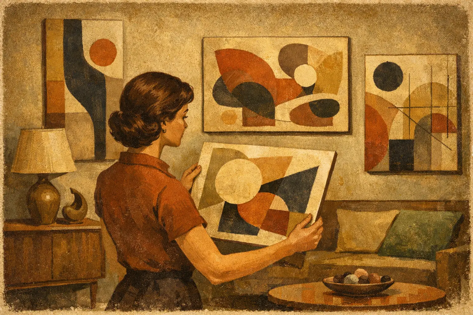
A quiet room can be transformed by a single field of color, a broken line, or a gesture that refuses easy explanation. Knowing how to choose abstract wall art begins not with a search for something that matches the sofa, but with a more intimate question: what atmosphere do you want to live with?
Abstract art does not tell you exactly what to see. It leaves room for memory, mood, and interpretation. That openness is its gift, but it can also make choosing feel uncertain. The most satisfying piece is rarely the one that explains itself fastest. It is the work that continues to reveal a different rhythm as the light changes, the room evolves, and your attention returns to it.
Begin With the Feeling of the Room
Before considering dimensions or palette, stand in the space and notice its existing character. Is it a place for restoration, conversation, focus, or ceremony? A bedroom may call for softened forms, open space, and colors that settle the eye. A dining room can hold greater tension: a deep contrast, a vivid gesture, or a composition that gives guests something to return to between conversations.
This is especially useful in minimalist interiors. When furnishings are restrained, art carries more of the emotional weight. A quiet composition in stone, ink, sand, or misted gray can extend a sense of calm. A work with an unexpected red, cobalt, or electric green can become a deliberate interruption – a pulse within an otherwise measured room.
Do not confuse calm with blandness. Wabi-Sabi teaches us that beauty often lives in irregularity, weathered texture, incompleteness, and the evidence of time. A painting with uneven edges, layered marks, or imperfect balance may bring more humanity to a polished interior than a perfectly coordinated print ever could.
How to Choose Abstract Wall Art by Scale
Scale is the practical decision that most affects whether art feels at home. A work can be visually compelling on a screen yet appear timid above a large sofa, or overpowering in a narrow entry. Measure the wall before you fall in love, then consider the relationship between the art, the furniture, and the open space around it.
Above a sofa, credenza, or bed, a single artwork generally feels composed when it spans roughly two-thirds to three-quarters of the furniture below it. This is a guide, not a law. A small, deeply concentrated work may be more moving when given generous blank wall space, particularly in an intimate reading corner or a contemplative hallway.
Ceiling height matters as much as width. Rooms with high ceilings often benefit from vertical works that draw the eye upward, while horizontal compositions can make a low, wide room feel more expansive. In a compact apartment, oversized art is not automatically too much. One substantial piece can create clarity and presence where several small decorative objects might feel fragmented.
When hanging, place the visual center of the artwork at approximately eye level, often around 57 to 60 inches from the floor. Above furniture, leave enough breathing room that the piece feels connected rather than crowded. Usually, 6 to 10 inches above a sofa or console works well, though lower ceilings and taller furniture may call for adjustment.
One Large Work or a Grouping?
A single large abstract work offers stillness. It gives the eye one place to rest and lets texture, gesture, and negative space speak without competition. This approach suits rooms with strong architecture, sculptural furniture, or a desire for a gallery-like sense of restraint.
A grouping creates a more conversational rhythm. It can be effective on long walls, stairwells, and hospitality spaces, especially when individual works share a tonal thread without becoming overly uniform. The trade-off is that groupings require more attention to spacing and visual balance. If the art is busy, keep the arrangement simple. If the works are quiet, variation in size or framing can add life.
Let Color Respond Rather Than Match
A common mistake is treating art as an accessory whose only task is to repeat the room’s existing colors. Matching can be harmonious, but it can also make a space feel overly resolved. Better interiors allow for response, contrast, and a little ambiguity.
Look for a color already present in the room, perhaps in a rug, ceramic, timber grain, or textile, then choose art that echoes it indirectly. A warm beige room may come alive with mineral blues and muted rust. A charcoal interior may welcome a pale work with translucent whites and soft blush. Rather than asking whether every color matches, ask whether the palette belongs to the same emotional climate.
Consider the light as well. North-facing rooms tend to receive cooler light, which can make blue-gray art feel more austere and warm pigments especially welcome. South-facing rooms carry brighter, warmer illumination and can support more nuanced whites, subtle neutrals, and delicate tonal shifts. A work seen in morning light may feel entirely different after sunset, so imagine it across the full day.
For a room that already contains pattern, choose abstraction with a clear dominant gesture or a more limited palette. In a spare room, more layered or energetic work can supply the complexity that the furnishings intentionally avoid. Neither choice is better. The point is to create balance rather than visual noise.
Pay Attention to Surface, Material, and Presence
Abstract wall art is not only an image. It is also an object with a surface, an edge, a degree of depth, and a relationship to the room’s materials. This becomes especially meaningful in interiors shaped by natural stone, linen, oak, plaster, leather, or brushed metal.
Original works often carry tactile evidence of their making: built-up pigment, pencil traces, erased lines, or the shifting sheen of layered media. These details create intimacy, particularly in spaces where viewers can stand close. Museum-quality Giclée prints can offer another kind of value, making a striking visual language accessible in larger formats or carefully considered editions. The right choice depends on your collecting priorities, budget, and the role the work will play.
Framing changes the character of a piece. A natural wood frame may soften a geometric composition and connect it to organic materials in the room. A slim black frame can add definition and contemporary precision. Floating frames give canvas works a subtle architectural presence, while an unframed presentation can feel immediate and informal. Let the work lead. Not every piece needs to be made more formal.
Buy for the Second Look
The first response to art is often physical: a pause, a lift in attention, a sense of recognition without a clear reason. Trust that response, but give it a second look. Ask whether you are drawn to the work itself or simply to the idea of what it might do for the room.
A lasting abstract piece can hold both decorative and personal meaning. You may see a shoreline in one moment, an interior landscape in another, and only color and movement the next day. That flexibility allows it to stay with you through changes in furniture, homes, and taste.
It can help to picture the work in less flattering conditions. Would you still want to see it on a gray afternoon? Would its quieter passages matter when the room is not styled for guests? The artwork does not need to be universally pleasing. In fact, a little friction can be a sign that it has a point of view.
Consider the Life of the Artwork Beyond the Wall
For first-time buyers, price often feels like the central decision. Yet value is also shaped by how the work is produced, whether an edition is limited, the quality of paper and inks, the care of the framing, and the confidence you have in its long-term presentation. A well-made print with archival materials may be a more thoughtful acquisition than an inexpensive decorative image that quickly loses its visual integrity.
For collectors and design professionals, provenance, edition information, and consistency across a larger scheme deserve closer attention. A residential project may need one defining work; a hotel or workplace may need a coherent visual language across many rooms. In both cases, the art should feel chosen, not merely supplied.
Taygeta Gallery approaches abstract art as an encounter between visual culture and lived space. The aim is not to fill a wall, but to introduce a presence that can alter the pace of a room.
The best choice may not be the safest one. Choose the work that gives the room a deeper silence, a sharper question, or a small, enduring sense of wonder each time you pass it.
Leave a Reply