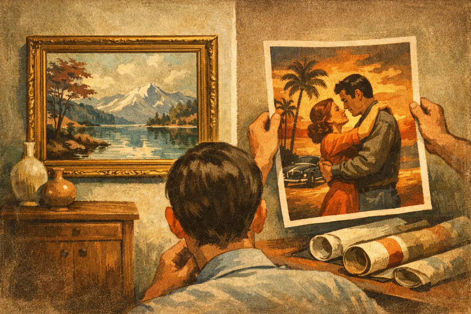
A print can occupy the same space on a wall yet create an entirely different atmosphere in a room. The question of giclee versus posters is not only about price or process. It is about whether an image feels like a considered work of art, a fleeting graphic gesture, or something in between.
For a quiet bedroom, a layered living room, or a hospitality setting where every detail carries meaning, that distinction becomes visible. Paper catches light differently. Color settles with different depth. Even the margin around an image can change the pace of a room.
Giclee Versus Posters: The Essential Difference
A Giclée print is a high-resolution fine art reproduction, typically produced with archival pigment inks on carefully selected art paper or canvas. The word comes from a French term referring to the spraying of ink, but its contemporary meaning is more specific: a print made to preserve the tonal range, detail, and character of an artwork with exceptional fidelity.
A poster is generally a mass-produced reproduction, most often printed in larger quantities on lighter, coated paper using commercial printing methods. Posters have their own visual language. They can be lively, graphic, accessible, and immediate. But they are usually designed for broad distribution rather than for the close, sustained looking associated with fine art printing.
Neither format is automatically more meaningful. The image, the context, and the production quality all matter. Still, when the goal is to bring an artwork into a design-conscious space with depth and longevity, the differences are substantial.
Ink Changes the Experience of Color
The most perceptible difference often lies in the ink. Giclée printing uses pigment-based inks, which can render subtle shifts in color, shadow, and texture. In an abstract work, this may mean the difference between a flat field of gray and a surface that seems to breathe with blue, umber, and soft mineral tones.
Pigment inks are valued for their stability as well. When paired with archival paper and displayed away from direct, intense sunlight, a well-made Giclée can retain its color for decades. This matters for collectors and for designers specifying art for spaces meant to endure beyond a season.
Posters are commonly made with dye-based or commercial offset inks. Their colors may be bright and persuasive at first glance, particularly in bold photography or graphic design, but they tend to offer less nuance in delicate gradients. Depending on materials and exposure, they may also be more susceptible to fading over time.
This is not a criticism of the poster as a format. A vivid poster can bring energy to a temporary studio, a child’s room, or an informal creative space. It simply serves a different intention. A Giclée is made for the moment when an image needs to hold attention without demanding it.
Paper Is Not a Background Detail
Fine art paper is part of the work, not merely the surface beneath it. Giclée prints are often produced on heavyweight, acid-free cotton rag or alpha-cellulose paper. These papers may have a smooth, velvety finish, a soft matte character, or a lightly textured surface reminiscent of traditional drawing and watercolor papers.
That material presence is especially important in work informed by Wabi-Sabi sensibility. A muted digital composition, an imperfect line, or a spacious field of color can feel unexpectedly tactile when printed on a matte, museum-quality sheet. The paper absorbs glare and allows the eye to rest with the image rather than skim across it.
Posters are usually printed on thinner stock, often with a satin or glossy coating. Gloss can intensify contrast, but it also reflects windows, lamps, and movement in the room. In a space built around calm materials such as linen, oak, plaster, and stone, that shine can feel more promotional than contemplative.
Weight matters, too. A heavier Giclée lies beautifully in a frame, holds a clean edge, and communicates care before anyone has even examined the image. A thin poster can still look good when properly framed, but it may ripple, show pressure marks, or require more protective handling.
The frame cannot correct every compromise
Thoughtful framing elevates both formats, but it cannot create detail that was not printed or turn low-grade paper into archival stock. A poster with a generous mat and a refined frame can become a charming decorative object. A Giclée framed with restraint can become a focal point – one that carries visual presence without visual noise.
For many interiors, the best choice is not the largest possible image. It is the print whose surface, margin, and framing create proportion with the surrounding architecture. A smaller Giclée on fine paper may feel more collected and intentional than an oversized poster filling a wall by force.
Editioning, Authenticity, and the Collector’s Relationship
Giclée does not automatically mean limited edition, signed, or collectible. Those qualities depend on how the artist or gallery releases the work. A Giclée can be open edition, meaning it may be printed without a fixed quantity. It can also be part of a limited edition, with a stated number of prints, an artist signature, and sometimes a certificate of authenticity.
Editioning introduces a different relationship to ownership. It does not make a work more emotionally powerful by itself, but it can give the buyer confidence that the print has been released with intention and traceability. For buyers beginning an art collection, a limited-edition Giclée can offer an accessible entry into owning carefully produced work rather than a generic reproduction.
Posters are most often open-run products. Their value tends to rest in the image’s cultural appeal, graphic impact, or personal association rather than scarcity. A beloved film poster, exhibition poster, or typographic print can absolutely belong in a sophisticated home. The question is whether you want an object of visual memory or an artwork reproduced with collector-oriented attention.
At Taygeta Gallery, museum-quality Giclée editions are presented not as substitutes for original artworks, but as their own considered format. They make distinctive contemporary art more available while honoring the tonal complexity and visual stillness that drew viewers to the work in the first place.
When a Poster Is the Better Choice
There is freedom in choosing a poster precisely because it is not precious. If you are styling a short-term rental, refreshing a first apartment, creating a playful gallery wall, or testing a color direction before making a larger commitment, a poster may be the sensible answer.
Posters also work well when the image is inherently graphic: vintage typography, music imagery, bold illustration, or an exhibition design with strong cultural resonance. In these cases, slight flatness or gloss may support the visual intent rather than diminish it.
Choose a Giclée when the image contains subtle texture, nuanced color, fine linework, or an atmospheric sense of space. It is also the stronger choice when you want art to live with you for years, when framing is part of a larger interior plan, or when the work needs to feel appropriate beside original art, natural materials, and considered furnishings.
How to Choose Without Overthinking It
Begin with the room rather than the label. Ask what role the piece should play. Is it meant to be a bright, changeable note? A personal reference? Or is it meant to create a pause – a visual place where the room becomes quieter and more complete?
Then look closely at the image. Works with soft gradients, intricate details, painterly marks, and restrained palettes benefit profoundly from Giclée production. Strong, simple graphics can be more forgiving in poster form. If possible, request or examine information about the paper, inks, edition size, and recommended framing. Those details reveal whether a print has been made as an afterthought or as an object worthy of attention.
Budget deserves an honest place in the decision. A poster allows immediate access to imagery you love. A Giclée asks for more, yet offers greater material quality, permanence, and visual depth. The right purchase is not always the most expensive one. It is the one whose presence feels aligned with the life of the room.
Art does not need to announce its value loudly. Sometimes its value appears slowly: in the way a softened surface catches afternoon light, in a color that changes beside a clay vessel, or in the stillness you notice after living with it for a while.
Leave a Reply