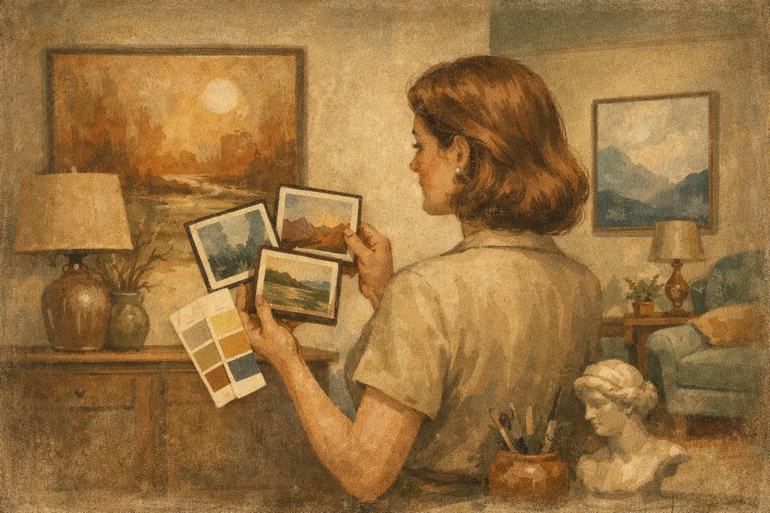
A room can have the right furniture, generous light, and a beautiful artwork, yet still feel faintly unsettled. Often, the issue is not the art itself but the quiet temperature beneath its visible color. Learning how to match art undertones is what turns a collection of attractive objects into an interior with a sense of coherence.
Undertones are subtle, but they shape atmosphere. A cream wall may lean pink, yellow, gray, or green. A charcoal painting may carry blue rather than brown. Even natural oak can appear honeyed, rosy, or muted depending on its finish and the light around it. When these underlying notes speak to one another, a room feels composed without becoming overly coordinated.
What Art Undertones Actually Are
An art undertone is the secondary color influence that lives beneath the dominant hue. It is not always obvious at first glance. A painting may read as white, for example, while its whites lean cool blue-gray, soft ivory, or warm pink. A black-and-white photograph may contain silvery blue shadows or sepia-brown depth. An abstract field of beige may be built on ochre, blush, olive, or stone-gray.
This distinction matters because interiors rarely consist of pure color. Most materials are nuanced: linen has a flaxen cast, plaster has mineral variation, marble may contain green or violet veining, and painted walls shift throughout the day. Art that echoes these quieter color notes tends to look at home in the space.
Matching undertones does not mean finding a painting that repeats the exact colors of a rug or sofa. That approach can flatten a room into a formula. Instead, look for a shared temperature or an adjacent family of color. A warm, earthen canvas can live beautifully above a tobacco leather sofa even when no two shades precisely match. The relationship is felt rather than announced.
How to Match Art Undertones Before You Buy
Begin with the largest, least-changeable surfaces. In most rooms, these are the walls, flooring, upholstery, cabinetry, and wood finishes. Stand back from the space and ask a simple question: does it lean warm, cool, or balanced?
Warm rooms often contain cream rather than bright white, oak with golden or red notes, brass, terracotta, camel, rust, or warm gray. Cool rooms may feature blue-gray walls, blackened metal, crisp white, marble, pale ash, or fabrics with blue, violet, or green casts. A balanced room can accommodate either direction, but it will still have a dominant mood: sunlit and soft, mineral and quiet, or graphic and architectural.
Next, isolate the undertone of the wall behind the intended artwork. This is more useful than identifying the wall’s main color. A greige wall can have a green, pink, yellow, or violet base. Hold a few materials near it – a sheet of clean white paper, a warm ivory textile, a gray sample, or a muted olive object. The contrast often reveals what the wall is doing.
Then consider the art in natural light and again in the room’s evening lighting. Screens can disguise undertones, particularly in subtle neutrals and dark paintings. If you are buying online, study close-up imagery and read the work’s color description, but also allow for the fact that a museum-quality print or original will respond to real light differently than it does on a phone. A work that appears neutral on screen may reveal an atmospheric green, cobalt, umber, or rose once installed.
Use One Dominant Undertone, Not Every Color
Choose one or two undertones from the room for the art to acknowledge. If your living room has warm off-white walls, walnut furniture, and an olive linen chair, a painting with ochre, umber, softened black, or muted green will create an easy conversation. It does not need to include all four.
In a cooler setting of pale gray walls, blue velvet, and brushed steel, look toward blue-black ink, lavender-gray, slate, silver, or cool white. A warm accent can still be welcome, especially in a small measure. A burnt sienna mark in an otherwise blue-gray work can keep the composition from feeling sterile, provided the warm note appears intentional rather than accidental.
The aim is resonance, not camouflage. Art should retain its own presence. Its undertones merely give it a place to land.
Let Materials Guide the Palette
Color matching becomes easier when you think in materials rather than paint chips. Materials carry emotional and cultural associations as well as color: travertine is chalky and warm; concrete is often blue-gray; aged brass can be yellow, greened, or brown; black wood may have a red or cool ebony cast.
A quiet Wabi-Sabi interior, for instance, may be built from plaster, hand-thrown ceramics, weathered wood, raw linen, and imperfect stone. Art with softened neutrals, mineral blacks, smoke-gray, clay, or diluted earth pigments will usually feel more integrated than a sharply saturated, high-gloss image. That does not make vivid art unwelcome. It simply asks for a deliberate counterpoint elsewhere, perhaps in one ceramic vessel, a single textile, or a smaller companion work.
In more contemporary interiors, a digital or abstract print with clear planes of color can bring useful structure. Pairing it with surrounding materials is still essential. A deep ultramarine artwork may feel crisp against cool white lacquer and chrome, yet more contemplative beside pale oak and nubby wool. The art has not changed. The undertones around it have changed its voice.
Frames Have Undertones Too
A frame is not a neutral afterthought. White frames can be bright, creamy, or gray. Natural wood can lean orange, yellow, red, or ash. Black frames may read softened brown-black or stark blue-black. The mat board introduces another field of color, especially around restrained works where negative space is part of the composition.
For a calm result, let the frame support either the artwork’s undertone or the room’s architectural materials. A warm oak frame can bridge a muted landscape to wood furniture. A black frame with a cool white mat can sharpen a monochrome photograph in a modern room. If the artwork is visually dense or richly colored, a simpler frame often gives the eye room to rest.
When Contrast Is Better Than Matching
Not every artwork should blend. A room that is entirely warm can benefit from a cool, ink-blue painting; a pale neutral room can be transformed by a concentrated note of vermilion. The question is whether the contrast creates tension with purpose.
Use contrast when you want the art to act as a focal point, especially above a mantel, sofa, bed, or reception desk. In that case, repeat its undertone somewhere else in a smaller gesture. A blue-violet artwork may be answered by one dark glass object, a thread in a rug, or the shadowy cast of a charcoal lamp. This small repetition makes the contrast feel composed rather than isolated.
Be more cautious with competing undertones in low-light rooms. Warm artificial light can intensify yellow and red bases while flattening cooler grays and blues. A painting that feels balanced in daylight may look unexpectedly muddy at night if its delicate undertones clash with the walls or bulbs. Before committing, view samples or the work itself under the lighting the room actually uses.
A Simple Test for a More Cohesive Wall
Before hanging, place the artwork where it will live and view it from the room’s main entrance. Do not judge it only from close range. Notice whether the wall seems to recede, support, or fight the work. Then look at the nearest wood, textile, and metal surface. If the art feels detached, identify the mismatch: perhaps the wall is green-gray while the image’s neutral areas are pink-beige, or perhaps the frame’s orange oak is competing with cooler flooring.
Small adjustments can resolve more than a complete redesign. Change the frame, add a mat, move the work to a different wall, or introduce one material that repeats its undertone. In a layered home, this kind of visual editing is often more persuasive than buying more decoration.
A room does not need perfect agreement to feel harmonious. It needs an attentive rhythm between warmth and coolness, softness and definition, presence and pause. Choose art whose undertones honor that rhythm, and the space will feel less styled than settled.
Leave a Reply