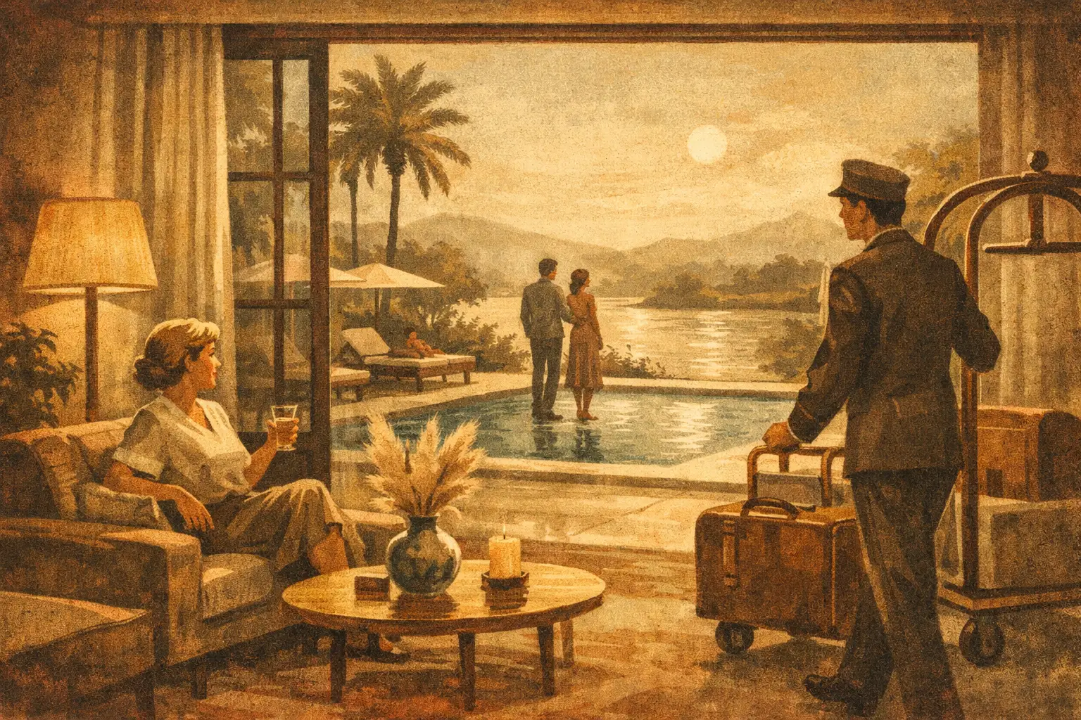
A lobby can be perfectly furnished and still feel unfinished. The missing element is often not another chair or a more dramatic light fixture, but an image with enough presence to gather the room into a single emotional atmosphere. This designer trade project example follows the art-curation process for a small, design-led hotel: a project where artwork was asked to create calm without becoming invisible.
The purpose is not to prescribe one aesthetic formula. A coastal inn, urban residence, wellness studio, and restaurant each carry different practical demands. Yet the questions behind a successful trade art project remain remarkably consistent: What should guests feel? What must the artwork withstand? Where does scale matter most? And how can a collection feel considered rather than merely coordinated?
The project: a hotel shaped by stillness
The imagined project is a 28-room boutique hotel in the Pacific Northwest. Its interiors combine pale oak, hand-finished plaster, charcoal stone, linen upholstery, and soft brass details. The architecture is quiet, but not austere. It is designed for guests who want respite from visual noise while still expecting a memorable sense of place.
The interior designer’s initial request is concise: art that brings depth to the lobby, corridors, and guest rooms without introducing literal regional imagery or predictable nautical motifs. The hotel should feel rooted in its climate through mood rather than illustration – mist, mineral surfaces, shifting water, weathered wood, and open space.
That distinction changes the entire selection process. Instead of searching for pictures that match the sofa, the curator builds a visual language that can live beside the materials and deepen their character. In this case, contemporary abstract works informed by Wabi-Sabi offer the right balance. Their irregular marks, restrained palettes, and subtle fields of texture honor imperfection without turning it into a decorative theme.
A designer trade project example, step by step
Begin with the experience, not the inventory
The first stage is a conversation about movement through the hotel. A guest arrives carrying luggage, pauses at reception, passes through corridors several times, and finally closes the door to a private room. These are not identical viewing conditions. Art in each location has a different role.
The lobby needs a work with a slow, immediate pull. It should register from a distance, hold its own against active circulation, and reward a closer look while someone waits to check in. The corridors need rhythm. Guest rooms need intimacy and visual rest, especially when the furnishings already contain strong natural texture.
For this project, the designer and curator establish three emotional notes: arrival should feel grounded, passage should feel contemplative, and rest should feel spacious. Those words become more useful than a spreadsheet of colors because they guide decisions when several images appear equally attractive on screen.
Build a palette with room for variation
The selected collection centers on smoky indigo, warm ivory, muted rust, soft gray, and near-black. This is not a strict color-matching exercise. If every print repeats the exact tones of the drapery and rugs, the hotel risks looking staged. A good art program should create a measured tension with the interior, offering variation while preserving harmony.
The lobby receives one large abstract composition with a dark lower field and pale, cloudlike upper forms. Its vertical movement echoes the height of the plaster walls, while the indigo establishes a visual anchor near the reception desk. Across from it, a smaller companion work uses a more open composition. Together, the pair creates dialogue without the symmetry of a hotel chain.
In the corridors, six related works are selected from the same artistic world but not as duplicated editions. Some are more gestural; others feel nearly meditative. Their shared palette allows guests to sense continuity as they walk, while the changing compositions prevent the hallway from becoming a gallery of repeats.
Selecting art that serves the space
A trade project asks more of art than an individual purchase does. The work must be beautiful, of course, but it also needs to perform within a set of specifications. At Taygeta Gallery, that can mean considering an original work, a limited collector edition, or a museum-quality Giclée print according to the project’s budget, placement, and desired level of exclusivity.
For the hotel, the lobby receives a framed limited-edition print in a larger format. It has the visual authority required for the space, while allowing the client to invest more substantially in a central public-facing moment. The corridor program uses museum-quality Giclée prints in a consistent edition format. Guest rooms receive smaller framed works, each with an individual composition but a shared tonal sensibility.
This mix is intentional. Spending the same amount on every wall can flatten the experience. A project often benefits from a hierarchy: one or two defining works, a connected sequence for transitional spaces, and quieter pieces that support private rooms.
Scale deserves equal attention. A common mistake is selecting artwork at the size it appears on a laptop screen rather than at the size it will occupy in a room. In the lobby, the focal work is large enough to remain legible from the entrance. In guest rooms, the works are sized to feel generous above a writing desk without competing with the bed or obstructing bedside lighting.
Frame choice also carries meaning. For this project, narrow natural-oak frames soften the darker artwork and speak to the millwork without blending into it. White mats are avoided in the corridors, where their brightness would create a series of small visual interruptions. A float-mounted presentation or a print with a restrained border gives the artwork breathing room while maintaining the hotel’s quiet material palette.
Production details are part of the curatorial decision
A beautiful image can lose its force through careless production. The project specification should confirm final dimensions, orientation, paper or canvas choice, frame finish, glazing, hanging hardware, lead times, delivery sequence, and the precise location for each piece.
For a hospitality setting, glazing is considered carefully. Acrylic may be preferable in areas where safety and weight are concerns, while a higher-reflective surface can be distracting near windows or pendant lights. The answer depends on the sightline. It is worth reviewing a sample in the actual space when possible, especially for works with deep blacks or delicate pale passages.
The designer also creates a placement schedule before shipping. Each artwork is assigned a room or wall code, installation height, and orientation. This modest act of organization protects the concept during installation day, when painters, electricians, housekeeping teams, and delivery crews may all be working at once.
For the corridor series, the works are hung on center at a consistent height, but spacing is adjusted slightly for doorways and architectural breaks. Perfectly equal measurements are not always visually equal. The installer must account for sconces, wall returns, and the way a guest approaches each work from either direction.
Where the project could have gone wrong
The first risk was choosing art that was too neutral. Because the interior already favored soft materials and low contrast, a collection of pale beige prints would have disappeared into the walls. The indigo and charcoal notes give the hotel a necessary center of gravity.
The opposite risk was selecting dramatic art for every location. Strong images need silence around them. The lobby can hold a major visual statement; a guest room often benefits from a less insistent work that allows the visitor to settle. This is where restraint becomes more than a style preference. It is a form of hospitality.
Budget could have pushed the project toward identical prints throughout the property. Repetition is sometimes appropriate, particularly in large-scale developments where consistency is essential. Here, however, the hotel’s independent character depended on variation. The solution was not to abandon the budget, but to reserve the most expansive format for the lobby and use a coordinated print program elsewhere.
The lasting value of a considered art program
When the hotel opens, guests may not know the language of Wabi-Sabi or identify the edition process behind a print. They will still feel the result. The lobby will seem more composed. A long corridor will become a passage with its own pace. A guest room will have an image that remains in the mind after the suitcase is closed.
That is the quiet ambition behind a well-curated trade project. Art should not simply fill a wall or confirm a color palette. It should give the space an inner life – one that guests carry with them, often without realizing why.
Leave a Reply