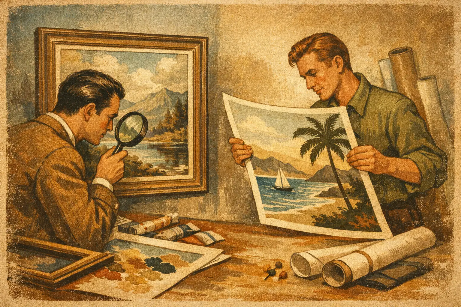
A print can look beautiful at first glance and still feel entirely different once it enters a room. That is the real question behind giclee print vs poster – not simply which one costs more, but which one carries the visual weight, material presence, and longevity your space asks for.
For anyone building a home with intention, styling a hospitality project, or choosing art that should feel curated rather than temporary, the distinction matters. Two prints may share the same image, yet one reads as décor and the other as art. The difference begins in how each piece is made, but it does not end there.
Giclee print vs poster: the basic difference
A poster is typically a mass-produced reproduction printed quickly on thin, inexpensive paper. It is designed for accessibility, speed, and broad distribution. Posters have their place. They can be casual, graphic, fun, and useful for short-term styling or low-commitment decorating.
A giclee print is a fine art inkjet print made with archival pigment inks on high-quality paper or canvas. The term is associated with museum-quality reproduction because the process prioritizes tonal range, color depth, detail, and longevity. A giclee print is not only about the image itself. It is also about the fidelity of the surface, the richness of the blacks, the softness of gradients, and the way the print holds up over time.
If a poster is built for circulation, a giclee is built for presence.
Why materials change the experience
The most immediate difference between these two formats is material quality. Posters are often printed on lightweight coated stock. That surface can appear flat or glossy in a way that reflects light harshly, especially under lamps or large windows. The paper may bend easily, ripple in humidity, or show wear at the edges after handling.
Giclee prints are usually produced on archival cotton rag, textured fine art paper, or premium canvas. These surfaces absorb pigment with more subtlety. Instead of bouncing light back aggressively, they tend to hold color with a softer, deeper finish. This gives the artwork a quieter authority on the wall.
That quality matters even more in minimalist interiors. In a restrained space, every material speaks more clearly. Thin poster paper can feel visually noisy, while a fine art paper with gentle texture adds calm and depth.
Ink quality and color depth
Ink is where much of the visual difference becomes visible. Posters are commonly printed with dye-based or commercial inks intended for volume and efficiency. They can look bright initially, but they often lack the nuanced tonal transitions that make art feel alive.
Giclee printing uses archival pigment inks with a wider color gamut. That means more subtle shadows, smoother gradients, and better retention of delicate details. In abstract work, this can be the difference between a flat field of color and a layered, atmospheric surface. In photographic or digital art, it can preserve edge definition and tonal complexity that a poster process may lose.
This is especially relevant when the artwork depends on mood. If the piece is built around stillness, depth, negative space, or restrained tones, the print method can either honor that intention or flatten it.
Longevity is not a small detail
Many buyers compare giclee print vs poster through price alone. A better comparison is cost over time. Posters are affordable upfront, but they are not generally made to last. Exposure to sunlight, moisture, or ordinary interior conditions can cause fading and discoloration relatively quickly. The paper itself can become brittle or warped.
A properly made giclee print, displayed with reasonable care, is designed for endurance. Archival materials are chosen specifically to resist fading and deterioration. For collectors and design-conscious buyers, this changes the purchase from a temporary visual fix into a lasting part of the interior.
That does not mean everyone needs archival printing for every wall. A poster may be perfectly suitable for a dorm room, a casual office, a trend-driven installation, or a space you expect to redesign soon. But if the artwork is meant to anchor a room, move with you, or hold emotional significance, longevity becomes part of its value.
Surface, texture, and the feeling of art
One of the quiet differences between a poster and a giclee print is texture. Posters usually present the image as a smooth, mechanical reproduction. That can work well for bold graphics, pop references, or images where flatness is part of the appeal.
A giclee print often has a more tactile surface. On cotton rag paper, colors can appear velvety and matte. On textured stock, the image gains a sense of body. On canvas, it can echo some of the physicality associated with painting. This does not make it an original work, but it does bring it closer to the language of fine art.
For spaces shaped by Wabi-Sabi, natural materials, and quiet tonal harmony, this tactile quality can make a considerable difference. Texture softens the digital edge. It allows the print to belong among wood, linen, plaster, and stone rather than sitting on the wall as a purely commercial object.
Framing changes both, but not equally
A poster can certainly look more elevated when framed well. A clean frame, quality matting, and thoughtful placement can improve even an inexpensive print. Good framing adds intention.
Still, framing does not fully erase the underlying material difference. Thin paper and lower-grade inks remain thin paper and lower-grade inks. Under glass, a poster may look neat and finished, but a giclee print usually retains greater visual depth, especially in close viewing.
This matters in rooms where art is meant to be experienced slowly rather than glanced at in passing. In a living room, bedroom, gallery wall, or hospitality setting where guests move near the work, the finer production quality becomes easier to feel.
Does a giclee print have more value?
Value depends on what you want the artwork to do. If your goal is affordable image-based decoration for the short term, a poster can offer good value. It is accessible, easy to replace, and well suited to casual use.
If your goal is to collect with more intention, a giclee print offers a different kind of value. It preserves the artist’s composition with greater fidelity. It carries higher production integrity. It often feels more substantial in the room and more deserving of framing, placement, and long-term care.
There is also a psychological dimension. People tend to live differently with art that feels considered. A museum-quality print invites attention. It slows the eye. It can help a room feel composed rather than merely decorated.
That is why many collectors and designers choose giclee prints for spaces where atmosphere matters. The artwork does not need to shout. It simply needs to hold the room with quiet confidence.
When a poster is the better choice
Not every purchase needs the refinement of a giclee. A poster may be the better decision when budget is the first concern, when the image is playful or trend-based, or when the installation is temporary. For children’s rooms, event styling, student spaces, or fast-changing interiors, posters offer freedom.
There is no need to force permanence where experimentation is the point. Some walls are for testing mood, color, and personal taste. A poster can serve that role beautifully.
The key is honesty about expectations. If you want a piece to feel collectible, endure over time, and contribute to a carefully shaped interior, a poster may eventually feel like a compromise. If you want immediacy and flexibility, it may be exactly enough.
How to choose between a giclee print and a poster
Start with the room. Ask whether the artwork is meant to fill space or define it. A hallway accent, temporary office refresh, or graphic statement piece may not require archival production. A bedroom sanctuary, living room focal point, or design project with layered materiality often does.
Then consider viewing distance. From afar, some posters can look convincing. Up close, the difference in detail, paper weight, and tonal nuance becomes much clearer. If the print will be seen intimately, quality matters more.
Finally, consider your relationship to the piece. Is this an image you enjoy now, or a work you want to live with for years? That question often answers the format question better than any technical specification.
At Taygeta Gallery, this distinction is treated with the seriousness it deserves, because art is never only visual. It shapes atmosphere, memory, and the emotional temperature of a space.
A thoughtful interior does not ask every object to be precious. But it does ask each object to be true to its purpose. If you want something light, immediate, and temporary, a poster may be enough. If you want a print that carries depth, stillness, and lasting presence, a giclee is usually the more meaningful choice.
The right print is the one that continues to feel right after the novelty fades and the room grows quiet.
Leave a Reply