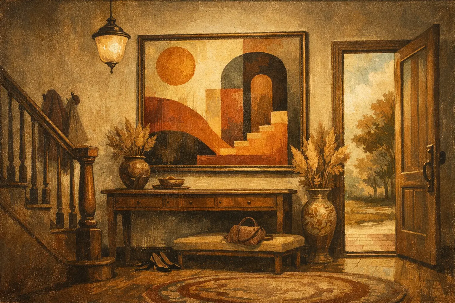
The entryway sets the emotional temperature of a home before a single word is spoken. That is why choosing the best statement art for entryways is less about filling a blank wall and more about shaping arrival itself. A strong piece can quiet visual noise, establish character, and turn a transitional zone into a place with presence.
Unlike a living room, an entryway is experienced in motion. You pass through it, return to it, glimpse it from other rooms, and sometimes share it immediately with guests. The art placed here has a particular task. It must hold attention quickly, yet continue to reward a slower look. It should feel resolved from a distance and intimate up close.
What makes the best statement art for entryways
Statement art is often mistaken for art that is simply large, loud, or expensive. In a well-composed entry, the statement comes from clarity. The work says something definite about the home, whether that feeling is serene, cerebral, mysterious, or warm.
Scale matters first. A piece that is too small tends to look apologetic in an entryway, especially above a console. One work with generous proportions usually has more authority than several scattered pieces competing for attention. If the wall is narrow, a tall vertical format can be more effective than a wide composition because it echoes the architecture of the doorway and draws the eye upward.
Equally important is emotional tone. The best entryway art does not always announce itself with drama. In some homes, a restrained abstract with subtle texture creates a stronger first impression than a saturated figurative work. It depends on the atmosphere you want to create at the threshold. If the rest of the interior is quiet and minimal, a bold piece may provide necessary tension. If the home already carries rich materials, pattern, or sculptural furniture, art with composure can bring balance.
Choosing art by the feeling you want guests to meet
A refined entryway begins with mood, not trend. This is where many art decisions become generic. People ask what style works best when the better question is what kind of arrival they want to stage.
For calm, choose atmospheric abstraction
Layered abstract works are especially compelling in entryways because they register immediately as shape, rhythm, and color, then reveal complexity over time. Soft neutrals, mineral grays, smoke blues, earthy umbers, and black-on-ivory compositions create an atmosphere of stillness without becoming inert. These works suit modern homes, Japandi interiors, and spaces influenced by Wabi-Sabi principles, where emptiness is not absence but room to breathe.
If your entry receives limited natural light, a pale composition with tonal depth can brighten the area without feeling decorative in a superficial way. Museum-quality Giclée prints can be particularly effective here, preserving subtle gradations and painterly textures that cheaper reproductions tend to flatten.
For energy, choose bold graphic work
Some entryways benefit from sharper contrast. Black and white compositions, expressive line work, or contemporary pieces with one strong accent color can create a confident opening note. This approach works well in urban apartments, modern townhomes, and interiors where architecture is clean and spare.
The trade-off is that high-contrast work can dominate a compact space if everything around it is equally assertive. In a narrow foyer, it often helps to keep surrounding objects simple so the art remains the focal point rather than part of a crowded visual argument.
For intimacy, choose figurative or symbolic pieces
Not every statement needs to be abstract. A figurative work, a poetic portrait, or a symbolic composition can make an entryway feel deeply personal. These are strong choices for collectors who want the threshold of the home to suggest story and sensibility rather than pure formal design.
Still, intimacy in an entryway requires discipline. A deeply narrative work can be beautiful, but if it demands too much interpretation in a passage space, it may feel better suited to a room where people linger. The most successful figurative entryway art tends to have a clear silhouette, distinct mood, and enough visual simplicity to read in a moment.
Size, placement, and the architecture around the work
Great art can underperform when scale and placement are mishandled. This is especially true in entryways, where walls are often interrupted by doors, mirrors, benches, sconces, or coat storage.
If you are hanging a piece above a console, keep the relationship intentional. The artwork should feel anchored by the furniture, not adrift above it. In most cases, the artwork should occupy a substantial portion of the console’s width. Too narrow, and it looks incidental. Too wide, and the composition loses grace.
Height matters just as much. Entryway art is often hung too high because people treat the wall as a void to be filled. The visual center of the work should sit where it can be encountered naturally upon entering. If the piece is above furniture, leave enough breathing room to separate the two, but not so much that they seem unrelated.
In double-height foyers, the instinct is often to go monumental. Sometimes that is right. But scale should answer architecture, not ego. A very large work can be extraordinary in a tall entry, yet it should still possess enough internal structure to hold the wall. A huge canvas with weak composition can feel emptier than a smaller, stronger piece.
Framing and material presence
The frame is not a technical afterthought. It changes how the work speaks.
For minimal and contemplative interiors, a thin natural wood frame, black gallery frame, or float-mounted presentation often preserves the artwork’s silence. Ornate frames can be beautiful, but they rarely suit entryways that seek modern restraint. In more traditional homes, however, a frame with historical character can create a rich threshold if the art itself has enough gravity to support it.
Material quality is especially visible in an entryway because people encounter it at close range. Poor print quality, reflective glazing, and flimsy framing can undermine even a strong image. Collectors and design-minded buyers are usually sensitive to this immediately. A well-produced print with archival depth and precise framing reads differently. It feels intentional, not improvised.
Color strategy for a stronger first impression
Color in the entryway should relate to the home beyond it. That does not mean matching every finish. It means creating a conversation between the artwork and the atmosphere of the interior.
If the adjacent rooms are layered with warm wood, travertine, linen, and soft plaster tones, art with earthen pigments or muted tonal shifts will feel integrated. If the home opens into cooler stone, steel, or monochrome furnishings, a crisper palette may create continuity. Sometimes the most elegant move is a single contrast note, such as rust against pale walls or indigo against oak.
This is where the best statement art for entryways distinguishes itself from generic wall decor. It does not merely add color. It edits and concentrates the visual language of the home.
When one piece is better than a gallery wall
Gallery walls have their place, but entryways are rarely where they are most convincing. They can work in generous hall-style entrances or homes with an eclectic, collected spirit. Yet in many contemporary entryways, they create fragmentation where calm is needed.
One compelling work tends to produce a stronger emotional effect. It establishes hierarchy, gives the eye a place to rest, and makes the space feel curated rather than assembled. If you do prefer multiple works, keep the logic clear. Shared framing, tonal cohesion, or a disciplined grid helps the arrangement read as one statement instead of several competing introductions.
Art that feels elevated, not intimidating
A statement piece should not make a home feel staged beyond comfort. The most memorable entryway art carries conviction without stiffness. That balance matters for first-time buyers as much as seasoned collectors.
This is also where thoughtful curation matters. A gallery such as Taygeta Gallery understands that contemporary art in the home has to do more than impress. It has to live well with architecture, light, and daily ritual. The right work can feel museum-quality in presence while still remaining accessible in format, whether original, limited edition, or fine art print.
The strongest entryway art leaves a trace. Not because it shouted, but because it gave form to a feeling the home already held in quiet. Choose the piece that changes the space the moment you walk in, then keeps changing as you learn how to look at it.
Leave a Reply