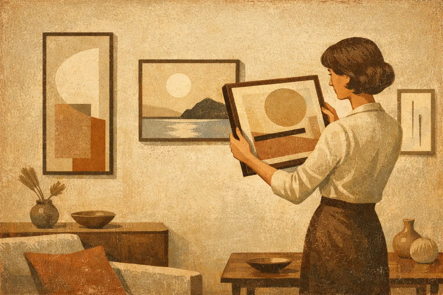
Minimal rooms are rarely empty. They are edited. Every line, material, and object is asked to justify its place. That is why art for minimalist interiors carries unusual weight – a single work can steady a room, disturb it slightly, or give it the emotional temperature it was missing.
The common mistake is to treat minimalist space as a place for safe art. Neutral art. Quiet art that asks for nothing. But minimalism is not the absence of feeling. At its best, it heightens perception. In a room with fewer visual interruptions, the right artwork becomes more than decoration. It becomes atmosphere, rhythm, and point of view.
What minimalist rooms really need from art
A minimalist interior does not necessarily need a small artwork, a pale palette, or a blank composition. It needs clarity. The piece should feel deliberate within the architecture of the room, whether that means echoing its calm or introducing a measured tension.
This is where many spaces fall flat. The furniture is disciplined, the palette is restrained, the styling is careful – yet the walls remain generic. Mass-produced prints often mimic minimalism through emptiness alone, but they rarely create presence. A room can be spare and still feel emotionally thin.
Art changes that when it contributes something the room itself cannot. Sometimes that is softness. Sometimes it is depth. Sometimes it is a trace of imperfection that saves the interior from becoming too polished to feel human.
Minimalist spaces respond especially well to work with a strong internal logic. Abstract compositions, contemplative photography, monochrome studies, gestural mark-making, and pieces shaped by Zen or Wabi-Sabi sensibilities often sit naturally here. Not because they are fashionable, but because they leave room for silence while still holding attention.
How to choose art for minimalist interiors
The best starting point is not color. It is mood. Ask what the room lacks when you stand in it quietly. Does it need gravity? Warmth? Stillness? A subtle rupture? Once you know the emotional role the artwork must play, style becomes easier to judge.
Scale matters more in minimalism than in layered interiors. A work that is too small can feel apologetic, especially above a sofa, console, or bed. In a reduced room, undersized art often amplifies emptiness rather than resolving it. One large piece, or a well-proportioned pair, usually feels stronger than a scattered arrangement of minor accents.
Negative space also deserves attention. In art for minimalist interiors, the unpainted field, the margin around the image, and the breathing room around the frame are part of the composition. This is one reason restrained works often feel so powerful in pared-back rooms. They do not crowd the eye. They guide it.
Texture is another quiet force. A flat interior benefits from surfaces that catch light differently throughout the day: layered pigment, fiber-rich paper, subtle grain, soft tonal variation, or painterly edges that resist mechanical perfection. Even a digital work can feel tactile when the image has depth and the print quality preserves tonal nuance.
There is also the question of contrast. Some minimalist rooms benefit from harmony, where art extends the palette and mood already present. Others need interruption. A dark ink-based abstract in a pale room can create a grounded center. A weathered, earth-toned composition can soften sharp contemporary architecture. It depends on whether the space feels unfinished or over-controlled.
Minimal does not mean monochrome
One of the most limiting ideas about minimal interiors is that they require black, white, beige, and very little else. In reality, many of the most compelling minimalist spaces rely on nuanced color. Clay, smoke, umber, indigo, moss, ash, and muted rust can all read as minimal when used with restraint.
Art is often the safest and most intelligent place to introduce those notes. A room built from stone, plaster, oak, and linen may not need bright saturation, but it can be transformed by a work carrying diluted mineral blue or a veil of burnt sienna. The effect is not loud. It is atmospheric.
This is where culturally informed curation matters. Works influenced by Eastern aesthetics often understand restraint in a richer way than trend-driven minimal decor. They allow asymmetry, weathering, emptiness, and tonal complexity to coexist. Instead of reducing a room to sterility, they create calm with soul.
Framing, placement, and the luxury of restraint
Presentation can elevate or weaken even an excellent piece. In minimalist interiors, frames should support the work without draining it of character. Thin black, natural oak, soft walnut, or restrained gallery-white frames are common for a reason – they create definition without visual noise. Still, the right choice depends on the work itself. A rough, earthy composition may need warmth from wood. A crisp monochrome piece may sharpen beautifully in black.
Matting can add a sense of pause. It gives the image room to exist, which is often valuable in interiors where proportion and breathability matter. But not every work benefits from extra distance. Some abstracts feel more immediate and architectural without a mat, especially at larger scale.
Placement should be confident. Art hung too high tends to feel detached from the room. Art placed with intention creates conversation with furniture, light, and circulation. In minimalist homes, where there are fewer competing elements, these relationships become more visible.
There is also real elegance in not overfilling every wall. A single work in the right place can define an entire zone. That restraint is not a lack of ambition. It is a form of trust.
Original works, prints, and what feels worth buying
For many buyers, the question is less about taste than confidence. What is worth investing in? What will feel distinctive rather than generic after the novelty fades?
Original art offers singularity – the direct presence of the artist’s hand, surface variation, and the quiet knowledge that no one else has that exact object. For collectors and for rooms where one piece must carry significant emotional and visual weight, that matters.
Museum-quality Giclée prints and framed digital editions can also be deeply compelling, especially when the source work is strong and the production is handled with seriousness. In minimalist interiors, print quality is not a minor detail. Sparse rooms expose everything. Muddy blacks, weak paper, poor framing, or flattened color are easier to notice when the environment is otherwise refined.
That is why curation matters as much as format. A carefully selected limited edition or museum-quality print can feel far more elevated than an original chosen without conviction. Taygeta Gallery approaches this space thoughtfully, presenting works that read not as filler for blank walls but as meaningful visual anchors for contemporary living.
Common mistakes with art for minimalist interiors
The first is choosing art that is too literal. Minimal rooms often benefit from work that leaves interpretive space. A piece does not need to explain itself immediately to belong. In fact, some ambiguity can deepen the room over time.
The second is matching too closely. When the artwork repeats the exact tones and shapes already present, the room can become mute. Cohesion is useful, but sameness is not. Even serene spaces need a pulse.
The third is mistaking trend language for timelessness. Much of what circulates as minimalist wall art is simply thin visual content with generous white borders. It may photograph neatly, but it rarely rewards long attention. Better to choose a work with inner tension, material richness, or philosophical depth.
Finally, many people rush the decision because a room feels unfinished. Yet minimalist interiors reveal impatience. It is often better to wait for the right piece than to install something merely adequate.
When the room leads, and when the art leads
Sometimes the interior sets the terms. A hospitality project, a calm bedroom, or a tightly resolved architectural space may call for art that supports an existing atmosphere with quiet discipline. In those cases, harmony is the achievement.
At other times, the artwork should lead. A spare living room may need one commanding piece to establish identity. A neutral apartment may only become memorable when art introduces depth, philosophy, or friction. Neither approach is more correct. The question is where meaning currently lives in the room – and where it is still missing.
The finest minimalist spaces understand that restraint is not reduction for its own sake. It is a way of making what remains more alive. Choose art with that same spirit, and the room will not simply look composed. It will feel considered, inhabited, and quietly complete.
Leave a Reply