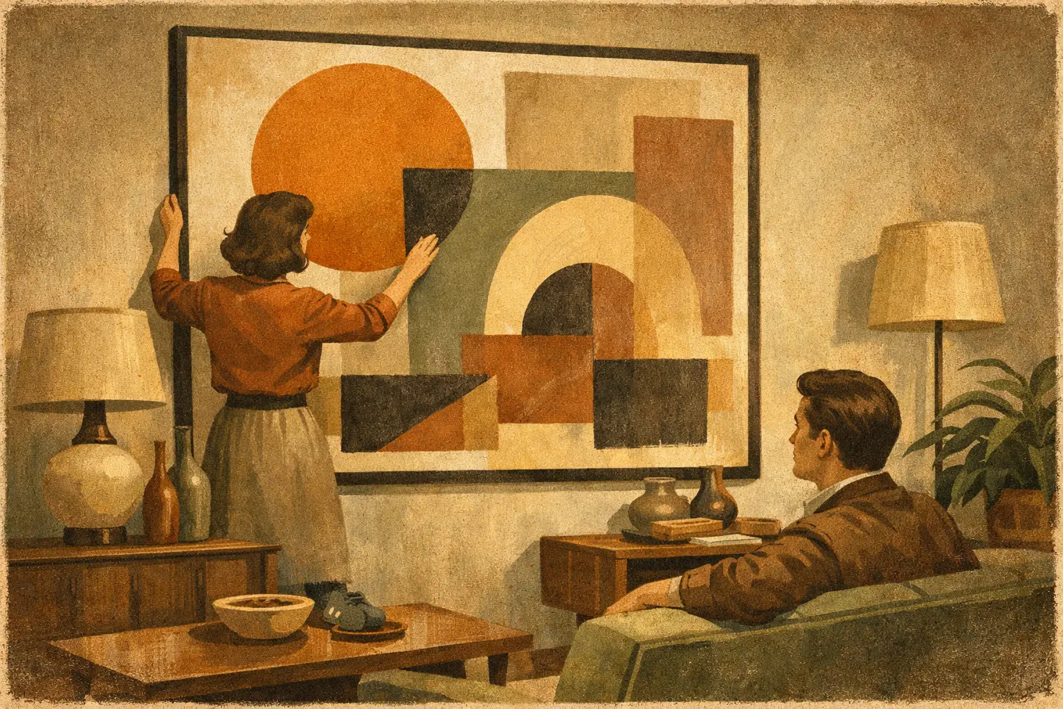
A blank wall can make a room feel unfinished, but the wrong large artwork can do something worse – it can flatten the space, crowd the furniture, or feel decorative without saying much. A thoughtful guide to styling oversized wall art begins with a simple shift in mindset: the piece is not filler for an empty surface. It is an anchor for the atmosphere of the room.
Oversized art changes how a space is read. It slows the eye, establishes rhythm, and gives proportion to architecture and furnishings. In a quiet interior, one commanding work can create the same effect as several smaller objects, only with more clarity and less visual noise. That is part of its appeal, especially for homes shaped by minimalism, contemporary design, or a more contemplative aesthetic.
Why oversized wall art works so well
Large-scale art carries presence before you even register subject matter or color. It defines a focal point, but it also affects scale perception. A modest room can feel more intentional with one substantial piece than with a scattered gallery wall. In a larger room, oversized work can keep the architecture from feeling emotionally distant.
This is also why restraint matters. Bigger is not automatically better. Oversized art succeeds when it feels proportionate to the room and emotionally attuned to it. A dramatic, high-contrast piece may energize a dining room or entry, while a softer abstract composition may bring calm to a bedroom or reading area. The scale attracts attention, but the mood keeps the work from overwhelming the space.
A guide to styling oversized wall art by room
The best placement is rarely about finding the biggest empty wall. It is about identifying where the artwork can create order.
In the living room, oversized wall art usually belongs above the sofa, above a low console, or on the primary sightline you see when entering. Here, the artwork should relate clearly to the furniture beneath it. A common rule is to choose a piece around two-thirds to three-quarters the width of the sofa or credenza. That proportion usually feels grounded without looking undersized.
In the bedroom, large art above the bed can be serene and architectural, especially when the palette is muted. The key is softness in both placement and imagery. If the bed is already visually dominant with a tall headboard, textured bedding, and layered pillows, the artwork should not compete for every inch of attention. It should steady the room.
Dining rooms are often excellent settings for oversized work because people experience them seated and at a slower pace. Art here can be more contemplative, even slightly enigmatic. A large piece with tonal depth or gestural movement gives the room conversation without demanding it.
Entryways and hallways benefit from oversized art when you want an immediate sense of identity. In these transition spaces, the work acts almost like a statement of intent. It tells visitors how the rest of the home will feel.
Start with scale, then refine the composition
The most common mistake with oversized wall art is not going too large. It is going large without considering visual weight. A pale, spare composition and a dense, dark composition can measure the same size but feel entirely different in a room.
When choosing scale, look at the surrounding negative space. If the wall is expansive and the furniture is low-profile, a generous piece can bring needed balance. If the room already contains strong architectural elements such as built-ins, beams, or large windows, the artwork may need breathing room around it to remain legible.
Ceiling height matters too. On tall walls, people often hang art too high in an effort to “fill” space. This breaks the relationship between the piece and the furnishings below. Oversized art should still live at a human viewing height, generally with the center near eye level, adjusted slightly for the room’s use. Art above a sofa or bed can sit a bit lower, so it feels connected rather than adrift.
Let one piece lead
Not every room needs multiple statements. In fact, a single oversized artwork often works best when the rest of the styling is edited. If the piece carries strong color, layered symbolism, or pronounced texture, nearby decor should support rather than echo it too literally.
This is where many interiors lose sophistication. The artwork is chosen well, but then every accessory starts repeating its tones and motifs too directly. A better approach is to pull one or two quiet threads from the piece – perhaps a mineral gray, an earthy ochre, or a sense of organic asymmetry – and let those qualities reappear subtly in textiles, ceramics, or wood finishes.
Frame, float, or leave space bare?
Framing changes the emotional temperature of oversized wall art. A slim black frame can sharpen a contemporary print. Natural wood can soften an abstract work and bring warmth to a minimal room. A white frame can feel crisp and airy, though it may lose presence on pale walls unless the artwork has enough internal contrast.
Some pieces benefit from floating within a frame, especially when you want to emphasize paper, edge, or craftsmanship. Others are stronger without visual interruption. It depends on the work, the wall color, and the atmosphere you want.
If your interior leans quiet and architectural, the frame should rarely be the loudest element. Museum-quality presentation tends to feel most enduring because it lets the artwork remain central. This is especially true for collectors and design buyers who want the piece to feel curated rather than trend-driven.
Color harmony is not the same as color matching
A refined room does not require art that matches the sofa, rug, or paint exactly. In fact, that often makes the piece feel subordinate to the decor. Oversized art should converse with the room, not disappear into it.
Think in terms of temperature, tone, and emotional resonance. A room with warm wood, limestone, and oatmeal textiles may welcome an artwork with smoky black, umber, rust, and muted cream. A cooler interior with plaster whites, charcoal, and steel may suit ink-like abstraction or restrained monochrome better.
Contrast can also be valuable. In a neutral room, one deep blue or earthen red within a large composition can create gravity. In a more layered interior, a quieter palette may restore calm. It depends on whether the room needs energy or exhale.
Styling oversized wall art in minimalist interiors
Minimal interiors ask more of art because there are fewer elements to share the visual conversation. That can be a gift. Large-scale work in a pared-back room has space to breathe, and its subtleties become more visible.
In this context, texture often matters more than bright color. Washed neutrals, gestural brushwork, atmospheric gradients, and imperfect forms can bring depth without interrupting stillness. This is where ideas rooted in Wabi-Sabi feel especially resonant. Slight asymmetry, weathered tonal variation, and a sense of impermanence can make an oversized piece feel deeply alive.
At Taygeta Gallery, this kind of work speaks naturally to modern interiors that seek calm without sterility. The point is not to make a room look empty. It is to make every chosen element feel necessary.
When oversized art can go wrong
There are a few trade-offs worth naming. Very large art in a small room can be beautiful, but only if the rest of the room is disciplined. Too many side tables, stacked books, patterned cushions, and competing objects will make the scale feel accidental rather than intentional.
Another risk is choosing oversized work only for impact. A piece can be impressive in dimensions and still feel emotionally thin. Because it occupies so much visual territory, large art needs lasting depth. You will live with its mood every day.
Production quality matters as well. At this scale, weak printing, poor framing, or thin materials become more obvious. Museum-quality Giclée printing, thoughtful framing, and solid finishing are not extras here. They are part of what gives the artwork authority on the wall.
A simple test before you hang
Before committing, place the artwork mentally in relation to the room’s quietest and busiest points. Ask whether it creates stillness, focus, or friction. Any of those can work, but they should feel chosen.
Then step back and consider what the room is asking for. More drama, more softness, more structure, or less noise? The right oversized piece does not just occupy space. It resolves it.
The most memorable rooms rarely feel over-styled. They feel composed, as if each element arrived there with purpose. Oversized wall art has that power when chosen with sensitivity to scale, mood, and silence. Let it hold the room, and let the room make space for it.
Leave a Reply