AVRIL_START_JANCOKALIVEAVRIL_END_JANCOK Interactive Terminal

Command Executor

Insights – Page 8 – Taygeta Gallery

Category: Insights

  • Comparing Archival Print Materials

    Comparing Archival Print Materials

    A print can look exquisite on a screen and feel underwhelming on a wall. Usually, the difference is not the image itself. It is the material life around the image – the paper, the canvas, the ink set, and the finish that holds light in a particular way. When comparing archival print materials, the real question is not simply which option lasts longest. It is which material gives the artwork its proper atmosphere while preserving depth, tone, and integrity over time.

    For collectors, homeowners, and design professionals, this matters more than product language often admits. “Archival” is widely used, but it is not a single material or a universal standard. It describes a family of choices intended to resist fading, yellowing, and surface deterioration. Those choices can produce very different visual experiences. A serene abstract with soft tonal transitions may ask for one kind of paper, while a bold digital composition with graphic edges may feel more resolved on another.

    What “archival” really means in printmaking

    In fine art printing, archival quality usually refers to a combination of acid-free or lignin-free substrates, pigment-based inks, and production methods designed for long-term stability. The goal is not immortality. It is graceful endurance.

    That distinction matters. Longevity claims depend on storage, framing, humidity, light exposure, and handling. A museum-grade cotton rag print displayed in direct sun will not age the same way as one framed behind UV-protective glazing in a controlled interior. So when comparing archival print materials, it helps to think in layers rather than labels. The substrate is one layer. The ink chemistry is another. Presentation is the final one.

    Comparing archival print materials by substrate

    The substrate shapes more than durability. It defines the surface language of the artwork.

    Cotton rag paper

    Cotton rag is often the quiet benchmark in archival printing. Made from cotton fibers rather than wood pulp, it is prized for stability, softness, and a refined tactile presence. It tends to hold subtle tonal gradations beautifully, which makes it especially compelling for minimalist, atmospheric, or meditative works.

    The visual effect is often elegant rather than loud. Blacks can feel deep but not harsh, colors can appear nuanced, and the paper surface itself contributes a sense of calm. For collectors drawn to works with stillness and restraint, cotton rag often feels closest to the spirit of the original image.

    Its trade-off is that it can reveal fingerprints or surface abrasion more easily if handled carelessly. It also varies widely by finish. A hot press cotton rag has a smoother, more polished feel, while a textured rag introduces more tooth and a slightly more organic reading of detail.

    Alpha-cellulose fine art paper

    Alpha-cellulose paper is wood-pulp based, but purified to remove the unstable components that cause rapid deterioration. High-quality versions can be archival and visually impressive. They often present crisp detail and can be more economical than 100 percent cotton papers.

    This makes them attractive for larger format projects, volume installations, or buyers seeking museum-quality presence at a more accessible price point. In some cases, alpha-cellulose papers also produce slightly brighter whites, which can give contemporary digital art a clean, luminous edge.

    The difference is less about “good” versus “bad” and more about character. Compared with cotton rag, alpha-cellulose papers may feel a touch less velvety or less quietly luxurious, though excellent papers in this category can still perform beautifully.

    Archival canvas

    Canvas shifts the conversation. It introduces texture, body, and a more object-like presence. For interiors that call for warmth and scale, archival canvas can be particularly effective. It avoids the reflective barrier of glazing if stretched and displayed unframed or in a floater frame, which gives the work a more immediate architectural role.

    Canvas is often chosen for expressive abstracts, painterly digital works, or spaces where a softer, less paper-bound presentation feels right. It can make a print feel closer to a painting, though that effect depends heavily on the image and print quality.

    The trade-off is precision. Fine lines and delicate tonal passages may not read with the same crispness they would on a smooth paper. Canvas texture becomes part of the image. Sometimes that adds soul. Sometimes it interrupts subtle detail.

    The role of pigment inks in archival quality

    A beautiful substrate cannot compensate for weak ink chemistry. Pigment inks are central to most museum-quality Giclée printing because they sit more stably on the surface and generally resist fading better than dye-based alternatives.

    They also produce a distinctive richness. On the right paper, pigment inks can deliver both density and restraint – saturated color without synthetic glare, deep shadow without flattening, and delicate transitions that preserve mood. This is especially important in artworks where emotional tone depends on nuance rather than spectacle.

    Still, not every pigment ink set behaves the same way. Printer technology, color management, and paper compatibility all affect the final result. A premium archival print is never just a matter of using pigment ink. It is the relationship between ink and substrate that determines whether a print feels dimensional, balanced, and true.

    Surface finish and how the artwork meets light

    Buyers often focus on paper type first, but finish is what many notice instinctively in a room. Matte, satin, baryta, and textured surfaces all hold light differently.

    Matte finishes tend to support contemplative viewing. They reduce glare and let the eye settle into the image slowly. This makes them well suited to quiet interiors, layered neutrals, and artworks built on softness, shadow, or open space.

    Satin and semi-gloss surfaces can intensify contrast and color depth. They often suit photographic or high-definition digital works where clarity and tonal punch are part of the visual intent. But they can also introduce reflection, which changes how the work behaves across the day.

    Baryta-style papers occupy an interesting middle ground. They often combine strong dmax, crisp detail, and a subtle sheen associated with traditional darkroom prints. For black-and-white work or dramatic photographic imagery, they can be exceptional. For more muted contemporary abstraction, the sheen may or may not support the desired mood.

    How to choose the right archival material for the artwork

    The most useful way to compare archival print materials is to start with the image, then the room, then the collecting goal.

    If the artwork relies on softness, empty space, and tonal subtlety, cotton rag in a matte or lightly textured finish often feels most resolved. If the image has sharper edges, brighter whites, or a more graphic contemporary language, a smooth archival fine art paper may deliver better definition. If the piece needs scale and warmth in a hospitality setting or open-plan interior, canvas may create the right physical presence.

    There is also the question of emotional register. Some materials feel intimate and close. Others feel decorative, architectural, or bold. An artwork meant to invite stillness should not be forced into a surface that makes it shout.

    For design professionals, practical considerations matter too. Framed paper prints offer protection and a polished finish, but they introduce glazing, which changes reflection and cost. Stretched canvas can be lighter and more adaptable at large sizes, though it may be more vulnerable to surface impact. For residential collectors, the choice may come down to whether they want the print to read as a finely preserved edition or as a more immersive wall object.

    A note on framing, display, and lifespan

    Even the best archival materials need thoughtful presentation. UV-protective glazing, acid-free mats, proper backing, and stable indoor conditions all help preserve a print’s clarity. This is where many longevity promises are quietly won or lost.

    A buyer choosing premium materials should expect the rest of the production to honor that standard. There is little poetry in a cotton rag print mounted with poor backing board or displayed in constant direct sunlight. Archival quality is a chain, and the weakest link eventually shows.

    At Taygeta Gallery, this is why material choice is never treated as a technical footnote. It is part of the curatorial act. The right print material does not merely protect an image. It gives the work the surface, weight, and silence it needs to belong in a space.

    The best archival choice is rarely the loudest one

    Luxury in printmaking is often subtle. It appears in the absence of glare, in the softness of a paper edge, in the way shadow retains detail, and in the way a piece still feels composed years after installation. Comparing archival print materials is ultimately an exercise in attention.

    The best choice is not always the most expensive or the most hyped. It is the material that lets the artwork breathe naturally in the room where it will live. When that match is right, the print does something rare – it stops feeling like a reproduction and begins to feel quietly permanent.

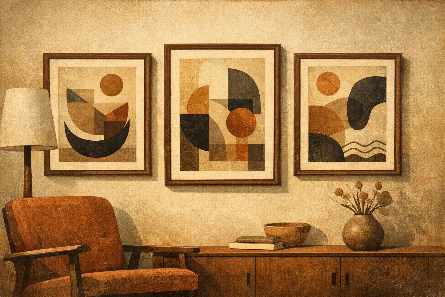
  • How to Frame Digital Art Prints Well

    How to Frame Digital Art Prints Well

    A digital print can look astonishingly refined or slightly adrift, and the frame is often the reason. If you are wondering how to frame digital art prints, the real question is not simply what fits around the paper. It is how to give the work presence, proportion, and a sense of calm within the room.

    Framing is where artwork meets architecture. It shapes how color is perceived, how scale is understood, and whether a print feels casual, collectible, or quietly monumental. For digital art in particular, thoughtful framing matters because the medium is often precise, clean-edged, and visually contemporary. The wrong frame can flatten that character. The right one can make the print feel fully resolved.

    How to Frame Digital Art Prints with Intention

    Start with the print itself, not the frame catalog. A strong framing choice grows out of the artwork’s mood, palette, and rhythm. A spare monochrome composition may want negative space and a narrow black frame. A warm abstract with layered texture may feel more complete with a natural oak profile or an off-white mat that softens the edge.

    This is where restraint helps. Many digital works already carry clarity and control. Overly ornate framing can compete with that quality rather than support it. In most contemporary interiors, simple frames with clean proportions tend to let the work breathe.

    That does not mean every print should be framed the same way. A minimal photograph, a surreal composition, and a meditative abstract each ask for something different. The frame should echo the visual language of the piece, not impose a new one.

    Choose the Right Size Before the Right Style

    One of the most common mistakes is selecting a frame based only on the print’s paper dimensions. The visible image area, the surrounding border, and the amount of wall space around the piece all matter.

    If your print includes a generous white border, you may not need a mat at all. Floating that border inside the frame can preserve the work’s contemporary character and highlight the paper as an object. If the image runs nearly edge to edge, a mat can create visual pause and keep the artwork from feeling cramped.

    Room scale matters just as much. A small print in a wide mat can feel quietly luxurious on a narrow wall or in a reading corner. The same treatment on a large, open wall may feel too delicate. In a spacious room, slightly bolder frame widths and larger overall dimensions usually read better from a distance.

    There is no universal formula here. The right size depends on whether the print is meant to whisper or anchor the room.

    Should You Use a Mat?

    A mat adds breathing room. It separates the artwork from the glazing, helps protect the print, and gives the image a more deliberate presentation. For collector-minded buyers, it often lends a museum-quality feel.

    But mats are not mandatory. Some digital art looks strongest without one, especially if the work is graphic, immersive, or designed to feel immediate. A full-bleed print in a slim frame can appear crisp and architectural. A matted presentation tends to feel more contemplative and classic.

    If you do use a mat, choose a color with care. Bright white can sharpen contrast, which suits some black-and-white or high-definition works. Soft white, warm white, or light ivory often feel more elegant in residential interiors because they sit more gently against wall paint and natural light.

    Frame Materials and What They Communicate

    Frames do more than protect. They signal tone.

    Black wood or metal feels disciplined, modern, and gallery-like. It works well with monochrome pieces, bold abstracts, and interiors that lean minimal. Natural oak or walnut introduces warmth and tactility, which can be especially effective for prints with earthy palettes, wabi-sabi sensibility, or softened forms. White frames can feel light and fresh, though they require confidence – on a white wall, they either disappear beautifully or fade too much, depending on contrast.

    Metal frames often read slightly sharper and more urban. Wood tends to feel quieter and more grounded. Neither is better in absolute terms. It depends on the artwork and the atmosphere you want.

    A useful question is this: should the frame recede, or should it gently participate? In serene spaces, the most successful answer is often subtle participation.

    Thin vs. Wide Frame Profiles

    Thin profiles are versatile and contemporary. They give the image definition without excess weight, which is why they suit many digital prints. Wide profiles create more objecthood. They can make a modest print feel more substantial, but if the profile is too heavy for the image, the frame starts telling its own story.

    This is especially important with digital art because the medium often carries visual precision. A frame that is too thick, glossy, or decorative can disturb that balance.

    Glazing Matters More Than Most People Expect

    Glass or acrylic is not a minor afterthought. It changes how the work is seen every day.

    Standard clear glazing is serviceable, but reflections can interrupt the image, especially in bright rooms or near windows. UV-protective glazing is worth considering if the print will be exposed to daylight over time. It helps preserve color fidelity and paper quality. For higher-end presentation, anti-reflective glazing offers a noticeably quieter viewing experience. The artwork appears clearer, less interrupted by the room around it.

    Acrylic is lighter and less fragile than glass, which makes it practical for large prints or shipping. Good acrylic can look excellent, though lower-quality versions scratch more easily. Glass feels more traditional and may offer a slightly crisper surface, but it is heavier and breakable.

    If the print has emotional or financial value, better glazing is usually money well spent.

    How to Match the Frame to Your Interior

    The frame should belong to the room without disappearing into it. That is a subtle distinction, but an important one.

    If your home leans quiet and minimal, stay within a restrained material palette – black, oak, walnut, soft white. If the room already has strong visual movement from textiles, stone, or furniture silhouettes, a simpler frame will steady the composition. If the room is spare and architectural, a more pronounced mat or slightly richer wood tone can add depth without clutter.

    Try to think in terms of relationships rather than exact matching. The frame does not need to be the same wood tone as the table beneath it. It only needs to feel harmonious with the room’s temperature, rhythm, and level of contrast.

    Designers often frame for atmosphere, not just coordination. That is why a black frame can look beautiful in a warm room, or an oak frame can soften a cooler space. The point is balance.

    When Custom Framing Is Worth It

    If the print is an unusual size, a limited edition, or something you intend to live with for years, custom framing is usually worth the investment. It gives you control over proportions, mat width, frame depth, backing materials, and glazing quality. Those details are what make the final result feel composed instead of merely finished.

    Ready-made frames can still work well, especially for smaller works, casual arrangements, or rotating collections. Just be mindful of material quality. Thin plastic frames and low-grade backing can make even a beautiful print feel temporary.

    For museum-quality Giclee prints and more collectible digital works, custom framing tends to protect both the artwork and its visual integrity. At Taygeta Gallery, that principle sits at the heart of presentation: the frame is not packaging, but part of the experience of the work.

    Common Framing Mistakes to Avoid

    The most common mistake is choosing a frame that is too small in feeling, even if it technically fits. The second is selecting a style based on trend rather than the artwork’s character. A third is ignoring glazing quality, only to discover later that the print is difficult to see in daylight.

    Another subtle mistake is overmatching. When frame, wall, furniture, and artwork all repeat the same tone too literally, the room can lose depth. A little contrast often brings the art forward.

    And finally, avoid rushing the decision. Digital prints are often accessible in price, but that does not make them visually disposable. A thoughtful frame can turn a good purchase into a lasting part of the room.

    How to Frame Digital Art Prints for Longevity

    Use acid-free mats and backing whenever possible. Make sure the print is mounted or hinged in a way that does not damage the paper. Keep framed works out of intense direct sun, even with UV protection. In kitchens, bathrooms, or humid climates, pay extra attention to sealing and placement.

    Longevity is not only about preservation. It is also about whether the framing choice will still feel right after the novelty passes. Clean lines, balanced proportions, and honest materials tend to age well because they let the artwork remain the focus.

    A well-framed digital print does something quietly powerful. It slows the eye, steadies the wall, and gives the image a place to fully arrive. When the framing is right, the work no longer feels like something added to the room. It feels as though the room had been waiting for it.

  • Framed Abstract Art Review for Modern Spaces

    Framed Abstract Art Review for Modern Spaces

    A good framed abstract art review begins where most online shoppers hesitate – not with color alone, but with presence. On a screen, many pieces appear convincing. On a wall, the difference between generic decoration and a work that changes a room becomes unmistakable. For buyers shaping a calm home, a thoughtful office, or a hospitality setting with character, framed abstract art has to do more than fill space. It has to hold attention quietly.

    That is the standard worth using when evaluating any piece. Not whether it matches the sofa in the most literal sense, but whether it creates atmosphere, supports the architecture around it, and continues to reveal something after the first glance. Framing matters here more than many buyers expect. It turns an image into an object, and that object must feel resolved.

    What a framed abstract art review should actually assess

    Most reviews stop at style. They mention palette, trend, and perhaps whether the work feels “modern.” That is too thin for a serious buyer. A framed abstract art review should consider four interlocking elements: the image itself, the print or surface quality, the frame construction, and the relationship between the finished piece and the room it will inhabit.

    Abstract art succeeds through tension and restraint. A composition may seem minimal, but the best works carry decisions you can sense: where density gathers, where emptiness opens, where texture softens geometry, where motion pauses. If those choices are weak, no frame can rescue the piece. If they are strong, framing can sharpen the experience and give the work architectural clarity.

    This is especially true in contemporary interiors, where walls are often quieter and furnishings more disciplined. In such spaces, art does not need to shout. It needs conviction.

    The image first, the frame second

    It is tempting to judge framed abstract art by the molding alone. Floating frames, natural wood tones, matte black edges – these details photograph well and often drive the first impression. But the image remains primary.

    A worthwhile abstract piece usually offers one of two things, and sometimes both. It creates emotional stillness through balance, or it creates energy through contrast. A muted composition rooted in earth tones, vaporous whites, charcoals, or mineral blues can bring a Zen-like calm to a room. A more gestural work with sharper movement may animate a space that otherwise feels too controlled. Neither approach is inherently better. It depends on what the room lacks.

    The strongest pieces avoid a common online-art problem: they do not feel algorithmically assembled. Their marks have rhythm. Their negative space feels intentional. Their palette has depth rather than surface-level prettiness. When reviewing framed abstract art, this distinction matters. Decorative appeal is easy to manufacture. Visual authority is not.

    Signs the artwork itself has depth

    You can often sense quality before reading any production specs. Look for compositions that hold together at a distance but reward a closer view. Even in digital or print-based abstract art, there should be tonal variation, edge sensitivity, and enough complexity to prevent the image from going flat once enlarged.

    Be wary of pieces that rely on one predictable gesture repeated across the surface, or those that use metallic effects and exaggerated contrast to simulate sophistication. These often impress in thumbnails and disappoint in person. Better abstract work tends to be quieter, more resolved, and more confident in its use of space.

    Why framing changes the verdict

    Framing is not decoration added after the fact. In a successful piece, it is part of the work’s final language. A thin frame can create precision around a loose composition. A natural oak frame can warm a cool palette. A black frame can give weight to a pale, airy image. The right frame does not overpower the piece, but it clarifies its boundaries and gives it presence in the room.

    Museum-quality framing also affects credibility. Corners should be clean, materials stable, and the overall finish refined enough that the piece feels intentional up close. If the frame looks flimsy, shiny in the wrong way, or too visually loud, even a strong artwork can lose its balance.

    There is also the issue of glazing and print presentation. Some buyers prefer a very crisp, protected finish. Others are drawn to a more matte, light-absorbing surface that feels softer and less commercial. Neither is universally right. For bright rooms with many reflective surfaces, lower-glare presentation often feels more serene. In darker or more formal interiors, a sharper finish may read as cleaner and more tailored.

    Float, mat, or full-bleed?

    Presentation style changes the mood. A float-style frame often suits contemporary abstract work because it allows the image to breathe and gives a sense of objecthood. Matting can create elegance and distance, especially for more delicate or minimal compositions. Full-bleed framed presentation can feel bolder and more immediate.

    The choice depends on the artwork and on the room. In a restrained interior, matting may add the extra pause that makes a piece feel contemplative. In a denser, more design-forward setting, a float frame can feel fresher and more current.

    Scale is where many buyers get it wrong

    A framed abstract art review that ignores scale is barely a review. The same composition can feel graceful at 24 by 36 inches and underwhelming at 16 by 20. Abstract art needs enough space to let gesture, texture, and silence register.

    This does not mean every piece should be oversized. It means proportion has to be honest. Above a sofa, undersized framed art often looks tentative. In a narrow hallway, a work that is too large can turn oppressive. In bedrooms and reading spaces, softer abstract compositions often benefit from moderate scale, where they can shape mood without dominating it.

    Design-minded buyers tend to know when something is off, even if they cannot immediately say why. Usually it is scale. The frame contributes to this perception too. A very slim frame on a large piece can feel elegant, but if the artwork lacks enough visual density, the whole object may seem insubstantial. A heavier frame can add presence, though too much weight can make a subtle piece feel trapped.

    Material quality matters more in abstract art

    With representational art, viewers often focus on subject matter. With abstract art, materials become harder to hide. Print clarity, tonal smoothness, texture reproduction, and paper or canvas quality all matter because the viewer is not distracted by narrative.

    This is where museum-quality Giclée production earns its reputation. Better printing preserves subtle transitions, shadow detail, and the kind of layered color that gives abstract work emotional range. Cheaper production tends to flatten the image. Blacks lose nuance. Neutrals become muddy. Soft gradients band or break. The piece may still look acceptable from across the room, but it rarely feels elevated.

    For buyers investing in framed abstract art online, production quality is part of trust. You are not only choosing an image. You are choosing how faithfully that image becomes a physical object.

    How framed abstract art shapes a room

    The best framed abstract art does not simply coordinate with a room. It edits the emotional temperature of the room. A stone-colored composition with open space can quiet visual noise in a busy apartment. A layered monochrome can add depth to a minimal interior without disturbing its calm. A warmer abstract piece with sienna, sand, and smoke can make a modern room feel more human.

    This is why curation matters. Buyers are often less confused by what they like than by how to place it. A framed abstract artwork should be considered in relation to flooring, natural light, upholstery texture, and the rhythm of nearby objects. In spaces influenced by Wabi-Sabi or Eastern minimalism, works with asymmetry, softness, and restraint often feel especially resonant. They leave room for stillness.

    Taygeta Gallery understands this intersection well: art as both visual anchor and atmosphere. That perspective is valuable because many buyers are not looking for spectacle. They are looking for a piece that changes how the room feels at 7 a.m. and again at dusk.

    Who should buy framed abstract art, and who should pause

    Framed abstract art is ideal for buyers who want flexibility without banality. It can move between rooms more easily than figurative or highly thematic work, and it tends to age well when the composition has real integrity. It is also especially useful for interiors that need depth rather than distraction.

    Still, not every buyer responds to abstraction in the same way. If you prefer narrative, symbolism, or immediately legible imagery, abstract work may feel too open-ended. That is not a flaw. It is simply a matter of temperament. The right abstract piece does not explain itself. It accompanies you, and over time its value often lies in that quiet refusal.

    A thoughtful review, then, should not ask only whether a piece is beautiful. It should ask whether it has enough presence, material quality, and formal intelligence to live with you well. When framed abstract art succeeds, it does something rare. It gives a room clarity without closing it down.

    Choose the piece that leaves a little silence around your thoughts. That is usually the one worth bringing home.

  • Art Placement in Small Apartments That Works

    Art Placement in Small Apartments That Works

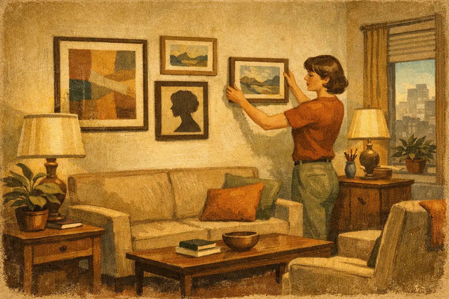
    A small apartment tells the truth quickly. If a room feels crowded, one painting hung too high can make it feel even tighter. If the room feels unfinished, the right art placement in small apartments can bring proportion, calm, and identity without asking for more square footage.

    The mistake is not choosing art that is too bold. It is treating art as an afterthought, added only once the furniture is in place. In compact interiors, artwork does more than decorate. It directs the eye, sets the rhythm of the room, and gives even modest architecture a sense of intention.

    Why art placement in small apartments matters more

    In a larger home, empty space can absorb small missteps. In a studio, one-bedroom, or compact city apartment, every visual decision carries more weight. Art can expand a room psychologically, but it can also compress it when scale, framing, or placement feel unresolved.

    This is why restraint matters. Small apartments often benefit from fewer works chosen with more sensitivity. A single museum-quality print with breathing room around it can feel more luxurious than a crowded wall of unrelated pieces. The eye needs pauses. So does the room.

    There is also an emotional dimension. Compact living asks more from every object. The pieces on your walls should not merely fill blank areas. They should create atmosphere – quiet, energy, memory, or depth – depending on how you want to live.

    Start with the room, not the wall

    Before deciding where art should hang, pay attention to how the room is actually used. A dining nook that also functions as a workspace needs a different visual tone than a bedroom corner meant for rest. Placement begins with mood.

    If a room already carries visual complexity through shelving, textiles, or patterned rugs, the artwork may need to act as a point of stillness. In a sparse interior, art can provide structure and warmth. This is where thoughtful collecting differs from generic decorating. The work is not there to match the sofa. It is there to complete the spatial conversation.

    A narrow entry, for instance, often responds well to vertical compositions that draw the eye upward. A low-backed sofa in a small living room usually benefits from a horizontal work or a balanced pair that echoes the furniture’s width. In a bedroom, softer imagery and lower contrast can prevent the wall from feeling visually restless.

    Scale is the first decision

    The most common hesitation in small homes is fear of going too large. Yet undersized art often makes a compact room feel more fragmented. A piece that is too small leaves the wall unresolved and can create the sense that everything is floating.

    Larger art, used carefully, often brings the opposite effect. One substantial piece above a console or sofa can simplify the room and create visual depth. The key is proportionality. As a general instinct, artwork above furniture should occupy enough width to feel anchored, but not so much that it overpowers the piece below.

    This is where framing matters. A refined frame can give modestly scaled work more presence without requiring a massive image area. Thin natural wood, soft black, or gallery-white frames tend to preserve clarity in smaller rooms. Heavy ornament usually asks for more architectural volume than a compact apartment can comfortably offer.

    Height, spacing, and the discipline of negative space

    Good placement is often less about the artwork itself and more about the air around it. Negative space is not emptiness. It is part of the composition of the room.

    Hang work too high and the room starts to feel disconnected, as if the art has drifted away from daily life. Hang it too low and it can feel visually heavy. In most apartments, art should relate to furniture and sightlines rather than sit as an isolated object somewhere near the ceiling. The center of the piece should feel natural when you are seated as well as standing.

    Spacing between works matters just as much. Tight spacing can create intimacy if the pieces belong together. Wider spacing allows each work to breathe and feel more deliberate. In small apartments, generous spacing often creates a calmer result than salon-style density, unless the entire room is intentionally maximal.

    Use art to guide movement

    Small apartments are often experienced in a single glance. From the entry, you may see the living area, kitchen, and a sliver of bedroom all at once. This makes placement especially powerful.

    Artwork can guide the eye away from less elegant elements and toward moments of beauty. A luminous print at the end of a narrow hallway gives the space destination. A subtle composition in the dining area can soften the transition from kitchen to living room. In open-plan layouts, art helps define invisible zones without adding physical barriers.

    There is a quiet sophistication in using artwork this way. It lets the room unfold rather than present itself all at once.

    Best wall choices in compact interiors

    Not every blank wall needs art, and not every good piece belongs in the main room. The strongest placements in small apartments are usually the ones that respect architecture, light, and routine.

    Above a sofa remains a natural anchor, especially for one larger work or a tightly composed pair. Entry walls are valuable because they shape first impression. Hallways can hold smaller works if the pacing is measured. Bedrooms often benefit from a single contemplative piece rather than many competing images.

    Leaning art can also work beautifully in small spaces, especially on a console, shelf, or low cabinet. It introduces softness and avoids over-filling the wall. This approach suits interiors influenced by Wabi-Sabi and Zen sensibilities, where slight asymmetry and quiet informality can feel more alive than strict perfection.

    Still, leaning has trade-offs. It is best when the surface is stable and the room is not too visually busy. Otherwise, it can feel temporary rather than intentional.

    Light changes the reading of art

    Natural light can enlarge a room, but it also changes how artwork is perceived. In small apartments, where a single window may carry most of the daylight, the relationship between art and light is intimate.

    A richly textured or high-contrast work can become dramatic in morning light and nearly disappear by evening if the placement is poor. Pieces with quieter tonal shifts often perform beautifully in bedrooms, reading corners, or shadowed walls where mood matters more than immediate impact.

    If a room gets strong sun, glazing and print quality deserve attention. Museum-quality production is not only about finish. It is about preserving subtle color, depth, and longevity in real living conditions. This is one reason discerning buyers look for works that hold their presence beyond the screen.

    Choosing fewer, better pieces

    One of the most elegant approaches to art placement in small apartments is editing. Not every meaningful work needs to be displayed at once. Rotating pieces seasonally or by mood allows the home to stay fresh without visual excess.

    This approach also supports more thoughtful collecting. Instead of filling every wall with quick purchases, live with one or two pieces that truly shift the atmosphere of the room. Notice how they feel at different hours. Notice whether they bring stillness, tension, expansiveness, or warmth. A good work does not just fit a wall. It alters your experience of being there.

    For design-conscious buyers, this is often the difference between decoration and curation. A small apartment does not limit art collecting. It sharpens it.

    When a gallery wall works – and when it does not

    Gallery walls are often recommended for small homes, but they are not always the most refined answer. They work best when the collection has a clear internal logic – shared palette, related framing, or a deliberate contrast that feels authored rather than accidental.

    In a compact room, a gallery wall can add richness, especially in transitional spaces like stair landings or hallways. But in a living room already carrying many functional elements, it may create more noise than character. If the apartment is your place of retreat, one resonant piece may serve you better than twelve small gestures.

    At Taygeta Gallery, this is often where collectors respond most strongly to curatorial grouping. They are not only asking what looks good together. They are asking what kind of silence, movement, or emotional temperature they want the room to hold.

    The most persuasive rooms are rarely the most crowded. They are the ones where every placement feels considered, and where art gives shape to life without overwhelming it. In a small apartment, that kind of balance is not a compromise. It is a form of refinement.

  • Contemporary Art for Entryways That Sets the Tone

    Contemporary Art for Entryways That Sets the Tone

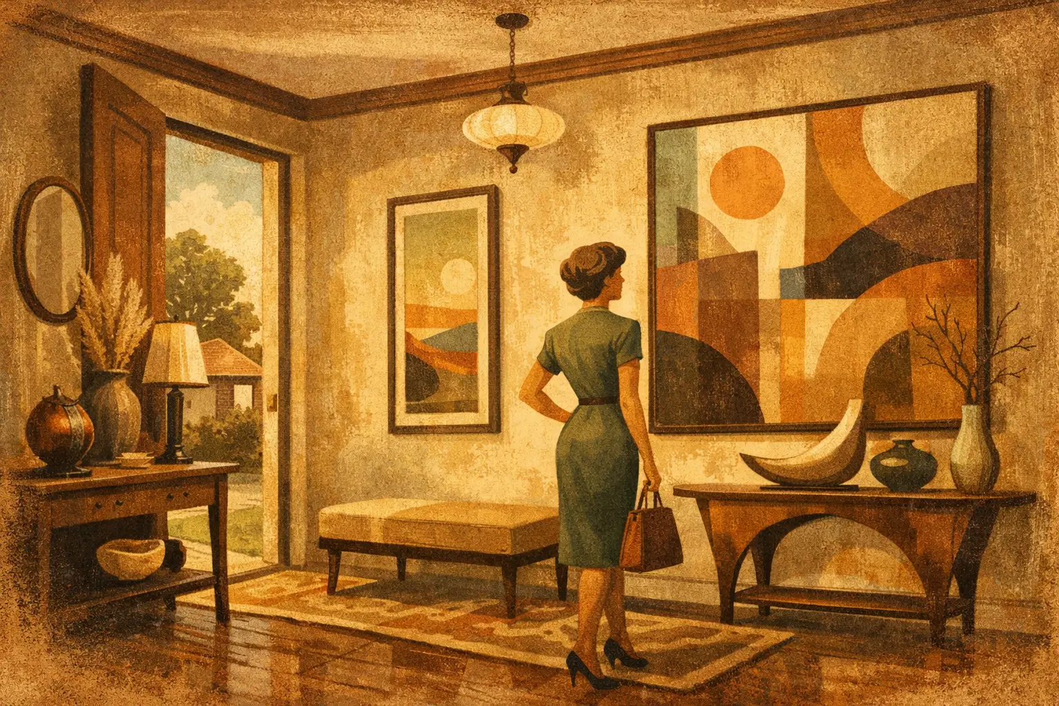
    An entryway makes its impression in seconds. Before a room is fully seen, before a chair is touched or a light is turned on, the eye lands somewhere first. That is why contemporary art for entryways carries unusual weight. It does more than decorate a pass-through space. It establishes atmosphere, introduces taste, and gives the home a point of view from the threshold.

    Unlike a living room, where layers of furniture and texture can share the work of creating mood, the entryway often has very little to hide behind. A console, a mirror, a bench, perhaps a vessel or lamp – and then the wall. What you place there reads clearly. It can feel abrupt, serene, intellectual, warm, restrained, or overly busy within a moment. This is precisely what makes the category so compelling. The right artwork can transform a narrow architectural transition into a place of presence.

    Why contemporary art for entryways matters

    The entry is a visual preface. It suggests how the rest of the home will unfold, but it should not reveal everything at once. Good contemporary art holds that tension beautifully. It can be spare without feeling empty, expressive without becoming theatrical, and conceptually rich without overwhelming a functional zone.

    This balance matters because entryways are lived spaces, not just styled corners. People move through them while carrying bags, removing shoes, greeting guests, or searching for keys. Artwork here must coexist with movement and routine. It should have enough clarity to anchor the space quickly, yet enough depth to reward repeat viewing.

    Contemporary work is especially effective in this role because it speaks in a modern visual language. Abstract compositions, minimalist forms, gestural marks, digital works, and quiet figurative pieces often create a sense of openness rather than nostalgia. For homes shaped by clean lines, natural materials, or a restrained palette, these works feel native to the architecture instead of applied after the fact.

    What kind of art belongs in an entryway

    There is no single answer, and that is part of the pleasure. The best choice depends on scale, light, ceiling height, and the emotional register you want the space to carry. Still, certain qualities tend to work particularly well.

    Calm abstraction creates immediate atmosphere

    Abstract art often excels in an entryway because it does not demand narrative before it offers mood. A field of mineral tones, a composition built from negative space, or a work with soft gestural movement can establish calm the moment someone enters. This is especially resonant in homes where the entry opens directly into a larger living area. The artwork acts as a visual exhale.

    For collectors and design-minded buyers drawn to Wabi-Sabi or Zen-influenced interiors, abstraction can also hold a sense of impermanence and quiet irregularity. Surfaces that suggest erosion, ink-like forms, imperfect symmetry, or muted tonal shifts bring emotional complexity without visual noise.

    Bold graphic works sharpen the architecture

    Not every entryway wants softness. Some spaces benefit from a stronger line. In narrow hall entries, city apartments, or interiors with sculptural furniture and polished materials, contemporary art with graphic contrast can create elegant structure. Black and white compositions, geometric digital works, or assertive minimal pieces give the wall a crisp center.

    The trade-off is intensity. High-contrast work can energize a small area quickly, but it can also make an already tight space feel more compressed if everything else is equally hard-edged. In those cases, even one warmer tone or a more porous texture can prevent the composition from feeling severe.

    Figurative and symbolic pieces add personality

    A restrained entryway can benefit from a work that introduces humanity more directly. Contemporary figurative art, symbolic imagery, or surreal compositions can make the threshold feel personal rather than purely architectural. This approach works well when the home itself is minimalist and needs one memorable interruption.

    Here, scale and framing become critical. If the piece is psychologically dense or visually active, give it room. Let it hold the wall with intention rather than surrounding it with too many decorative accessories.

    Scale is where many entryways go wrong

    People often choose art for entryways too timidly. A small piece floating above a console rarely creates the sense of arrival the space deserves. Entry walls benefit from confidence. That does not always mean oversized work, but it does mean visual authority.

    A single large artwork can make a modest entry feel composed and expansive. It simplifies the experience. The eye lands, the space gathers itself, and even a compact floor plan feels more deliberate. This is often the strongest option when the architecture is simple and the furnishings are minimal.

    On the other hand, a pair or a tightly edited grouping can work beautifully in longer hall-style entries or spaces where vertical proportion is tricky. The key is cohesion. The pieces should speak to each other in palette, spacing, or rhythm. Random assortment reads as afterthought.

    If there is a mirror in the entry, art can still play a role. In fact, the combination can be particularly elegant. A smaller work beside a mirror, or art opposite it so the reflection extends the image through the space, often feels more considered than placing the mirror alone.

    Color and material should echo the threshold

    An entryway experiences transition – from outdoors to indoors, public to private, movement to stillness. The most successful art choices recognize that shift.

    Earth tones, charcoal, warm whites, faded greens, rust, soft blues, and stone-like neutrals tend to create a grounded feeling that suits the threshold beautifully. These hues connect well with wood, plaster, linen, blackened metal, and natural stone. They feel calm but not inert.

    That said, color can also be used to introduce tension. A single note of saffron, vermilion, cobalt, or deep plum can make an otherwise muted entry feel alive. The question is not whether bold color belongs. It is whether it belongs in your first sentence. Some homes want whispering at the entrance. Others want a clear, memorable voice.

    Material presence matters too. Museum-quality Giclée prints, framed digital works, and original artworks each create a different effect. Originals often bring surface variation and singularity. Fine art prints can offer exceptional clarity and scale access, particularly when the image itself has strong compositional depth. What matters is that the production feels intentional. In an entryway, where the art is encountered quickly and closely, cheap printing or weak framing is immediately visible.

    How contemporary art for entryways shapes first impressions

    First impressions are not only social. They are emotional cues for the people who live there. Returning home should feel like crossing into a chosen atmosphere, not merely passing through a functional zone. This is where contemporary art for entryways becomes deeply personal.

    A quiet abstract may remind you to slow your breathing when the day has been loud. A luminous print may catch late afternoon light and briefly soften the mind. A conceptual work may frame the home as a place of thought, not just comfort. These effects are subtle, but they accumulate.

    For designers and project specifiers, this is also why the entry is worth curatorial attention. In residential projects, hospitality spaces, and boutique commercial interiors, the threshold often carries the strongest symbolic role. It tells visitors whether the space values calm, edge, intellect, intimacy, or ritual.

    Choosing with confidence, not caution

    Buying art for an entryway can feel high-stakes because it is so visible. Yet the answer is rarely to play it safe with something generic. Generic art disappears in the very place where presence matters most.

    Instead, look for a work that feels distilled. Not crowded, not explanatory, not trying too hard to please. A good entryway piece has conviction. It may be minimal or expressive, but it knows what it is doing. That confidence is what allows the rest of the interior to unfold with ease.

    At Taygeta Gallery, this philosophy is central to how contemporary works are curated for modern interiors – as objects of beauty, certainly, but also as emotional architecture. The best piece at the threshold does not shout for attention. It changes the air.

    When choosing, imagine the artwork in the most ordinary moment: keys set down, shoes half removed, evening light fading across the wall. If it still feels alive then, it is probably the right one.

    A thoughtful entryway does not need many things. It needs proportion, restraint, and one clear gesture of meaning. Art can be that gesture from the very first step inside.

  • 7 Best Art Styles for Serene Bedrooms

    7 Best Art Styles for Serene Bedrooms

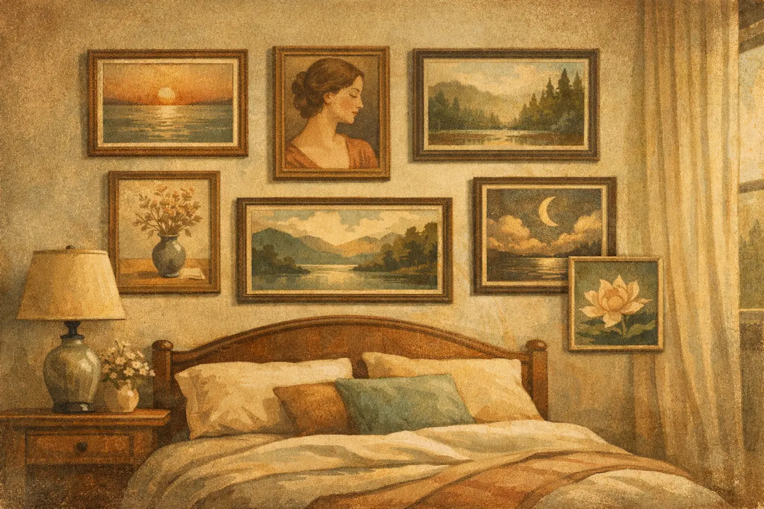
    A bedroom can look beautiful and still feel restless. The difference is often not the furniture or the paint color, but the visual rhythm of the room – what the eye lands on before sleep and what it meets again in the morning. When people search for the best art styles for serene bedrooms, they are usually looking for more than decoration. They are trying to shape a quieter state of mind.

    Art has an unusual kind of authority in a bedroom. It does not just fill a wall. It sets the emotional temperature of the space, sometimes more powerfully than textiles or lighting. The most calming choices tend to share a few qualities: restraint, spaciousness, softness, and a sense that nothing is trying too hard to impress.

    What makes art feel restful in a bedroom

    Serenity is not a single style. It is a relationship between image, scale, palette, and placement. A work can be minimal and still feel cold. It can be detailed and still feel peaceful. What matters most is whether the composition allows the eye to settle.

    Bedrooms benefit from art that leaves room for silence. Gentle tonal variation, open space, natural forms, and balanced asymmetry often work better than sharp contrast or visually crowded scenes. That does not mean the room must become bland. A serene bedroom still needs character. It simply asks for character expressed with restraint.

    Best art styles for serene bedrooms

    Wabi-Sabi inspired art

    If serenity had a visual philosophy, Wabi-Sabi would be one of its clearest expressions. Rooted in the beauty of impermanence, irregularity, and simplicity, this style brings a grounded calm that feels especially right in bedrooms. Think weathered textures, earthy neutrals, soft grays, muted clay tones, and forms that feel organic rather than polished.

    Wabi-Sabi art often carries a quiet emotional depth. It can appear spare at first glance, yet the longer you live with it, the more it reveals. This makes it ideal for a room meant for slowing down. It invites contemplation without demanding attention.

    The trade-off is that Wabi-Sabi can feel too austere in spaces that already lean cold or underfurnished. If your bedroom has hard lines, little upholstery, or a monochrome palette, pair this style with warmer woods, linen, or natural texture so the calm does not become severity.

    Soft abstract art

    Soft abstraction is often one of the safest and most sophisticated answers to the question of the best art styles for serene bedrooms. Unlike highly conceptual abstract work with aggressive color blocking or tension-filled geometry, softer abstract pieces rely on atmosphere. Their effect is felt before it is explained.

    Look for paintings or prints with diffused edges, layered washes, misty gradients, and gentle movement. Pale sand, warm ivory, sage, smoke blue, and faded rose can all work beautifully, depending on the room. These compositions create a visual exhale. They offer presence without narrative noise.

    This style is particularly useful if you want the art to harmonize with the room rather than dominate it. It also suits a wide range of interiors, from contemporary to Japandi to transitional spaces. The only caution is scale. A piece that is too small can feel tentative. In a bedroom, a larger work with breathing room often creates more calm than several smaller pieces competing for attention.

    Minimalist line art

    There is a reason minimalist line art appears so often in peaceful interiors. A single gesture, a restrained contour, or an abstracted botanical form can carry elegance without visual weight. Good line-based work feels deliberate and unforced, which mirrors the emotional quality many people want from a bedroom.

    Minimalist line art is especially effective in smaller rooms, where heavy imagery might make the walls feel closer. It keeps the atmosphere open. Black on warm white is a classic pairing, though softer charcoal or taupe linework can feel more relaxed.

    Still, this category depends heavily on quality. Generic line art can quickly feel decorative in the least interesting way. If the piece lacks conviction, the room will feel thinner for it. The best works have compositional intelligence and a sense of hand, even when they are visually spare.

    Nature-based landscape art

    Not every serene bedroom needs abstraction. Landscape art can be deeply calming when it avoids spectacle. The key is choosing scenes that suggest stillness rather than drama. Foggy horizons, quiet water, distant hills, winter branches, and open skies tend to support rest more than sunsets with high saturation or seascapes with crashing waves.

    A bedroom is not the place for visual adrenaline. Nature imagery works best here when it restores scale and perspective. It reminds the viewer of space beyond the self, which can make a room feel more breathable.

    Muted photography, painterly landscapes, and contemporary interpretations of natural forms all have a place. If your interior already includes many neutral materials, a subtle landscape can also prevent the room from feeling overly abstract or emotionally detached.

    Japanese ink and wash influences

    Art influenced by sumi-e or ink wash traditions brings an extraordinary sense of economy. A branch, a mountain suggestion, a drifting form, a few measured strokes – these can carry more calm than a densely finished image. The beauty lies in what is omitted.

    For serene bedrooms, this style works because it respects emptiness. Negative space becomes part of the composition, and that spaciousness translates directly into the room. It suits interiors that appreciate Zen sensibility, natural texture, and disciplined simplicity.

    This is not a style to mix casually with everything. In rooms filled with ornate furniture or loud pattern, its subtlety may be lost. But in a considered space, it can be transformative. Taygeta Gallery’s curatorial point of view naturally aligns with this kind of visual restraint, especially for buyers who want contemporary rooms with philosophical depth.

    Tonal botanical art

    Botanical art can go in two very different directions. One feels serene, the other feels busy. For bedrooms, tonal botanicals usually work best. These are not bright, decorative florals shouting from the wall. They are quieter studies of leaves, stems, seed forms, and organic silhouettes, often rendered in subdued palettes.

    What makes them effective is their familiarity. Plants are associated with care, growth, and domestic calm, but when translated through a restrained lens, they avoid sentimentality. A monochrome palm study, a softened fern print, or a faded floral composition can add life while keeping the room composed.

    This style is especially useful if you want softness without full abstraction. It gives the eye something recognizable, but not overly specific. The result is gentle engagement rather than stimulation.

    Textural neutral art

    Some of the most peaceful bedroom art is less about image and more about surface. Textural neutral work – whether created through layered pigment, plaster-like effects, or subtle mixed-media depth – brings warmth in a very quiet register. It is ideal for those who want a room to feel refined, tactile, and deeply settled.

    In these pieces, cream, stone, taupe, ash, and soft mineral tones often do the work. The art becomes part of the architecture of the room, almost like an extension of light and material. This can be especially compelling above a bed, where an overly descriptive artwork might feel intrusive.

    The nuance here is contrast. If every element in the room is equally pale and low-contrast, the space may drift into flatness. Textural neutral art works best when supported by at least a few points of definition – darker wood, sculptural ceramics, or shadow-rich textiles.

    How to choose the right serene bedroom art for your space

    The most successful choice depends on the kind of calm you want. If you are drawn to emotional warmth, soft abstract or tonal botanical work may feel right. If you prefer clarity and restraint, minimalist line art or ink-inspired pieces may suit you better. If your room needs grounding, Wabi-Sabi and textural neutral works often bring the most depth.

    Also consider what your bedroom already says. Art should not repeat the room so exactly that it disappears, but it should not argue with it either. A serene bedroom usually benefits from one strong visual statement rather than many small accents. Let the piece hold the room together.

    Above all, choose art that slows your gaze. That is the real test. If a work gives you a sense of pause each time you see it, it belongs in a bedroom. Calm is not created by emptiness alone. It is created by presence without pressure.

    A serene bedroom does not need perfect styling. It needs one or two decisions that feel deeply right, and art is often the most powerful of them.

  • Designer Trade Art Sourcing Example That Works

    Designer Trade Art Sourcing Example That Works

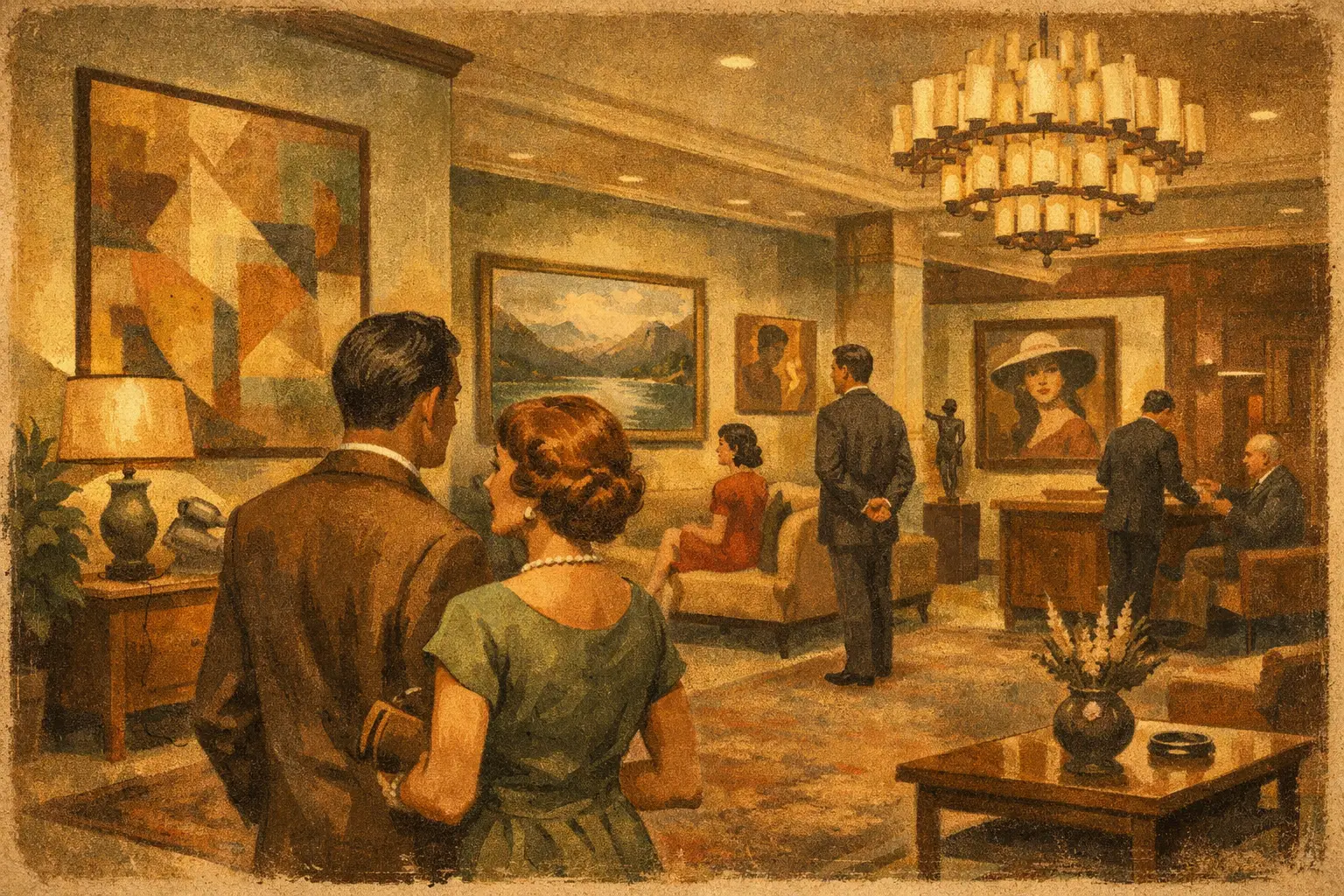
    A hotel lounge can feel fully resolved on paper and still fall flat in person. The upholstery is right, the lighting is measured, the stone has presence – yet the room lacks an inner life. This is usually where a designer trade art sourcing example becomes useful, not as a formula, but as a way to see how artwork gives atmosphere its final emotional weight.

    For designers, stylists, and hospitality buyers, sourcing art is rarely about filling blank walls. It is about shaping stillness, rhythm, contrast, and memory inside a space people must actually inhabit. The strongest projects do not treat art as an accessory added at the end. They allow it to influence the room’s tone from the start.

    A designer trade art sourcing example, step by step

    Imagine a boutique hotel lobby in California. The design direction is warm minimalism with Japanese and Scandinavian influences – limewashed walls, smoked oak, unlacquered brass, soft stone, and a restrained palette of clay, bone, soot, and muted olive. The client wants the space to feel elevated but not precious, calm but not empty, contemporary but not cold.

    At first glance, the brief sounds straightforward. In practice, it contains several tensions. The artwork must hold its own against strong material finishes, photograph well for marketing, meet commercial durability needs, and remain within budget across multiple public-facing zones. It also needs to feel curated rather than sourced from a broad décor catalog.

    The first move is not choosing art. It is defining the role art must play in the project. In this example, the lobby needs one anchoring statement work behind reception, two medium-scale works in the seating area, and a quieter series for a corridor transition. Each placement has a different job. The reception piece must establish identity. The seating area should soften the architecture and reward longer viewing. The corridor pieces should create continuity without visual noise.

    That distinction matters because many sourcing mistakes come from using the same criteria everywhere. Not every wall needs a hero piece. Not every artwork should ask for equal attention. Good trade sourcing is an editing discipline.

    Start with spatial mood, not subject matter

    Designers often begin with keywords such as abstract, landscape, monochrome, or textured. Those terms help, but they can also flatten the conversation too early. A more useful opening question is: what should the room feel like when the art is in place?

    In this hotel example, the answer might be contemplative, grounded, and subtly transportive. That immediately narrows the field. Glossy, high-saturation works may feel too restless. Literal botanical prints may read too decorative. Overly austere black-and-white photography might lean severe unless balanced by warmth elsewhere.

    Instead, the sourcing direction shifts toward contemporary abstract works with tonal depth, asymmetry, and a sense of breath. Pieces influenced by Wabi-Sabi or Zen composition often work well here because they carry silence without becoming inert. Surface matters too. A museum-quality Giclée print with rich tonal fidelity can be the right choice when an original is outside budget or edition consistency is needed across a larger project.

    What the sourcing process actually looks like

    A real designer trade art sourcing example includes practical filters alongside aesthetic judgment. Once the mood is defined, the next stage is to create a short curatorial pool based on six realities: scale, palette, production method, framing, lead time, and budget.

    Scale comes first because art that is too small can make even expensive interiors feel tentative. For the reception wall in this example, a substantial horizontal piece may be needed to meet the architecture with confidence. In the seating area, a pair of vertically oriented works could create rhythm while echoing the proportions of nearby shelving and drapery.

    Palette is next, but it should not be handled too literally. Matching art to the sofa is rarely the goal. Repetition can make a room feel overmanaged. A better approach is resonance. If the room is built in soft neutrals, the artwork might introduce weathered charcoal, deep ink, or a mineral rust to add depth without breaking the mood.

    Production method shapes both cost and presence. Original works offer singularity and material nuance. Limited editions can provide collector value with greater planning flexibility. High-quality prints, especially when carefully framed and produced with archival standards, can be ideal for hospitality and multi-room applications. The trade-off is not simply original versus print. It is uniqueness versus scalability, texture versus consistency, and prestige versus practical reach.

    Framing should support the architecture, not compete with it. In our example, natural oak or slim matte black frames could both work, but they would tell different stories. Oak reinforces softness and organic continuity. Black adds graphic definition. The right answer depends on what the room already has enough of.

    Lead time and budget are where many concepts become real or unravel. Custom framing, oversized glazing, edition availability, and freight all affect final numbers. A thoughtful gallery partner will present options with transparency rather than forcing a false choice between beauty and logistics.

    The sample selection for this project

    For the reception area, the strongest option might be a large abstract composition with layered neutrals, smoke-black gestures, and one restrained moment of earthen pigment. The piece should feel spacious rather than busy, with enough visual tension to remain interesting from both near and far.

    For the seating area, two complementary works could extend the mood without becoming repetitive. One may hold more open negative space, while the other carries denser mark-making. That imbalance is often what keeps paired pieces from feeling staged.

    For the corridor, a small series of quiet works on paper or archival prints can create a slower cadence. This is where understated art often performs best. Transitional spaces do not always need spectacle. They benefit from restraint.

    If this sounds intuitive, it is. But intuition alone is not enough in trade sourcing. Every choice still has to answer to installation conditions, maintenance, shipping risk, and client approval.

    Where designers often lose the thread

    The most common mistake is sourcing art too late, once all major finishes are locked and the budget is nearly spent. Art then gets reduced to color coordination, and the result is usually forgettable. Another mistake is overcorrecting by choosing work that is so assertive it overwhelms the room.

    There is also a quieter problem: generic curation. Many spaces today borrow the language of minimalism, but minimal interiors are especially vulnerable to weak art. When the room is pared back, every piece carries more symbolic and visual responsibility. Generic abstraction in a calm space does not disappear gracefully. It simply lowers the emotional temperature.

    This is why a gallery with a clear point of view matters. Designers do not only need options. They need discernment. A tightly curated selection helps the project maintain integrity, especially when the brief calls for atmosphere rather than trend.

    Why this designer trade art sourcing example matters

    A sourcing example is helpful because it reveals that good art selection is less about personal taste than many clients assume. Taste matters, of course, but so do context and role. The right artwork for a private residence may not be right for a lobby. The right piece for a serene bedroom may fail in a high-traffic restaurant. Art has to converse with function, architecture, and pacing.

    For design professionals, this is also where trade relationships become valuable. Preferential pricing matters, but so does access to edition planning, curation support, format options, and reliable production quality. When a project needs cohesion across guest rooms, model units, or public areas, consistency is not a minor detail. It is part of the design language.

    At Taygeta Gallery, this kind of sourcing is most compelling when the art is allowed to do more than decorate. A carefully chosen work can introduce a philosophy of space – impermanence, stillness, asymmetry, freedom – without stating it outright. That subtlety is often what distinguishes a refined interior from one that is merely expensive.

    The best outcome is felt before it is explained

    When the hotel lobby in our example is complete, guests may not analyze the art in technical terms. They may simply feel that the space is quieter, deeper, more resolved. They may linger for a moment longer than expected. That response is not accidental. It comes from sourcing artwork with enough intelligence to serve the room and enough soul to exceed the brief.

    If you are building a home, a hospitality project, or a layered commercial interior, the most useful question is not what should go on the wall. It is what kind of presence the room is missing – and which artwork can bring it there without forcing the point.

  • 12 Best Contemporary Art Gifts to Give

    12 Best Contemporary Art Gifts to Give

    A well-chosen artwork changes the tone of a room long after the ribbon is gone. That is what makes the best contemporary art gifts different from predictable luxury objects – they do not simply fill a moment, they continue a conversation. For the person building a home with care, refining a collection, or searching for something more lasting than another decorative accessory, art offers presence, memory, and meaning.

    Not every art gift should be expensive, and not every expensive piece feels personal. The right choice depends on the recipient’s pace of life, visual language, and relationship to space. Some people want a bold work that defines a room. Others respond to restraint – a quiet composition, a subtle texture, a print that brings calm rather than spectacle.

    What makes the best contemporary art gifts

    The best gifts in this category carry two qualities at once: aesthetic conviction and emotional accuracy. They feel considered, not generic. A museum-quality print can be a beautiful gesture when it reflects the recipient’s taste with precision, while an original work may fall flat if it feels disconnected from the life they actually live.

    This is where contemporary art has a particular advantage. It speaks to modern interiors without becoming sterile, and it can hold conceptual depth without feeling academic. Whether the recipient prefers abstraction, surreal imagery, meditative minimalism, or digitally inflected works with a collectible edge, contemporary art allows you to give something that feels current yet enduring.

    Scale matters as much as style. A striking oversized piece may be perfect for a new homeowner with an empty dining wall, but less welcome for someone in a compact apartment who values visual breathing room. Framing also changes the character of a gift. An unframed print can feel flexible and approachable, while a framed work arrives with more ceremony and immediacy.

    Best contemporary art gifts for different kinds of recipients

    For the design-conscious homeowner

    A framed Giclee print is often the most balanced choice. It offers polish, permanence, and visual authority without the commitment level of a major original. For homeowners shaping a living room, entryway, or bedroom around a calm and intentional palette, contemporary abstract works tend to integrate beautifully. They give the eye a place to rest while still adding intelligence and character to the space.

    If their home leans minimal, look for compositions with negative space, muted earth tones, black ink-like gestures, or quiet geometry. If they embrace warmer eclecticism, a more expressive work with layered texture or surreal elements may feel more alive. The point is not to match the sofa. It is to understand the emotional temperature of their interior.

    For the aspiring collector

    A limited edition print or collector edition makes an especially thoughtful gift for someone beginning to acquire art seriously. It introduces scarcity, authorship, and a sense of occasion. This kind of gift says you are not just decorating their wall – you are participating in the formation of their eye.

    Editioned works also create a gentle bridge between accessibility and collectibility. They tend to feel more intentional than open-edition décor, yet they remain approachable for gift-giving budgets. If the recipient follows artists, visits galleries, or speaks about art with curiosity, this is often the sweet spot.

    For the person who has everything

    The hardest person to buy for is often the one who already owns every useful object. In that case, originality matters more than utility. A small original artwork on paper, a refined digital work in a collectible format, or a piece selected for its philosophical resonance can feel far more intimate than another luxury item.

    This is where a curatorial lens becomes valuable. Instead of asking what they need, ask what sensibility they return to. Do they gravitate toward stillness, tension, imperfection, dreamlike imagery, or disciplined abstraction? The gift becomes stronger when it feels like a reflection of their inner architecture.

    For hosts, newlyweds, and milestone celebrations

    Art gifts work especially well when the recipient is entering a new chapter. A wedding, housewarming, anniversary, or retirement naturally invites something that can live with them over time. In these moments, avoid work that feels too trend-driven or overly specific unless you know their taste extremely well.

    A serene contemporary piece with emotional openness often works best. Think of art that suggests balance, freedom, quiet movement, or renewal. These themes do not overwhelm a space, yet they carry symbolic weight. They allow the gift to remain relevant as the room changes around it.

    12 best contemporary art gifts worth considering

    A museum-quality Giclee print is one of the most reliable choices because it combines visual sophistication with practical range. It can suit first-time buyers and seasoned design lovers alike.

    A framed digital artwork offers a particularly modern sensibility. It feels crisp, intentional, and well suited to contemporary interiors where line, atmosphere, and visual clarity matter.

    A limited edition print brings collectibility into the gesture. It is ideal when you want the gift to feel special without moving into the price level of a major original.

    A small original work on paper has intimacy. It is less imposing than a large canvas and often more personal, especially for desks, reading corners, and quieter rooms.

    A diptych or paired print set works beautifully for symmetrical spaces or recipients who appreciate visual rhythm. It can make a stronger architectural statement than a single modest work.

    A minimalist abstract piece suits calm interiors and recipients drawn to restraint. These works tend to age well and adapt across homes and layouts.

    A surreal contemporary print is a compelling choice for someone with a more expressive or imaginative style. It introduces narrative without becoming literal.

    A Wabi-Sabi-inspired artwork can be deeply resonant for those who value imperfection, atmosphere, and the beauty of understatement. It feels less like decoration and more like a subtle philosophy on the wall.

    A monochrome work is ideal for refined spaces that rely on texture and form rather than obvious color. It offers elegance without visual noise.

    A piece in a curated collector edition format gives the gift a sense of rarity and presentation. This works well for anniversaries, important birthdays, and professional milestones.

    An artwork selected for a hospitality-like setting, such as an entryway or guest room, can be a thoughtful gift for someone who loves hosting. It shapes how others experience their home.

    A statement print in an oversized format is best for someone with the wall space and confidence to let art lead the room. When it is right, it is unforgettable.

    How to choose contemporary art as a gift without guessing

    Start with the room, not the occasion

    People often begin with the event and end up choosing something symbolic but visually disconnected. It is usually better to imagine where the piece might live. A bedroom invites softness. A dining area can carry more drama. A hallway may benefit from vertical movement or a quieter tonal field.

    Once you can picture the room, the gift becomes easier to refine. You are no longer buying “art” in the abstract. You are selecting atmosphere.

    Pay attention to what they save, wear, and notice

    Taste leaves clues. The person who wears black, favors natural materials, and keeps a calm home will likely respond differently than someone drawn to sculptural furniture, saturated accents, and cinematic spaces. Even the books they leave out or the ceramics they choose can tell you whether they prefer tension or tranquility.

    This does not mean matching everything literally. It means noticing the emotional pattern behind their choices.

    Know when to stay quiet

    Some gifts should be bold, but many benefit from restraint. If you are uncertain, choose work with depth rather than obviousness. A contemplative abstract piece can grow with the recipient over years. An overly thematic or novelty-driven image may not.

    That is one reason the best contemporary art gifts often feel measured. They leave room for the person receiving them.

    When prints are better than originals

    There is a tendency to assume an original is always the more meaningful gift. Sometimes it is. But prints can be the wiser and more elegant choice, especially when quality is high and the image has been chosen with care.

    Museum-quality prints allow access to sophisticated work in a format that is easier to place, easier to budget for, and often easier to live with. They are also well suited to recipients who are still discovering their collecting instincts. A beautifully produced print from a thoughtful gallery, including collections such as those presented by Taygeta Gallery, can feel elevated without placing pressure on the recipient.

    The real distinction is not original versus print. It is whether the work feels considered, well made, and true to the person receiving it.

    A good art gift does not need to explain itself. It settles into a home, catches the light differently over time, and becomes part of someone’s daily rhythm. If you choose with sensitivity – to space, temperament, and mood – the piece will keep giving long after the occasion has passed.

  • Giclee Prints for Collectors: What Matters

    Giclee Prints for Collectors: What Matters

    A print can be affordable and still feel rare. That tension is exactly why giclee prints for collectors deserve a closer look.

    Many buyers first encounter giclee as a technical label, tucked beneath the image almost like a footnote. Yet for collectors, the term matters because it sits at the meeting point of art, craftsmanship, and longevity. A giclee print is not simply a digital reproduction. At its best, it is a carefully produced work with archival inks, refined tonal range, and a surface presence that can hold quiet authority in a room.

    For design-minded collectors, this distinction is especially important. When a print enters a home, a studio, or a hospitality setting, it does more than fill a wall. It shapes atmosphere. It carries the artist’s gesture into daily life. The question is not only whether a piece looks beautiful at first glance, but whether it continues to reveal depth over time.

    What makes giclee prints for collectors different

    The word giclee refers to a high-resolution inkjet printing process used for fine art reproduction and digital art editions. That definition is accurate, but incomplete. What collectors actually care about is fidelity – how closely the print carries the feeling, texture, color, and tonal subtlety of the original work or the artist’s intended final image.

    A strong giclee print can hold shadow detail without becoming muddy. Soft gradients remain soft. Black areas retain complexity rather than flattening into a single dark block. On the right paper, even stillness has texture. This is where museum-quality production begins to separate itself from ordinary poster printing.

    That said, the term itself is not a guarantee. Some sellers use giclee loosely, as if the word alone proves excellence. It does not. For collectors, quality lives in the total equation: the printer, the ink set, the substrate, the file preparation, the edition control, and the curatorial seriousness behind the release.

    Why collectors are drawn to the format

    Original works remain the emotional center of collecting, but prints have their own place. They offer access to an artist’s visual language at a lower entry point, and they can do so without feeling secondary. For many collectors, a print is not a compromise. It is a deliberate acquisition.

    This is particularly true when the work is released as a limited edition, signed, or produced with unusual attention to materials. A collector may choose a giclee print because it fits the architecture of a space, because the scale is more suitable than the original, or because the edition carries a kind of intimacy that mass reproduction lacks.

    There is also a quieter appeal. Prints allow collectors to live with art more freely. They can build a conversation across rooms, acquire works from multiple artists, or develop a thematic collection around abstraction, Zen aesthetics, landscape, or surreal form without the financial threshold of buying only one-of-one works.

    The quality questions worth asking

    If you are evaluating giclee prints for collectors, begin with materials rather than marketing language. Pigment-based archival inks are usually preferred because they offer stronger longevity than dye-based alternatives. The paper or substrate matters just as much. Cotton rag papers, textured fine art papers, and certain museum-grade canvases give a print depth that glossy commercial stock rarely can.

    Scale also changes the experience. A print that looks persuasive at 12 by 16 inches may lose tension when enlarged, while another becomes more immersive as it grows. Ask whether the image was prepared for the size being sold. Serious editions are not simply stretched to fit demand.

    Then there is finish. Some works need the absorbent softness of matte paper. Others benefit from a smoother surface that sharpens detail. There is no universal best choice. Minimal abstract work, tonal studies, and images rooted in silence often gain more from restraint than from sheen.

    Editioning deserves equal attention. Open editions can be beautiful, but limited editions generally carry more collector interest because scarcity is part of the value structure. A clearly stated edition size, accompanied by a signature or certificate of authenticity, suggests discipline. It tells you the print was conceived as an artwork, not just a product.

    Paper, ink, and the feeling of permanence

    Collectors often ask about longevity in practical terms: Will it fade? Will it yellow? How long will it hold up? The honest answer is that display conditions matter. Even museum-grade prints should be protected from harsh direct sunlight, humidity swings, and poor framing materials.

    Still, archival quality is not a vague promise. Well-made giclee prints, produced with pigment inks on acid-free substrates, are designed for durability. This matters aesthetically as much as financially. A work that changes too quickly loses not only value, but presence. Collecting is partly an act of trust in time.

    Framing plays a subtle but decisive role here. UV-protective glazing, acid-free mats, and proper backing materials help preserve the work and sharpen its visual integrity. A refined frame should support the art, not overpower it. In many interiors, the most successful presentation is the least insistent one.

    How to tell if a print feels collectible

    Collectibility is not created by scarcity alone. It comes from a combination of artistic merit, production integrity, and cultural context. A small edition with weak imagery is still weak. A larger edition by a compelling artist, produced beautifully and placed within a thoughtful curatorial framework, may have far more lasting appeal.

    Ask yourself whether the work has an identity beyond trend. Does it hold emotional tension? Does it carry a point of view? Does it reward repeat viewing? Collectors tend to return to works that remain slightly open – works that do not explain themselves all at once.

    This is one reason curatorial context matters. When a print belongs to a coherent body of work or a meaningful thematic release, it feels anchored. The buyer understands not only what the image is, but why it exists. That sense of intention often distinguishes collectible editions from generic wall decor.

    For buyers who are still building confidence, this is where a gallery with a clear aesthetic philosophy becomes useful. Taygeta Gallery, for example, approaches prints not as filler pieces but as editions with atmosphere, material quality, and conceptual resonance. That framing helps collectors buy with more clarity and less guesswork.

    The role of giclee prints in interior spaces

    Collectors who live with art every day understand something simple: scale, tone, and mood matter as much as pedigree. A giclee print can transform a room when it is chosen with sensitivity to light, architecture, and pace.

    In a minimalist interior, a print with subtle tonal movement can create calm without emptiness. In a layered space, a stronger composition may act as an anchor. Hospitality and design projects often rely on this balance. The work must feel elevated and distinct, yet it also needs to live well within the rhythm of the environment.

    This is where prints offer unusual flexibility. They make it possible to place meaningful art in bedrooms, corridors, reading corners, and shared spaces where an original might be financially or logistically impractical. For collectors and designers alike, that flexibility is not a lesser choice. It is part of the medium’s strength.

    When a giclee print is the right acquisition

    There are moments when buying a print makes more sense than buying an original. Perhaps you are drawn to an artist whose paintings are beyond your current budget. Perhaps the original sold, but the edition still carries the image that stayed with you. Perhaps you want to begin a collection thoughtfully, with several works that speak to one another rather than a single dramatic purchase.

    There are also cases where the print is the primary artwork, not a reproduction after something else. This is often true with digital art, photography, and editioned image-based practices. In those situations, the old hierarchy between original and print becomes less useful. What matters is the artist’s intent and the seriousness of production.

    The collector’s task, then, is not to ask whether a print is as good as an original in the abstract. It is to ask whether this particular work has been made, presented, and preserved with care.

    Art collecting does not always begin with rarity. Sometimes it begins with recognition – that quiet instant when a work changes the air around you and you know you want to live with it for years.

  • Hotel Lobby Art Collection Example That Works

    Hotel Lobby Art Collection Example That Works

    A guest enters your lobby before they enter your brand. The desk, the lighting, the stone underfoot – all of it speaks at once. But art does something the rest of the room cannot. It creates memory. A strong hotel lobby art collection example is not just a set of attractive pieces on clean walls. It is a visual philosophy for arrival.

    For hospitality spaces, that distinction matters. Guests may forget the exact chair silhouette or the millwork finish, yet they often remember the painting near the entrance, the quiet tension of a large abstract above a console, or the small work that made a waiting corner feel considered instead of staged. In the best hotels, art is not an accessory. It is part of the emotional architecture.

    What a hotel lobby art collection example should actually show

    A useful hotel lobby art collection example should do more than present a mood board of expensive objects. It should reveal how a collection builds atmosphere, supports circulation, and reflects the identity of the property without becoming overly literal.

    That usually begins with a curatorial premise. A coastal hotel does not need predictable seascapes. A wellness property does not need art that simply repeats the language of calm. The better approach is subtler. Think of erosion, horizon, silence, mineral texture, ritual, memory, or movement. These themes have enough depth to shape a collection while leaving room for interpretation.

    In practice, the lobby collection often needs to serve several audiences at once. First-time guests need an immediate impression. Returning guests need visual layers that hold attention over time. Designers and owners need the work to align with interiors, but not disappear into them. This is where many collections fail. They become too decorative to feel memorable, or too concept-heavy to feel welcoming.

    A refined hotel lobby art collection example

    Imagine a boutique hotel lobby with limestone flooring, dark oak accents, brushed brass details, and a restrained palette of sand, charcoal, and muted clay. The architecture is contemporary, but softened by handmade textures. The goal is not spectacle. The goal is grounded elegance.

    The collection begins with a large-scale anchor piece behind the reception area. Rather than a loud signature work, the hotel selects a museum-quality abstract composition in layered neutrals with subtle black gestures and areas of open space. It holds the wall with confidence, yet leaves room for breath. Guests register it immediately, even if they cannot explain why it feels right.

    Near the entrance, a pair of vertically oriented works introduces movement. These are not mirrors of each other, but companions. One carries a sense of upward lift through pale tonal shifts; the other is denser, with weathered marks and a slightly darker field. Together, they establish the emotional range of the collection – stillness with tension, refinement with trace elements of imperfection.

    A seating nook receives three smaller framed works on paper. This is where intimacy matters. Instead of filling the area with generic hospitality art, the collection shifts scale and asks for slower looking. The pieces might explore natural asymmetry, empty space, or the visual language of Wabi-Sabi. Guests seated with coffee or waiting for check-in notice the details. The corner becomes not just furnished, but inhabited.

    A transitional corridor leading from lobby to lounge includes one sculptural or dimensional piece. This is a wise placement because movement changes how art is perceived. Texture, shadow, and material variation can quietly animate the walk without interrupting it. In a hotel setting, that rhythm matters more than many people realize. A lobby is rarely static. Art must hold up to passing glances as well as sustained attention.

    Why this approach feels expensive, even when budgets vary

    Luxury in art curation is rarely about excess. It is about edit. A collection with six well-related works often feels more assured than one with twenty mismatched pieces trying to fill every available wall.

    That is especially true in a lobby, where visual noise can flatten the guest experience. If every surface competes for attention, the room loses its center. A stronger approach is to create intervals of intensity and restraint. One significant work, one quieter grouping, one moment of texture, one breathing wall. This gives the collection cadence.

    Budget changes the format, not the principle. An independent hotel may choose a mix of original works and high-quality Giclée prints to preserve curatorial integrity without forcing compromise on scale. A larger property might commission original series or acquire collector editions for consistency across public spaces. Neither path is inherently better. The question is whether the collection feels intentional.

    How to curate a hotel lobby art collection example with depth

    The first step is to define emotional positioning before selecting any artwork. Ask what the lobby should feel like at 8 a.m., at 3 p.m., and at 9 p.m. Morning hospitality has a different atmosphere than evening arrival. If the art can live across those shifts, it is likely strong enough for the space.

    Then consider the architectural tempo. A double-height lobby can absorb scale and negative space differently than a compact urban check-in area. In tall spaces, one oversized work may be more effective than a salon-style arrangement that feels visually scattered. In smaller lobbies, a sequence of medium and small works can create warmth without crowding the room.

    Material dialogue matters too. Art should not merely match the palette. It should deepen it. If the interiors include travertine, raw plaster, smoked wood, or matte textiles, the artwork can echo those sensibilities through tonal layering, imperfect geometry, restrained contrast, or tactile framing. Harmony does not mean sameness.

    This is also where a gallery with a curatorial point of view becomes valuable. Brands like Taygeta Gallery are compelling in this context because they do not treat art as filler. Their emphasis on contemplative abstraction, Eastern aesthetics, and emotionally resonant collections is naturally aligned with hospitality environments that want to feel composed rather than overdesigned.

    Common mistakes in hotel lobby collections

    The most common mistake is choosing art too late in the design process. When artwork is treated as the final decorative step, the result often feels disconnected from the architecture. Art needs to be considered while sightlines, lighting, furniture placement, and guest movement are still being shaped.

    Another misstep is leaning too hard on local storytelling in the most obvious way. It is understandable to want regional relevance, but a collection does not need to illustrate the city to belong there. In many cases, subtle references to landscape, craft, atmosphere, or cultural memory create a more sophisticated sense of place.

    There is also the issue of scale. Pieces that are too small can make an expensive lobby feel timid. Pieces that are too dominant can overwhelm service functions and social areas. The right scale depends on distance, ceiling height, and where the eye naturally lands when guests enter.

    Finally, there is the temptation to make every work equally dramatic. This rarely succeeds. A collection needs hierarchy. Without it, nothing truly stands out, and the room feels restless.

    A hotel lobby art collection example is really a lesson in mood

    What makes a memorable lobby collection is not only what hangs on the wall. It is the relationship between visual silence and visual presence. The best collections understand that hospitality is a choreography of first impressions, waiting, passing, pausing, and returning.

    That is why contemplative art often performs so well in these spaces. It does not exhaust the room. It allows guests to project themselves into it. Abstract work, minimalist compositions, and pieces informed by impermanence or natural texture can feel deeply luxurious because they do not demand a single fixed reading. They remain open, and that openness creates calm.

    If you are studying a hotel lobby art collection example to guide your own project, look beyond style alone. Ask whether the collection gives the space a center of gravity. Ask whether it can hold both traffic and stillness. Ask whether it feels curated, not merely purchased.

    A good lobby welcomes people. A thoughtful art collection gives them a reason to remember how it felt to arrive.