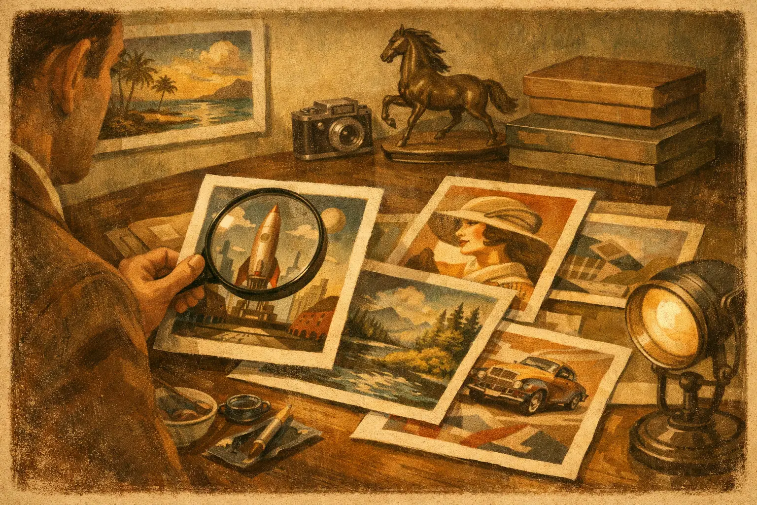
A limited edition print can change a room long before anyone asks about the artist. It alters pace. It gives the eye somewhere to rest, or somewhere to return. That is why collector edition print trends matter right now – not as passing style notes, but as signals of how people want to live with art, and what they expect art to hold in a space.
The current shift is subtle but decisive. Buyers are moving away from decorative abundance and toward editions that feel considered, finite, and emotionally grounded. A print is no longer chosen only for image. It is chosen for paper, scale, scarcity, framing, and the atmosphere it creates once it leaves the screen and enters a home, studio, hotel, or quiet corner of a larger design project.
Why collector edition print trends are changing
For years, online art buying trained people to browse quickly and compare visually. That habit is still with us, but the standards have risen. Design-conscious buyers now want more than an attractive file translated onto paper. They want evidence of curatorial thought. They want editions that feel intentional rather than endlessly reproducible.
Part of this comes from fatigue. Mass-market wall art is everywhere, and its sameness is easy to spot. A collector edition print offers a different promise. It suggests restraint. It tells the buyer that not everyone will have this work, and that the piece was made to endure beyond a season.
There is also a practical reason behind this shift. As interiors become calmer and more minimal, every visual object carries more weight. In a sparse room, one artwork has to do more. It must hold aesthetic presence, but it also needs emotional and material depth. Collector editions answer that need better than generic open prints.
Smaller editions, stronger identity
One of the clearest collector edition print trends is the move toward tighter edition sizes. Smaller runs create confidence for buyers who care about rarity, but the appeal is not only financial. A restrained edition signals discernment. It suggests the artist or gallery chose to protect the integrity of the work rather than maximize output.
This does not mean every serious edition must be extremely scarce. There is a balance. An edition of 10 carries one kind of intimacy, while an edition of 50 may offer a more accessible entry point without losing its collector character. What matters is transparency and proportion. Buyers are looking closely at whether the edition size feels aligned with the artwork, the artist’s profile, and the overall presentation.
In interiors, this trend also supports a more personal relationship with the piece. Knowing a work exists in a limited number changes how it is perceived. The print becomes less like decor and more like a chosen object with a place in a wider artistic conversation.
Scarcity only works when quality supports it
Artificial rarity has little lasting value. If the image, print quality, and finish do not justify the edition, the number alone will not carry meaning. Serious buyers can sense when scarcity is being used as a sales device instead of a curatorial decision.
That is why museum-quality Giclee printing, archival inks, and carefully selected substrates have become central rather than secondary. The edition must feel physically worthy of its limitation.
Material richness is replacing visual excess
Another major shift is the return of tactile value. Collector editions are being judged less by loudness and more by surface, depth, and finish. This is especially visible in the growing appreciation for fine art papers with warmth, subtle texture, and tonal nuance.
A soft matte paper can quiet a composition in a beautiful way. Cotton rag can give digital or contemporary abstract work a grounded presence that feels almost meditative. These details matter because buyers increasingly understand that a print is not just an image transfer. It is an object with body.
Framing is following the same direction. Instead of ornate statements or trend-heavy finishes, many collectors and designers are choosing frames that support stillness – natural wood tones, slim profiles, black, white, or muted metallics used with restraint. The goal is not to make the artwork louder. It is to let it breathe.
This is particularly resonant in spaces shaped by Wabi-Sabi, Japandi, minimal modern, and other interiors that value quiet texture over spectacle. In those environments, material honesty is part of the artwork’s appeal.
Quiet palettes and contemplative imagery
Not every trend is about production. Image language is shifting too. In collector editions, there is growing demand for work that offers calm rather than constant stimulation. Muted neutrals, weathered earth tones, deep blacks, vaporous blues, and softened reds are appearing more often in favored pieces.
This does not mean color is disappearing. It means color is becoming more intentional. Instead of highly saturated compositions designed to dominate, many buyers are choosing prints that create emotional atmosphere. They want art that can hold silence.
Abstract works, minimal landscapes, contemplative portraiture, and digital pieces with spatial openness are all benefiting from this change. These works suit contemporary interiors because they do not compete with architecture and objects. They deepen them.
The emotional function of the print matters more now
People are increasingly buying art to shape how a room feels, not simply how it looks in a photograph. A collector edition placed above a console, in a reading room, or within a hospitality setting has to do something subtle. It might soften a hard space. It might create a focal pause. It might introduce imperfection, mystery, or a sense of balance.
That emotional role is one reason contemplative works continue to gain ground. They live well over time.
Story-led curation over trend-chasing
A collector edition becomes more compelling when it arrives within a clear curatorial frame. Buyers want context. They want to know why this work was selected, how it relates to a theme, and what kind of visual philosophy supports it.
This is one of the most important collector edition print trends for galleries and collectors alike. The edition is no longer treated as an isolated product. It is presented as part of a point of view. Themes like impermanence, stillness, memory, surreal interiority, or freedom through abstraction help buyers connect with the work on a deeper level.
For galleries with a defined aesthetic language, this matters even more. A thoughtful collection builds trust. It tells the buyer that the edition was not added to fill inventory, but chosen because it belongs to a coherent visual and cultural world. Taygeta Gallery, for example, speaks naturally to buyers who are drawn to Eastern aesthetics, meditative modernism, and art that carries both decorative elegance and philosophical weight.
Scaled editions for real spaces
One practical trend deserves more attention: sizing is becoming smarter. Oversized prints still have a place, especially in hospitality and commercial projects, but many collectors are favoring dimensions that suit urban homes, layered walls, and quieter rooms.
This has changed how editions are produced and presented. A piece may be offered in two or three sizes, but not in a way that feels endless. The best approach preserves hierarchy. Perhaps one size is the primary collector format, while another offers accessibility for smaller interiors. This gives buyers flexibility without diluting the edition’s identity.
Designers especially value this balance. They often need a work that fits a specific wall plan, sightline, or furniture composition. A well-scaled collector print can meet that practical need while still feeling elevated.
The line between art print and collectible object is sharpening
As standards rise, collector editions are being evaluated more like collectible objects than decorative accessories. Signature placement, numbering, certificates of authenticity, embossing, custom framing, and presentation all contribute to perceived value.
But there is a trade-off here. Too much ceremonial packaging can feel performative. Too little information can feel casual. The strongest editions sit in the middle. They present enough evidence of care and legitimacy while keeping the artwork itself at the center.
This balance is especially relevant for first-time collectors. Many want access without intimidation. They appreciate a print that feels special and professionally produced, but they do not want to feel excluded by unnecessary opacity or inflated language.
What buyers should watch for next
The next phase of collector editions will likely become even more selective. Buyers are becoming better educated, and their expectations are sharpening. They will continue to ask where a print was made, what materials were used, how many exist, and whether the edition belongs to a broader curatorial vision.
We are also likely to see stronger crossover between residential collecting and design specification. Hotels, wellness spaces, and high-end commercial interiors increasingly want artwork that feels culturally aware, calming, and distinct without becoming generic luxury wallpaper. Collector editions are well suited to that need because they can be consistent in quality while still preserving rarity and artistic character.
At the same time, not every trend should be followed. The best purchase is still the one that continues to resonate after novelty fades. Some buyers should choose a smaller, quieter edition over a bold statement piece. Others need scale and visual tension. It depends on the room, the architecture, the light, and the emotional life the artwork is meant to support.
The most lasting collector edition print trends are not really about fashion. They are about attention – to quality, to atmosphere, to context, and to the quiet difference between an image you like and a work you want to live with for years.
Leave a Reply