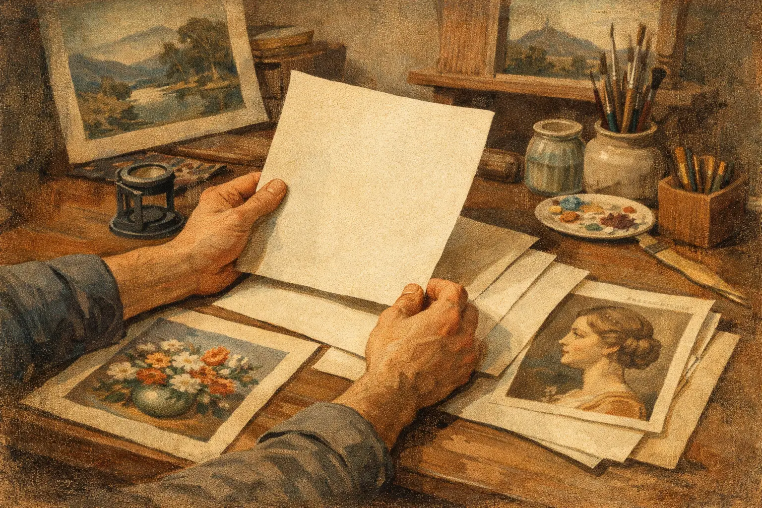
A print can hold the same image on two different papers and feel like two different works. One may appear luminous and quiet. The other may look heavy, overly sharp, or strangely flat. That is why learning how to choose giclee paper matters so much – the paper does not simply carry the art, it shapes how the art is seen, felt, and lived with.
For collectors, designers, and anyone building a more intentional interior, paper choice is not a technical afterthought. It is part of the artwork’s final expression. Surface, weight, whiteness, and finish all influence mood. A misted landscape, a graphic abstract, and a warm-toned photographic study rarely ask for the same foundation.
How to choose giclee paper by starting with the artwork
The most useful place to begin is not with paper names or specifications. It is with the character of the image itself. Ask what the artwork needs in order to remain honest.
If the piece relies on delicate tonal transitions, atmospheric depth, and a sense of softness, a matte fine art paper often preserves that quiet better than a glossy surface. Matte papers absorb light rather than bounce it back, which helps subtle color shifts feel more natural. This is often ideal for meditative abstracts, minimalist compositions, and works influenced by wabi-sabi sensibilities.
If the art depends on saturated contrast, crisp edges, or photographic detail, a smoother paper with a slightly brighter surface may serve it better. Some contemporary digital works and bold color-driven pieces gain presence from that added clarity. The trade-off is that brighter, smoother papers can sometimes feel less tactile and less organic.
This is the first principle: do not choose paper by prestige alone. Choose it by alignment. The right paper should make the image feel more fully itself.
Matte, textured, smooth, or satin?
When people ask how to choose giclee paper, they are often really asking how the print should feel in the room. Finish is where that question becomes visible.
Matte paper
Matte fine art paper is often favored for museum-quality giclee printing because it offers depth without glare. It suits interiors that value calm, softness, and restrained elegance. In natural light, matte paper tends to feel composed and intimate rather than flashy. This makes it especially compelling for collectors who want the work to unfold slowly.
The trade-off is that matte surfaces usually produce less apparent contrast than glossy or satin papers. Blacks may appear softer. Colors may look more velvety than vivid. For many artworks, that is a virtue. For others, it can slightly mute the intended energy.
Textured paper
Textured paper introduces a physical surface that can echo traditional watercolor or etching papers. It adds warmth, tactility, and a sense of material presence. If the work has painterly movement, organic forms, or an aged, imperfect beauty, texture can deepen its emotional resonance.
But texture is not universally flattering. Highly detailed photography or precision-based digital art can lose some sharpness on a heavily textured sheet. Fine lines may appear less clean, and tiny details may soften. Texture offers atmosphere, but sometimes at the expense of exactness.
Smooth paper
Smooth fine art paper creates a cleaner, more contemporary result. It supports crisp detail and can feel especially right for modern interiors, architectural imagery, and refined digital compositions. If your space leans minimal and your artwork depends on line, structure, or exact color transitions, smooth paper may be the better choice.
Its limitation is emotional rather than technical. Some smooth papers can feel cooler or less soulful than textured alternatives. That does not make them inferior. It simply means the finish should match the spirit of both the artwork and the setting.
Satin or semi-gloss paper
Satin sits between matte restraint and glossy brightness. It can produce richer contrast and more visual punch while avoiding the strong reflections of a full gloss surface. For some photographic prints, this balance is ideal.
Still, satin is less common for collectors seeking a classic fine art print sensibility. In rooms with shifting light, even moderate sheen can compete with the viewing experience. If serenity is part of your design language, lower-glare papers are often easier to live with.
The role of paper weight and thickness
Weight matters, even before the print is framed. A substantial paper feels more stable, archival, and considered. It tends to lie flatter, handle better, and communicate quality in a way lighter poster-style papers do not.
Most museum-grade giclee papers have enough heft to feel serious in the hand, but heavier is not always better. Very thick paper can be beautiful, though it may be unnecessary for some editions or mounting methods. What matters more is whether the paper feels appropriate to the artwork and presentation. A collector edition with a deckled edge may benefit from pronounced weight. A framed print intended for clean modern display may only need a refined, solid stock that supports the image without drawing attention to itself.
In other words, weight contributes to presence, but it should not overpower the work.
White point, warmth, and color accuracy
Not all paper is the same shade of white. Some are bright white. Others are soft white or slightly warm. This detail changes everything.
A bright white paper can make colors appear more vivid and contrast more pronounced. It often works well for contemporary pieces with clean lines, cool palettes, and strong graphic structure. It can also make whites in the image look more brilliant.
A warmer paper base creates a gentler, more natural impression. Earth tones, muted neutrals, sepia notes, and organic palettes often gain depth from that warmth. For art meant to quiet a room rather than energize it, a softer paper base can be especially beautiful.
The trade-off is simple. Bright white tends toward clarity and intensity. Warm white tends toward softness and atmosphere. Neither is inherently more correct. The decision should reflect the artist’s intention, the palette of the piece, and the emotional temperature of the room.
Archival quality is not optional
If a print is meant to endure, archival quality matters. This is the less romantic part of the conversation, but it is essential.
A proper giclee paper should be acid-free and designed for longevity. Cotton rag papers are often favored because they offer both beauty and durability. Alpha-cellulose papers can also perform very well when made to archival standards. Pigment-based giclee printing on archival paper gives the work a far better chance of retaining its tonal integrity over time.
For buyers, this is one of the clearest signals of value. Museum-quality printing is not only about appearance on the day it arrives. It is about whether the piece will age with grace.
How the room should influence your choice
A serene print in a sun-filled living room behaves differently than the same print in a dim hallway or hospitality setting. Light, scale, and interior mood all affect paper choice.
In bright spaces, matte papers are often easier to appreciate because they reduce reflections. In darker rooms, a smoother or slightly brighter paper can help preserve clarity. Large-scale works may benefit from surfaces that keep the image legible from a distance, while smaller prints can carry more texture without losing impact.
Interior style matters too. A quiet, minimalist home may welcome soft matte cotton paper that absorbs light and supports stillness. A sharper contemporary space might call for smoother surfaces and brighter whites. Designers often think in terms of harmony rather than rules, and that is the right instinct here.
Ask for intention, not just specifications
Paper names can sound persuasive, but the real question is why a certain paper was chosen for a certain artwork. A thoughtful gallery or printmaker should be able to explain how the paper supports the image, not just list technical features.
At Taygeta Gallery, that curatorial lens matters. The best print choices come from understanding the work’s atmosphere as much as its resolution or color profile. Buyers deserve that level of care, especially when collecting online.
A simple way to decide
If you feel uncertain, reduce the decision to three questions. Does this paper preserve the artwork’s true character? Does it suit the light and mood of the room? Will it still feel beautiful years from now?
That is usually enough to separate a merely good print from one that feels resolved.
Giclee paper is a quiet element, but quiet things often shape a space most deeply. Choose the surface that lets the artwork breathe, and the room will understand the difference.
Leave a Reply