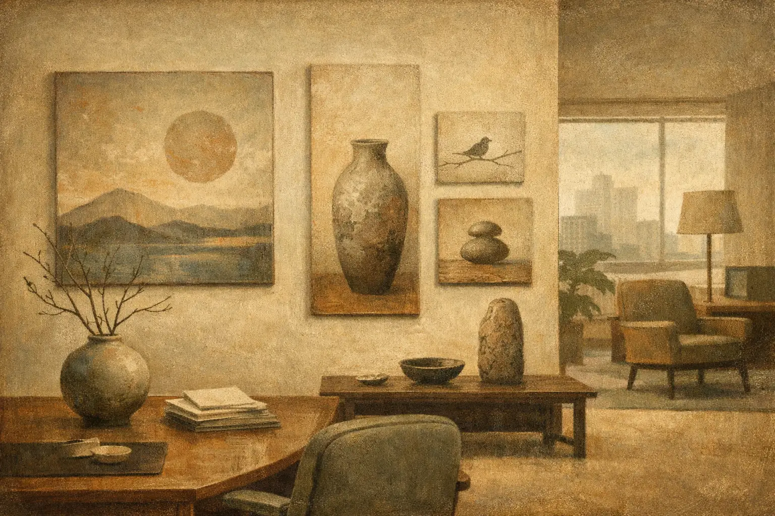
The room says more than the meeting ever will. Before anyone speaks, an office has already signaled its values through light, material, proportion, and what it chooses to place on the walls. Wabi sabi art for office spaces offers a different kind of message – one rooted in restraint, texture, and the beauty of what feels honest rather than polished for effect.
For design-conscious workplaces, that distinction matters. Many offices still rely on artwork that is visually safe but emotionally vacant: generic abstracts, stock-inspired prints, or decorative pieces chosen only to fill scale. They may coordinate with the furniture, yet leave the space untouched at a deeper level. Wabi-sabi approaches art differently. It invites quiet attention. It creates atmosphere. It allows an office to feel composed without becoming sterile.
Why wabi sabi art for office spaces feels right now
The contemporary office is under pressure to do more than function. It needs to support focus, represent brand identity, and offer a sense of ease in a culture saturated with visual noise. This is why the wabi-sabi sensibility feels so relevant. It does not compete for attention. It steadies a room.
Rooted in Japanese aesthetics, wabi-sabi values impermanence, asymmetry, modesty, and the subtle richness of natural wear. In art, that often appears through muted palettes, mineral tones, spare compositions, tactile surfaces, weathered forms, and gestures that feel intuitive rather than overworked. The result is not emptiness. It is presence without excess.
In an office setting, that presence can soften hard architectural lines and digital intensity. Glass walls, screens, concrete, metal, and engineered lighting all tend toward precision. Wabi-sabi art introduces a needed counterbalance. It reminds the eye that beauty does not always arrive through perfection. Sometimes it arrives through pause, grain, irregularity, and silence.
What this aesthetic changes in a workplace
Art shapes behavior more subtly than furniture or layout, yet it often leaves a deeper emotional trace. A workspace filled with high-gloss imagery can feel performative. A workspace anchored by contemplative art tends to feel more grounded.
Wabi-sabi art can encourage a slower visual rhythm. In reception areas, it signals discernment rather than trend-chasing. In private offices, it supports concentration by reducing visual friction. In conference rooms, it can shift the emotional register from corporate formality to thoughtful exchange. Even in compact home offices, one well-chosen piece can make the room feel less like a workstation and more like a place of considered work.
There is also a brand dimension. Offices increasingly function as cultural spaces, especially for client-facing businesses, studios, wellness practices, and hospitality-adjacent workplaces. The art on display becomes part of the company’s language. Choosing wabi-sabi art suggests maturity, clarity, and comfort with nuance. It communicates that taste is not being outsourced to whatever feels most fashionable this quarter.
That said, this aesthetic is not universally right for every environment. A fast-scaling tech sales floor or a highly extroverted retail office may need art with more velocity and contrast. Wabi-sabi works best where the desired atmosphere includes calm, reflection, credibility, and material sensitivity.
How to choose wabi sabi art for office spaces
The first step is to think beyond the label. Not every beige abstract is wabi-sabi, and not every minimalist piece carries emotional weight. The question is whether the work feels lived-in, balanced, and quietly resonant.
Look closely at texture, even when selecting prints. Art informed by wabi-sabi often carries the memory of the hand: brushed pigment, softened edges, layered washes, stone-like surfaces, distressed tonal shifts, or compositions that breathe. A museum-quality Giclée print can preserve these nuances beautifully when the source work has real depth and the production is handled with care.
Color matters, but in a measured way. Earth tones, smoke, clay, sand, bone, charcoal, moss, and off-black tend to sit naturally within this language. Yet a wabi-sabi piece does not need to be colorless. Oxide red, muted indigo, weathered green, or a faded mineral blue can add richness without breaking the calm. What matters is restraint and tonal harmony.
Scale deserves equal attention. In office interiors, undersized art often creates more tension than no art at all. A generous single piece can bring coherence to a reception wall or executive office, while a quieter pair of works may suit a corridor or meeting room. If the architecture is strong, the art can be subtle. If the room is visually sparse or acoustically hard, a larger piece with depth and texture may be what gives the space its center.
Framing should support, not overstate. Natural wood, matte black, soft oak, or restrained gallery framing typically works well. High-shine finishes can fight the sensibility. The goal is not rustic styling. It is refinement with humility.
Placement and mood: room by room
Reception areas benefit from art that creates immediate atmosphere without theatricality. A large abstract with a mineral palette, asymmetrical balance, and visible texture can establish confidence and calm at once. It suggests curation rather than decoration.
Private offices call for pieces that reward repeated viewing. This is where layered abstraction, spare landscape references, or meditative forms are especially effective. Over time, their value grows because they do not reveal themselves all at once.
Conference rooms are trickier. The artwork should not distract, but it should prevent the room from feeling hard or impersonal. One substantial piece behind the main seating axis often works better than multiple smaller works. It gives the room visual gravity.
Home offices offer more freedom. Here, wabi-sabi art can feel intimate and personal, especially when paired with natural materials, linen, wood grain, ceramics, and softened light. In these spaces, the art is not just part of the design. It becomes part of the ritual of working.
Original works, prints, and the question of value
For many buyers, the most practical decision is not whether they love the aesthetic, but which format makes sense. Original works offer singularity, surface presence, and collector appeal. They are ideal when the office is intended to express a strong point of view or when the artwork will serve as a signature element.
Museum-quality prints, however, can be an excellent choice for offices, especially in larger projects or multi-room schemes. The trade-off is not simply price versus prestige. It is about matching format to use. A carefully produced Giclée print can preserve tonal subtlety and texture with remarkable fidelity while allowing more flexibility in sizing, framing, and volume purchasing.
This is particularly useful for designers, hospitality buyers, and businesses furnishing several rooms at once. A curated print program can create cohesion across a workplace without flattening its character. The key is to avoid anything that feels mass-produced or overly familiar. The work should still carry authorship and atmosphere.
Avoiding the common mistakes
The most frequent mistake is treating wabi-sabi as a trend shorthand for neutral minimalism. True wabi-sabi has emotional temperature. It should feel contemplative, not vacant.
Another mistake is over-theming the office. If every object in the room tries to signal Japanese restraint, the result can feel staged and culturally superficial. A better approach is to let the artwork carry the philosophy while the rest of the space remains materially coherent and quietly modern.
It is also easy to confuse subdued with weak. In a busy office, art still needs enough presence to hold the wall. That may come through scale, tonal contrast, or composition rather than bright color. Quiet art should still be convincing.
For buyers who want that balance between philosophical depth and contemporary refinement, galleries with a strong curatorial point of view matter. Taygeta Gallery, for example, approaches this territory with a sensitivity to both Eastern aesthetics and modern interiors, which makes the work feel considered rather than merely styled.
The lasting appeal of restraint
Office design tends to swing between extremes: too cold, too branded, too casual, too eager to impress. Wabi-sabi art steps outside that cycle. It offers something rarer – an atmosphere of confidence without noise.
That is why it endures. Not because it is minimal, and not because it is fashionable, but because it honors the feeling many people want from the places where they spend their working hours: steadiness, clarity, and a little room to breathe.
If an office should reflect how work is done at its best, then the art on its walls should do the same – less performance, more presence.
Leave a Reply