Articles

  • Hospitality Art Procurement That Feels Intentional

    Hospitality Art Procurement That Feels Intentional

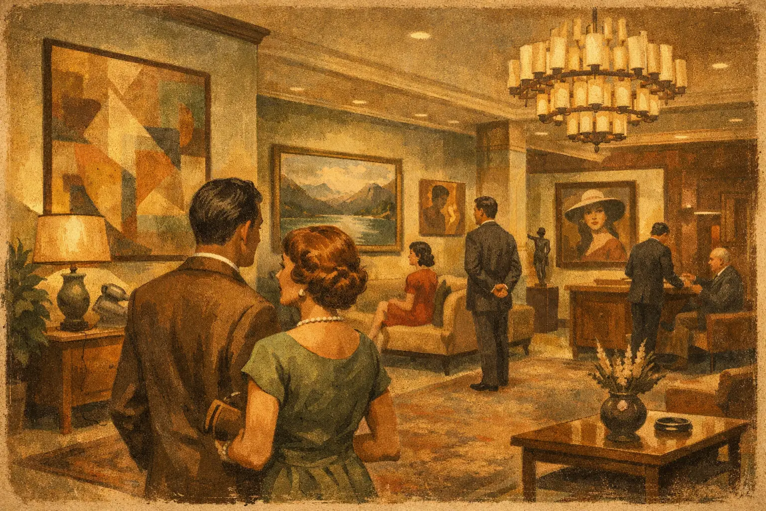
    A guest rarely says, “the art was specified well.” What they remember is subtler than that. They remember the lobby that felt composed rather than staged, the corridor that held quiet interest, the suite that seemed to breathe. Hospitality art procurement sits inside that impression. Done well, it does not shout for attention. It gives a property its inner tone.

    For hotels, resorts, restaurants, and branded residences, art is not a finishing touch applied at the end. It is part of the atmosphere itself. It shapes pace, emotional temperature, and memory. It can soften a minimalist interior, deepen a heritage narrative, or bring stillness to a space designed for constant movement. The challenge is that art in hospitality must do several jobs at once. It must feel distinctive, support the concept, withstand public life, and remain financially and logistically realistic.

    What hospitality art procurement is really solving

    At a surface level, hospitality art procurement is the process of sourcing, curating, producing, and delivering artwork for guest-facing environments. In practice, it is a question of alignment. The art must align with the brand story, the architecture, the guest demographic, the budget, the project timeline, and the operational realities of the site.

    That is why the best procurement process begins before anyone asks for “something for the walls.” A luxury urban hotel and a wellness retreat may both want contemporary art, yet the emotional brief is entirely different. One may need tension, edge, and metropolitan energy. The other may need restraint, spaciousness, and a sense of return. If the emotional brief is vague, the result often becomes generic – visually pleasant, commercially safe, and instantly forgettable.

    Strong hospitality projects treat art as part of placemaking. The work does not merely match the upholstery or echo the accent color. It interprets the identity of the property in a more subtle language. Sometimes that means a coherent collection running throughout public and private spaces. Sometimes it means a quieter strategy, where a few carefully placed works shift the entire rhythm of the interior.

    The difference between decoration and curation

    Not every hotel needs a blue-chip collection, and not every restaurant benefits from dramatic statement pieces. But every hospitality setting benefits from intention. This is the line between decoration and curation.

    Decoration fills a visual gap. Curation creates a relationship between space, artwork, and viewer. In hospitality, that relationship matters because guests are not standing in front of a piece in gallery silence. They are checking in after a long flight, meeting someone for dinner, moving through a hallway late at night, waking slowly in unfamiliar surroundings. Art meets them in motion, in fatigue, in anticipation, in solitude.

    This is where mood becomes central. A work grounded in Wabi-Sabi sensibility, for example, can bring uncommon calm to a room without becoming cold. Textured abstraction can suggest depth without dictating interpretation. Limited editions and museum-quality prints can offer consistency across multiple rooms while preserving a curated character. Original works may anchor signature spaces where a property wants stronger distinction. There is no single right format. It depends on where the piece lives, how many are needed, and what kind of experience the property wants to create.

    How to approach hospitality art procurement with clarity

    The most successful projects tend to move through a clear curatorial sequence. First comes the concept, then the spatial strategy, then the medium, then the production details. Teams often rush into image selection too early, when the more useful first questions are atmospheric.

    What should a guest feel within the first thirty seconds of arrival? Where should the property feel animated, and where should it feel quiet? Which areas call for visual continuity, and which deserve contrast? Is the design language rooted in locality, minimalism, historical reference, nature, or cosmopolitan polish?

    Once that is clear, the art brief becomes more precise. A lobby may call for one commanding focal work or a restrained group of pieces that support rather than dominate. Guest rooms often benefit from art that restores rather than overstimulates. Corridors need repetition with variation, so the experience feels intentional but not monotonous. Restaurants and lounges can usually tolerate more personality, though even there the art should not compete with the social energy of the room.

    This stage is also where procurement becomes practical. Originals bring singularity and collector value, but they can be harder to scale across large properties. Editions and Giclée prints offer consistency, cost control, and production flexibility, especially when quality standards are high. Framed digital art can be especially effective when the visual language is sophisticated and the printing and finishing are handled with care. The real question is not which format is more prestigious. It is which format best serves the space.

    Budget, scale, and why cheaper often costs more

    Hospitality budgets are rarely limitless, even at the high end. That reality does not weaken the case for art. It simply means procurement must be disciplined.

    The common mistake is treating art as a line item to compress once construction or FF&E costs expand. The immediate result may look acceptable on installation day, but low-grade printing, weak framing, and generic imagery age quickly. Guests may not identify the technical flaw, yet they sense the lack of conviction. In spaces where every material choice is working to signal quality, poor art becomes unexpectedly loud.

    A more intelligent approach balances hero moments with scalable solutions. Invest where guests pause longest or where the property creates its visual identity – reception, lounge, restaurant, VIP suites. In more repetitive zones, use editioned or print-based works that maintain the curatorial language without overextending the budget. Good hospitality art procurement is not about spending indiscriminately. It is about knowing where uniqueness matters most and where consistency carries the project.

    Production quality is part of the artwork

    In hospitality, artwork is never just the image. Substrate, paper, frame, glazing, scale, and installation method all affect how the piece is received. Museum-quality production matters because these are public interiors with changing light, frequent cleaning, and constant occupancy.

    A quiet abstract work can lose all nuance if printed flatly. A refined composition can feel mass-produced if the frame is too thin, too shiny, or out of proportion to the architecture. Large-scale pieces need not only visual presence but physical confidence. They must arrive correctly packed, fabricated to spec, and ready for site conditions.

    This is one reason curatorial sourcing and production should not be separated too sharply. The artwork may be beautiful in concept, but if it cannot be executed well at the required scale or within the project timeline, it is not yet a workable specification. Art procurement at this level asks for both sensitivity and control.

    Why guests respond to art with emotional depth

    Hospitality environments are increasingly designed around experience rather than utility alone. Art plays a quiet but powerful role in that shift. It can humanize a polished interior. It can create moments of pause in highly managed spaces. It can suggest that the property values culture, not only image.

    Guests are more visually literate than many brands assume. They know when a space feels copied, trend-driven, or hollow. They also know when it carries an authentic point of view. Art with emotional depth does not need to be difficult or overtly conceptual. It simply needs to feel chosen rather than purchased in bulk as decoration.

    This is especially true in projects influenced by minimalism, Japanese aesthetics, or contemporary wellness design. In those settings, every visible object carries more weight. Fewer elements mean fewer places to hide indifference. A restrained artwork with texture, asymmetry, or contemplative force can hold a room more effectively than something louder but less considered.

    For this reason, many designers and specifiers now look for art partners who understand both atmosphere and execution. A gallery with a clear curatorial perspective can help a project avoid the flattened look of mass-market hospitality packages. Taygeta Gallery, for example, approaches art through a lens of stillness, material nuance, and contemporary collecting, which can be especially resonant in interiors seeking calm, depth, and distinction.

    A thoughtful close to the process

    The best hospitality art procurement does not begin with inventory. It begins with attention. Attention to the property’s rhythm, to the guest’s state of mind, to the cultural tone of the interior, and to the practical life the artwork must live once installed.

    When that attention is present, art stops behaving like décor and starts shaping memory. A guest may not recall the title of a piece or the method of print production. They may simply remember that the space felt grounded, rare, and complete. That is often the clearest sign that the art was right.

  • Framed Art Prints for Living Room Style

    Framed Art Prints for Living Room Style

    A living room rarely feels finished when the walls are silent. The sofa may be beautifully proportioned, the lighting soft, the materials carefully chosen, yet the space can still feel emotionally incomplete. Framed art prints for living room interiors solve that quiet problem when they are chosen with intention – not as filler, but as visual anchors that shape atmosphere, rhythm, and memory.

    The difference lies in curation. A strong print does more than match a rug or echo a paint color. It creates a point of focus, introduces tension or stillness, and gives the room a point of view. In a well-composed interior, framed art is not the last decorative step. It is often the element that teaches the room how to feel.

    Why framed art prints work so well in living rooms

    The living room carries unusual pressure. It is where people gather, rest, read, host, think, and retreat. Because it serves several emotional functions at once, the artwork here has to do more than look attractive. It should hold the room together while leaving enough openness for daily life.

    Framed prints are especially effective because they balance accessibility with presence. A museum-quality Giclée print can bring depth, tonal subtlety, and a highly finished look without the cost or fragility of a one-of-a-kind work on paper. The frame gives the piece structure. It signals permanence, adds architectural clarity, and helps the art belong to the room rather than float on the wall as an afterthought.

    That matters in contemporary interiors, especially those shaped by minimalism, Japandi, Wabi-Sabi, or modern organic design. In these spaces, every visible object carries more weight. The right framed print introduces visual meaning without creating clutter.

    How to choose framed art prints for living room spaces

    The best starting point is not color. It is mood.

    Ask what the room is asking for. Some living rooms need calm because the architecture is busy or the household is active. Others need energy because the palette is restrained and the furniture is low in contrast. A print with soft tonal transitions, open composition, and negative space can deepen a sense of stillness. A bolder abstract with sharper geometry or expressive movement can wake up a room that feels too polite.

    This is where many people make the wrong trade-off. They shop for something that “goes” with the room, and end up with art that disappears into it. Harmony matters, but complete agreement can flatten a space. A stronger approach is to choose a work that relates to the room while introducing one subtle disruption – a darker line, an unexpected rust tone, a field of emptiness, a surreal gesture. That small tension is often what makes a room feel designed rather than decorated.

    Let scale lead the decision

    Scale changes everything. A beautiful image in the wrong size will always feel hesitant.

    Above a sofa, the artwork should usually occupy a meaningful portion of the width, often around two-thirds to three-quarters. If the print is too small, the wall feels underdressed and the furniture overwhelms it. If it is too large, the room can feel top-heavy. In open-plan living rooms or spaces with high ceilings, larger framed works often create the grounded focal point the room needs.

    There is also a psychological effect to scale. Large art slows the eye and invites immersion. Smaller pieces create intimacy and ask to be approached. Neither is inherently better. It depends on whether you want the room to feel expansive and architectural or layered and personal.

    Frame choice is part of the artwork

    A frame is not only a finishing detail. It changes how the image is read.

    Black frames bring crisp definition and suit contemporary interiors with stronger contrast. Natural wood frames soften the transition between art and architecture, especially in rooms with linen, oak, stone, boucle, or handcrafted ceramics. White frames can feel quiet and airy, though in some cases they reduce impact unless the work itself has enough internal depth.

    If the artwork carries a contemplative or Zen-inflected sensibility, the frame should support that restraint. Overly ornate moldings can interrupt the visual silence. Clean lines tend to let the image breathe. For many design-conscious buyers, the most successful framed art prints are those where the frame feels inseparable from the composition’s mood.

    Color, restraint, and the art of not overmatching

    Living room art does not need to repeat the exact tones already in the space. In fact, overmatching often makes a room feel staged. Better results come from working within a tonal family while allowing variation.

    If your interior is built around warm neutrals, consider prints with mineral blacks, muted clay, washed indigo, faded umber, or soft ivory rather than beige on beige. If the room is cooler – gray plaster, black accents, pale ash wood – look for work with smoky blue, charcoal, olive, or off-white instead of trying to force brightness.

    Muted palettes tend to age well because they leave room for materials and light to shift throughout the day. But restraint does not mean absence of emotion. A restrained print can still carry intensity through texture, mark-making, contrast, and composition. Some of the most memorable works whisper rather than announce themselves.

    Subject matter and what it says about the room

    Abstract art is a natural fit for living rooms because it leaves interpretive space. It can support stillness without dictating a narrative. This is particularly valuable in rooms meant for conversation or quiet restoration. Gestural abstraction, atmospheric landscapes, minimalist forms, and digital works with painterly depth all offer different emotional temperatures.

    Figurative and surreal works can also be compelling, especially when the room needs more personality or conceptual edge. The question is whether the image invites return. In a living room, you will see the work every day. Pieces that continue to reveal themselves over time tend to have greater staying power than images with immediate but shallow appeal.

    For buyers drawn to Eastern aesthetics, Wabi-Sabi influences, or meditative spaces, art with emptiness, asymmetry, weathered texture, and imperfect balance often resonates deeply. These qualities bring a sense of humanity into polished interiors. They remind the room that beauty does not need to be loud to be complete.

    Placement shapes the experience

    Even the right piece can lose power if it is hung without sensitivity to the room’s architecture.

    Above the sofa is the most common placement, but it is not the only meaningful one. A large framed print opposite a window can catch changing light and create a contemplative axis in the room. A pair of vertically oriented works can add elegance beside shelving or between architectural openings. In smaller spaces, a single piece leaned on a console or low cabinet can feel less formal and more collected.

    Height matters as much as position. Art hung too high feels disconnected from the furniture and from the body. In most cases, the piece should relate to the seating arrangement, not drift above it. The goal is visual conversation between art, object, and open wall.

    Quality is visible, even at a distance

    A living room is where quality reveals itself slowly. People notice it while seated, while passing through, while seeing the space in morning light and lamplight. This is why print method, paper, glazing, and framing construction matter.

    Museum-quality Giclée printing offers a level of tonal richness and detail that cheaper reproductions rarely achieve. Blacks feel deeper, soft gradients remain nuanced, and surfaces hold their integrity over time. A well-made frame sharpens the presentation and protects the work, but it also communicates confidence. The piece feels considered.

    For many buyers, this is the real threshold between generic wall decor and art worth living with. Taygeta Gallery approaches framed prints with that distinction in mind – as works meant to hold aesthetic value, emotional atmosphere, and everyday durability at once.

    A curated room feels personal, not crowded

    There is no rule that every wall needs art. Sometimes one framed print is enough to establish the room’s emotional center. In other interiors, a dialogue between two or three pieces creates the right cadence. The answer depends on architecture, ceiling height, furniture mass, and how much visual silence the room needs.

    If your living room already contains strong elements – sculptural lighting, a dramatic fireplace, patterned stone, or floor-to-ceiling shelving – fewer works may create a more refined result. If the space is quiet and spare, a larger or more commanding print can prevent it from feeling unfinished.

    The best collectors and designers understand this instinctively. They do not fill walls simply because they are empty. They place art where it can breathe, where its presence changes the room, and where it feels necessary.

    A framed print should not just complete your living room. It should make the room more honest about who you are, and more generous in how it holds the people who enter it.

  • Best Statement Art for Entryways

    Best Statement Art for Entryways

    The entryway sets the emotional temperature of a home before a single word is spoken. That is why choosing the best statement art for entryways is less about filling a blank wall and more about shaping arrival itself. A strong piece can quiet visual noise, establish character, and turn a transitional zone into a place with presence.

    Unlike a living room, an entryway is experienced in motion. You pass through it, return to it, glimpse it from other rooms, and sometimes share it immediately with guests. The art placed here has a particular task. It must hold attention quickly, yet continue to reward a slower look. It should feel resolved from a distance and intimate up close.

    What makes the best statement art for entryways

    Statement art is often mistaken for art that is simply large, loud, or expensive. In a well-composed entry, the statement comes from clarity. The work says something definite about the home, whether that feeling is serene, cerebral, mysterious, or warm.

    Scale matters first. A piece that is too small tends to look apologetic in an entryway, especially above a console. One work with generous proportions usually has more authority than several scattered pieces competing for attention. If the wall is narrow, a tall vertical format can be more effective than a wide composition because it echoes the architecture of the doorway and draws the eye upward.

    Equally important is emotional tone. The best entryway art does not always announce itself with drama. In some homes, a restrained abstract with subtle texture creates a stronger first impression than a saturated figurative work. It depends on the atmosphere you want to create at the threshold. If the rest of the interior is quiet and minimal, a bold piece may provide necessary tension. If the home already carries rich materials, pattern, or sculptural furniture, art with composure can bring balance.

    Choosing art by the feeling you want guests to meet

    A refined entryway begins with mood, not trend. This is where many art decisions become generic. People ask what style works best when the better question is what kind of arrival they want to stage.

    For calm, choose atmospheric abstraction

    Layered abstract works are especially compelling in entryways because they register immediately as shape, rhythm, and color, then reveal complexity over time. Soft neutrals, mineral grays, smoke blues, earthy umbers, and black-on-ivory compositions create an atmosphere of stillness without becoming inert. These works suit modern homes, Japandi interiors, and spaces influenced by Wabi-Sabi principles, where emptiness is not absence but room to breathe.

    If your entry receives limited natural light, a pale composition with tonal depth can brighten the area without feeling decorative in a superficial way. Museum-quality Giclée prints can be particularly effective here, preserving subtle gradations and painterly textures that cheaper reproductions tend to flatten.

    For energy, choose bold graphic work

    Some entryways benefit from sharper contrast. Black and white compositions, expressive line work, or contemporary pieces with one strong accent color can create a confident opening note. This approach works well in urban apartments, modern townhomes, and interiors where architecture is clean and spare.

    The trade-off is that high-contrast work can dominate a compact space if everything around it is equally assertive. In a narrow foyer, it often helps to keep surrounding objects simple so the art remains the focal point rather than part of a crowded visual argument.

    For intimacy, choose figurative or symbolic pieces

    Not every statement needs to be abstract. A figurative work, a poetic portrait, or a symbolic composition can make an entryway feel deeply personal. These are strong choices for collectors who want the threshold of the home to suggest story and sensibility rather than pure formal design.

    Still, intimacy in an entryway requires discipline. A deeply narrative work can be beautiful, but if it demands too much interpretation in a passage space, it may feel better suited to a room where people linger. The most successful figurative entryway art tends to have a clear silhouette, distinct mood, and enough visual simplicity to read in a moment.

    Size, placement, and the architecture around the work

    Great art can underperform when scale and placement are mishandled. This is especially true in entryways, where walls are often interrupted by doors, mirrors, benches, sconces, or coat storage.

    If you are hanging a piece above a console, keep the relationship intentional. The artwork should feel anchored by the furniture, not adrift above it. In most cases, the artwork should occupy a substantial portion of the console’s width. Too narrow, and it looks incidental. Too wide, and the composition loses grace.

    Height matters just as much. Entryway art is often hung too high because people treat the wall as a void to be filled. The visual center of the work should sit where it can be encountered naturally upon entering. If the piece is above furniture, leave enough breathing room to separate the two, but not so much that they seem unrelated.

    In double-height foyers, the instinct is often to go monumental. Sometimes that is right. But scale should answer architecture, not ego. A very large work can be extraordinary in a tall entry, yet it should still possess enough internal structure to hold the wall. A huge canvas with weak composition can feel emptier than a smaller, stronger piece.

    Framing and material presence

    The frame is not a technical afterthought. It changes how the work speaks.

    For minimal and contemplative interiors, a thin natural wood frame, black gallery frame, or float-mounted presentation often preserves the artwork’s silence. Ornate frames can be beautiful, but they rarely suit entryways that seek modern restraint. In more traditional homes, however, a frame with historical character can create a rich threshold if the art itself has enough gravity to support it.

    Material quality is especially visible in an entryway because people encounter it at close range. Poor print quality, reflective glazing, and flimsy framing can undermine even a strong image. Collectors and design-minded buyers are usually sensitive to this immediately. A well-produced print with archival depth and precise framing reads differently. It feels intentional, not improvised.

    Color strategy for a stronger first impression

    Color in the entryway should relate to the home beyond it. That does not mean matching every finish. It means creating a conversation between the artwork and the atmosphere of the interior.

    If the adjacent rooms are layered with warm wood, travertine, linen, and soft plaster tones, art with earthen pigments or muted tonal shifts will feel integrated. If the home opens into cooler stone, steel, or monochrome furnishings, a crisper palette may create continuity. Sometimes the most elegant move is a single contrast note, such as rust against pale walls or indigo against oak.

    This is where the best statement art for entryways distinguishes itself from generic wall decor. It does not merely add color. It edits and concentrates the visual language of the home.

    When one piece is better than a gallery wall

    Gallery walls have their place, but entryways are rarely where they are most convincing. They can work in generous hall-style entrances or homes with an eclectic, collected spirit. Yet in many contemporary entryways, they create fragmentation where calm is needed.

    One compelling work tends to produce a stronger emotional effect. It establishes hierarchy, gives the eye a place to rest, and makes the space feel curated rather than assembled. If you do prefer multiple works, keep the logic clear. Shared framing, tonal cohesion, or a disciplined grid helps the arrangement read as one statement instead of several competing introductions.

    Art that feels elevated, not intimidating

    A statement piece should not make a home feel staged beyond comfort. The most memorable entryway art carries conviction without stiffness. That balance matters for first-time buyers as much as seasoned collectors.

    This is also where thoughtful curation matters. A gallery such as Taygeta Gallery understands that contemporary art in the home has to do more than impress. It has to live well with architecture, light, and daily ritual. The right work can feel museum-quality in presence while still remaining accessible in format, whether original, limited edition, or fine art print.

    The strongest entryway art leaves a trace. Not because it shouted, but because it gave form to a feeling the home already held in quiet. Choose the piece that changes the space the moment you walk in, then keeps changing as you learn how to look at it.

  • Giclee Print vs Poster: What Sets Them Apart?

    Giclee Print vs Poster: What Sets Them Apart?

    A print can look beautiful at first glance and still feel entirely different once it enters a room. That is the real question behind giclee print vs poster – not simply which one costs more, but which one carries the visual weight, material presence, and longevity your space asks for.

    For anyone building a home with intention, styling a hospitality project, or choosing art that should feel curated rather than temporary, the distinction matters. Two prints may share the same image, yet one reads as décor and the other as art. The difference begins in how each piece is made, but it does not end there.

    Giclee print vs poster: the basic difference

    A poster is typically a mass-produced reproduction printed quickly on thin, inexpensive paper. It is designed for accessibility, speed, and broad distribution. Posters have their place. They can be casual, graphic, fun, and useful for short-term styling or low-commitment decorating.

    A giclee print is a fine art inkjet print made with archival pigment inks on high-quality paper or canvas. The term is associated with museum-quality reproduction because the process prioritizes tonal range, color depth, detail, and longevity. A giclee print is not only about the image itself. It is also about the fidelity of the surface, the richness of the blacks, the softness of gradients, and the way the print holds up over time.

    If a poster is built for circulation, a giclee is built for presence.

    Why materials change the experience

    The most immediate difference between these two formats is material quality. Posters are often printed on lightweight coated stock. That surface can appear flat or glossy in a way that reflects light harshly, especially under lamps or large windows. The paper may bend easily, ripple in humidity, or show wear at the edges after handling.

    Giclee prints are usually produced on archival cotton rag, textured fine art paper, or premium canvas. These surfaces absorb pigment with more subtlety. Instead of bouncing light back aggressively, they tend to hold color with a softer, deeper finish. This gives the artwork a quieter authority on the wall.

    That quality matters even more in minimalist interiors. In a restrained space, every material speaks more clearly. Thin poster paper can feel visually noisy, while a fine art paper with gentle texture adds calm and depth.

    Ink quality and color depth

    Ink is where much of the visual difference becomes visible. Posters are commonly printed with dye-based or commercial inks intended for volume and efficiency. They can look bright initially, but they often lack the nuanced tonal transitions that make art feel alive.

    Giclee printing uses archival pigment inks with a wider color gamut. That means more subtle shadows, smoother gradients, and better retention of delicate details. In abstract work, this can be the difference between a flat field of color and a layered, atmospheric surface. In photographic or digital art, it can preserve edge definition and tonal complexity that a poster process may lose.

    This is especially relevant when the artwork depends on mood. If the piece is built around stillness, depth, negative space, or restrained tones, the print method can either honor that intention or flatten it.

    Longevity is not a small detail

    Many buyers compare giclee print vs poster through price alone. A better comparison is cost over time. Posters are affordable upfront, but they are not generally made to last. Exposure to sunlight, moisture, or ordinary interior conditions can cause fading and discoloration relatively quickly. The paper itself can become brittle or warped.

    A properly made giclee print, displayed with reasonable care, is designed for endurance. Archival materials are chosen specifically to resist fading and deterioration. For collectors and design-conscious buyers, this changes the purchase from a temporary visual fix into a lasting part of the interior.

    That does not mean everyone needs archival printing for every wall. A poster may be perfectly suitable for a dorm room, a casual office, a trend-driven installation, or a space you expect to redesign soon. But if the artwork is meant to anchor a room, move with you, or hold emotional significance, longevity becomes part of its value.

    Surface, texture, and the feeling of art

    One of the quiet differences between a poster and a giclee print is texture. Posters usually present the image as a smooth, mechanical reproduction. That can work well for bold graphics, pop references, or images where flatness is part of the appeal.

    A giclee print often has a more tactile surface. On cotton rag paper, colors can appear velvety and matte. On textured stock, the image gains a sense of body. On canvas, it can echo some of the physicality associated with painting. This does not make it an original work, but it does bring it closer to the language of fine art.

    For spaces shaped by Wabi-Sabi, natural materials, and quiet tonal harmony, this tactile quality can make a considerable difference. Texture softens the digital edge. It allows the print to belong among wood, linen, plaster, and stone rather than sitting on the wall as a purely commercial object.

    Framing changes both, but not equally

    A poster can certainly look more elevated when framed well. A clean frame, quality matting, and thoughtful placement can improve even an inexpensive print. Good framing adds intention.

    Still, framing does not fully erase the underlying material difference. Thin paper and lower-grade inks remain thin paper and lower-grade inks. Under glass, a poster may look neat and finished, but a giclee print usually retains greater visual depth, especially in close viewing.

    This matters in rooms where art is meant to be experienced slowly rather than glanced at in passing. In a living room, bedroom, gallery wall, or hospitality setting where guests move near the work, the finer production quality becomes easier to feel.

    Does a giclee print have more value?

    Value depends on what you want the artwork to do. If your goal is affordable image-based decoration for the short term, a poster can offer good value. It is accessible, easy to replace, and well suited to casual use.

    If your goal is to collect with more intention, a giclee print offers a different kind of value. It preserves the artist’s composition with greater fidelity. It carries higher production integrity. It often feels more substantial in the room and more deserving of framing, placement, and long-term care.

    There is also a psychological dimension. People tend to live differently with art that feels considered. A museum-quality print invites attention. It slows the eye. It can help a room feel composed rather than merely decorated.

    That is why many collectors and designers choose giclee prints for spaces where atmosphere matters. The artwork does not need to shout. It simply needs to hold the room with quiet confidence.

    When a poster is the better choice

    Not every purchase needs the refinement of a giclee. A poster may be the better decision when budget is the first concern, when the image is playful or trend-based, or when the installation is temporary. For children’s rooms, event styling, student spaces, or fast-changing interiors, posters offer freedom.

    There is no need to force permanence where experimentation is the point. Some walls are for testing mood, color, and personal taste. A poster can serve that role beautifully.

    The key is honesty about expectations. If you want a piece to feel collectible, endure over time, and contribute to a carefully shaped interior, a poster may eventually feel like a compromise. If you want immediacy and flexibility, it may be exactly enough.

    How to choose between a giclee print and a poster

    Start with the room. Ask whether the artwork is meant to fill space or define it. A hallway accent, temporary office refresh, or graphic statement piece may not require archival production. A bedroom sanctuary, living room focal point, or design project with layered materiality often does.

    Then consider viewing distance. From afar, some posters can look convincing. Up close, the difference in detail, paper weight, and tonal nuance becomes much clearer. If the print will be seen intimately, quality matters more.

    Finally, consider your relationship to the piece. Is this an image you enjoy now, or a work you want to live with for years? That question often answers the format question better than any technical specification.

    At Taygeta Gallery, this distinction is treated with the seriousness it deserves, because art is never only visual. It shapes atmosphere, memory, and the emotional temperature of a space.

    A thoughtful interior does not ask every object to be precious. But it does ask each object to be true to its purpose. If you want something light, immediate, and temporary, a poster may be enough. If you want a print that carries depth, stillness, and lasting presence, a giclee is usually the more meaningful choice.

    The right print is the one that continues to feel right after the novelty fades and the room grows quiet.

  • How Surrealism Wall Art Prints Change a Room

    How Surrealism Wall Art Prints Change a Room

    A room can be technically beautiful and still feel finished too soon. The sofa is right, the palette is restrained, the lighting is warm – yet nothing interrupts the expected. This is where surrealism wall art prints begin to matter. They introduce a slight shift in reality, a visual pause that makes a space feel less decorated and more awake.

    Surrealism has always lived in that fertile area between dream and structure, symbol and silence. In an interior, it does something few other styles can do so effortlessly. It holds elegance and strangeness at once. A floating figure, an altered landscape, an impossible object, a face divided by shadow or symbolism – these images do not simply match a room. They alter its emotional temperature.

    Why surrealism wall art prints feel so relevant now

    Many contemporary interiors lean toward calm restraint. Natural textures, softened neutrals, sculptural furniture, and uncluttered layouts offer relief from visual noise. But calm can slip into sameness when every object behaves too politely. Surrealism introduces a necessary counterweight.

    The appeal is not only aesthetic. It is psychological. Surreal imagery invites interpretation without forcing a single answer. That ambiguity gives the viewer room to return, notice, and reflect. In a bedroom, that can feel intimate. In a living room, it can become conversational. In a hospitality setting, it can create a memorable identity without resorting to spectacle.

    This is one reason surrealism has moved beyond niche collecting and into more design-conscious homes. Buyers are looking for work that feels curated rather than generic, expressive rather than loud. A well-chosen print can offer that tension beautifully.

    What surrealism brings to an interior

    Surrealist imagery has range. Some works are cinematic and dramatic, built around contrast, symbolism, and dream logic. Others are sparse and meditative, using surreal displacement in a quieter register. That distinction matters, because not every room asks for the same kind of intensity.

    In a minimal interior, surrealism can act as the one controlled disruption that keeps the space from feeling sterile. In a layered, eclectic room, it can unify disparate objects by introducing a conceptual center. The artwork becomes less of an accessory and more of a lens through which the room is read.

    There is also a useful trade-off to consider. Bold surreal works can command a room instantly, but they may leave less space for surrounding objects to speak. More restrained surreal compositions – especially those with negative space, muted color, or symbolic simplicity – often have greater longevity in interiors that evolve over time. The right choice depends on whether you want the art to dominate, anchor, or quietly haunt the space.

    Scale changes the emotional effect

    A large print above a sofa or bed creates immersion. It gives surrealism room to breathe, which is often essential. Symbolic imagery loses some of its power when compressed too much. If the composition relies on subtle details, dreamlike transitions, or spatial distortion, scale helps the viewer enter the work rather than glance past it.

    Smaller prints can be equally compelling, but they tend to work best in intimate zones – an entryway niche, a reading corner, a hallway moment where surprise is welcome. In these settings, the viewer encounters the piece at closer range, and the surreal element feels more private.

    Color matters more than style labels

    People often shop by genre first and palette second, but interiors tend to work the other way around. Two surrealist prints may belong to the same visual family while behaving very differently in a room. A piece with warm umber, rust, ash blue, or faded black will settle into a contemplative interior. A print with acid green, crimson, or electric cobalt may create beautiful friction, though it will ask more of the room around it.

    Neither direction is better. It depends on your threshold for tension. If your home is built around stillness, choose a surreal piece that deepens that mood rather than breaking it completely. If the room needs one gesture of risk, then a sharper color contrast may be exactly what gives it life.

    Choosing surrealism wall art prints with intention

    A strong print should reward both immediate attraction and sustained attention. The first response may be emotional – intrigue, recognition, unease, tenderness. The second response is slower. Why does this image stay with you? What atmosphere does it create? Does it expand the room, soften it, unsettle it, clarify it?

    This is especially important when buying online. The most successful surrealism wall art prints are not chosen only because they are unusual. They are chosen because their visual language aligns with the life of the space. A dreamlike desert scene may bring stillness to a neutral bedroom. A fragmented portrait may add psychological depth to an office or study. A symbolic composition built around moon, water, bird, or stone imagery may resonate strongly in interiors shaped by Zen, Wabi-Sabi, or quiet minimalism.

    Material quality matters just as much as image selection. Surreal work often depends on tonal subtlety, shadow detail, and fine transitions between color fields. Museum-quality Giclee printing helps preserve those nuances. Cheap reproduction tends to flatten the very qualities that make surrealism compelling in the first place.

    Framing also changes the reading of the work. A thin black frame can sharpen the image and give it modern clarity. Natural wood softens and humanizes more atmospheric pieces. A white frame can work well in bright interiors, though it may reduce the dramatic edge of darker compositions. Floating presentation often suits surreal work because it gives the image a sense of suspension, which is fitting for the genre.

    Where surreal prints work best

    Living rooms are the most obvious placement, but not always the most interesting. Because surrealism invites introspection, it often feels especially resonant in spaces where the mind slows down. Bedrooms, libraries, studies, and quiet corridors can all hold this kind of work beautifully.

    In dining spaces, surreal art introduces a subtle theatricality. It can shift the room away from pure function and toward ritual. In entryways, it creates immediate identity. For designers and hospitality buyers, surreal prints are also useful because they can give a project a distinct voice without the budget threshold of acquiring singular originals for every wall.

    There are practical considerations, of course. If a room already contains strong patterned textiles, expressive lighting, or highly sculptural furniture, the artwork may need more visual restraint. If the architecture is plain, the art can carry more complexity. A room should not become a competition between statements.

    Pairing surrealism with quiet interiors

    One of the most elegant uses of surrealist art is in rooms built around softness and space. Limewash walls, linen upholstery, travertine, aged wood, smoked glass, and hand-finished ceramics create a tactile field that welcomes conceptual contrast. The art becomes the single element that bends reality while everything else remains grounded.

    This pairing works because surrealism is not always excess. At its best, it is disciplined. The image may be strange, but the composition is often controlled, precise, and deeply considered. That makes it surprisingly compatible with refined interiors.

    For collectors and design-oriented buyers, this is part of the pleasure. A print can be accessible in format while still feeling intellectually and emotionally rich. It offers the atmosphere of serious collecting without requiring that every purchase begin at the level of a rare original.

    At Taygeta Gallery, this approach resonates because the work is framed not simply as decoration, but as a meaningful visual presence – something to live with, not just look at once.

    The difference between decorative surrealism and lasting art

    Not all surreal imagery carries the same weight. Some pieces rely on novelty alone: an odd juxtaposition, a dream symbol repeated without depth, a technically polished image that fades after the first impression. Others hold tension longer. They suggest a world rather than a trick.

    A lasting piece usually has one or more of the following qualities: formal balance, emotional ambiguity, symbolic intelligence, and restraint. It does not explain itself too quickly. It leaves a little silence around the image.

    That silence is valuable in a home. We live among enough objects that demand immediate comprehension. Art can offer another rhythm. Surrealism, in particular, allows a room to keep a private layer. It lets beauty remain slightly unresolved.

    If you are choosing your first surreal print, trust the work that continues to draw you back after the novelty has worn off. If you are choosing for a project, think about how the piece will feel after six months, not six minutes. Strong art does not merely complete a wall. It changes the pace at which the room is experienced.

    The best surreal print is not the strangest one. It is the one that makes your space feel more inward, more distinct, and a little less predictable.

  • Online Art Gallery Review: What to Look For

    Online Art Gallery Review: What to Look For

    A beautiful artwork can change the emotional temperature of a room in a single glance. But an online art gallery review should begin somewhere less romantic: with trust. When you cannot stand in front of the work, study its surface, or speak with a gallerist in person, the gallery itself becomes part of the artwork’s frame. Its curation, clarity, and standards shape whether the purchase feels meaningful or merely convenient.

    Buying art online is no longer unusual. What remains difficult is telling the difference between a true gallery experience and a polished storefront selling images without context. For collectors, design-conscious homeowners, and interior professionals, that difference matters. Art is never only about filling a blank wall. It sets pace, mood, and identity. The right gallery understands that and presents works accordingly.

    Online Art Gallery Review: The First Signal Is Curation

    The fastest way to assess an online gallery is not by price, but by selection. Strong curation has a point of view. Even when a gallery carries varied artists or mediums, there is a visible thread running through the collection – a shared sensitivity to form, atmosphere, concept, or cultural language.

    A weak gallery often feels crowded. Styles clash without intention. Product pages read like inventory tags. The work may be technically attractive, yet emotionally interchangeable. That is usually the first warning sign. Art buying, especially online, needs some degree of editorial intelligence. Without it, the experience starts to resemble general home decor retail.

    A thoughtful gallery does something quieter and far more persuasive. It helps the viewer understand why a piece exists, what visual world it belongs to, and how it may live in space. That does not require academic density. It requires discernment. A few well-written lines about process, influence, or atmosphere can reveal more than a page of generic sales copy.

    For buyers drawn to minimal interiors, Eastern aesthetics, abstract compositions, or contemplative spaces, curation is especially important. Restraint is hard to fake. If a gallery claims a refined philosophy but presents inconsistent work, the gap becomes obvious.

    What an Online Art Gallery Review Should Measure

    Any serious online art gallery review should look beyond whether the website is attractive. Good web design helps, but it is not proof of artistic seriousness. The more useful question is whether the gallery gives you enough information to buy with confidence.

    Start with the artwork presentation itself. Are dimensions clear? Are edition details transparent? Is the medium described precisely? If a print is offered, does the gallery explain whether it is a museum-quality Giclée, an open edition, or a limited release? These details affect not just price, but permanence, texture, and collector value.

    Photography matters too. Close-ups, framed views, and in-room visuals can be helpful, though they should not become deceptive staging. Some galleries oversell scale through dramatic mockups that distort the actual presence of the piece. Others are so sparse that buyers are left guessing. The best approach is balanced: enough imagery to understand detail and proportion, without theatrical distraction.

    Then there is the language around materials and fulfillment. Serious galleries explain paper stock, framing quality, production standards, and shipping practices in plain terms. If a site repeatedly uses elevated language but avoids specifics, caution is reasonable. Poise is welcome. Vagueness is not.

    Originals, Prints, and the Question of Value

    One of the most outdated assumptions in art buying is that only originals carry meaning. In reality, value depends on intention, quality, and context. An original work offers singular presence. A museum-quality print can offer extraordinary visual depth, accessibility, and suitability for interiors where scale and consistency matter.

    The distinction becomes especially relevant online because many buyers are furnishing not one room, but an entire home, hospitality setting, or design project. In those cases, prints and framed digital works can be a thoughtful choice, not a compromise. They make strong art more livable and more available.

    Still, the gallery should be honest about what is being sold. A print should never be positioned with the ambiguity of an original. Limited editions should clearly state run size and format. Collector editions should feel genuinely considered rather than artificially scarce. Trust is built through precision.

    Price should also feel coherent. If a gallery offers very low pricing across all works, regardless of size or production method, that usually signals mass volume over curatorial value. At the other extreme, high pricing without a clear rationale can feel equally hollow. Buyers do not need cheap art. They need justified art.

    The Best Galleries Sell Atmosphere, Not Just Images

    What separates a memorable online gallery from an efficient one is its ability to communicate atmosphere. This matters because art is experienced in relation to space. A piece may be striking on a screen but unsettling in a room meant for calm. Another may appear understated online, then become the element that anchors an entire interior.

    The strongest galleries understand this spatial reality. They present art not only as a visual object, but as a force within the home. A work can soften a hard architectural line, introduce stillness into a busy room, or bring tension to a minimalist setting that would otherwise feel too pure. Buyers often sense this intuitively, but a well-curated gallery helps give language to that feeling.

    This is where philosophical coherence becomes more than branding. A gallery informed by ideas like impermanence, asymmetry, harmony, or silence will often build collections with unusual depth. The artwork begins to feel less decorative and more lived with. For many buyers, that emotional credibility is the reason to choose a gallery at all.

    Service Is Part of the Artwork Experience

    Art buying is intimate, but it is also practical. Any online gallery review worth reading should examine service with the same seriousness as aesthetics. Safe payment, responsive communication, careful packaging, and worldwide shipping are not secondary details. They are part of the collector experience.

    This is particularly true for first-time buyers, who may be emotionally ready to purchase but hesitant about the mechanics. They want to know whether the framed piece will arrive as expected, whether color variation is addressed honestly, and whether the gallery feels available if questions arise. Clear policy pages help, but tone matters too. A premium gallery should feel reassuring, not cold.

    For designers and trade buyers, the standard rises further. Volume purchasing, project support, and specification assistance are signs that a gallery understands professional use cases. Not every buyer needs those services, but their presence often indicates operational maturity. A gallery that can support a hospitality project is usually one that has thought carefully about consistency, logistics, and production quality.

    Red Flags in an Online Art Gallery Review

    Some warning signs are subtle. Others are immediate. If every artwork looks algorithmically trendy, the gallery may be chasing visual fashion rather than cultivating artistic identity. If artist information is missing or oddly thin, authenticity deserves a second look. If return, shipping, or edition policies are difficult to find, that usually suggests friction will appear later.

    There is also a tonal red flag that experienced buyers recognize quickly: when the gallery speaks only in sales language. Art does not need mystification, but it does need interpretation. If every page pushes urgency, discounting, or generic luxury messaging, the relationship to the work can feel transactional in the least flattering way.

    By contrast, a gallery like Taygeta Gallery earns attention when curation, philosophy, and commercial clarity stay in balance. That balance is harder to achieve than it appears. Too much poetry and the buyer lacks confidence. Too much retail language and the work loses depth. The strongest galleries hold both.

    How to Choose the Right Gallery for You

    The right online gallery is not always the largest or most visible one. It is the one whose visual intelligence aligns with your own. If you are building a serene home, look for restraint and tonal coherence. If you are collecting for impact, look for conviction rather than noise. If you are specifying for a project, look for reliability as much as originality.

    It also helps to notice your own response. Do you feel hurried, or invited to look? Do the works stay with you after you leave the site? Can you imagine not only owning the piece, but living with it over time? Good art often reveals itself slowly. Good galleries respect that pace.

    A thoughtful online art gallery review, then, is not merely a verdict on a website. It is a way of asking whether a gallery honors the meaning of art in domestic and public life. The answer is rarely found in a single feature. It appears in the total atmosphere – the curation, the honesty, the materials, the language, and the care behind the transaction.

    When those elements come together, buying art online stops feeling like a gamble. It becomes what it should be: a considered act of placing beauty, presence, and emotional intelligence into the spaces where life unfolds.

  • How Curated Wall Art Sets Shape a Room

    How Curated Wall Art Sets Shape a Room

    A blank wall rarely feels neutral. More often, it feels unresolved – as if the room has not yet decided who it is. That is why curated wall art sets have such quiet power. They do more than fill space. They establish rhythm, mood, and point of view, giving a room the sense that its elements belong to one another.

    For many art buyers, the appeal is immediate. Choosing a single work can feel deeply personal, but choosing several pieces that must live together is another matter. Scale, palette, spacing, and emotional tone all start to matter at once. A well-considered set removes some of that friction while preserving what matters most: the feeling that the art was chosen with care rather than assembled out of convenience.

    What makes curated wall art sets feel different

    Not every grouped arrangement deserves the word curated. A true set is not simply a series of matching prints or repeated motifs. It is a conversation between works. One piece may bring stillness, another movement, and a third a sense of depth or interruption. Together, they produce a visual atmosphere that would be harder to achieve through a single artwork alone.

    This is where many mass-market collections fall short. They often offer coordination without character. The colors line up, the sizes behave, and the result is pleasant enough, but it can feel overly resolved – decorative rather than expressive. Curated wall art sets, at their best, leave room for tension. They allow contrast in texture, mood, or pacing while still holding the wall in balance.

    That balance is especially important in contemporary interiors shaped by minimalism, natural materials, and slower living. In these spaces, art does not need to shout to be felt. A restrained grouping can alter the entire emotional temperature of a room. It can make a dining area feel more intimate, a bedroom more contemplative, or an entry more assured.

    The emotional logic behind a strong set

    A successful arrangement is rarely only about appearance. It works because it expresses a coherent emotional idea. That idea may be serenity, impermanence, memory, solitude, or freedom. Even abstract works benefit from this kind of internal logic. Without it, a set may look coordinated while saying very little.

    This is why collectors and design-conscious buyers are often drawn to sets built around a curatorial theme rather than a color trend. A grouping informed by wabi-sabi, for example, tends to honor asymmetry, patina, restraint, and the beauty of incompletion. The room absorbs that sensibility. The wall begins to feel quieter, more grounded, and less performative.

    By contrast, a set chosen only because it matches the sofa may solve one problem and create another. It can flatten the room by making the art too obedient. Interiors need harmony, but they also need depth. Art is often where that depth enters.

    How to choose curated wall art sets for your space

    The first question is not what size to buy. It is what kind of feeling the room should hold. A living room used for conversation and evening light may call for something layered and atmospheric. A home office might benefit from a set with cleaner contrast and more directional energy. In a bedroom, softer tonal relationships often feel more natural than highly saturated visual drama.

    Once the emotional register is clear, scale becomes easier to judge. For larger walls, a set can prevent a single work from feeling stranded. It distributes attention across the space and can help connect furnishings below it, whether that is a sofa, console, headboard, or banquette. In smaller rooms, a pair or trio often works best. Too many pieces can make the wall feel restless.

    Medium matters as much as image selection. Museum-quality Giclée prints and framed digital works can offer the precision and tonal nuance needed for a set to feel elevated rather than disposable. When pieces are displayed together, production quality becomes more visible. Weak paper, muddy blacks, or inconsistent framing will reveal themselves quickly in a grouped presentation.

    There is also the question of sameness. Some buyers assume every piece in a set should share the same frame, dimensions, and orientation. Sometimes that clarity is useful, especially in more architectural interiors. But too much uniformity can drain the life from the arrangement. A better approach is often controlled variation: a shared palette with shifting compositions, or a common theme expressed through different visual weights.

    When symmetry works, and when it doesn’t

    Symmetry brings order. It is useful in formal dining rooms, hospitality settings, and spaces where calm structure matters. A balanced pair above a bed or a clean row in a hallway can feel composed and timeless.

    But symmetry is not always the most compelling choice. In more intimate or layered interiors, slight asymmetry often feels more human. It introduces pause and surprise. This is particularly true for art informed by Zen or wabi-sabi aesthetics, where irregularity is not a flaw but part of the work’s inner life.

    The right answer depends on the room. If the surrounding architecture is strong and geometric, asymmetrical art sets can soften it. If the room already contains many organic gestures, a more orderly arrangement can bring needed clarity.

    Curated wall art sets in different interiors

    In a modern apartment, sets can create presence without visual clutter. A restrained triptych in neutral, earthy, or ink-based tones can give the room identity while preserving openness. This is often more effective than scattering smaller unrelated pieces across multiple walls.

    In larger homes, curated sets help maintain continuity from room to room. Not every space needs the same style, but there should be a felt intelligence behind the transitions. A meditative abstract grouping in the living area can lead naturally into quieter works in the bedroom and more graphic pieces in a study or passageway.

    For designers and hospitality buyers, sets are also practical. They simplify sourcing, especially when a project requires cohesion across multiple rooms. Yet practicality should not lead to generic choices. Guests and clients may not always analyze the art directly, but they register its presence. They sense when it has been chosen with intention and when it has merely been installed to complete a specification.

    Why curation matters more than abundance

    There is a common impulse to solve a blank wall by adding more. More frames, more imagery, more visual information. But abundance does not guarantee resonance. Often the opposite is true. The most memorable arrangements are edited. They allow each piece room to breathe.

    Curation is an act of restraint. It asks not only what belongs together, but what should be left out. This is what gives a set elegance. The wall feels resolved, yet not overworked.

    That distinction matters for buyers who want their homes to feel collected rather than styled for a moment. A thoughtfully assembled set can grow with a space. It can move from one home to another, or from one room to the next, because its coherence is not based on trend alone. It is rooted in a deeper visual idea.

    At Taygeta Gallery, this is often where art becomes most meaningful – when a grouping carries both aesthetic harmony and philosophical weight. The pieces do not simply decorate the wall. They shape the atmosphere around them.

    Buying with confidence

    Online art buying asks for trust. That trust is easier to give when a set is presented with curatorial clarity, strong production standards, and a clear sense of scale and finish. Buyers want to know that the work will arrive with presence, not just resemblance.

    This is especially true when investing in multiple pieces at once. A set should feel like a considered acquisition, not a gamble. Authenticity, print quality, framing, and visual consistency all matter, but so does emotional accuracy. The work should feel in person the way it felt in contemplation.

    The best sets offer both ease and discovery. They reduce decision fatigue without reducing the art to a formula. That is a difficult balance, and it is what separates elevated art commerce from ordinary decor.

    A good wall can hold beauty. A well-chosen set can hold something more lasting – a mood you return to, a stillness that changes with the light, a sense that the room has finally found its center.

  • What Makes a Giclee Print Valuable?

    What Makes a Giclee Print Valuable?

    A giclee print can look exquisite on the wall and still vary widely in value. That is usually the first surprise for new buyers asking what makes a giclee print valuable. The answer is not one thing, but a quiet convergence of artistic intention, production quality, scarcity, and trust.

    In the best cases, a giclee print is not a lesser substitute for an original. It is a carefully produced work in its own right – one that carries the artist’s image with fidelity, nuance, and longevity. But not every print deserves the same regard. Value lives in the details, and in art, details are rarely accidental.

    What makes a giclee print valuable in the first place?

    The word giclee refers to a high-resolution inkjet printing process, usually using archival pigment inks on fine art paper or canvas. On its own, that definition says very little about worth. It describes a method, not a guarantee.

    A valuable giclee print typically combines several qualities at once: a compelling artwork, museum-grade materials, a controlled edition, and clear authorship. If even one of those elements is weak, the print may still be beautiful, but it may not hold the same collector interest.

    That distinction matters for buyers who want more than decoration. A print can absolutely transform a room through color, composition, and atmosphere. Yet when people speak about value, they often mean something more layered: emotional resonance, design impact, and a credible place within an artist’s body of work.

    The artist matters more than the process

    Collectors do not invest in printing technology alone. They respond to vision. The strongest factor behind a print’s value is often the artist’s reputation, originality, and cultural relevance.

    If the image comes from an artist with a distinct visual language, a committed following, or a meaningful exhibition history, the print begins with stronger footing. This does not mean only famous names matter. Emerging artists can produce highly valuable editions when their work feels singular, thoughtfully developed, and professionally presented.

    A generic image printed beautifully is still generic. By contrast, a work with real authorship carries presence. It has a point of view. It feels chosen rather than manufactured.

    This is especially true in interiors where art is expected to do more than match a sofa. Design-conscious buyers often want a piece that sets the emotional temperature of a room. In that setting, artistic depth becomes part of value because it gives the work staying power.

    Edition size shapes scarcity

    Scarcity is one of the clearest answers to what makes a giclee print valuable. A limited edition usually carries more value than an open edition because it establishes boundaries. If only 25, 50, or 100 prints exist, each one feels more intentional and more collectible.

    That said, smaller is not always automatically better. A tiny edition from an unknown source does not create significance by itself. Scarcity only matters when paired with quality and demand. Still, edition size sends a signal. It tells the buyer whether the work was produced as a considered collector release or as an endlessly reproducible decorative image.

    Signed and numbered editions tend to command more respect, especially when the numbering is clear and consistent. An artist signature, whether by hand or in some cases verified through approved studio practice, creates a stronger connection between the print and its maker.

    Artist proofs can also carry interest, though their value depends on context. Some collectors appreciate them for their relative rarity. Others care more about the standard numbered edition. It depends on the artist, the market, and the seriousness of the release.

    Materials are not a side note

    A giclee print may be visually stunning at first glance, but if it is made with unstable inks or low-grade paper, its long-term value weakens. Materials matter because they affect both the immediate experience of the artwork and its endurance over time.

    Archival pigment inks are central. They offer greater color stability and resistance to fading than cheaper dye-based alternatives. Fine art papers also make a difference. Cotton rag, textured matte papers, and museum-quality substrates tend to hold detail more gracefully and age more elegantly than mass-market stock.

    The same image can feel entirely different depending on what it is printed on. A velvety matte paper can deepen stillness and subtle tonal shifts. A smoother surface may emphasize precision and line. For certain works, canvas introduces warmth and physicality. The right choice supports the spirit of the artwork rather than flattening it.

    Serious buyers notice this, even when they cannot name every technical specification. They can see when blacks feel rich instead of muddy, when soft gradients remain intact, and when the surface has a tactile integrity that cheap prints lack.

    Color accuracy and print fidelity

    A valuable giclee print honors the original work. That sounds obvious, but accurate translation is one of the most difficult parts of printmaking.

    If the source image was poorly captured or the file was badly prepared, no premium paper can rescue it. Fine details may disappear, colors may shift, and shadows may block up. What remains is a version of the artwork, not a faithful rendering.

    High-value prints are usually made through careful color management and proofing. The printer, artist, or publisher pays attention to tonal balance, edge definition, saturation, and surface interaction. This is where technical discipline meets aesthetic judgment.

    For collectors and designers alike, fidelity matters because the print must feel resolved. It should not merely resemble the original image on a screen. It should possess depth, balance, and clarity as an object in space.

    Provenance builds confidence

    In the print world, trust has real value. Buyers want to know who produced the work, whether the edition is authentic, and how the print relates to the artist.

    This is where provenance enters. Certificates of authenticity, edition records, artist documentation, and reputable gallery representation all help establish legitimacy. They answer a practical question with emotional consequences: is this print what it claims to be?

    Without that confidence, even a beautiful print can feel uncertain. With it, the work becomes easier to collect, gift, insure, or place within a larger design project. Provenance does not make weak art stronger, but it protects strong art from doubt.

    For online buyers, this is especially important. They are often making decisions without seeing the piece in person. Clear edition information, production standards, and curatorial context reduce hesitation and support value.

    Presentation influences perceived and lasting worth

    Framing does not create artistic value, but it can either honor it or diminish it. A museum-quality print deserves presentation that protects the work and supports its character.

    Acid-free mats, UV-protective glazing, and well-made frames preserve the print and elevate how it is experienced. Poor framing can introduce discoloration, warping, or a generic visual finish that undermines the artwork’s presence.

    There is also a design dimension here. A print that is thoughtfully framed becomes more architecturally integrated into a room. It feels intentional. For collectors, that may be secondary to the work itself. For interior designers and homeowners, it is part of value because it affects how fully the piece can live in a space.

    Market demand and emotional demand are not the same

    Some buyers ask value as a financial question. Others mean, is this worth bringing into my home for years? These are related, but they are not identical.

    Market value depends on artist recognition, edition scarcity, secondary demand, and credibility of production. Emotional value comes from the way a piece changes a room and stays meaningful over time. The most satisfying giclee prints often hold both.

    A contemplative abstract work may never become a speculative collectible, yet it can still be deeply valuable if it has artistic integrity, archival quality, and lasting presence. In a calm interior, a print can become a daily point of return – something that steadies the eye and alters the atmosphere of a space.

    That is not sentimental language. It is one reason thoughtful buyers continue to collect prints. They offer access to serious art in a format that is often more attainable, while still preserving refinement, authorship, and permanence.

    So, what should a buyer look for?

    If you are assessing what makes a giclee print valuable, look for a clear combination of factors rather than a single badge of quality. Ask who the artist is, whether the edition is limited, what materials were used, how faithfully the work was reproduced, and whether the documentation is credible.

    Then look a little longer. Does the image feel distinct? Does it hold your attention after the first impression fades? Does the production support the mood of the work? A valuable print should satisfy both the eye and the standards behind it.

    At Taygeta Gallery, that balance matters because art is never only about ownership. It is also about living with something carefully made, quietly enduring, and deeply felt.

    The best giclee prints do not ask for attention through excess. They earn value through restraint, precision, and presence – and those qualities tend to last.

  • Best Wall Art for Boutique Hotels

    Best Wall Art for Boutique Hotels

    A boutique hotel is often remembered in fragments: the hush of the lobby at dusk, the texture of linen, the light across plaster, the artwork that seemed to hold the room together. That is why choosing the best wall art for boutique hotels is not a styling afterthought. It is part atmosphere, part identity, part guest experience.

    In hospitality design, wall art does more than fill negative space. It sets emotional temperature. It can slow a guest down, sharpen a brand story, or create a subtle sense of place without relying on clichés. In a boutique setting, where every visual decision is meant to feel considered, the right artwork becomes one of the clearest signals that the hotel has taste, confidence, and a point of view.

    What makes the best wall art for boutique hotels?

    The answer is rarely a single style. The best wall art for boutique hotels is work that feels curated rather than purchased in bulk, distinctive without becoming distracting, and durable enough in mood to live with over time. Guests may only spend one or two nights in a room, but the impression is immediate. Art that feels generic can flatten the entire interior. Art that is too loud can overwhelm rest.

    The strongest hotel art programs usually balance three things: visual coherence, emotional depth, and practical suitability. Coherence matters because boutique hotels depend on a recognizable atmosphere. Emotional depth matters because art is often what gives a room its inner life. Practical suitability matters because hospitality spaces need pieces that can be produced consistently, framed well, and installed across multiple rooms or public areas without losing refinement.

    This is where original artworks, limited editions, and museum-quality Giclée prints often become especially valuable. They preserve a sense of authorship while allowing flexibility across a project. A hotel can maintain consistency in production quality while still avoiding the anonymous feeling of mass-market décor.

    Start with atmosphere, not decoration

    The most successful hospitality art selections begin with a question that is almost cinematic: how should the guest feel here?

    A coastal boutique hotel may want calm rather than obvious beach references. A city property may want tension, rhythm, and modernity rather than predictable skyline imagery. A wellness-focused retreat may benefit from work that carries stillness, asymmetry, and space to breathe. Once the emotional direction is clear, the art choices become more intelligent.

    Abstract art is often a strong answer because it leaves room for interpretation. It can create mood without dictating it. Soft tonal abstraction, gestural minimalism, or compositions shaped by Wabi-Sabi sensibility can bring quiet sophistication to guest rooms, corridors, lounges, and spa spaces. These works tend to age better than trend-driven imagery because they are rooted in feeling rather than novelty.

    That said, abstraction is not the only path. Boutique hotels with a more narrative identity may use figurative work, conceptual photography, or culturally resonant graphic pieces. The trade-off is that representational art asks more from the viewer. Sometimes that is exactly right in a bar, restaurant, or gallery-like lobby. In a bedroom, it depends on the intensity of the image and the rest of the room.

    The styles that tend to work best

    Minimal and contemplative abstract art remains one of the safest and most elegant choices for boutique hospitality. These pieces offer visual structure while preserving calm. They work particularly well in projects where materiality already does much of the speaking – natural wood, stone, limewash, linen, bronze, smoked glass.

    Textural works with an organic or weathered sensibility are equally compelling. Art informed by impermanence, erosion, emptiness, and natural imbalance can deepen a boutique hotel interior in a way polished decorative prints cannot. This is especially true for hotels leaning into Japandi, warm minimalism, desert modernism, or quiet luxury.

    Black-and-white photography can also be effective, though it needs restraint. If the imagery is too literal or overly nostalgic, it can make a boutique property feel conceptually dated. The better approach is photography with atmosphere: architectural shadow, ambiguous landscape, or close-framed natural detail that leaves space for interpretation.

    Large-format digital art and Giclée prints have become increasingly attractive for hospitality projects because they allow scale, consistency, and museum-quality finish. When the source work is genuinely strong, digital formats do not feel secondary. They feel precise, contemporary, and collectible. What matters is tonal richness, paper quality, framing, and the curatorial intelligence behind the selection.

    Public spaces and guest rooms need different art

    One common mistake is treating every wall in a hotel as if it needs the same visual energy. In practice, guest rooms and public spaces ask for different kinds of attention.

    Guest rooms benefit from work that supports rest. That does not mean bland art. It means pieces with emotional steadiness – compositions that can hold presence without becoming mentally noisy. Gentle asymmetry, muted palettes, layered neutrals, earth tones, and open forms all tend to work well. Art above the bed should feel anchored. Art near a writing desk or seating area can be a touch more intimate or introspective.

    Public spaces carry more expressive freedom. A lobby can accommodate scale, contrast, and a stronger conceptual statement because it functions as a first impression. Restaurants and bars often support bolder works, especially when the goal is memorability. Corridors benefit from rhythm and continuity rather than isolated spectacle. A series of related pieces often feels more intentional than a mix of unrelated images.

    This distinction matters because boutique hotels are not private homes, even when they borrow the language of residential comfort. The art has to support movement, repetition, and multiple viewing distances.

    Local relevance without becoming predictable

    Many hospitality brands want art that reflects place. That instinct is right, but the execution often becomes obvious: landmarks, literal maps, or heritage references used too directly. Boutique hotels usually need something more nuanced.

    Local relevance can appear through palette, material references, artistic collaboration, or thematic connection rather than straightforward depiction. A hotel in the Southwest might draw from mineral tones, dryness, and horizon lines rather than cactus imagery. A property in Kyoto-inspired interiors might favor emptiness, brush-like movement, and meditative balance rather than overt symbols.

    Guests rarely remember art because it explained a destination to them. They remember it because it gave the destination a feeling.

    Quality matters more than quantity

    A boutique hotel does not need every wall to carry a statement piece. In fact, too much art can dilute the atmosphere. Better to place fewer works with conviction than to overcrowd a space with decorative filler.

    This is where production standards become essential. Poor printing, weak framing, reflective glazing, and generic paper stock can diminish even a strong image. Museum-quality Giclée printing, thoughtful framing, and controlled palettes create quiet authority. They tell the guest that details were not rushed.

    For designers and hoteliers, there is also a practical side. Hospitality projects need scalable sourcing, dependable fulfillment, and consistency across editions or room types. The ideal art partner can offer curatorial depth as well as production reliability. That balance is especially useful when a project needs collector-level feeling without the fragility or budget demands of placing only one-of-a-kind originals throughout.

    How to choose wall art for a boutique hotel concept

    Begin with the emotional identity of the property, then narrow by color environment, scale, and guest behavior. If the hotel relies on serenity, avoid art that feels too performative. If the brand is culturally adventurous, avoid safe choices that disappear into the background. Art should not compete with the architecture, but it should complete it.

    Think carefully about scale. Undersized art is one of the fastest ways to make a room feel unresolved. Boutique hotels generally benefit from confident sizing, especially in lobbies, above beds, and in transition spaces. At the same time, very large work needs enough negative space around it to breathe.

    It also helps to consider repetition. A single hero artwork may define the lobby, but guest room art often needs a family relationship rather than exact duplication. Variations within a shared mood – similar palettes, forms, or themes – can make the hotel feel curated instead of standardized.

    For design-led buyers, this is where a gallery with a clear point of view becomes valuable. Taygeta Gallery, for instance, approaches art through atmosphere, philosophy, and museum-quality presentation, which aligns naturally with hospitality spaces that want more than decoration.

    A final thought on memory

    Guests may not recall the dimensions of a chair or the brand of a sconce. They will remember how a room made them feel when the door closed behind them. Art plays an unusually quiet role in that memory. It shapes stillness, sharpens identity, and gives the space a pulse beneath the surface. The best choice is rarely the most obvious piece. It is the one that lets the hotel linger in the mind after checkout.

  • A Guide to Curating Art for Restaurants

    A Guide to Curating Art for Restaurants

    A restaurant is remembered in fragments: the light on the table, the pace of the room, the sound of glass, the feeling of being held by a space that knows what it is. Art shapes that memory more than many owners expect. A thoughtful guide to curating art for restaurants is not really about filling blank walls. It is about giving atmosphere a visual language.

    When the artwork is right, guests feel coherence before they can name it. The room gains depth. Service feels more intentional. The brand becomes less of a concept deck and more of a lived experience. When the artwork is wrong, even expensive interiors can feel staged, generic, or strangely hollow.

    Why a guide to curating art for restaurants starts with mood

    Before style, medium, or budget, there is mood. A restaurant does not need art that merely matches the banquettes or echoes the paint color. It needs art that clarifies emotional tone. Is the room meant to feel intimate and slow, vibrant and social, restrained and architectural, or warm with a sense of imperfection? That answer should guide every curatorial decision.

    A fine dining space might benefit from work with stillness, subtle structure, and layered restraint. A lively neighborhood restaurant may need art with rhythm and tension, pieces that hold their own against conversation and movement. A wellness-forward cafe or minimalist Japanese-inspired concept may call for quieter imagery, natural textures, and compositions that leave room for breath.

    This is where many projects go off course. Owners often shop for art too late, once furniture and finishes are already fixed. Then the artwork is asked to solve a branding problem that should have been addressed from the beginning. The stronger approach is to treat art as part of the interior concept, not as the final accessory.

    Curating for concept, not decoration

    Good restaurant art is not generic “hospitality art.” It should feel specific to the identity of the place. That does not mean every piece needs an obvious theme. In fact, literal choices can flatten a room. A seafood restaurant does not need photographs of fish. An Italian restaurant does not need vintage posters of Rome. Guests respond more deeply to a visual world than to a visual cliché.

    Instead, ask what the restaurant stands for beyond cuisine. Perhaps it is ritual, sensuality, play, memory, urban energy, raw materiality, or calm. Those qualities can be expressed through abstraction, photography, works on paper, limited-edition prints, or mixed media. The point is alignment.

    If the menu is rooted in seasonality and restraint, the art can echo impermanence and natural variation. If the concept is dramatic and nocturnal, bolder contrast and stronger scale may be right. If the space is built around craft and provenance, original works or collector editions can reinforce that sense of integrity.

    How to build the art plan room by room

    A restaurant is not one visual condition. The entry, bar, main dining room, private room, corridor, and restrooms all carry different energy. Curating well means respecting those shifts.

    The entrance should establish tone quickly. This is often the place for a statement piece, but statement does not always mean oversized. It means memorable. The bar usually tolerates more intensity because the space is louder, more kinetic, and socially charged. The main dining room needs balance. Guests stay there longer, so the art should reward repeated looking rather than demand constant attention.

    Private dining areas can carry more personality because the viewing experience is slower and more intimate. Transitional spaces, such as hallways, are useful for sequences or smaller grouped works that create rhythm. Even restrooms deserve care. They are often where a single unexpected piece can deepen the sense that the entire environment has been considered.

    Scale matters more than most people think

    One of the most common mistakes in restaurant curation is timid scale. Small works on large walls disappear under commercial lighting and high ceilings. They feel apologetic. Art in hospitality spaces often needs more presence than it would in a home.

    That said, bigger is not automatically better. Oversized work in a compact dining room can create visual pressure. The right scale depends on ceiling height, viewing distance, furniture placement, and how much visual texture already exists in the room. A clean, minimal interior may support a larger work with ease. A richly layered space with patterned upholstery, shelving, and decorative lighting may need fewer pieces and more visual restraint.

    Grouping can solve scale issues elegantly. A salon-style arrangement can bring warmth and narrative to a more eclectic concept, while a disciplined grid can suit modern interiors. The decision should feel architectural, not improvised.

    Choosing art that can live with food, light, and time

    Restaurants are demanding environments. Heat, humidity, grease, sunlight, and constant occupancy all affect what belongs on the wall. A curatorial vision has to meet practical reality.

    Original works can bring remarkable presence, especially in entry moments, private rooms, or lower-risk areas. But open kitchens, poorly ventilated zones, and sun-exposed walls may be better suited to museum-quality Giclée prints or framed digital works produced with longevity in mind. These can still feel elevated and distinctive when the imagery is strong and the framing is thoughtful.

    Glazing choice matters. So does framing material. Works near banquettes or circulation paths should be secure and easy to maintain. In many projects, the best result comes from mixing formats: original art where intimacy and prestige matter most, editioned works where durability and consistency are more important.

    The case for restraint

    Not every wall needs art. Some of the most elegant restaurant interiors understand the value of pause. Negative space can heighten the impact of a single piece and preserve a feeling of calm.

    This is especially true in concepts influenced by minimalism, Japanese aesthetics, or Wabi-Sabi sensibilities. A room built around natural materials, tactility, and quiet light may be weakened by over-curation. In those spaces, one contemplative work with emotional depth can do more than ten decorative ones.

    Restraint is not emptiness. It is confidence. It tells the guest that the room does not need to explain itself too loudly.

    Budget, editions, and where to invest

    A strong art program does not require placing originals everywhere. It requires knowing where authenticity and emphasis matter most. Signature zones deserve more investment because they shape photography, first impressions, and brand memory. Secondary zones can be resolved with high-quality prints, framed editions, or series-based installations that maintain a coherent point of view.

    This is where working with a gallery or curatorial partner can save both money and missteps. Instead of sourcing piece by piece from disconnected vendors, you build a visual language with consistency in quality, framing, and tone. For restaurants opening on a timeline, this matters. Delays and mismatched presentation can weaken an otherwise strong interior.

    At Taygeta Gallery, this curatorial approach is central to how contemporary art enters designed spaces – not as filler, but as a considered part of atmosphere.

    What guests actually notice

    Most guests will not ask who the artist is. Some will. Many more will simply feel the difference between a room with presence and a room without it. Art affects dwell time, perception of quality, and how often people photograph a space. It also shapes staff experience. Rooms with visual coherence tend to feel calmer, more anchored, and more intentional to work in.

    There is also a subtler benefit. Art gives a restaurant something beyond trend. Menus change. Lighting gets updated. Seating is reupholstered. But a well-curated visual identity can mature with the brand and become part of its cultural memory.

    A practical guide to curating art for restaurants without losing soul

    If there is one principle worth holding onto, it is this: curate from the inside out. Start with the emotional truth of the restaurant, then choose artwork that sharpens it. Let scale answer architecture. Let material choices answer real conditions. Let budget guide hierarchy, not compromise taste.

    The goal is not to make every guest comment on the walls. The goal is to create a place that feels whole, where art participates quietly or boldly in the experience of being there. A restaurant at its best offers more than a meal. It offers a temporary world. The art should make that world feel unforgettable.

    When the room is honest, the artwork does not compete with the food or the design. It completes the silence between them.