AVRIL_START_JANCOKALIVEAVRIL_END_JANCOK Interactive Terminal

Command Executor

Taygeta Gallery – Page 7 – www.taygetagallery.com

Articles

  • Collector Art Gifts That Outlive the Occasion

    Collector Art Gifts That Outlive the Occasion

    A gift can mark a date on the calendar, then quietly disappear into a drawer. Collector art gifts ask something more lasting of the gesture. They enter the recipient’s daily field of vision, alter the atmosphere of a room, and gather meaning through repetition. A well-chosen work is not simply something to own. It becomes a companion to a home, a memory made visible.

    For the person who values thoughtful interiors, visual culture, and objects with a point of view, art offers a rare balance of intimacy and endurance. The most meaningful choice is rarely the loudest or most expensive piece. It is the work that feels attuned to a person’s inner landscape, their space, and the life they are making.

    What Makes Collector Art Gifts Different?

    Collector art gifts are chosen with attention to the artwork itself: its authorship, edition, material quality, visual language, and place within a larger artistic practice. This is what separates a considered art gift from decorative imagery selected only to fill an empty wall.

    An original artwork carries the singular presence of the artist’s hand, whether through paint, collage, photography, or digital composition realized as a unique physical work. A limited edition offers a different but equally compelling form of ownership. Its value lies in a defined number of authorized impressions, often signed or accompanied by clear edition information. Museum-quality Giclée prints can make exceptional gifts as well, particularly when the image, paper, pigment, and framing have been chosen with care.

    The distinction matters because the recipient is not only receiving an image. They are receiving a relationship to an artist’s vision. A quiet abstract may offer a place of rest after a long day. A surrealist composition can remain slightly elusive, revealing a new association each time it is seen. A work shaped by Wabi-Sabi may bring warmth to an otherwise polished interior through texture, incompletion, and the beauty of irregular forms.

    Art does not need to arrive with the pressure of expertise. A first edition or a framed print can be a beginning rather than a final declaration of taste. The strongest gifts leave room for a collector’s eye to evolve.

    Begin With the Recipient’s Way of Living

    Choosing art for someone else requires observation more than certainty. Consider the rooms they return to, the colors they wear, the books they keep in reach, and the pace they seem to seek at home. Someone drawn to pale wood, linen, ceramics, and restrained forms may respond to meditative abstraction or an artwork with organic texture. A person who collects expressive objects, vintage furniture, and unexpected color may welcome a more theatrical work with tension and movement.

    It is useful to think beyond a favorite color. Color matters, but atmosphere matters more. Does the recipient want their home to feel calm, energized, intimate, playful, contemplative, or slightly strange? Art is capable of holding these emotional registers without explaining them away.

    There is also the question of scale. A small framed work can feel deeply personal on a bedside table, bookshelf, or narrow entry wall. A larger piece may become the visual center of a living room, dining space, or studio. If you do not know the dimensions of the intended wall, avoid guessing at an oversized statement piece. A smaller edition, an unframed work that allows the recipient to choose a frame, or a gift presented with an invitation to select the final format can be more considerate.

    Choose a work, not a personality test

    Avoid treating art as a rigid reflection of who someone already is. The best gifts can also offer a new possibility. A minimalist may be moved by a dense, dreamlike image. A confident collector may need a work of stillness. Taste is not fixed, and art can gently expand it.

    The key is to choose with a sense of resonance rather than trying to decode the recipient completely. If a piece makes you think of the person with clarity and warmth, that instinct is often worth trusting.

    Original, Limited Edition, or Fine Art Print?

    Each format creates a different kind of gift experience. There is no universal hierarchy, only a question of intention, budget, and the recipient’s relationship to collecting.

    An original work is especially fitting for a landmark occasion: a wedding, significant birthday, new home, major professional milestone, or a gift shared by several people. Its singularity gives the occasion a sense of permanence. Yet originality is not the only measure of emotional value. A small original may feel more intimate than a large canvas, while an edition by an artist the recipient genuinely admires can become a more meaningful acquisition than an original chosen without connection.

    Limited editions suit recipients who appreciate rarity but may be building their collection gradually. Look for a clearly stated edition size and production method. A smaller edition generally offers greater scarcity, but the artwork should still be the reason for choosing it. Edition numbers alone do not create significance.

    Museum-quality Giclée prints offer access to richly detailed work at a more approachable price point. They are particularly well suited to contemporary digital art, photographic work, and image-based compositions in which archival printing preserves nuance, tonal depth, and color. The quality of the print matters: pigment inks, archival paper or canvas, thoughtful color management, and professional framing allow the work to retain its presence over time.

    At Taygeta Gallery, collector-oriented editions and museum-quality prints are approached as works with a visual life beyond the screen. This is essential when giving art online. The recipient should receive an object that feels intentional in the hand and convincing on the wall.

    Let the Artwork Meet the Room Without Obeying It

    A common hesitation is whether the artwork will match. This concern is understandable, but exact coordination can make a room feel overly managed. Art should converse with an interior, not disappear into it.

    In a neutral space, a tonal piece can deepen the existing sense of calm, while a concentrated field of color can create a welcome point of energy. In a richly layered room, a quieter composition may provide visual breathing room. The relationship is often strongest when there is an element of contrast: rough texture against smooth surfaces, a dark image in a light room, a precise geometric form beside handmade ceramics.

    Framing shapes this conversation. Natural oak, walnut, black, white, or a fine metal profile can shift an artwork’s character without changing the image itself. If the recipient has a defined interior style, a framed gift may feel complete and ready to inhabit the space. If their home is still evolving, an unframed print can offer welcome flexibility.

    Do not overlook placement. A work given for a bedroom does not need to perform like a work for a lobby. Private spaces often invite images with softer emotional frequency, while communal rooms can carry bolder gestures and more complex visual narratives.

    Give Context, Not Instructions

    The presentation of an art gift can deepen its meaning. Include the artist’s name, title, medium, edition details where relevant, and a few words about why the work was chosen. This context is not a lecture. It is a small doorway into attention.

    A note might mention the weathered stillness of the composition, the sense of freedom in its open forms, or the way its colors recalled a particular place or conversation. Leave the interpretation open. Art becomes personal when its meanings are allowed to change.

    If the recipient is new to collecting, resist the urge to explain investment value too heavily. Art can hold financial value, especially when provenance, condition, edition, and artistic reputation are carefully documented, but a gift should not make the recipient feel responsible for a future market outcome. The first value is lived with: the pause it creates, the room it transforms, the thought it returns to.

    A Gift With Time Inside It

    The finest art gifts do not demand immediate understanding. They remain on the wall through changing seasons, changing furniture, and changing versions of the person who received them. What first felt beautiful may later feel consoling, challenging, or quietly familiar.

    Choose a work that has enough stillness to stay, enough character to be remembered, and enough openness to keep offering itself. That is how a gift moves beyond the occasion and becomes part of someone’s life.

  • A Guide to Curatorial Art Buying for Your Home

    A Guide to Curatorial Art Buying for Your Home

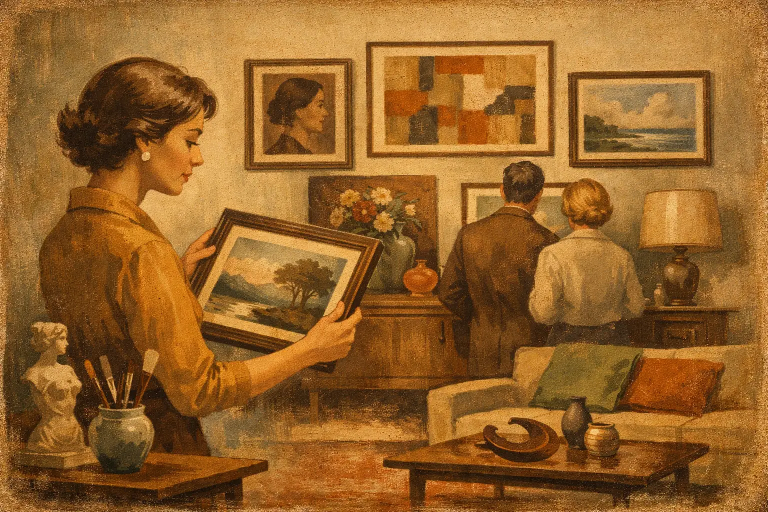
    A guide to curatorial art buying begins not with a blank wall, but with the atmosphere you want to protect or create. A work of art can bring quiet to an active room, introduce tension to an orderly one, or give a familiar space a more personal center of gravity. The aim is not to fill space efficiently. It is to choose an image, object, or edition that continues to reveal itself as you live beside it.

    Curatorial buying asks a different question from ordinary decorating: not simply, Does this match? but, What does this work make possible here? It considers visual form, certainly, but also material, context, artistic intention, and the pace of daily life. That approach can feel more deliberate, yet it often makes buying art less intimidating. You are looking for resonance, not trying to pass an exam in taste.

    Begin With the Feeling, Not the Frame

    Before considering dimensions or color palettes, observe the room as it is. Notice its light at different hours, its surfaces, the objects already carrying emotional weight, and the amount of visual silence it offers. A pale, minimal interior may need a work with texture or a concentrated gesture. A richly layered room may ask for an image with restraint.

    Words are useful here. You might want the room to feel contemplative, sensual, expansive, playful, grounded, or slightly unsettled. Those intentions become a more reliable guide than a trend or a color chip. Wabi-Sabi, for example, is not a decorative shorthand for beige or imperfect pottery. Its deeper appeal lies in its acceptance of irregularity, age, absence, and the beauty of what cannot be made perfectly symmetrical.

    Art does not need to repeat the room’s existing mood. Sometimes the best choice is a quiet interruption: an austere abstract in a warm, tactile space, or a luminous surreal image in an otherwise disciplined interior. Harmony is not the same as sameness.

    Learn What You Are Actually Buying

    The language around art can sound ceremonial, but the essentials are clear once they are separated. An original artwork is a unique object made by the artist, such as a painting, drawing, collage, or one-of-one digital work with a defined physical presentation. Its surface, scale, and presence are inseparable from the piece itself.

    A limited edition is a work produced in a fixed, stated quantity. Each example is generally numbered, such as 7/50, and may be signed or accompanied by a certificate of authenticity. The edition size matters, but it is not the sole measure of value. The artist’s practice, the quality of production, the rarity of the image, and the integrity of the documentation matter as well.

    An open edition has no predetermined limit. It can be an excellent choice when the primary desire is to live with a compelling image at an accessible price. A museum-quality Giclée print, produced with archival inks on carefully selected paper or canvas, can offer exceptional tonal depth and longevity. It should be understood for what it is: a finely made editioned or open-format artwork, not a substitute pretending to be an original.

    Ask how the work is made, what materials are used, whether the edition is limited, and how authenticity is documented. Clear answers are a sign of professional care, not an inconvenience to the seller.

    A Guide to Curatorial Art Buying Online

    Buying online requires imagination, but it does not require blind faith. The screen cannot fully transmit scale, texture, or the way a print’s blacks settle into paper. A thoughtful gallery should make those decisions easier with accurate dimensions, detail images, material descriptions, edition information, framing options, and a clear explanation of what is included.

    Start by marking the intended wall with painter’s tape or kraft paper in the artwork’s stated dimensions. This modest act changes the conversation immediately. Many buyers choose a work that is too small because they are visualizing the image rather than its physical role in the room. Above a sofa, bed, or console, art usually benefits from enough scale to feel intentional rather than incidental.

    Then consider viewing distance. A richly detailed photograph or digital composition can reward close looking in a hallway or reading corner. A broad abstract field may be more powerful across a living room, where its energy is perceived from several feet away. For a pair or grouping, leave room for the works to breathe. The space between images is part of the composition.

    Color should be assessed with care. Screens vary, and a warm white, charcoal black, or muted blue can change character under different lighting. Rather than seeking an exact match, look for a relationship. A work can echo the undertone of wood, stone, linen, or metal without duplicating it.

    Let the Work Lead, Then Test Its Place

    There is a useful tension in art buying: choose from genuine attraction, then examine the practical fit. If a piece makes you pause, return to it. Notice whether your attention stays with its composition or whether you only admire its ability to coordinate with a rug. Decorative compatibility alone rarely sustains a long relationship.

    At the same time, personal connection does not excuse every placement decision. A delicate small work can disappear on a large wall. A heavily framed piece may overwhelm a narrow passage. A quiet monochrome can be transformative, but in a dim room it may need considered lighting to retain its subtle range.

    Frame choice also changes meaning. A natural wood frame can draw out warmth and tactility. Black can sharpen a graphic composition and give it architectural definition. White can create distance, allowing an image to feel airy and suspended. For works with strong surface presence, a simple frame or float mount often keeps attention where it belongs.

    Buy Across Price Points Without Lowering Your Standards

    A considered collection does not have to begin with a major original. One meaningful limited edition, selected with conviction and properly framed, can establish a visual language for a home. Over time, that work may sit beside an original drawing, a photograph, or a more ambitious painting. The result is often more personal than acquiring everything at once.

    Set a budget that includes the complete cost of living with the work: framing, shipping, taxes where applicable, and installation. Framing is not an afterthought. It protects the artwork and determines much of its finished presence. Archival materials, ultraviolet-protective glazing when appropriate, and careful mounting are especially worthwhile for works on paper.

    If you are choosing between a smaller original and a larger edition, there is no universal answer. The original may offer singularity and material immediacy. The edition may better serve the architecture of the room and provide the scale the image needs. Choose according to the role the work will play, not according to a hierarchy you feel obliged to follow.

    Ask the Questions That Build Confidence

    A good purchase should leave little mystery about the work’s identity and care. For an original, ask about medium, date, condition, signature, and any provenance available. For an edition, ask about the edition size, print method, paper or canvas, ink, numbering, signature, certificate, and whether the work is sold framed or unframed.

    Also clarify handling and delivery. Art should be packed with attention to its material vulnerabilities, particularly corners, glazing, and works on paper. International buyers may need to understand duties or local taxes before the work ships. For designers, hospitality teams, and larger residential projects, it is useful to ask about volume availability, lead times, and consistency across multiple framed pieces.

    These questions are not merely administrative. They reveal the care surrounding the object, which is part of the experience you are bringing into your space.

    Build a Collection With a Point of View

    A collection becomes coherent when it reflects a way of seeing, not when every work uses the same palette. You may be drawn to traces of landscape, altered figures, meditations on freedom, spare geometry, or images that hold a dreamlike ambiguity. Let those affinities recur naturally.

    Avoid buying only for the room you have at this exact moment. Homes change. Furniture moves. Walls are repainted. A work with emotional and visual depth can travel through those changes. It can move from a bedroom to an entryway, from an apartment to a larger home, and still retain its charge.

    Taygeta Gallery approaches this process as an encounter between art and atmosphere. The right work is not a finishing touch applied after a room is complete. It can be the element that makes the room feel finally inhabited.

    Give yourself time with the images that stay in your mind. The strongest choice is often the one that does not demand attention loudly, yet quietly alters the way you see the space around it.

  • How to Buy Art Prints Online With Confidence

    How to Buy Art Prints Online With Confidence

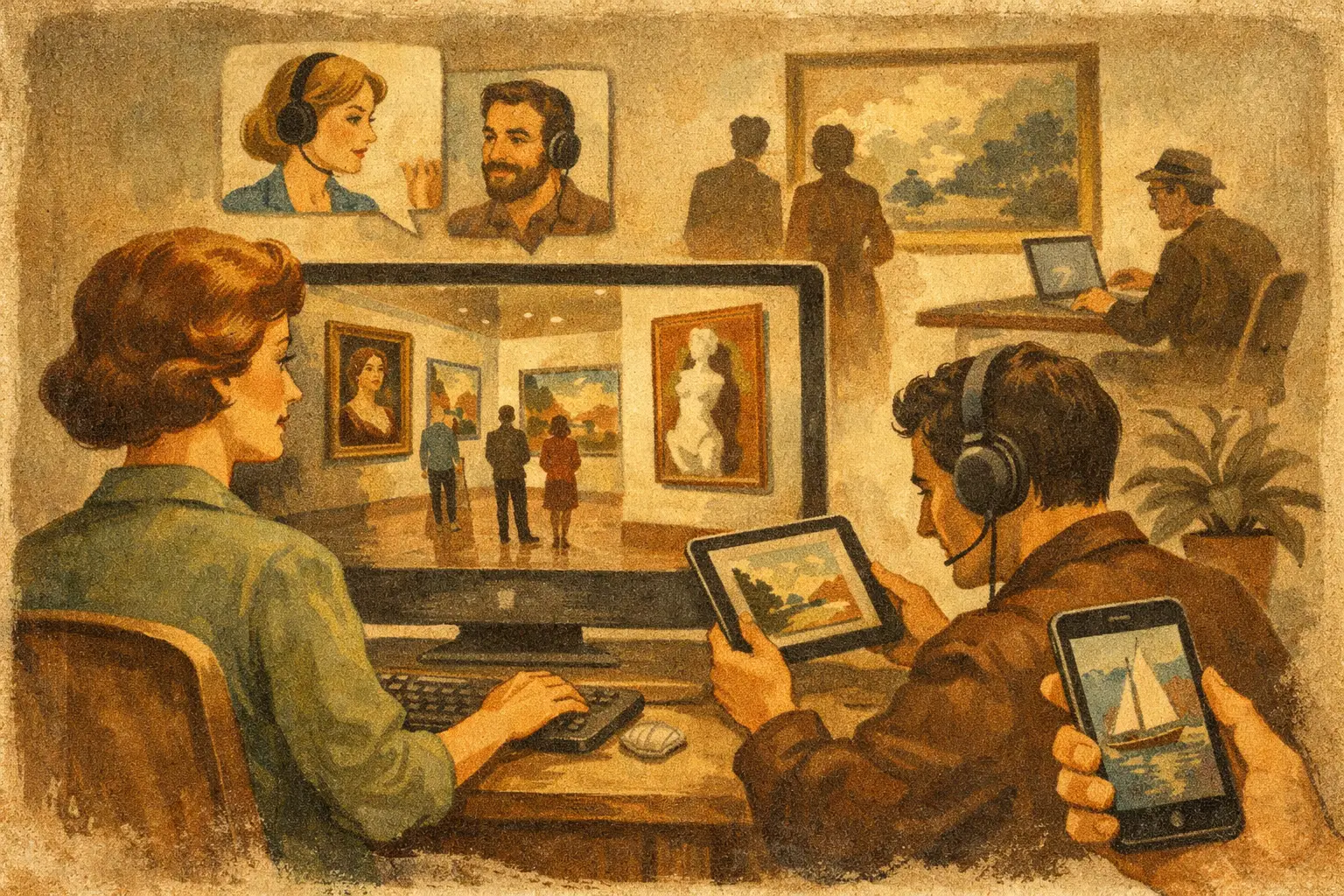
    A print can arrive in a tube, yet alter the emotional weather of an entire room. That possibility is what makes buying art online so compelling – and why it deserves more attention than choosing an image that merely matches a sofa. Knowing how to buy art prints online means learning to recognize both visual connection and material quality, then giving each work the space to live with you over time.

    The best online art purchase rarely begins with a color search. It begins with a feeling: the quiet of a pale, spacious composition; the tension of an abstract gesture; the strange pleasure of an image that resists immediate explanation. Once that response is present, practical decisions can bring it into focus.

    Begin With the Atmosphere, Not the Empty Wall

    A wall is not simply a measurement. It sits within a larger field of light, texture, movement, and daily ritual. Before looking at prints, notice how you want the room to feel. A bedroom may ask for stillness and soft tonal shifts. An entryway may hold a bolder work that creates a moment of arrival. A dining room can carry complexity, inviting people to look again between conversations.

    This does not mean every artwork must coordinate. A room often becomes more personal when art introduces a subtle contrast: a surreal image in a restrained interior, or a rough, imperfect mark against polished architectural surfaces. Wabi-Sabi teaches that beauty can be found in irregularity, age, and incompleteness. An art print with texture, ambiguity, or an off-center composition may bring more lasting presence than a perfectly matched decorative piece.

    Start by saving works that hold your attention for more than a few seconds. Then look for the thread among them. It might be an interest in muted earth colors, geometric forms, dreamlike figures, Japanese-influenced minimalism, or images that suggest distance and silence. Taste becomes clearer through repetition.

    How to Buy Art Prints Online Without Guesswork

    Buying online requires a little more reading than buying art from a wall display. A good gallery page should give you enough detail to understand what you are receiving, not simply present a beautiful thumbnail. Look beyond the image itself and consider the print process, edition, dimensions, and framing options together.

    Understand what Giclée quality means

    Museum-quality Giclée printing uses high-resolution archival inkjet technology, typically with pigment inks and fine-art paper or canvas. The result can preserve subtle gradients, deep blacks, and delicate details with impressive fidelity. For digital and contemporary works, this matters greatly: the character of a soft color field or a precise line can be lost on inexpensive poster stock.

    Still, Giclée is a production method, not a guarantee on its own. Ask what paper is used, whether the inks are archival, and how the print is finished. Fine-art papers vary in surface and weight. A matte cotton rag paper often lends a velvety, tactile depth to painterly or understated work, while a smoother paper can suit crisp photography, graphic compositions, and saturated digital art.

    The screen is useful for discovery, but it cannot fully convey surface. If texture is central to the work, read the description closely and consider how the chosen paper will support its mood.

    Read the edition information carefully

    An open edition can be an excellent choice when you want accessible, high-quality art for a home, a gift, or a large design project. Limited editions introduce a different kind of value: scarcity. They are produced in a defined quantity, often numbered and sometimes signed or accompanied by a certificate of authenticity.

    Neither is automatically better. A limited edition may appeal to a collector who values rarity and a documented connection to the artist. An open edition may allow you to choose a more generous scale or invest in framing without stretching the budget. What matters is clarity. The listing should state whether the work is open or limited, the total edition size when relevant, and what accompanies the print.

    Be wary of vague language that uses terms such as exclusive or collectible without explaining the actual edition. In art, specificity is a sign of care.

    Choose scale with the room in mind

    Many people buy art too small, particularly above a sofa, bed, console, or dining table. The image may be beautiful, but a modest print placed alone on a broad wall can feel visually adrift. Measure the available area before ordering, then use painter’s tape or paper cut to size to see the proposed dimensions in the room.

    As a general visual principle, art above furniture often feels balanced when its total width occupies roughly two-thirds to three-quarters of the furniture beneath it. This is not a rigid rule. A small, intimate print can be powerful in a quiet corner, while a large-scale work can become the calm center of an otherwise minimal room.

    Consider viewing distance, too. Fine linework and intricate detail reward closer looking. Broad fields of color or strong abstract forms can hold their own across a room. If a print is offered in several sizes, do not assume the largest is best. The right scale is the one that allows the work to breathe without overwhelming its setting.

    Framing Is Part of the Artwork’s Presence

    A frame changes how a print is read. It can make a contemporary digital artwork feel architectural, give a delicate composition more air, or pull a color from the image into the wider room. For this reason, framing should be considered before checkout, not treated as an afterthought.

    A white or natural wood frame often supports light, contemplative interiors and lets the work remain the focus. Black framing adds definition and can sharpen a graphic or high-contrast image. Oak, walnut, and other wood tones introduce warmth, especially against plaster, linen, stone, or neutral textiles.

    Matting also changes the rhythm of the piece. A generous white mat creates visual pause and can make a smaller print feel more intentional. Printing closer to the frame edge gives the image greater immediacy. There is no universal answer: it depends on the artwork, the room, and whether you want a quiet object or a more assertive focal point.

    If ordering unframed, account for framing costs and local availability before choosing an uncommon size. Standard dimensions are easier and often more economical to frame. A custom size may be worthwhile when the proportions are essential to the composition.

    Look for a Gallery That Offers Real Transparency

    The comfort of online buying comes from knowing what happens between the image on your screen and the art on your wall. A trustworthy gallery makes that path visible. Product descriptions should identify the work’s materials, dimensions, print type, and edition status. Images should show detail when possible, and policies should explain payment, packaging, delivery, and returns in plain language.

    For international buyers, shipping information deserves special attention. Check whether the work ships rolled or framed, how duties and taxes may be handled, and what timing to expect. Large framed works can be convenient, but they also involve greater shipping complexity. A carefully packed unframed print may be the wiser choice if you have a trusted local framer or are ordering across borders.

    Safe payment and responsive support are not secondary luxuries. They are part of the experience of collecting with confidence, especially when selecting art for a hospitality project, client installation, or multiple-room home.

    Give Yourself Permission to Choose Slowly

    There is a difference between hesitation and discernment. If you are drawn to a work but uncertain, return to it at different times of day. Imagine it in the room when it is quiet, when guests are present, and when the seasons change. Art does not need to explain itself immediately, but it should continue to offer something after the first impression.

    At the same time, avoid waiting for perfect certainty. The most meaningful artworks often carry a slight element of risk. They reveal something you did not know you wanted: a color that deepens at dusk, a shape that feels newly unfamiliar, a sense of calm that cannot be measured in a product specification.

    Choose the print that makes your space feel less finished and more alive. A considered artwork leaves room for attention, and attention is where a home begins to reflect its inhabitants.

  • Eastern Philosophy in Art and Modern Space

    Eastern Philosophy in Art and Modern Space

    A room can be visually complete and still feel restless. That tension is often what draws people toward eastern philosophy in art: not simply for its look, but for its ability to create stillness, space, and emotional clarity. In the best works, philosophy is not added as decoration. It is embedded in composition, restraint, texture, and the way an image allows the eye to rest.

    For collectors and design-minded buyers, this matters because art does more than fill a wall. It sets the rhythm of a space. Eastern thought has shaped that rhythm for centuries, offering a visual language grounded in impermanence, balance, humility, and presence. When translated into contemporary painting, printmaking, or digital abstraction, those ideas can feel deeply current rather than historical.

    What eastern philosophy in art really means

    The phrase can sound broad, and it is. Eastern philosophy includes many traditions, regions, and lineages, from Zen Buddhism and Taoism to broader ideas of harmony, emptiness, and natural order found across Asian aesthetics. In art, these ideas rarely appear as literal symbols alone. More often, they shape how a work is made and how it is experienced.

    Zen, for example, values directness and awareness. In visual terms, that can appear as disciplined simplicity, spare gestures, asymmetry, and a respect for negative space. Taoist influence often appears in the sense of flow, softness, and alignment with natural movement rather than force. Wabi-Sabi, though often simplified in Western design culture, centers on imperfection, transience, and modest beauty. A weathered surface, an irregular mark, or a muted tonal field can carry more emotional truth than polished perfection.

    This is why eastern-inspired art often feels calming without becoming passive. It does not demand attention through excess. It earns attention through depth.

    The visual qualities that carry the philosophy

    In many contemporary works, the philosophical foundation is felt through a few recurring qualities. Space is one of them. Empty space is not emptiness in the sense of lack. It is active, intentional, and necessary. It gives form to what remains and invites contemplation rather than visual overload.

    Materiality is another. Textured surfaces, faded tones, raw brushwork, and restrained palettes suggest time, touch, and impermanence. These qualities can make a work feel more human and less manufactured. Even in digital art, when handled with sensitivity, layered texture and tonal quiet can preserve that sense of authenticity.

    Then there is balance. Not symmetry for its own sake, but equilibrium. A composition may feel centered emotionally while remaining formally uneven. That subtle instability is often what gives the work life. It mirrors nature, where balance is rarely rigid.

    Why it resonates in modern interiors

    Contemporary interiors often struggle with a familiar problem: abundance. Too many objects, too much visual information, too little room for reflection. Art informed by eastern philosophy offers a counterpoint. It helps shape an atmosphere that feels grounded rather than staged.

    In a minimal home, such work adds soul without clutter. In a layered interior, it can create a pause between stronger elements. For hospitality and commercial spaces, it often supports the kind of mood people remember but cannot always name – calm, spaciousness, and ease.

    This is also where buyers become more discerning. A mass-produced print may imitate a neutral palette or abstract brushstroke, but it rarely carries the internal coherence of a thoughtfully made piece. The difference is subtle at first and unmistakable over time. Art with philosophical integrity continues to reveal itself.

    Zen, Wabi-Sabi, and the shift from trend to meaning

    Some eastern aesthetics have become popular design shorthand, especially Zen and Wabi-Sabi. That visibility has benefits, but it also creates confusion. Not every beige abstract is Zen. Not every distressed surface expresses Wabi-Sabi.

    The distinction lies in intention. Zen-influenced art tends toward concentration, reduction, and presence. Wabi-Sabi accepts irregularity, age, and incompletion as part of beauty. Both ask the viewer to slow down. Both resist the polished certainty of purely decorative art.

    For a collector, this means choosing work that does more than match a palette. The strongest pieces contribute a psychological dimension to the room. They soften perfection, deepen atmosphere, and make the space feel lived with rather than merely styled.

    At Taygeta Gallery, this curatorial approach is part of the appeal. The eastern-aesthetic foundation is not treated as a trend layer, but as a serious visual and philosophical framework for contemporary living.

    How to choose art with this sensibility

    The first question is not whether a work looks eastern. It is whether it creates a particular state of attention. Does it feel quiet but not empty? Restrained but not cold? Is there tension, softness, and room for interpretation?

    Look closely at scale and placement as well. Art rooted in stillness needs space around it. A modest work can be powerful if it is allowed to breathe. Larger pieces can anchor a room beautifully, especially when their composition avoids noise and their palette supports the architecture rather than fighting it.

    It also helps to notice your own pace in front of the work. If you feel compelled to linger, that is often the sign of substance. Philosophically grounded art does not always announce itself immediately. It unfolds.

    For those building a home collection or sourcing for a design project, eastern philosophy in art offers something rare: visual refinement with emotional intelligence. It allows a space to feel composed, but also alive to time, silence, and the beauty of what is unresolved. That may be its most lasting value – not that it completes a room, but that it changes how the room is felt.

  • What Makes a Curated Online Gallery Work

    What Makes a Curated Online Gallery Work

    You can feel the difference almost immediately. One art site presents an endless grid of images with no rhythm, no point of view, and no clue where to begin. A curated online gallery does something quieter and far more valuable – it edits, interprets, and gives the viewer a way to see.

    That distinction matters because buying art online is rarely just a transaction. For a homeowner refining a living room, a designer sourcing for a hotel, or a collector looking for a work with staying power, the question is not simply what looks good on a screen. The deeper question is whether the work carries presence, whether the quality is real, and whether the selection reflects taste rather than volume.

    Why a curated online gallery matters

    A curated online gallery is not defined by being online. Plenty of websites sell art. What makes a gallery curated is the act of selection and the thinking behind that selection. Someone has made choices about which artists belong together, which themes deserve attention, and what kind of visual language the gallery wants to stand for.

    That act of restraint is a service to the buyer. In a market crowded with mass-produced decoration and algorithm-led recommendations, curation creates clarity. It says: these works have been chosen for a reason. They speak to one another. They belong to a larger atmosphere, philosophy, or conversation.

    For design-conscious buyers, this is often the missing piece. Many people are not looking for the loudest artwork in the room. They are looking for work that settles into a space with intelligence. They want an image that can hold quiet, create tension in the right place, or soften architecture without becoming generic. A curated gallery helps them move from searching to discerning.

    Curation is not just taste – it is context

    Good taste alone does not make a gallery meaningful. Context does. A strong curated online gallery frames artwork so the buyer understands why it matters, not only what it costs or what size it is.

    This can happen through themed collections, artist statements, exhibition concepts, or thoughtful descriptions that locate the work within a mood, movement, or material sensibility. A collection shaped around Wabi-Sabi, for example, invites the viewer into ideas of impermanence, asymmetry, stillness, and natural wear. That context changes the experience of the work. It shifts the buyer from decoration toward interpretation.

    This is especially powerful online, where the physical aura of a gallery space is absent. On a screen, context becomes part of the architecture. It replaces some of what walls, lighting, and pacing would normally do in person. Without it, even strong artwork can feel flattened.

    The role of editing

    Editing is often underestimated because it is invisible when done well. But it is the heart of curation. A gallery that shows everything usually says very little. A gallery that selects with precision creates identity.

    That identity helps buyers trust their own response. If the selection feels coherent, the viewer begins to understand the gallery’s eye. From there, discovery becomes easier. Even unfamiliar artists feel less risky when the surrounding presentation communicates judgment, care, and consistency.

    What buyers should look for in a curated online gallery

    The first sign is coherence. Not sameness, but coherence. Different artists and mediums can coexist beautifully if there is a clear sensibility holding them together. The work may range from minimal abstraction to surreal figuration, yet still feel part of one aesthetic world.

    The second sign is quality of presentation. Museum-quality prints, faithful color reproduction, framing options, edition clarity, and material transparency all matter. A refined gallery does not rely on mood alone. It supports the emotional pull of the work with practical confidence.

    The third sign is narrative depth. If every description sounds generic, the curation probably is too. A serious gallery offers language that helps the viewer notice something more precise – a tension in composition, a philosophical thread, a spatial effect, a cultural reference. This does not mean making art feel academic. It means treating it with respect.

    Trust is built through details

    Online art buying asks for a leap of faith. Buyers cannot stand in front of the surface, study the texture, or test how a frame catches the light. Because of that, details become part of the curatorial experience.

    Clear dimensions, edition information, production quality, shipping transparency, and secure checkout are not separate from the gallery identity. They support it. A beautifully written collection page paired with vague print specifications creates friction. The opposite is also true: practical clarity gives poetic presentation credibility.

    The tension between accessibility and exclusivity

    One of the most interesting challenges in a curated online gallery is balance. If the work feels too exclusive, new buyers may assume they are not the intended audience. If it feels too open-ended, the gallery can lose distinction.

    The best galleries solve this by being welcoming without becoming broad. They offer entry points at different collecting levels – perhaps original works, collector editions, and museum-quality prints – while maintaining a clear aesthetic standard. This makes art collecting feel possible without making the work feel ordinary.

    That balance matters in contemporary interiors. A first-time buyer furnishing a quiet apartment may need one framed print with emotional depth. A trade client may need a series with conceptual cohesion for a hospitality project. Both are looking for confidence, but not in the same format. A curated gallery can serve both if it understands that accessibility is about guidance and quality, not lowering the bar.

    How a curated online gallery shapes interiors

    Artwork changes a room long before anyone names why. It can introduce stillness into a hard modern space, bring warmth to restraint, or create a focal point that is less about spectacle than atmosphere.

    This is where curation becomes spatial, not just visual. A gallery with a strong point of view helps buyers imagine how a work lives in a room. Minimal abstract pieces may support a calm architectural environment. More symbolic or surreal works might add tension and inwardness to otherwise neutral spaces. Earth-led palettes can soften glass and stone. Monochrome compositions can deepen a room built around quiet luxury.

    A thoughtful online gallery does not need to shout these possibilities. It can suggest them through collection structure, imagery, framing choices, and language that connects art to lived space. The result is more useful than trend-driven styling because it speaks to atmosphere rather than impulse.

    Why this model resonates now

    People are more visually saturated than ever, yet often less moved. Endless content has made selection more valuable, not less. The appeal of a curated online gallery lies partly in this cultural fatigue. Buyers want fewer choices, made better.

    There is also a growing desire for interiors that feel emotionally grounded. Not empty minimalism, and not visual excess either. Many buyers are looking for objects with meaning, calm, and texture of thought. Art that reflects Zen sensibilities, Wabi-Sabi restraint, or contemplative abstraction speaks to that desire because it asks the viewer to slow down.

    For that reason, curation is not a luxury add-on. It is a way of protecting attention. It helps people choose work they can live with for years, not just images that perform well for a moment.

    The best curated online galleries do more than sell

    A strong gallery creates a relationship between viewer, artwork, and setting. It teaches the eye gently. It helps a buyer understand not only what they like, but why they like it.

    That is where galleries such as Taygeta Gallery stand apart when they bring together philosophical depth, disciplined aesthetics, and collector-minded production. The work is not presented as disposable wall fill. It is framed as part of a larger visual life – one that includes personal space, cultural reference, and the quiet authority of well-made art.

    Of course, curation is not magic. It cannot replace your own instincts, and it should not flatten difference into one branded mood. The strongest curation leaves room for personal resonance. It offers a lens, not a script.

    When a curated online gallery is working as it should, it does something rare on the internet. It slows the scroll. It invites attention instead of chasing it. And in that pause, buyers often find the work that was meant for them – not because there was more to choose from, but because someone chose well.

  • 7 Emerging Abstract Art Trends to Watch

    7 Emerging Abstract Art Trends to Watch

    A quiet shift is happening on the walls of the most thoughtful interiors. Abstract art is moving away from formulaic gestures and oversized statements made for quick effect. In their place, emerging abstract art trends are favoring atmosphere, tactility, restraint, and a more intimate kind of presence – work that changes the room without overwhelming it.

    For collectors, homeowners, and design professionals, this shift matters because abstract art now carries a more nuanced role. It is not only there to provide color or fill scale. The right piece can hold silence, introduce rhythm, soften architecture, or bring an interior back into balance. What feels current now is less about spectacle and more about sensibility.

    Why emerging abstract art trends feel different now

    The strongest contemporary abstraction reflects a broader cultural mood. People want spaces that restore attention rather than compete for it. They want objects with emotional depth, but they also want clarity. That combination has changed what resonates.

    We are seeing less interest in generic “modern art” and more appreciation for works that feel curated, contemplative, and materially distinct. Buyers are asking better questions. Does the piece have presence up close as well as across the room? Does it feel timeless, or merely current? Will it live well with natural materials, changing light, and quieter interiors?

    This is where abstraction has become especially compelling. It can remain open-ended while still carrying philosophy, memory, and spatial intelligence. The best new work is not trying to explain itself too quickly.

    1. Quiet minimalism with emotional weight

    Minimal abstract art is not new, but its current form is more sensitive than stark. Instead of cold reduction, artists are creating compositions with softened edges, muted tonal shifts, negative space, and a palpable sense of pause. These works often feel architectural, but they are rarely rigid.

    What makes this trend notable is its emotional range. A restrained painting in bone, ash, ink, or clay can feel deeply expressive when surface, scale, and proportion are handled well. The appeal is obvious for contemporary interiors, especially spaces shaped by natural wood, stone, linen, and soft light.

    There is a trade-off here. Quiet work asks more from the viewer and from the room. In a rushed or overly decorated space, its subtlety can disappear. But in a well-composed interior, it offers something louder art cannot – calm that still feels alive.

    2. Texture as meaning, not ornament

    One of the most important emerging abstract art trends is the return of texture with purpose. Thick surfaces, raw layering, mineral-like finishes, weathered brushwork, and tactile irregularities are being used not as decorative effects but as part of the work’s emotional language.

    This reflects a growing preference for art that feels embodied and imperfect. Texture introduces time into a piece. It suggests revision, erosion, accumulation, and touch. In a market full of flat visual content, that physicality carries unusual power.

    For designers, textured abstraction can also do practical work. It softens clean-lined spaces, complements natural materials, and adds depth without requiring high contrast. Yet scale matters. Heavy texture in a small room can feel dense, while delicate relief in a larger setting may need more visual breathing room to register.

    Why tactile surfaces resonate in modern interiors

    Contemporary interiors often lean smooth – plaster walls, polished stone, streamlined furniture, quiet palettes. Textured abstract art introduces a counterpoint. It creates friction in the best sense, giving the eye somewhere to rest and return.

    Museum-quality Giclée production has also raised expectations around surface fidelity in prints, which means collectors can now seek tactile visual richness even when purchasing editions rather than one-of-one works. Still, not every textured original translates equally well. The success of the piece depends on how faithfully its material nuance is preserved.

    3. Earth-led palettes and softened neutrals

    Bold color has not disappeared, but it no longer dominates the conversation. Many of the most refined abstract works now move through sand, rust, smoke, charcoal, umber, faded indigo, moss, chalk, and warm off-white. These palettes feel grounded rather than muted for the sake of trend.

    Their appeal lies in versatility and mood. Earth-led abstraction works across minimal, Japandi, organic modern, and transitional interiors because it does not fight the room. It participates in atmosphere. It can sharpen a quiet space or soften a more structured one.

    This also aligns with a deeper desire for visual continuity between art and environment. Buyers are increasingly drawn to pieces that feel integrated rather than imposed. The risk, of course, is safety. A neutral abstract work still needs tension, movement, or formal clarity. Without that, it can slip into decoration.

    4. Digital abstraction that still feels human

    Digital art has matured. What once felt slick or overly synthetic is becoming more layered, painterly, and conceptually assured. Artists are using digital tools to create abstract compositions with translucency, fragmentation, grain, and spatial ambiguity that rival traditional media in emotional complexity.

    This shift matters because digital abstraction is no longer confined to novelty. It has entered the language of serious collecting and sophisticated interiors, particularly when offered as carefully produced limited editions or framed collector formats. For many buyers, it offers access to distinctive work at a more approachable price point.

    The line between digital and physical is also becoming less relevant. What matters now is visual intelligence, edition quality, and how the piece lives in space. Some digital works bring a luminosity that pigment cannot, while others intentionally mimic the softness of ink, paper, or washed mineral surfaces. It depends on the artist’s hand, even when that hand works through a screen.

    5. East-influenced abstraction and the aesthetics of impermanence

    A quieter but enduring movement within emerging abstract art trends draws from Eastern aesthetics – not as a surface reference, but as a philosophical foundation. Concepts such as emptiness, asymmetry, impermanence, and restraint are shaping how many contemporary abstract works are made and understood.

    This can appear in spare compositions, broken lines, suspended forms, or surfaces that seem weathered by time. The effect is often meditative rather than dramatic. Instead of filling every moment, the work leaves room for stillness.

    For design-conscious buyers, this approach offers more than visual harmony. It supports a way of living that values simplicity without sterility. In the right interior, these works create a rare sense of exhale. Taygeta Gallery has helped define this conversation by presenting abstraction through a lens of Zen and Wabi-Sabi sensibility, where beauty lives in nuance rather than perfection.

    That said, philosophy should not become styling shorthand. The strongest works engage these traditions with sensitivity and depth, not trend-driven borrowing.

    6. Larger scale, softer presence

    Large abstract art remains desirable, but its function has changed. The most compelling oversized works today are not always high-energy focal points. Many are expansive yet quiet, using tonal composition, diffuse movement, or minimal structure to create presence without visual noise.

    This matters in open-plan homes, hospitality settings, and commercial spaces where art must hold scale while preserving atmosphere. A large work can anchor a room, but if it competes too aggressively with furniture, materials, or sightlines, it can flatten the experience of the space.

    The newer approach is more spatially aware. Instead of asking to dominate, the art collaborates with architecture. It gives a wall gravity while allowing the room to breathe.

    Choosing scale with intention

    Bigger is not automatically better. A compact but materially rich abstract piece can feel more resolved than an oversized canvas selected only to fill emptiness. Proportion, ceiling height, viewing distance, and the emotional tone of the room all matter.

    Collectors often make stronger choices when they think less about coverage and more about cadence. What should the eye encounter first? Where should it rest? What kind of energy should remain after the initial impression fades?

    7. Curated individuality over trend matching

    Perhaps the most meaningful shift is that buyers are becoming less interested in matching art to a preset interior formula. They want work that feels discovered, not algorithmically assigned. This is changing the role of curation.

    Rather than shopping by color alone, collectors are paying attention to authorship, materiality, edition structure, and conceptual voice. They are more open to abstraction that creates subtle tension in a room, not just harmony. This is a healthier way to buy art because it leaves room for personality.

    It also means trend awareness should be used carefully. A current aesthetic can guide the eye, but it should not make the final decision. The best abstract art continues to reveal itself over time. It does not expire after one season of interiors imagery.

    How to read these trends when buying abstract art

    The most useful way to approach trend is not to ask what is popular, but what feels lasting within the current moment. A textured monochrome may be ideal for a serene bedroom but too recessive for a dynamic entry. A digital limited edition might suit a clean urban interior beautifully, while a heavily worked original may bring more soul to a layered, material-rich home.

    Good collecting lives in that tension between personal response and spatial awareness. When both are present, abstract art becomes more than a finishing touch. It becomes part of how a room thinks and feels.

    If the current direction of abstraction suggests anything, it is this: people are choosing art with greater care. They want work that holds complexity softly, that honors emptiness as much as form, and that remains generous to live with long after the novelty of newness has passed.

  • Best Calming Art for Bedrooms

    Best Calming Art for Bedrooms

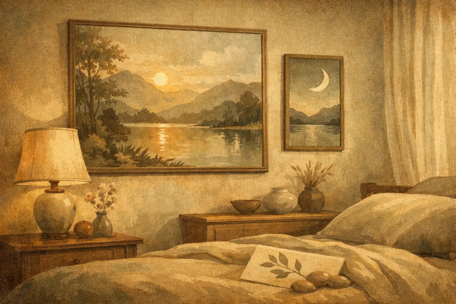
    A bedroom can be beautifully furnished and still feel unsettled. Often, the missing element is not another textile or lamp, but the image that holds the room emotionally. The best calming art for bedrooms does more than match a palette. It slows the eye, softens mental noise, and gives the space a deeper sense of rest.

    This is why bedroom art deserves a different standard than art chosen for a hallway, living room, or office. In a room designed for restoration, visual energy matters. Strong work can still be quiet. Memorable work can still feel gentle. The goal is not bland decoration, but a form of presence that supports stillness.

    What makes art feel calming in a bedroom

    Calm is not a single style. It is a relationship between composition, color, scale, and emotional tone. Some pieces create calm through emptiness and restraint. Others do it through rhythm, softness, or a sense of distance. A misted landscape, a minimal abstract, or a subtle botanical can each feel serene for different reasons.

    The most reliable quality is visual breathing room. Art that leaves space within the composition tends to feel more restful than work packed with contrast and detail. Negative space, softened edges, tonal layering, and balanced asymmetry can all help the mind settle rather than stay alert.

    Color also shapes the nervous system’s response. Muted earth tones, stone, sand, warm ivory, faded blue, sage, charcoal, and dusty blush often work well because they feel grounded without becoming heavy. Bright primary colors, hard black-and-white contrast, and highly saturated neon tones can be striking, but they usually bring more stimulation than most bedrooms need.

    That said, calm does not always mean pale. Deep ink washes, midnight blues, and mineral greens can feel profoundly restful when the composition remains spacious and measured. The question is less about light versus dark, and more about whether the work introduces tension or release.

    The best calming art for bedrooms by style

    The most successful bedroom art usually belongs to one of a few visual families, though the edges often overlap.

    Minimal abstract art

    Minimal abstracts are often among the best calming art for bedrooms because they create atmosphere without over-explaining themselves. A restrained composition in layered neutrals or softened organic forms can give a room depth while preserving silence. This is especially effective in modern interiors, where clean lines benefit from one piece that adds emotional texture.

    Look for movement that feels slow rather than sharp. Gestural works can still be calming if the mark-making is spacious and fluid. Pieces inspired by Zen aesthetics or Wabi-Sabi sensibilities often excel here because they honor imperfection, emptiness, and balance.

    Quiet landscapes and horizon-based work

    There is a reason distant horizons feel restorative. They imply openness, perspective, and exhale. Seascapes, desert scenes, fog-bound mountains, and abstracted landscapes with a strong horizontal line can all bring a bedroom into a more contemplative register.

    Avoid scenes that are too dramatic. A stormy sky may be beautiful, but beauty alone is not the test. In a bedroom, gentler weather usually works better. Think still water, softened terrain, or a field reduced to color and light.

    Botanical and nature-inspired compositions

    Nature imagery can be deeply calming when handled with subtlety. The best examples feel observed rather than decorative. A single branch, reed, leaf study, or softened floral form often has more longevity than a busy bouquet or overly styled print.

    For bedrooms with natural wood, linen, plaster, or stone elements, botanical art can create a refined continuity. It echoes the material language of the room without becoming too literal.

    Monochrome ink, wash, and line work

    Ink-based art has a meditative quality that suits private spaces beautifully. A spare brushstroke, a field of diluted pigment, or a minimal line composition can feel disciplined yet tender. These works often carry a sense of stillness because they rely on essence rather than excess.

    This approach is particularly compelling in interiors that lean quiet and architectural. It offers presence without visual clutter.

    Color choices that support rest

    If you are choosing bedroom art from a place of uncertainty, start with temperature and intensity. Warm neutrals tend to make a room feel held. Cool neutrals often create clarity and air. Neither is better. It depends on the emotional atmosphere you want.

    For a cocooning bedroom, consider art with clay, taupe, umber, soft rust, mushroom, or muted terracotta. These tones work well in spaces with creamy walls, walnut wood, and tactile fabrics. For a lighter, more meditative effect, art in foggy blue, sage, faded gray, and off-white can make the room feel quieter and more expansive.

    One useful principle is to avoid introducing a new loud color through the artwork unless that color already belongs to the room in a meaningful way. Bedroom art should feel integrated, not like an interruption.

    Scale matters more than most people think

    Even beautiful art can feel wrong if the scale is off. In a bedroom, oversized work can be calming when the image itself is quiet. A large, minimal piece above the bed often feels more restful than a cluster of smaller frames competing for attention.

    Small art can work well too, especially in intimate bedrooms or beside a reading chair, but it usually needs space around it to breathe. If several small pieces are grouped too tightly, the arrangement can start to feel busy.

    Above the bed, the artwork should generally feel anchored to the width of the headboard or bed frame. It should not appear tiny and apologetic, nor should it dominate the room like a billboard. Proportion creates peace because it removes subtle visual friction.

    Framing and materials shape the mood

    The image is only part of the experience. Framing can either preserve calm or disrupt it. Thin natural wood, soft black, muted oak, walnut, and restrained gallery-style frames usually suit bedrooms well. Heavy ornament often pulls the work into a more formal or historical mood, which may or may not fit the room.

    The finish matters too. Museum-quality Giclée prints with nuanced tonal range can retain the softness that calming imagery requires. Poor printing tends to flatten subtle color transitions, which is where much of the serenity lives. This is one reason design-conscious buyers often prefer curated galleries over generic print marketplaces. The difference is not only aesthetic. It is atmospheric.

    Placement is part of the feeling

    Over the bed is the obvious choice, but not the only one. A calm piece opposite the bed can be just as powerful, especially if it is the first thing seen in the morning. Art near a dressing area or reading corner can create a quieter rhythm across the room.

    If the bedroom already has strong architectural elements, such as a paneled wall, dramatic drapery, or a sculptural headboard, the artwork may need to be even simpler. In a more minimal room, the art can carry a little more emotional weight. It depends on where the eye needs rest and where it can hold attention.

    What to avoid when choosing calming bedroom art

    The most common mistake is confusing neutral with calming. A beige artwork can still feel lifeless or tense if the composition is unresolved. Another mistake is choosing art only to match bedding. Harmony matters, but art should not disappear into the room entirely. The best pieces deepen the mood rather than merely repeat it.

    Text-heavy prints, overtly motivational phrases, and highly trend-driven imagery rarely age well in bedrooms. The same goes for art that feels too performative or visually loud. A bedroom is one of the few spaces in a home where understatement can be genuinely luxurious.

    For couples or shared spaces, there is another layer to consider. Calming art should not feel so personal to one person’s taste that the other feels excluded. In these cases, abstract work, landscapes, and nature-based compositions often create common ground without becoming generic.

    Choosing art that still feels personal

    The most compelling bedroom art is serene, but not anonymous. A room meant for rest should also feel inhabited by your sensibility. That may mean a minimalist composition with an unusual tonal tension, a landscape that recalls a place of emotional significance, or a botanical work that carries a certain delicacy you respond to instinctively.

    This is where curatorial selection matters. A refined gallery perspective can help you find work that feels quiet yet distinctive, rather than mass-produced calm. At Taygeta Gallery, this kind of selection often lives in pieces shaped by simplicity, impermanence, and contemplative form – art that brings stillness without losing character.

    When you choose bedroom art, ask a simple question: does this piece ask more of me, or does it give something back? The right work will not clamor for attention every time you enter the room. It will meet you softly, and over time, that may be the most lasting kind of beauty.

  • The Future of Collectible Digital Art

    The Future of Collectible Digital Art

    A digital artwork framed on a quiet wall can do something a screen full of images cannot. It can slow a room, hold attention, and give form to a collector’s sensibility. That tension between the endless flow of online images and the desire for something singular sits at the center of the future of collectible digital art.

    For a few years, the conversation around digital art was dominated by speculation. Prices rose fast, categories blurred, and ownership often seemed more abstract than the work itself. What remains after that noise is more interesting. Serious buyers, designers, and collectors are asking better questions now. Not simply, Is it digital? But, What makes it worth living with? What gives it presence? What turns a file into an edition, an object, and eventually, a cultural artifact?

    What the future of collectible digital art really depends on

    The next chapter will not be defined by technology alone. It will be shaped by taste, trust, and context. Digital art has already won its place as a legitimate medium. The unsettled part is not whether it belongs in contemporary collecting, but how it will be collected with discernment.

    That shift matters. In the early market, novelty carried too much weight. Buyers were told that innovation itself created value. Sometimes it did. More often, innovation without curatorial depth created short-lived excitement. Collectibility, by contrast, tends to grow from slower qualities – artistic vision, edition integrity, production standards, provenance, and the ability of a work to remain emotionally alive after the trend cycle ends.

    For design-conscious collectors, this is welcome news. It means digital art is moving closer to the standards long applied to photography, printmaking, and works on paper. Medium matters, but so do composition, concept, rarity, and craftsmanship. A digital work that enters a home, hospitality setting, or private collection must hold its own not because it is new, but because it is good.

    From file to object

    One of the clearest changes in the future of collectible digital art is the return of material presence. Buyers do not collect pixels in the abstract. They collect editions, displays, framed works, certificates, artist narratives, and experiences of ownership that feel complete.

    This does not mean every digital artwork must become a print. Some works are native to light, motion, or responsive display, and forcing them into static form can weaken them. But for many collectors, especially those building interiors rather than purely speculative portfolios, physical realization is essential. A museum-quality print, a carefully scaled framed edition, or a thoughtfully produced collector release gives digital art weight in both senses of the word.

    The trade-off is subtle. Once digital art becomes an object, it enters the familiar world of production choices, archival concerns, framing, shipping, and placement. That adds friction, but it also adds credibility. A collector can understand what is being acquired, how it will live in space, and why one edition is distinct from another.

    For galleries and curators, this is an opportunity to shape value through restraint. Edition size, print method, substrate, framing, and presentation are not secondary details. They are part of the artwork’s identity in the market.

    Scarcity will matter, but not in a simplistic way

    Digital culture made abundance feel normal. Collecting depends on limits. The future belongs less to artificial scarcity for its own sake and more to meaningful forms of limitation.

    A small edition with clear documentation can feel collectible. So can a timed release tied to a specific exhibition context, or a digital work accompanied by a materially refined counterpart. What buyers are becoming less tolerant of is vague scarcity – editions that can be endlessly expanded, inconsistent production standards, or unclear rights around duplication and display.

    Collectors are not only buying an image. They are buying boundaries. They want to know what exists, who controls reproduction, and what makes their piece distinct. In this sense, digital art is maturing by becoming more legible.

    Curation will separate art from content

    The internet produces images at extraordinary speed. Most of them are consumed and forgotten. Collectible art asks for another mode of attention.

    This is where curation becomes decisive. The future of collectible digital art will favor galleries, platforms, and artists who can create context, not just inventory. A strong digital work does not arrive alone. It arrives with a point of view, with thematic coherence, with an understanding of where it sits within visual culture and how it speaks to a room, a collector, or a moment in time.

    For buyers, curation reduces a common anxiety: the fear of choosing something that looks impressive online but shallow in person. A curated presentation offers more than taste-making. It offers confidence. It says that this work has been considered in relation to quality, atmosphere, and lasting relevance.

    That is especially important in interiors. Designers and private clients are rarely looking for digital art as a category. They are looking for stillness, tension, luminosity, balance, or emotional contrast. The medium is part of the story, but not the whole story. A contemplative abstract digital work may belong in a Wabi-Sabi interior because of its cadence and restraint, not because of the software used to make it.

    The collector’s eye is becoming more sophisticated

    A more mature audience is emerging, and that will reshape the market. Early adopters often focused on novelty, platform mechanics, or resale potential. Today’s serious buyer is more likely to ask whether the work has formal intelligence, whether the edition is well produced, and whether it can live with depth in a real space.

    This sophistication will reward artists who have a recognizable visual language rather than a formula. It will also reward galleries that present digital art with the same seriousness they bring to print, photography, or contemporary mixed media.

    There is room here for accessibility too. Collectible does not have to mean unreachable. Limited digital editions can offer an entry point for first-time buyers who want distinctive work at a justifiable price, especially when production quality is high and the curatorial framing is thoughtful. Taygeta Gallery’s approach to digital editions and framed works reflects this broader shift: accessibility gains value when it is paired with rigor.

    Technology will stay in the background when the art is strong

    Technology will continue to matter, but probably less as spectacle and more as infrastructure. Authentication systems, provenance records, smart displays, and improved printing methods all support the category. They can reduce uncertainty and make ownership easier to verify and manage.

    Still, most collectors do not want to collect a tool. They want to collect a work that moves them. If the conversation stays fixed on technical novelty, the art becomes secondary. If the technology quietly strengthens trust, longevity, and display, it serves the work rather than competing with it.

    This is an important distinction for the years ahead. The market will likely become less enchanted by technical jargon and more attentive to how technology supports connoisseurship. Better archives, better edition control, better environmental durability, better display options – these are meaningful advances. They are simply not the main event.

    Interiors will shape demand as much as collectors do

    One reason digital art has such a strong future is that it aligns naturally with contemporary interiors. Clean lines, atmospheric color fields, meditative abstraction, and conceptual minimalism all translate beautifully across modern residential and hospitality spaces.

    That said, not every digital work belongs in every room. Some pieces thrive on luminous intensity and motion. Others need the quiet authority of paper, pigment, and frame. As more interior designers and specifiers collect digital editions for projects, the market will become more spatially aware. Scale, finish, reflection, tonal subtlety, and framing will influence buying decisions as much as authorship.

    This could be one of the healthiest developments in the category. It draws digital art away from pure online circulation and into lived environments. A work that can hold atmosphere in a bedroom, lobby, study, or dining room gains a different kind of legitimacy. It becomes part of daily ritual.

    What will endure

    The collectible digital artworks most likely to last will share a few qualities. They will have artistic clarity rather than gimmick. They will be presented with discipline. They will respect both the possibilities of the medium and the intelligence of the buyer.

    Some will remain entirely digital. Others will take physical form through prints, framed editions, or hybrid presentations. Some will command high prices, while others will become beloved because they meet a collector at the right moment, with the right emotional charge, and remain meaningful over time.

    The future of collectible digital art is not a single market prediction. It is a cultural refinement. The category is growing quieter, more selective, and more grounded in lived experience. For collectors, that is a good thing. It leaves more room for beauty, for discernment, and for artworks that continue to speak after the noise has passed.

    The best digital art will not ask to be excused for being digital. It will simply ask to be looked at, slowly, and then lived with.

  • What an Art Trade Program Should Offer

    What an Art Trade Program Should Offer

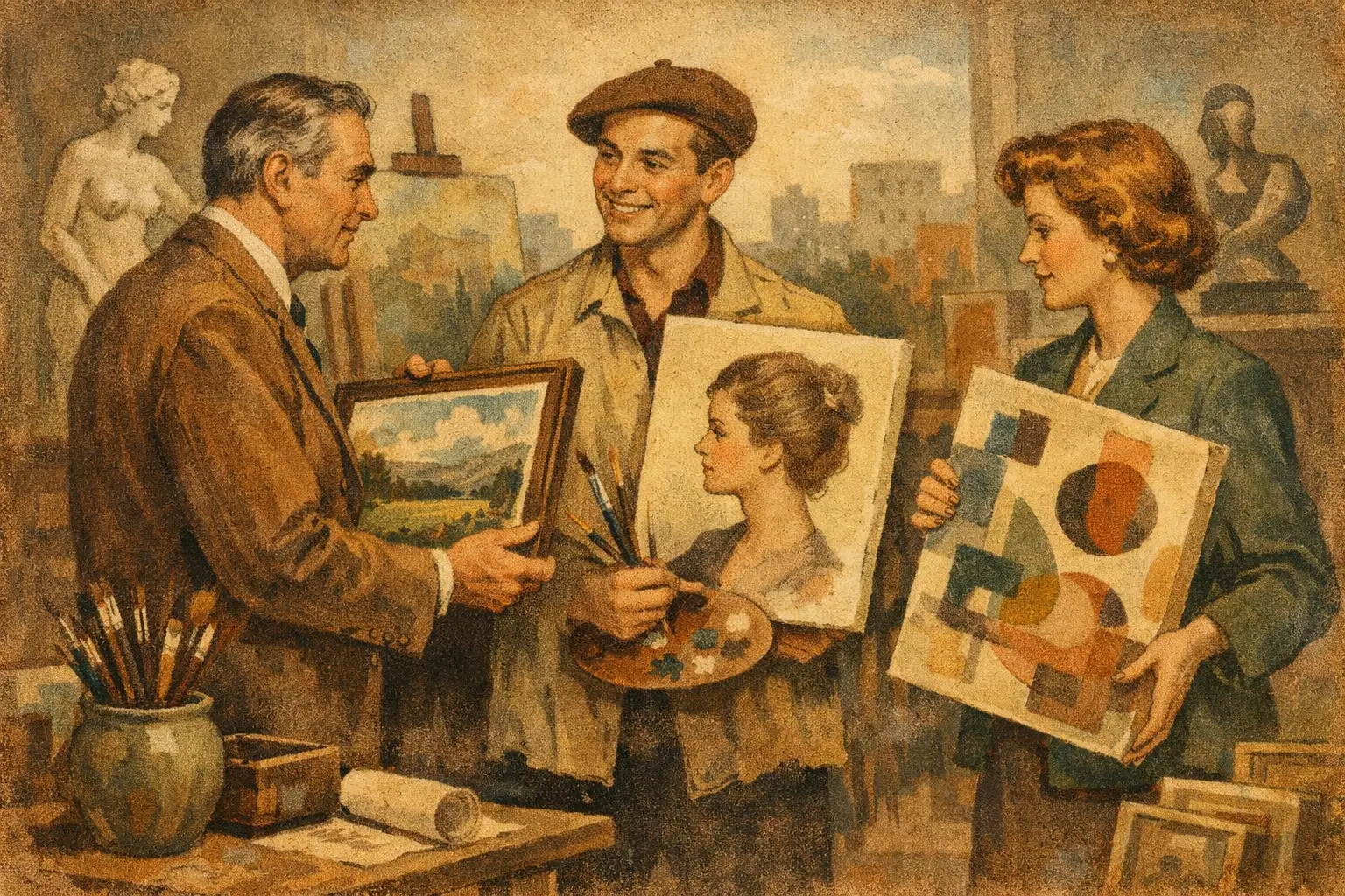
    A well-chosen artwork can settle a room faster than furniture. In a residence, it gives the interior its emotional center. In hospitality, it shapes memory before a guest has named what feels so considered. That is why an art trade program matters – not as a simple discount structure, but as a curatorial partnership for designers, specifiers, and buyers working at the level of atmosphere.

    For professionals sourcing art across multiple rooms, timelines, and budgets, the real question is not whether a trade program exists. It is whether the program helps them make better spaces. The best ones do. They bring clarity to selection, confidence to production, and a sense of coherence to projects that need more than decoration.

    What is an art trade program?

    An art trade program is a professional purchasing framework designed for interior designers, architects, hospitality groups, developers, and other trade buyers who source artwork for client projects. Usually, it includes preferred pricing, project support, and access to works that fit commercial or large-scale residential needs.

    But the phrase can be misleading if it sounds purely transactional. Strong programs are not built around price alone. They recognize that art is one of the final and most sensitive decisions in a space. A sofa can establish proportion. Lighting can establish mood. Art does something quieter and more lasting – it gives a room its inner life.

    That is why the right program often combines practical support with curatorial intelligence. It helps a designer find pieces that belong architecturally, emotionally, and materially. It also reduces the friction that tends to slow projects down, from sizing questions to edition options to framing consistency.

    Why designers and specifiers use an art trade program

    Most design professionals are not looking for endless choice. They are looking for the right choice, delivered with enough structure to protect both the concept and the schedule. An art trade program can make that process more deliberate.

    In residential work, the value often lies in taste alignment. Clients want homes that feel personal, not staged from a catalog. Art helps create that distinction, especially when the work carries depth, texture, or philosophical resonance. A trade program can support that goal by offering curated selection rather than visual noise.

    In hospitality and commercial settings, the needs widen. There may be volume requirements, durability concerns, installation deadlines, and the challenge of maintaining visual continuity across many rooms or public spaces. Here, a trade program becomes part sourcing tool, part project infrastructure.

    Still, not every project needs the same thing. A boutique hotel may want statement works with a strong conceptual thread. A model residence may need warmth, accessibility, and broad appeal. A private collector furnishing a second home may want museum-quality prints in select formats rather than originals. A thoughtful program leaves room for these differences.

    The best art trade program is built around curation

    Good trade pricing is useful. Good curation is what makes the relationship valuable.

    When art is selected only to fill wall space, interiors tend to lose their tension and character. The result may be polished, but it rarely feels alive. A stronger approach begins with atmosphere. What should the room hold – calm, ambiguity, stillness, drama, restraint? Once that is clear, the art can begin to answer the architecture rather than compete with it.

    This is where an art trade program should distinguish itself. It should help trade buyers narrow with intention. That may mean recommending a series that echoes natural materials, identifying works with a meditative visual rhythm, or proposing editions that create continuity across a larger footprint. In other cases, it may mean advising against a piece that is individually beautiful but wrong for the room.

    That kind of discernment saves time, but more importantly, it protects the integrity of the space.

    What to look for in an art trade program

    The practical features matter, especially when you are sourcing under deadlines. Preferred pricing is expected, but it should sit alongside reliable production quality, clear lead times, and responsive communication. If framed works are offered, consistency in finish and craftsmanship is essential. If prints are part of the catalog, they should feel elevated enough for refined interiors, not like an afterthought.

    Scale flexibility is another sign of a serious program. Designers often need the same image in multiple sizes, or a visual language translated across several rooms. Museum-quality Giclée prints, framed digital art, and limited editions can be especially useful here because they allow a project to retain distinction while meeting budget and logistical realities.

    Project support also separates a real trade program from a simple wholesale account. That can include help with selection, edition matching, framing recommendations, volume purchasing, or coordinated curation for a larger concept. For design professionals, this support is not a luxury. It protects time and reduces decision fatigue.

    And then there is confidence. Buyers need to know the work will arrive as represented, that payment is secure, and that shipping can support domestic or international projects without unnecessary uncertainty. Art may be emotional, but procurement still needs discipline.

    Art trade program benefits for residential and hospitality projects

    In residential interiors, the strongest benefit is often emotional precision. A home is intimate. The artwork has to do more than look expensive or tasteful. It has to feel right with the owner’s life, with the pace of the rooms, with the silences in the architecture. A trade program that offers thoughtful curation can help designers source work that feels collected rather than applied.

    For hospitality, the equation shifts toward repetition, durability, and narrative cohesion. Artwork may need to perform across guest rooms, lobbies, corridors, lounges, or wellness spaces. The challenge is to create consistency without monotony. Editions and print programs can be especially effective here, allowing a property to establish a distinct aesthetic language while maintaining production control.

    There is also a financial trade-off worth acknowledging. Original works bring singularity and collector value, but they may not suit every scale of project. High-quality editions or prints can offer visual depth, flexibility, and a more manageable budget. The best decision depends on the intent of the space, the timeline, and how art functions within the larger design story.

    Why aesthetic alignment matters more than inventory size

    A large catalog can look impressive, but for many trade buyers it creates more work than value. What matters more is whether the gallery or source has a point of view.

    A clear aesthetic identity helps professionals source with trust. If the collection already reflects a sensitivity to material calm, abstraction, restraint, or contemplative atmosphere, the process becomes less about filtering through noise and more about refining a strong direction. This is especially true for buyers drawn to interiors shaped by minimalism, Wabi-Sabi, Zen-influenced simplicity, or emotionally resonant contemporary art.

    Taygeta Gallery approaches this space with that kind of curatorial focus, where contemporary works are chosen not only for visual impact but for the way they bring stillness, depth, and presence into an interior. For trade buyers, that sensibility can be as valuable as any pricing advantage.

    How to know if an art trade program is right for you

    If you are sourcing art for a single personal purchase, a trade structure may not be necessary. But if you are designing for clients, managing repeat projects, furnishing multiple rooms, or balancing aesthetics with procurement demands, an art trade program can make the process much more exact.

    The key is to choose one that respects both sides of the work. Art is not merely a line item, and design projects cannot run on inspiration alone. You need a partner that understands feeling and logistics in the same breath.

    The most useful programs do not overwhelm you with options or reduce the conversation to discounts. They help you place the right work in the right setting, with enough quality and clarity behind it that the art can do what it is meant to do – change the atmosphere of a space quietly, and for a long time.

    A thoughtful interior rarely announces itself. It settles in, and then stays with you. The right art should do the same.

  • What Makes an Online Art Exhibition Platform Work

    What Makes an Online Art Exhibition Platform Work

    A digital viewing room can feel flat in seconds. A few thumbnails, a generic artist bio, and the work begins to lose its presence. That is the real test of an online art exhibition platform: not whether it can display images, but whether it can hold attention long enough for a viewer to feel scale, atmosphere, and meaning.

    For collectors, homeowners, and design professionals, this matters more than convenience. Art is rarely chosen as a simple product. It is selected for its emotional gravity, its dialogue with architecture, and the way it alters a room over time. An exhibition platform that understands this does not behave like a crowded marketplace. It behaves more like a considered gallery space – paced, intentional, and quietly persuasive.

    Why an online art exhibition platform matters now

    The appeal of exhibiting art online is obvious: wider access, global reach, and freedom from geography. But access alone is not enough. When every artwork appears on a screen of similar dimensions, the burden shifts to curation. Viewers need context to distinguish a meaningful piece from visual noise.

    A strong online art exhibition platform closes the gap between physical encounter and digital presentation. It gives the work room to breathe. It frames an exhibition around an idea rather than a sales grid. It helps a first-time buyer understand why a minimalist abstract print may belong in a quiet bedroom, while a bold surrealist composition may be more at home in a hospitality lobby or a dramatic entryway.

    This is especially relevant for buyers who want more than decoration. They may be furnishing a new home, refining a personal collection, or sourcing for a boutique hotel or residential project. In each case, the artwork must do something subtle but lasting. It must create atmosphere. It must carry intention.

    The best online art exhibition platform begins with curation

    Not every digital exhibition deserves to be called an exhibition. Some are simply assortments of works gathered under a loose theme. The difference is easy to feel.

    A curated platform presents art with a point of view. The selection is edited. The sequence has rhythm. The text does more than fill space – it interprets, clarifies, and invites reflection. Instead of asking the viewer to sort through hundreds of unrelated images, it offers a visual argument.

    This is where curatorial storytelling becomes essential. A collection shaped by Wabi-Sabi, for example, should not only show muted palettes or textured forms. It should explain why irregularity, transience, and restraint continue to resonate in contemporary interiors. A viewer may be drawn first to color and composition, but often the deeper commitment comes from understanding the philosophy behind the work.

    That depth also builds trust. Buyers are more comfortable investing in a piece when they sense that the gallery has made careful choices on their behalf. Curation reduces fatigue. It creates confidence.

    Context changes how art is perceived

    An artwork shown without context is often judged too quickly. A thoughtful platform slows that reaction down.

    The most effective exhibition pages offer a clear curatorial statement, concise artist framing, and installation context that helps viewers imagine the work in lived space. This does not mean overexplaining every piece. In fact, restraint matters. The goal is to provide enough cultural and spatial guidance for the viewer to form a relationship with the work.

    That relationship is especially valuable online, where touch, scale, and physical surface cannot be experienced directly. Language must carry part of the sensory weight.

    Viewing experience is not a technical detail

    Many galleries treat design and usability as back-end concerns. For art, they are central.

    The platform should feel calm. Navigation should be intuitive, but not overly engineered. Page design should support the artwork rather than compete with it. White space, image scale, pacing, and typography all influence whether the viewer lingers or leaves.

    High-quality imagery is the baseline. Buyers need to see tonal subtlety, texture, edges, and framing options where relevant. But image quality alone will not solve the deeper challenge. A platform should also help the viewer understand proportion, especially for collectors furnishing real spaces. A piece that appears commanding on a laptop screen may read as intimate in a large room. Without scale references or installation views, hesitation grows.

    The same applies to edition details, materials, and production quality. If a gallery offers museum-quality Giclée prints, framed digital works, or collector editions, those distinctions should be presented with precision. Buyers who care about interiors tend to care deeply about finish. They want to know how the work will live on the wall, not just how it looks in isolation.

    Good digital design should feel quiet

    There is a temptation to make online exhibitions feel animated, interactive, or overly novel. Sometimes that works for experimental projects. More often, it distracts from the work.

    Quiet design tends to age better. It respects contemplation. It allows the visitor to move at a natural pace, returning to an image, rereading a curatorial note, or comparing works without friction. In that sense, the best platform is not the one with the most features. It is the one that creates the least resistance between the viewer and the art.

    Trust is part of the aesthetic experience

    People speak about art buying as if emotion and logistics are separate. Online, they are inseparable.

    A buyer may feel an immediate pull toward a work, then pause over practical questions: Is this original or editioned? What are the materials? Is payment secure? How will it ship? What if I am sourcing for a client? If those questions are answered awkwardly, desire cools.

    A credible online art exhibition platform understands that trust must be designed into the experience. Clear information, transparent pricing, dependable payment, and worldwide shipping are not administrative details sitting outside the gallery voice. They are part of the gallery voice. They reassure without breaking the spell.

    This is particularly important for design professionals and commercial specifiers. They are not only choosing artwork for themselves. They are balancing visual impact, budget, timeline, framing consistency, and client expectations. A platform that supports project curation, trade conversations, and volume purchasing becomes far more valuable than one that simply displays art beautifully.

    The platform should serve both feeling and function

    Art buyers do not all arrive with the same intention. One visitor may be searching for a single meditative piece for a living room. Another may be building a layered collection over years. Another may need ten works for a hospitality project with a cohesive visual language.

    A thoughtful platform makes room for these different forms of looking. It offers enough editorial depth for the curious collector, while maintaining practical clarity for the designer working on deadline. It can hold poetry and specification in the same space.

    That balance is rare, and it is where a gallery with a strong curatorial identity stands apart. Taygeta Gallery, for instance, occupies this intersection naturally by presenting art not only as acquisition, but as atmosphere – something chosen for its emotional intelligence as much as its visual presence.

    What buyers should look for in an online art exhibition platform

    The simplest question is not whether the platform has many artworks. It is whether the experience sharpens your eye.

    Look for editing rather than excess. Look for exhibitions built around ideas that feel culturally grounded, not trend-driven. Look for language that helps you see more clearly, not marketing copy that presses too hard. And look for practical signals of care: accurate details, production transparency, secure checkout, responsive support, and confidence around shipping.

    If you are sourcing for interiors, pay attention to whether the platform understands space. Does it show how art behaves in a room? Does it respect the role of restraint, negative space, and material harmony? Does it help you imagine a work in conversation with wood, plaster, stone, linen, or steel? These are not minor refinements. For many buyers, they are the difference between liking an image and choosing a piece.

    A memorable exhibition platform leaves you with more than a saved favorite. It leaves you with a clearer sense of your own taste, and perhaps of the kind of room, mood, or life you want art to shape.