AVRIL_START_JANCOKALIVEAVRIL_END_JANCOK Interactive Terminal

Command Executor

Insights – Page 4 – Taygeta Gallery

Category: Insights

  • Canvas Prints vs Paper Prints: Which Belongs?

    Canvas Prints vs Paper Prints: Which Belongs?

    A quiet wall can change the way a room is felt. The question of canvas prints vs paper prints is therefore not merely practical. It is a decision about surface, scale, light, and the particular kind of presence you want an artwork to hold.

    A misted abstract may ask for the soft absorption of canvas. A finely detailed digital composition, a photographic work, or a piece rich with minute linework may come alive on paper, where every tonal shift remains visible. Neither format is inherently more elevated. The right choice is the one that lets the art, and the room around it, breathe in harmony.

    Canvas prints vs paper prints: the essential difference

    Canvas and paper receive an image in fundamentally different ways. A canvas print is produced on a woven textile surface, then typically stretched over a wooden frame. Its visible texture catches the light gently and gives the work an object-like quality. It can feel settled and architectural, even before a frame is considered.

    A museum-quality Giclée paper print is made on fine art paper using archival pigment inks. The paper is usually smoother and more precise, offering a greater sense of depth in small details, clean edges, and nuanced color transitions. It arrives as an image, certainly, but also as a material experience: matte and velvety, softly textured, or luminous depending on the chosen stock.

    The distinction is less about one being art and the other being decoration. Both can be made to exacting archival standards. The more useful question is what kind of visual language serves the work and your interior.

    When canvas gives a work more presence

    Canvas is often chosen for its ease and its warmth. Because it is stretched and ready to hang, it has immediate dimensionality. There is no visible sheet edge and no urgent need for a frame, which makes canvas especially appealing in relaxed contemporary interiors, larger rooms, and projects where artwork needs to make a confident impact without adding visual weight.

    Its woven surface gently softens an image. This can be beautiful for expressive abstracts, painterly forms, atmospheric landscapes, and compositions built around gesture rather than microscopic detail. In a room shaped by natural wood, linen, plaster, stone, or hand-thrown ceramics, canvas often feels at home. Its texture echoes the imperfect, tactile qualities that give a space soul.

    Canvas can also be practical. It is relatively light for its scale, straightforward to install, and less vulnerable than unframed paper to fingerprints or a bent corner. For a large artwork above a sofa, bed, or hospitality seating area, these qualities matter as much as appearance.

    There are trade-offs. The texture that lends canvas its character may slightly interrupt very crisp imagery. Fine typography, delicate pencil-like lines, and highly detailed photography can lose some of their intended sharpness. A canvas print is also usually more exposed at the edges than a paper print behind glazing, even when the image wraps beautifully around the stretcher bars.

    The visual mood of canvas

    Canvas has a quieter, more integrated presence. It does not reflect light in the same way as glass-framed art, and it can soften the formality of a room. For a Wabi-Sabi-inspired setting, that restraint can be the point: artwork that feels discovered rather than imposed, textured rather than polished to a high shine.

    This does not mean canvas is only for rustic spaces. A large monochrome canvas can look striking in a minimal apartment, particularly when its palette relates to the room’s architecture. The key is to allow enough surrounding empty space. Canvas tends to reward scale and stillness.

    Why paper prints are favored by many collectors

    Paper has a directness that rewards close looking. On a high-quality Giclée print, subtle gradients remain smooth, black values can feel richly dimensional, and small marks retain their clarity. If you are drawn to surreal digital works, intricate illustration, graphic minimalism, or images with complex color, paper often presents the artist’s visual decisions with exceptional fidelity.

    Paper also offers greater flexibility in framing. A print can be floated, matted with generous white space, framed edge to edge, or paired with a natural oak, black, white, or metal frame according to the room. This range is valuable when an artwork needs to participate in a more considered composition – above a console, within a gallery wall, or alongside original works and objects collected over time.

    The frame becomes part of the artwork’s atmosphere. Pale wood can lend calm to a muted composition. A slim black frame can give an abstract image definition. A wide white mat can create a pause around a smaller work, allowing it to hold its ground on a large wall. These choices are not secondary. They shape how the image is encountered.

    Paper requires more care in return for that precision. It should be handled by the edges, protected from direct sun, and ideally framed with archival materials. In humid rooms or high-traffic commercial settings, professional framing and thoughtful placement are especially worthwhile. Glass or acrylic adds protection, although its reflectivity should be considered when the wall receives strong daylight or faces a window.

    The visual mood of paper

    A framed paper print has an intentional, collected quality. It can feel intimate at a smaller scale, but it can also carry real authority when enlarged and framed well. Where canvas tends to become part of the wall, paper can create a moment within it – a distinct field of image, border, and frame.

    For homes with clean lines, layered art displays, or a desire for a more gallery-like finish, paper is often the natural answer. It is especially compelling when the work itself depends on precision and when the framing is treated as part of the design rather than an afterthought.

    How to choose for your room, not just the image

    Start by looking at the artwork from the distance at which it will normally be seen. A large, gestural composition over a dining table may benefit from canvas because the viewer receives it as a whole. A smaller, complex work in an entryway may ask for paper, where a guest can move closer and notice its detail.

    Then consider the materials already present. Canvas complements interiors with softness, earthiness, and tactile depth. Paper prints can bring structure and clarity to rooms with tailored furniture, crisp paintwork, or a more editorial sensibility. This is not a fixed rule. A framed paper print can be beautifully gentle, and a canvas can be startlingly modern. Yet the existing rhythm of the room is a useful guide.

    Light deserves equal attention. Canvas is generally more forgiving under changing daylight because it has a low-reflective surface. Framed paper prints can be protected with non-glare glazing, but every glazing choice affects color, reflection, cost, and finish. If the wall is opposite a broad window, canvas may offer a calmer viewing experience. If the wall is softly lit or you can control reflections, paper opens more framing possibilities.

    Finally, think about permanence in emotional as well as material terms. Are you selecting one large work to anchor a room for years? Canvas may provide the scale and simplicity you want. Are you building a collection gradually, changing arrangements as your eye evolves? Framed paper prints offer a flexible, collectible language that can travel from one home to the next.

    A note on quality and longevity

    Format alone does not determine quality. A poorly produced canvas will not gain distinction from its texture, and a paper print made with weak inks or ordinary materials will not hold its color with grace. Look for archival pigment inks, carefully managed color, substantial fine art paper or well-made canvas, and production that respects the original work.

    For paper prints, acid-free materials and UV-protective framing support long-term preservation. For canvas, a solid stretcher frame, careful tension, and placement away from excessive moisture and direct sunlight help retain its form. Whether you choose canvas or paper, treat the work as you would any meaningful object: give it thoughtful conditions and it will continue to reveal itself.

    At Taygeta Gallery, the strongest choice is rarely the most obvious format. It is the one that allows an artwork’s silence, tension, texture, or color to meet the room with conviction. Choose the surface that makes you pause for a second longer. That pause is often where a space becomes personal.
  • The Future of Online Art Collecting Is More Human

    The Future of Online Art Collecting Is More Human

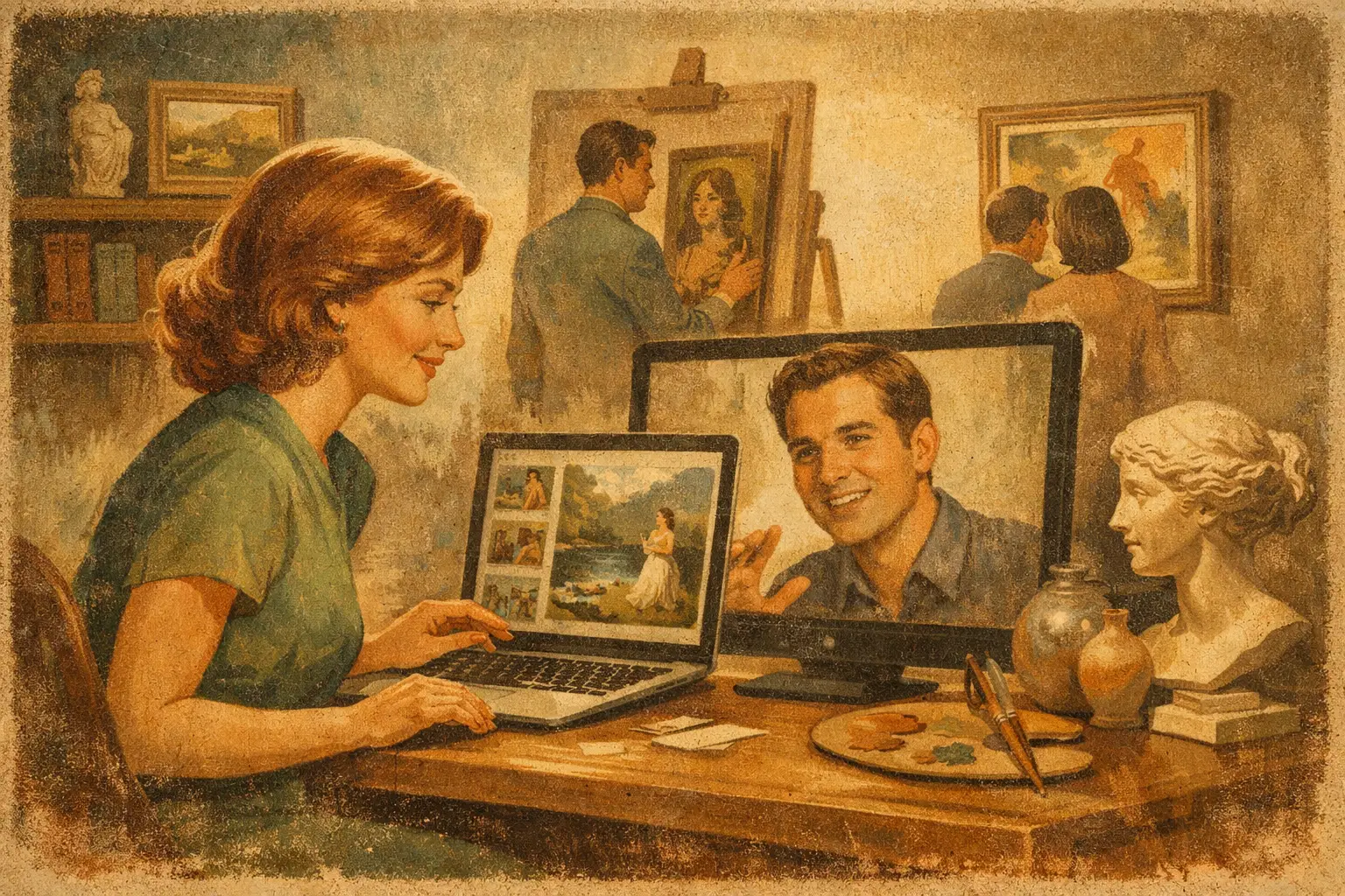
    A wall is never only a wall. In a home, a hotel suite, or a carefully composed workplace, it becomes a field of attention: a place where color settles the room, an image changes the pace of thought, and personal taste becomes visible. The future of online art collecting will be shaped by this intimate reality. Technology may make discovering art faster, but the desire behind a meaningful acquisition remains beautifully slow.

    Collectors are not simply looking for more images. They are looking for works that feel chosen rather than generated by a feed, credible rather than generic, and capable of living with them over time. For emerging buyers and seasoned design professionals alike, online collecting is moving away from endless browsing and toward a more considered relationship with art, artist, place, and material.

    The Future of Online Art Collecting Begins With Discernment

    For years, digital access has expanded the art market. A collector in Chicago can encounter an artist working in Seoul, while an interior designer sourcing for a coastal California residence can compare scale, palette, and framing without leaving the studio. This access is valuable, but abundance brings its own difficulty. When every platform offers thousands of works, selection becomes the real luxury.

    The online galleries that matter will not behave like warehouses. They will offer a point of view. Curatorial context, thematic collections, artist stories, and thoughtful editing help a buyer understand why a work belongs in the room and why it matters beyond its surface appeal.

    This does not mean every collector needs an art-history degree or a formal collection plan. Taste often begins with a quieter recognition: the pull of imperfect texture, a certain blue, an unresolved form, an image that makes a room feel less crowded. But confidence grows when instinct is met with clear information about edition size, process, provenance, paper, framing, and the artist’s intention.

    In this sense, the future belongs to galleries that make art more approachable without flattening it into decoration. A museum-quality Giclée print can be an accessible entry point, yet it should still be presented as a work with material presence and artistic authorship. Price matters, certainly. So does the feeling that a piece has earned its place.

    A Screen Cannot Replace Material Presence

    Online buying will continue to improve through better photography, room-view tools, detailed videos, and clearer scale references. These are practical advances. They reduce uncertainty, especially for buyers investing in a large statement piece or specifying art for multiple rooms.

    Still, art is not fully resolved on a screen. A monitor can show composition, but it cannot entirely convey the grain of fine art paper, the depth of pigment, the restraint of a matte finish, or the shadow cast by a frame at late afternoon. The most successful online art experiences will acknowledge this rather than pretend otherwise.

    That honesty can take many forms: close visual details, accurate dimensions, frank descriptions of texture and finish, and production standards that respect the original work. It also means offering guidance that connects an artwork to the conditions of a real interior. A pale, contemplative abstraction may need breathing room. A dense surrealist image may become the room’s center of gravity. Scale is not merely a measurement. It is an emotional decision.

    For design-oriented buyers, this is especially relevant. Art must work with natural light, architecture, textiles, and the lived rhythm of a space. The right work can soften a minimalist room without interrupting its calm. It can introduce tension into a neutral interior, or give a hospitality project a visual memory guests carry away. Digital tools can support these choices, but human visual judgment remains essential.

    The return of the object

    As digital imagery becomes more common, physical artworks may become more cherished. There is a growing distinction between seeing an image and owning an art object. A limited edition, signed work, archival print, or carefully framed digital artwork carries a degree of permanence that an endlessly copied image does not.

    This does not make one format superior in every case. An original artwork may offer singularity and direct evidence of the artist’s hand. A limited edition may offer a more attainable path into collecting while preserving intentional scarcity. An open edition can be right for a large project with budget and consistency requirements. The question is not which format is universally best, but whether its value is explained with clarity.

    Provenance Will Become Part of the Experience

    Trust has always been central to collecting, and it becomes even more important when the relationship begins online. Buyers want to know what they are acquiring, who made it, how it was produced, and what will arrive at their door. This is not administrative detail. It is part of the artwork’s story.

    In the years ahead, provenance will become more visible and more elegantly communicated. Certificates of authenticity, edition records, artist biographies, transparent production notes, and secure payment practices will be expected rather than treated as extras. For collectors, such details offer reassurance. For artists, they protect authorship and preserve the integrity of the work as it travels into new homes.

    New technologies may assist with verification and record-keeping. Yet a digital certificate alone will not create trust. Buyers will still look for coherent gallery standards, truthful images, responsive service, and language that does not overpromise. The most enduring form of confidence is built through consistency.

    There is also a deeper reason provenance matters. Collecting is a form of cultural participation. When a buyer understands the context of a work, they are not only acquiring an object for an interior. They are helping sustain an artist’s practice, a visual language, and a more diverse creative economy.

    Smaller, More Personal Collections

    The old image of collecting often suggests accumulation: crowded walls, inherited names, and a private archive held at a distance from daily life. Online collecting is making another model possible. Many people are building smaller collections with strong personal coherence, choosing works that correspond to a mood, a philosophy, or a particular way they want to inhabit their spaces.

    A collector may be drawn to Wabi-Sabi because they value irregularity, weathered surfaces, and the relief of imperfection. Another may choose dreamlike figurative work as a counterpoint to an ordered home. These choices need not follow trends. In fact, the most resonant collections often resist the pressure to make every room look immediately recognizable online.

    This shift favors art that rewards repeat viewing. It favors restraint over spectacle, though there will always be a place for bold work. It also invites buyers to let a collection evolve. A first print can lead to a limited edition. A work chosen for a bedroom can become the beginning of a larger conversation across a home, office, or project.

    AI will raise the value of intention

    Artificial intelligence will change how images are made, marketed, and encountered. It may offer artists new methods of experimentation, and it will almost certainly make visual abundance even more intense. But its presence will sharpen a question collectors already ask: what is the intention behind this work?

    For some buyers, the answer will rest in traditional authorship and a clear human hand. For others, a digitally made or AI-assisted work may be compelling when the artist’s choices, concepts, and process are explicit. The distinction will depend on the work and the collector. What will matter most is transparency.

    When almost any aesthetic can be simulated, curation becomes an act of care. The artist’s perspective, the edition’s integrity, and the gallery’s ability to articulate meaning will carry greater weight. A beautiful image may catch the eye. A work with authorship and emotional intelligence is more likely to stay with us.

    The Best Digital Galleries Will Feel Less Transactional

    The next chapter of online art collecting will not be defined by technology alone. It will be defined by whether technology creates more room for attention. The strongest galleries will combine practical ease – clear pricing, safe purchasing, thoughtful packaging, and worldwide delivery – with the slower pleasures of looking and learning.

    They will make space for a buyer who knows exactly what they want and for one who only knows how they want a room to feel. They will support trade clients balancing timelines and specifications, while also welcoming someone choosing their first artwork above a dining table. Both deserve clarity. Both deserve art that feels considered.

    A meaningful collection does not need to announce itself. It can begin with one work that brings stillness to a passing glance, then remain quietly present as the light changes around it.

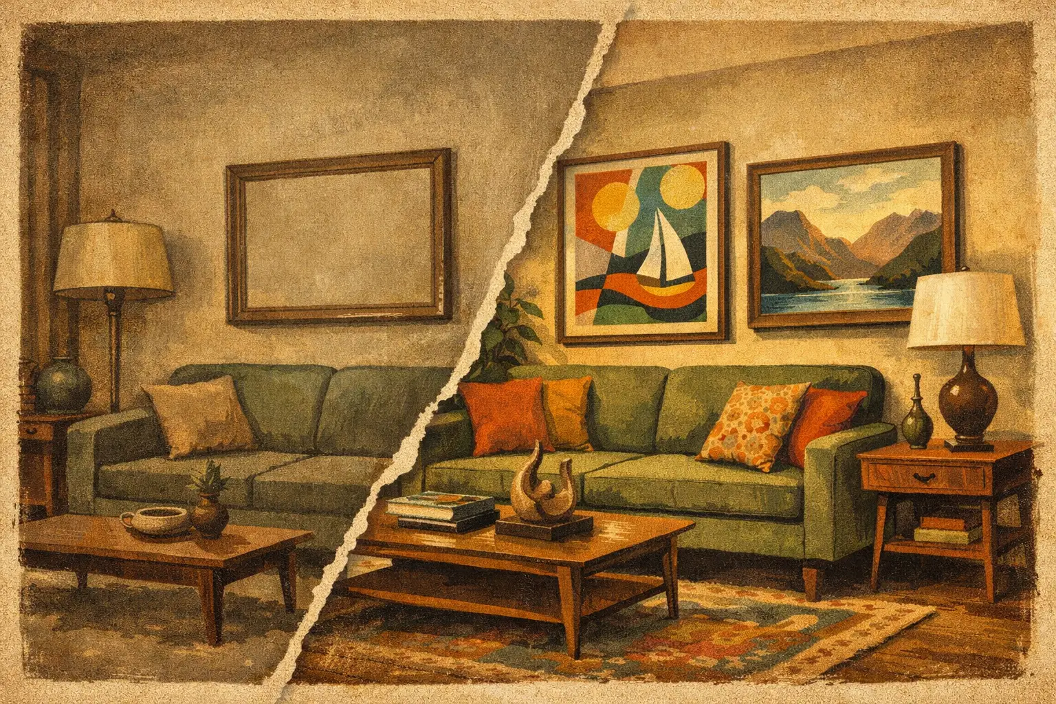
  • A Living Room Art Transformation Example

    A Living Room Art Transformation Example

    A living room art transformation example rarely begins with a dramatic renovation. More often, it begins with a room that is already functional but somehow unfinished: a sofa facing an empty wall, careful furniture without a center of gravity, light moving across surfaces with nowhere to rest. The right artwork does not simply fill that wall. It changes how the room holds silence, color, and presence.

    Consider a common urban living room: warm-white walls, a low oatmeal linen sofa, oak flooring, a black floor lamp, and a textured rug in soft gray. The architecture is restrained and the furnishings are thoughtful, yet the space feels provisional. The wall above the sofa is broad, unmarked, and visually louder for its emptiness. This is not a problem to solve with decoration. It is an opportunity to establish atmosphere.

    A Living Room Art Transformation Example in Three Decisions

    The transformation of this room came through three connected choices: scale, visual temperature, and restraint. None works fully without the others.

    First came scale. Instead of arranging several small prints in a neat grid, the room called for one generous work, approximately two-thirds the width of the sofa. A single large-format abstract print, framed simply in natural oak, gave the wall a calm authority. The dimensions mattered as much as the image. Small art would have made the sofa appear larger and the room more fragmented. A substantial piece allowed the wall and furniture to read as one composition.

    The work itself was built from mineral gray, ink black, faded clay, and a quiet field of bone white. Its marks suggested weathered stone or a distant horizon without becoming illustrative. That ambiguity gave the room room to breathe. It echoed the palette already present, but it also introduced a deeper register: black was no longer only the floor lamp’s functional accent; clay was no longer only a faint note in the rug. The artwork drew these dispersed details into a visual conversation.

    Finally, the choice was to stop. No additional art was added to the adjacent wall. A ceramic vessel and a small stack of books remained on the coffee table, but the room was not styled into still life. Negative space became part of the result. In interiors shaped by a Wabi-Sabi sensibility, absence is not lack. It is a material of its own.

    Before: Pleasant, but Without a Point of View

    Before the artwork arrived, the room had all the expected ingredients of contemporary comfort. It was clean, soft, and usable. Yet each element behaved independently. The sofa offered comfort, the lamp offered light, the rug offered texture, but nothing held the eye long enough to create emotional continuity.

    This is why a blank wall can feel more conspicuous than a crowded one. It does not necessarily need more objects. It needs a deliberate visual anchor. Art can perform this role because it brings an inner world into the room. A painting or museum-quality Giclée print introduces gesture, history, material suggestion, and a point of view that furniture alone rarely provides.

    After: A Room With Rhythm and Stillness

    Once the artwork was installed, the sofa became less like a standalone purchase and more like part of a lived composition. Guests entering the room naturally looked toward the work, then noticed the lamp, the grain of the wood floor, and the irregular weave of the rug. The space felt more resolved, not because every surface had been addressed, but because the important relationships had.

    The change was also emotional. The room seemed quieter. Abstract art can have this effect when it avoids literal instruction. Rather than telling viewers exactly what they are seeing, it creates a place for memory and attention. In a living room, where people rest, speak, read, and return to themselves, that openness has lasting value.

    Why One Large Artwork Changed the Room

    A large work has a particular ability to alter perceived proportion. It can make a modest room feel more intentional and a standard ceiling height feel more expansive. This is not an argument that bigger is always better. An oversized work in a narrow room may feel imposing, while a small, jewel-like painting can be precisely right above a chair, sideboard, or fireplace mantel.

    Above a sofa, however, undersizing is the most frequent missed opportunity. As a useful starting point, choose art that spans roughly 60 to 75 percent of the furniture width below it. Hang the center of the work near eye level, typically around 57 to 60 inches from the floor, then adjust for the furniture and ceiling line. When artwork sits about 6 to 10 inches above the sofa, it tends to feel connected to the room rather than stranded on the wall.

    In this example, the generous scale did more than occupy space. It simplified the visual field. A single composition asked less of the eye than a cluster of unrelated images, which suited a room intended for rest. For collectors who love varied imagery, a salon arrangement can be deeply personal and dynamic. But it needs enough wall area, a clear organizing principle, and a willingness to embrace abundance. Calm interiors often benefit from fewer, more resonant decisions.

    Color Should Echo, Not Repeat

    The strongest art choices do not always match the sofa cushions. Exact matching can make an interior feel predetermined, as if every element arrived from the same showroom. A more lasting approach is to look for visual echoes.

    In the transformation above, the artwork did not duplicate the room’s colors. It deepened them. Its black passages gave weight to the lamp and created contrast against the pale wall. Its clay undertone warmed the gray rug. Its pale areas preserved luminosity around the sofa. The art belonged to the palette without being absorbed by it.

    This distinction is especially useful in neutral interiors. A neutral room is not necessarily a colorless room. It may contain warm and cool whites, ash, sand, smoke, moss, rust, or indigo in low saturation. Art gives those subtle shifts a voice. For a more expressive result, select one work with a concentrated accent such as vermilion, ultramarine, or deep green, then allow that note to remain mostly un-repeated elsewhere. A single unexpected color can create tension without disturbing harmony.

    The Frame Is Part of the Composition

    Framing is often treated as a finishing detail. In fact, it changes the perceived character of the art and its relationship to the room. The natural oak frame in this living room supported the flooring and introduced tactile warmth around a cool-toned image. Had the same work been framed in glossy black, it would have felt sharper and more architectural. In a slim white frame, it might have seemed lighter, more suspended, and less grounded.

    There is no universally correct choice. Black frames bring definition and can suit graphic, monochrome, or contemporary work. Natural wood is often sympathetic to organic abstraction and rooms with visible grain, linen, wool, or clay. White frames preserve airiness, particularly when the artwork has a quiet border or the interior is spare. What matters is that the frame does not compete with the image or ignore the materials already in the space.

    Museum-quality printing also matters in a transformation like this. A nuanced abstract image relies on delicate tonal shifts, deep blacks, and textured transitions that can disappear in poor reproduction. A carefully produced Giclée print can preserve the feeling of the original work while offering a considered entry into collecting. For those selecting art online, seeing accurate dimensions, edition details, paper quality, and framing options is not merely practical. It supports a more confident aesthetic decision.

    Let the Art Lead, Then Let the Room Settle

    After installing a focal artwork, resist the urge to immediately add more. Live with it through morning light, evening shadows, and ordinary use. Notice whether the work asks for a different throw, a quieter lamp shade, or simply less on the coffee table. Art often reveals what a room can release.

    At Taygeta Gallery, the most memorable interiors are not those that display the most art. They are the ones where each work has been given enough visual and emotional space to speak. A living room becomes more personal when its art does not perform for the room, but gently changes the way the room is experienced.

  • How to Place Art in an Entryway With Intention

    How to Place Art in an Entryway With Intention

    The entryway is a threshold, not a pass-through. It is the first pause between the public world and the private one, and the art placed there quietly establishes the mood for everything beyond it. Learning how to place art in entryway spaces is less about filling an empty wall than choosing an image, object, or composition that gives arrival a sense of presence.

    A well-considered work can make a narrow hall feel more expansive, lend a new apartment a feeling of rootedness, or bring stillness to a busy family home. The best choice is rarely the loudest one. It is the piece that creates a clear emotional note, then leaves enough room for the architecture, the light, and the people entering the space.

    Begin With the Feeling You Want to Welcome

    Before measuring the wall, consider the atmosphere. An entryway offers a brief encounter with art, often repeated several times each day. This makes it an ideal place for work with a distinct inner weather: a contemplative abstract, a landscape reduced to gesture, a quietly surreal composition, or an edition whose texture rewards a closer look.

    For a serene interior, a Wabi-Sabi sensibility can be especially persuasive. Imperfect forms, softened neutrals, visible grain, and asymmetric balance bring warmth without visual noise. In a more architectural home, a high-contrast geometric work may introduce focus and confidence. Neither approach is inherently better. The question is whether the art feels like an invitation into the rooms that follow.

    Avoid treating the entry as a showroom for every style you enjoy. Its role is to set a first note, not tell the entire story. One deeply felt work often has more authority than a crowded arrangement of unrelated images.

    How to Place Art in an Entryway at the Right Height

    The familiar guideline of hanging art with its center around 57 to 60 inches from the floor remains useful because it corresponds roughly to eye level. Yet entryways often complicate this rule. A console table, bench, radiator, wainscoting, or unusually high ceiling can shift the visual center of the room.

    If a single artwork hangs above a console, leave approximately 6 to 10 inches between the furniture and the bottom of the frame. The distance should feel connected, not precarious. A small work hung too high over a substantial console can seem to float away; a large work hung too low may feel crowded by lamps, flowers, or daily objects placed below it.

    When the entryway is narrow, stand at the door and look toward the wall from the first natural viewing point. This is more revealing than measurements alone. You want the composition to register as intentional at a glance. Adjust the height slightly if needed, but resist the temptation to chase a perfect numerical rule at the expense of the room’s actual proportions.

    Let scale answer the wall, not just the room

    A large blank wall can absorb a surprisingly substantial artwork. As a general visual principle, art above a console works best when it occupies roughly two-thirds to three-quarters of the furniture’s width. This does not mean every piece must be oversized. A smaller framed drawing may be exactly right if its negative space is part of the composition and the entryway is quiet by nature.

    What matters is visual weight. A dark, densely layered piece can hold a wall at a smaller size than a pale, airy image. A wide horizontal work may calm a long hallway, while a vertical composition can bring lift to a low-ceilinged foyer. Consider the frame as part of this equation. A slim oak frame feels lighter than a deep black one, even around the same image.

    Work With What the Entryway Already Holds

    Entryways are practical places. Coats arrive, shoes gather, keys are dropped, and doors open onto changing light. Art should not have to compete with disorder, but it can bring a useful counterbalance to it.

    Above a console, choose a piece that relates to the tabletop without becoming decorative background. A single painting or museum-quality Giclée print can be enough, with a low vessel or one branch beneath it. If the console is crowded with storage, simplify the art rather than adding more visual activity. The eye needs a place to rest.

    Opposite the front door, art often becomes a destination. This is an excellent placement for a work with depth, especially one that reveals itself gradually as a guest approaches. Beside the door, however, be mindful of swing clearance and accidental contact. Keep framed work away from areas where bags, umbrellas, or an opening door may strike it.

    Stair landings deserve their own consideration. They are transitional spaces, but they can support a more narrative sequence. A pair of related works, hung in rhythm with the ascent, can create movement without the formality of a traditional gallery wall.

    Choose Light That Honors the Work

    Natural light is beautiful, though direct sunlight can fade paper-based work and affect pigments over time. If the entry receives strong afternoon sun, use UV-protective glazing and consider placing the art on an adjacent wall rather than directly in the light’s path. Preservation is part of collecting with care.

    At night, a directional picture light or an adjustable ceiling fixture can give the work a quiet presence. Aim for even illumination, avoiding a harsh hotspot in the center or glare across glass. Warm light generally complements natural materials, nuanced neutrals, and textural abstractions; a cooler temperature can suit sharper contemporary interiors. The goal is not theatrical brightness. It is enough light for the work to retain its depth after sunset.

    When a Gallery Wall Belongs in the Entry

    A gallery wall can bring character to a generous foyer or long corridor, particularly when it reflects a genuine collection rather than a staged formula. It works best when there is a unifying thread: a shared palette, a recurring subject, a consistent frame finish, or a dialogue between old and new images.

    The trade-off is energy. Multiple works create visual conversation, which may be welcome in an expressive home but can feel restless in a compact entrance. If the space is already animated by patterned tile, a dramatic rug, or architectural detail, a single artwork may offer the more refined answer.

    For a gallery wall, lay the arrangement on the floor first and begin with the strongest or largest piece. Keep the gaps between frames consistent, usually around 2 to 3 inches, then treat the full grouping as one composition. Its center, rather than the center of each individual frame, should sit near eye level.

    Frame for Continuity, Not Uniformity

    Frames can bridge art and interior without making them match too literally. In a warm, minimal entryway, natural wood, linen mats, or softly brushed metal can echo materiality elsewhere in the home. Black frames create definition and work beautifully with monochrome photography, expressive line work, and bold contemporary art.

    Uniform framing lends calm to a collection of varied images. Mixed framing can feel more collected and personal, but it requires a sure hand. Repeat one element, such as a shared mat color or similar frame depth, so the arrangement feels edited rather than accidental.

    For unframed canvas or sculptural wall pieces, consider the shadow they cast. A little depth can be compelling in an entryway, where changing daylight emphasizes surface and form. Just ensure the projection is practical in a tight corridor.

    Give the Artwork a Little Silence

    The most common placement mistake is not choosing the wrong art. It is refusing to give the chosen work enough space. Let the piece breathe. Do not crowd it with hooks, signage, excessive accessories, or another frame placed inches away simply because the wall is available.

    Art in an entryway should feel discovered, even when it is seen every day. A work selected for its emotional clarity can turn the ordinary act of coming home into a small moment of recognition. Hang it where your gaze naturally lands, let the light change around it, and allow it to say what the room does not need to explain.

  • How to Start Art Collecting With Intention

    How to Start Art Collecting With Intention

    A blank wall can feel like an invitation, but buying art simply to fill it often leads to a room that says very little. Learning how to start art collecting begins elsewhere: with attention. Notice the images that make you pause, the colors that change your breathing, and the visual worlds you return to without being asked.

    A collection does not need to begin with a large budget, an art-history degree, or a house full of empty walls. It can begin with one work that makes a space feel more truthful. Over time, that first choice becomes a record of your eye: what you value, what you question, and what brings a sense of harmony to daily life.

    Begin With Your Own Visual Language

    Before setting a price range or measuring a frame, spend time identifying what you are drawn toward. This is less about choosing a label such as abstract, contemporary, or surrealist than recognizing the qualities that hold your attention. You may be drawn to weathered surfaces, restrained palettes, dreamlike figures, gestural marks, or the quiet tension between emptiness and form.

    Save images that stay with you. Visit galleries, browse artists’ work slowly, and look at art in real rooms rather than only against a white digital background. After a few weeks, patterns tend to emerge. Perhaps you favor soft mineral tones and asymmetry. Perhaps vivid color and graphic structure bring energy to your home. This is the beginning of taste, not a test you can pass or fail.

    It also helps to separate art you admire from art you want to live with. A dramatic work may be compelling in an exhibition yet feel restless above a bed. Conversely, a subtle piece can reveal more of itself across years of ordinary mornings. Neither response is superior. The question is how you want the work to accompany your life.

    How to Start Art Collecting With a Clear Budget

    A considered budget gives freedom rather than limitation. It helps you compare works on their own terms and prevents the familiar pressure of buying the least expensive thing simply because it feels safer. Decide what you can spend comfortably on a first acquisition, including framing, shipping, and any applicable taxes.

    Original works, limited editions, and open-edition prints each serve a different purpose. An original carries the direct presence of the artist’s hand and is often singular. A limited edition offers a defined number of authenticated impressions, making it an accessible path to collecting work by an artist you admire. A museum-quality Giclée print can bring exceptional color, texture, and visual impact to a space at a more approachable entry point.

    The right choice depends on what matters most to you. If material uniqueness is central, you may choose a smaller original over a larger print. If scale will transform your room, a beautifully produced print may be the more satisfying decision. Collecting intelligently is not about forcing every purchase into the same category. It is about understanding what you are buying and why.

    When considering an edition, look for clear information about edition size, signature or authentication, paper or canvas, printing method, and dimensions. For originals, ask about medium, year, condition, provenance when relevant, and how the work will be documented. Good galleries make these details easy to understand, because confidence is part of the experience of collecting.

    Let the Work Lead, Not the Trend

    Art markets and interior trends can be useful reference points, but they are poor substitutes for connection. A piece can be widely admired and still not belong in your life. Likewise, a lesser-known artist may create a work that feels immediately necessary in your home.

    Try to give yourself a little distance before purchasing. Return to the work more than once. Look at it in the morning and at night. Imagine it near the objects you already own: wood, linen, books, ceramics, plants, metal, or stone. If the image continues to gather meaning rather than lose its charge, pay attention.

    This is especially valuable when choosing art online. Screen images can flatten texture and shift color, so read the description carefully and study every available detail image. Consider the stated dimensions in relation to your room. Tape the measurements on the wall if you can. A work that feels modest on a screen may possess a commanding physical presence, while a larger piece can create a welcome field of calm.

    Consider the Space Without Decorating by Formula

    Art should relate to a room, but it does not have to match it. The most memorable interiors often hold a little friction: a raw, expressive painting within a restrained space; a pale, meditative composition against a richly colored wall; a surreal image among disciplined modern furnishings.

    Begin with placement. Above a sofa or bed, a work generally benefits from enough scale to hold the wall rather than appear stranded. In an entryway, a smaller piece can create intimacy and set the emotional temperature of the home. In a dining room or shared living area, art can invite conversation without insisting on a single interpretation.

    Light matters as much as placement. Avoid direct, prolonged sunlight, which can affect works on paper and certain pigments over time. Use soft, indirect light when possible, and consider glazing for framed paper works. If you are collecting for a hospitality or commercial setting, think beyond appearance alone: durability, framing, scale, repeatability, and the emotional pace of the environment all deserve consideration.

    Learn the Difference Between Looking and Owning

    The practice of collecting becomes richer when you learn a little about the work’s context. Read the artist statement. Understand the materials. Notice recurring motifs across a body of work. This knowledge need not turn art into homework. It simply gives you another way to enter the piece.

    An abstract work may be rooted in memory, landscape, philosophy, or a deliberate refusal of fixed meaning. A Wabi-Sabi-influenced composition may find beauty in irregularity, quiet surfaces, and the evidence of time. Surrealist imagery may use the unfamiliar to reveal something psychologically close. Context does not prescribe your response, but it can deepen it.

    Keep records of what you acquire. Save certificates of authenticity, receipts, edition information, artist notes, and framing details. Photograph the work when it arrives and note where you first saw it and what drew you to it. These small acts create a personal archive. Years later, your collection will hold not only images but moments of recognition.

    Build Slowly Enough to See What Is Emerging

    There is no need to make your walls complete all at once. A collection benefits from intervals. Living with one piece often clarifies what should come next: a contrast in scale, a darker note, a more tactile surface, or perhaps more open space.

    Resist the urge to make every work coordinate perfectly. Cohesion can arise through sensibility rather than repetition. A shared feeling of stillness, material honesty, or emotional precision may connect works more deeply than a repeated color palette ever could. At Taygeta Gallery, this kind of curatorial relationship is often found across distinct visual languages, from contemplative abstraction to works shaped by imperfection, freedom, and imagination.

    There is also value in leaving room for surprise. Your taste will change as you move homes, encounter new artists, and become more confident in your own discernment. Early purchases do not need to predict the entire future of your collection. They only need to feel alive in the present.

    Care for What You Choose

    Art lasts longer when it is treated as more than décor. Handle unframed works with clean, dry hands and avoid touching the image surface. Keep paper works away from humidity, heat sources, and direct sun. If a work arrives rolled, follow the gallery’s handling guidance rather than rushing to flatten or frame it yourself.

    Framing is both protection and expression. A simple, well-made frame can give a print or work on paper the presence it deserves. Choose archival materials when possible, especially acid-free mats and UV-protective glazing. The frame should support the art, not compete with it.

    Most of all, allow the work to remain visible. Do not treat it as an investment that must be hidden away for a future moment. The deepest return on art is often immediate and quiet: the way a surface catches afternoon light, the way an image changes after a difficult day, the way a room begins to feel inhabited by your own attention.

    Choose the first piece with patience, then let it teach you what comes next. A meaningful collection is not assembled in a weekend. It takes shape through lived experience, one lasting encounter at a time.

  • 12 Best Websites for Buying Art Worth Knowing

    12 Best Websites for Buying Art Worth Knowing

    A screen can flatten art into a thumbnail. The best online galleries resist that flattening: they provide enough context, material detail, and visual honesty for a work to retain its presence before it reaches your wall. When looking for the best websites for buying art, the question is not simply where to find an image you like. It is where to find work that can hold a room, reward attention, and feel true to the life you are building around it.

    Buying art online asks for a little discernment. A bold abstract may look ideal above a sofa yet feel too restless after a few weeks. A limited print may be beautifully made but less suited to a space that calls for the texture and singularity of an original. The right source depends on your budget, your appetite for discovery, and whether you are collecting an object, shaping an interior, or both.

    What separates the best websites for buying art

    A strong art website does more than sort work by color or size. It identifies the artist, explains the medium, states edition information clearly, and gives practical details about framing, scale, shipping, and returns. For original art, condition reports and provenance matter. For prints, look for archival inks, museum-quality paper or canvas, a stated edition size, and clarity about whether the work is signed.

    Just as valuable is curatorial point of view. An enormous marketplace can be useful when you know exactly what you want. A tightly edited gallery is often better when you want to encounter a visual language rather than scroll through thousands of unrelated images. Neither model is inherently superior. The difference is whether it serves the way you choose.

    12 websites to consider for art with presence

    1. Artsy

    Artsy is a wide-reaching marketplace for gallery-represented artists, established names, and auction offerings. It suits buyers who want access to the contemporary art ecosystem and are comfortable comparing prices, galleries, and artists across a large inventory. Its scale is its advantage, though it can also make the search feel more analytical than intimate.

    2. Saatchi Art

    Saatchi Art is known for a broad international selection of original works and prints, particularly by emerging artists. It can be a useful starting point for buyers who enjoy the unpredictability of discovery and want to explore painting, photography, sculpture, and mixed media in one place. Read the artwork descriptions closely, especially when assessing scale and surface texture.

    3. Artfinder

    Artfinder places independent artists at the center and offers a direct-feeling route to original work. The selection spans many styles and price points, making it appealing for first-time collectors who want something personal rather than standardized. Because the inventory is expansive, begin with a clear sense of the mood, palette, and dimensions your room needs.

    4. Tappan Collective

    Tappan Collective focuses on emerging artists whose work often speaks naturally to contemporary interiors. It is a thoughtful choice for collectors drawn to expressive painting, photography, and works on paper with a current sensibility. The presentation tends to make art approachable, though buyers should still consider whether a rising artist’s work resonates beyond a passing trend.

    5. Uprise Art

    Uprise Art offers a more edited experience, with a particular appeal for people who want support selecting original art for a home or project. Its approach is especially useful when a blank wall feels less like an opportunity than a difficult decision. A smaller selection can create more confidence, provided its aesthetic aligns with your own.

    6. Singulart

    Singulart connects buyers with artists around the world, offering original paintings, sculpture, photography, and drawings. It is worth considering if your taste moves across borders and you want work that does not feel limited to one regional scene. International buying can involve longer lead times, so confirm shipping expectations before committing to a piece for a time-sensitive installation.

    7. 1stDibs

    For collectors seeking art with history, 1stDibs brings together dealers, galleries, and vintage specialists. Alongside contemporary work, it is a compelling destination for design-era prints, paintings, and objects that carry a sense of time. The prices can be substantial, but the right vintage work can give an interior a depth that newly made decoration rarely achieves.

    8. Artspace

    Artspace is geared toward editions, contemporary art, and collectible work from recognized artists and publishers. It is a strong option for buyers who understand that an edition is not a lesser choice, but a distinct collecting format. A well-produced, thoughtfully chosen edition can be more meaningful than an original selected only for the word “original.”

    9. Lumas

    Lumas specializes in limited-edition photographic and graphic art, often with accessible framing options. It can work well for buyers who appreciate clean visual impact, architectural photography, and polished presentation. Its aesthetic is generally more streamlined than painterly, so it may be less fitting if you want visible gesture, irregularity, or the quiet tactility of handmade surfaces.

    10. Minted

    Minted offers affordable art prints from a broad community of independent artists. It is a practical destination for gallery walls, secondary rooms, and design projects where a coordinated set of smaller works is more useful than one statement piece. The key is to choose with restraint: a limited palette and a shared visual rhythm will feel more collected than a wall of unrelated images.

    11. Society6

    Society6 offers an immense range of artist-designed prints and is best approached as a place for visual experimentation. It can be useful for discovering an emerging style or finding an unexpected image for a casual setting. For a primary living space or a long-term collection, pay close attention to production options and consider whether the work has enough distinction to live with over time.

    12. Taygeta Gallery

    Taygeta Gallery is suited to buyers who want contemporary art shaped by stillness, impermanence, and the disciplined beauty of Wabi-Sabi. Its curated originals, collector editions, and museum-quality Giclée prints offer a more unified aesthetic world than a general marketplace. This makes it particularly relevant for homes, hospitality settings, and interiors where art is meant to create atmosphere rather than merely fill a wall.

    Choose the source by the role art will play

    Before searching, decide what the work needs to do. A single large piece above a bed may need softness and visual breathing room. An entryway may welcome something more immediate – a work that introduces character before the rest of the room speaks. A dining room can support complexity because people return to it slowly, often in conversation.

    For an original, look beyond the image itself. Ask about the physical surface: is it oil, acrylic, collage, pigment, or ink? Does it have deckled edges, impasto, or subtle tonal variation? These qualities are often what transform a piece from an online selection into an object with gravity. For prints, prioritize production over vague claims of quality. Archival materials, careful color management, and considered framing shape the experience as much as the image does.

    Interior designers and project specifiers should also ask about lead times, edition availability, volume purchasing, and framing consistency early. A work may be perfect for a guest suite, restaurant, or multi-unit project, but only if it can be produced and delivered with reliable standards. The most beautiful selection is not useful if it arrives too late or cannot be repeated where repetition is required.

    A quieter way to buy art online

    Do not begin with the empty wall. Begin with the feeling you want the room to protect. Perhaps it is calm after a crowded workday, a sense of freedom, or the welcome irregularity that keeps a minimal space from feeling sterile. Then let the website serve as a tool for narrowing your attention, not scattering it.

    Save works and return to them after a day or two. Notice which one remains in your mind when the novelty has faded. The right artwork rarely needs to compete for attention. It creates a small field of presence, and over time, the room begins to organize itself around that quiet fact.

  • Giclee Print vs Lithograph: Choosing With Care

    Giclee Print vs Lithograph: Choosing With Care

    A print can hold the same quiet power as an original work when it has been made with intention. Yet the terms used to describe art prints are often treated as interchangeable, leaving collectors unsure what they are actually bringing into a room. In the question of giclee print vs lithograph, the meaningful distinction is not simply old versus new. It is about process, material presence, edition integrity, and the relationship you want with the artwork.

    For a serene apartment wall, a layered hospitality project, or the first considered piece in a growing collection, both formats can be beautiful choices. The right one depends on what you value: the tactile history of a traditional printmaking method, the exceptional color nuance of contemporary pigment printing, or the particular hand of an artist behind an edition.

    Giclee Print vs Lithograph: The Essential Difference

    A Giclée print is a high-resolution inkjet print, usually produced with archival pigment inks on fine art paper or canvas. The French-derived term refers to the spraying of ink, though in the art world it has come to describe a carefully managed digital reproduction or digital artwork printed to archival standards. A Giclée can reproduce subtle tonal shifts, delicate textures, and dense areas of color with striking fidelity.

    A lithograph, by contrast, originates in a printmaking process based on the natural resistance between grease and water. Traditionally, an artist draws on a prepared limestone or metal plate. The image is chemically processed, inked, and transferred to paper under pressure. Each color generally requires its own stone or plate, making traditional color lithography a demanding, layered practice.

    One point requires care: the word lithograph is also used for commercial offset printing. A poster described as a lithograph may be a mechanically reproduced image printed in large quantities, rather than a hand-pulled fine art lithograph. These are not equivalent objects. When considering a lithograph, ask whether it is an original lithograph, a signed limited edition, or an offset reproduction.

    What Makes a Giclée Print Distinctive

    Giclée printing is especially suited to contemporary digital art, photography, and paintings with nuanced surfaces. A well-produced Giclée can preserve a misty gradient, the grain of a scanned brushstroke, or the restrained variations within an almost-monochrome field. This sensitivity makes it compelling for interiors shaped by calm, simplicity, and close looking.

    Color, detail, and surface

    The best Giclée prints use pigment-based inks rather than less stable dye inks. Combined with acid-free, archival paper, these inks can resist fading for decades when displayed and cared for thoughtfully. The paper itself matters as much as the printer. Smooth cotton rag can lend a refined, photographic clarity; textured watercolor paper can bring a more tactile, painterly presence; canvas can suggest the physicality of an original painting.

    This flexibility is one of Giclée’s great strengths. An artist or publisher can select a surface that supports the emotional character of the image rather than treating paper as a neutral afterthought. A restrained abstract may feel more meditative on a softly textured matte paper, while a surreal digital composition may call for precise detail and rich black density.

    Editions and authenticity

    Giclée does not automatically mean limited edition, signed, or museum quality. Those qualities must be stated and supported by the work’s production details. A collectible Giclée edition is commonly numbered, signed by the artist, and limited to a defined quantity. It may also include a certificate of authenticity, edition information, and a record of the paper and inks used.

    An open-edition Giclée can still be a lovely and well-made artwork, particularly when the goal is accessible art for a complete interior. Its value lies less in scarcity and more in the quality of the image, the materials, and the atmosphere it creates. For collectors seeking a closer relationship to an artist’s practice, a signed limited edition provides a different kind of significance.

    What Gives a Lithograph Its Character

    A traditional lithograph carries evidence of a physical process. The artist’s marks are translated through stone or plate, ink, pressure, and paper. Slight variation can occur from one impression to another, and that variation is part of the medium’s life. It is not a flaw to be corrected but a trace of making.

    A medium with history and hand

    Lithography has been embraced by many major artists because it allows for expressive drawing, velvety blacks, translucent layers, and a range of marks that can feel immediate rather than reproductive. In an original lithograph, the image was made specifically for printmaking. It is not merely a copy of a painting, even if it relates to one.

    That distinction affects how a collector experiences the work. A lithograph can offer the intimacy of an artist’s drawn gesture at a more accessible price than a unique painting. It often suits collectors who are drawn to print history, process, and the quiet irregularities of handmade work.

    Scarcity, value, and condition

    Because traditional lithographs require specialized labor and equipment, editions are often relatively limited. Their market value may be shaped by the artist’s reputation, edition size, signature, provenance, rarity, and condition. Foxing, mat burn, light exposure, tears, and previous restoration can all influence value.

    But a lithograph is not inherently more valuable than a Giclée simply because it is traditional. A contemporary artist’s carefully produced, signed Giclée edition may be more relevant to your collection than an unsigned commercial lithograph. Value is never only a matter of technique. It also rests in authorship, integrity, condition, and the work’s ability to remain meaningful over time.

    Which Print Is Better for Your Space?

    Choose a Giclée when you want exceptionally faithful color, fine detail, and a broad range of scale and paper options. It is often the natural format for digital works and for reproductions approved by the artist or estate. It can also be an excellent choice when you are building a considered collection gradually, pairing visual sophistication with a more approachable entry point.

    Choose a traditional lithograph when the physical history of printmaking is central to the appeal. It may be right for a room that benefits from depth, material character, and a visible sense of the artist’s hand. In a minimal interior, a lithograph’s subtle paper tone or inky mark can provide warmth without introducing visual noise.

    Framing has a major role in either choice. A generous white mat can give a small work room to breathe. Float mounting may emphasize the deckled edge of handmade paper. For contemporary Giclée prints, a clean frame in natural oak, black, or soft white often lets the artwork hold the visual center. Use UV-filtering glazing when possible, especially in brighter rooms, and avoid direct sunlight or high-humidity areas.

    Questions Worth Asking Before You Buy

    The language around prints can be beautiful, but clarity is part of good collecting. Before purchasing, ask these practical questions:

    • Is the work a traditional hand-pulled lithograph, an offset lithographic reproduction, or a Giclée print?
    • Is it an open edition or a numbered limited edition, and what is the total edition size?
    • Has the work been signed by the artist, and is a certificate of authenticity included?
    • What inks, paper, canvas, and archival standards were used?
    • What are the image dimensions and framed dimensions, and how will they relate to the wall and surrounding furnishings?

    These details do not diminish the romance of choosing art. They protect it. They allow you to buy with an understanding of the object itself, rather than relying on a label that may be incomplete.

    A work of art earns its place slowly: in the change of morning light, in the pause before a conversation begins, in the way a room starts to feel more like its inhabitants. Whether you choose the luminous precision of a Giclée or the tactile tradition of a lithograph, choose the piece that continues to offer something when the room is quiet.

  • Art for Hospitality Spaces Guests Remember

    Art for Hospitality Spaces Guests Remember

    A guest may not remember the exact weave of a lobby rug or the name of a lounge chair. They often remember the feeling of arriving. Art for hospitality spaces gives that feeling a visual form: a moment of stillness at check-in, a spark of curiosity in a corridor, or an image that makes a restaurant feel rooted in its own point of view rather than assembled from a catalog.

    For hotels, restaurants, wellness retreats, residences, and workplace hospitality settings, artwork is not a finishing touch. It is part of the atmosphere guests carry with them. The right work can hold a room together quietly, creating a sense of place without asking for attention at every glance.

    Art for Hospitality Spaces Begins With Feeling

    A successful hospitality art program begins before dimensions, frames, or color palettes. It begins with a question: what should someone feel here?

    A coastal resort may call for spaciousness, softened horizons, and works that echo weathered stone, water, or open sky. A city hotel might need a sharper visual rhythm, with abstraction that reflects movement, architecture, and the pulse of the street beyond its doors. In a wellness setting, art can create a slower tempo through muted tones, negative space, organic forms, and images that invite the eye to rest.

    This emotional direction should be specific enough to guide choices without becoming a rigid theme. There is a difference between evoking a place and illustrating it literally. A generic photograph of a beach may confirm a coastal location, but a layered abstract in mineral blue, sand, and pale gray can offer something more lasting. It gives guests room for their own associations.

    That distinction matters because hospitality spaces serve many people. Artwork must feel considered to the design-aware traveler while remaining immediately welcoming to someone who simply wants to feel at ease. The strongest selections offer visual depth without becoming inaccessible.

    Start With a Curatorial Brief, Not a Shopping List

    When artwork is sourced room by room, a property can quickly lose its visual center. A curatorial brief prevents this. It defines the emotional language of the project, the desired level of contrast, the relationship between art and architecture, and the balance of original works, limited editions, and museum-quality prints.

    The brief should also identify where guests pause and where they pass through. A dramatic arrival wall can support a large-scale statement piece. Guest corridors benefit from a sequence of related works that creates rhythm without repetition. In a restaurant, art near banquettes and intimate tables should reward close looking, while a larger work visible across the room can establish a memorable focal point.

    Think in families rather than duplicates. A collection may share a tonal register, a material sensibility, or a philosophical thread while allowing each piece its own presence. Wabi-Sabi, for example, is not a decorative formula of beige and texture. Its deeper language is found in irregularity, restraint, time, and the beauty of the incomplete. That sensibility can be expressed through gestural abstraction, weathered surfaces, quiet monochrome, or photographic studies of natural change.

    A coherent art program also leaves room for surprise. If every work matches perfectly, the setting may feel overly controlled. One unexpected color, a more intimate figurative piece, or a work with subtle tension can bring life to an otherwise tranquil composition.

    Scale Changes the Entire Experience

    One of the most common mistakes in hospitality art is choosing work that is too small for the architecture. A generous lobby wall with a modest print above a console can make both the art and the room feel uncertain. In expansive spaces, scale is not indulgence. It is proportion.

    This does not always mean one enormous artwork. A thoughtful grouping can create equal presence, especially where a single large work would be difficult to install or transport. The key is to read the wall as part of the room’s composition. Consider the viewing distance, ceiling height, furniture below the artwork, and sightlines from entrances and seating areas.

    Guest rooms require a different calibration. Art above a bed should feel substantial enough to anchor the room, yet not so visually forceful that it interrupts rest. Here, a restrained color field, contemplative landscape, or softly structured digital work can create intimacy. The same image that feels beautiful in a guest room may disappear in a ballroom, which is why a project needs varied formats rather than a one-size approach.

    Framing has equal influence. A slim natural wood frame can lend warmth to minimalist interiors. Black or dark bronze can give a contemporary work definition against a pale wall. Float-mounted canvas and acrylic presentations can feel especially appropriate in clean-lined public spaces. The goal is not to make the frame invisible, but to make it belong.

    Choose Materials Built for Real Use

    Hospitality environments are beautiful, but they are demanding. Light levels, humidity, frequent cleaning, busy circulation, and long operating hours all affect how art should be produced and installed. An artwork selected only for its image may disappoint if its materials cannot support the setting.

    Museum-quality Giclée prints are a compelling option for projects that need visual integrity, edition consistency, and flexible sizing. When produced with archival inks and carefully chosen papers or canvas, they can hold nuanced color and fine detail while making a cohesive multi-room program more attainable. Framed digital art can offer similar advantages, particularly for contemporary interiors that require a precise palette or a large-format visual statement.

    Original artworks bring singularity and tactile presence, making them especially powerful in entry areas, private suites, executive lounges, and spaces designed around collecting. Their trade-off is practical: they may require a larger budget, more complex insurance planning, and closer attention to environmental conditions. A layered approach often works best, placing originals where their individuality has the greatest impact and using editions to extend the visual language throughout the property.

    Glazing, mounting, and installation hardware should be chosen for the project rather than treated as afterthoughts. In high-traffic locations, durable framing and secure mounting are essential. Near strong daylight, UV-conscious production and placement help preserve the work’s character over time. A hospitality project is a living environment, and its art should be specified for longevity.

    Let Art Create Pauses in the Guest Journey

    The most memorable placements often occur outside the obvious feature wall. An artwork at the end of a long corridor can turn a practical route into a destination. A quiet piece outside an elevator bank can soften a transition. A small work near a reading chair can make a public lounge feel unexpectedly personal.

    These moments matter because hospitality is made of transitions. Guests move from exterior to interior, from public space to private room, from activity to rest. Art can mark these shifts with grace. A vivid composition may energize an arrival zone, while a subdued work in a spa hallway gently signals that the pace has changed.

    Consider visual noise as carefully as visual impact. Not every surface needs artwork. Rooms with patterned carpets, ornamental lighting, detailed millwork, and active views may need fewer, stronger pieces. By contrast, a minimal wall can carry a work with more texture, complexity, or color. The art should not compete with the interior. It should give the interior another layer of meaning.

    Build a Collection With a Sense of Place

    The best art programs resist the temptation to be universally generic. They reflect the property’s location, values, and audience without turning local culture into a superficial motif.

    This can mean working with artists whose practices are connected to the region, selecting works that respond to the local landscape in an abstract way, or creating a collection around ideas that resonate with the destination. A desert property might explore light, erosion, and silence. An urban hotel might favor works about fragmentation, typography, or compressed perspective. A retreat centered on restoration may find its language in organic lines, imperfect geometry, and restrained tonal variation.

    Cultural reference deserves care. Art should engage a place with respect and knowledge, not use its visual symbols as decoration. Curatorial context helps here. Even a short written note in a guest guide, on a discreet wall label, or within a digital welcome experience can deepen a visitor’s relationship to the work and the story behind it.

    For designers and project teams, this is where a gallery partner can be especially useful: not simply as a source of images, but as a curator of relationships among works, rooms, materials, and guest experience. Taygeta Gallery approaches contemporary art through this balance of visual distinction, thoughtful production, and contemplative atmosphere.

    Make the Investment Feel Intentional

    Budget is real, and it should shape the art plan early. The question is not whether every work must be expensive. It is whether the collection feels deliberate at every price point.

    Prioritize the locations that define the guest’s first impression and strongest memory. Invest in scale, framing, or original work where it will be experienced most fully. Then create continuity through editions, coordinated print formats, and smaller works in secondary areas. This approach protects the concept while allowing the budget to work harder.

    It is also wise to plan for replacements, future phases, and additional locations. Editioned work can make expansion easier, while a clear curatorial framework ensures new additions do not feel disconnected from the original project. Ask for accurate lead times, production details, framing specifications, and support for volume purchasing before making final selections.

    A hospitality interior becomes more generous when its art does more than fill a wall. Choose work that offers guests a reason to pause, look again, and feel that the space has been made with care.

  • The Best Contemporary Prints for Collectors

    The Best Contemporary Prints for Collectors

    A print earns its place slowly. You may first notice its color from across a room, then return to its texture, its strange balance of forms, or the atmosphere it creates around a chair, a window, a quiet morning. The best contemporary prints for collectors are not simply images that fill a blank wall. They carry an artistic point of view, reward repeated looking, and hold their presence as the room changes around them.

    For a new collector, prints offer an unusually intelligent way to live with serious art. They make distinctive visual language more accessible without asking you to settle for generic decoration. For an experienced buyer, they can deepen a collection through a new medium, a closely considered edition, or an artist whose work deserves sustained attention. The distinction lies in how the work is made, selected, and encountered.

    What Makes a Contemporary Print Worth Collecting?

    The word “print” describes a broad field. It may refer to a traditional process such as screenprint, lithograph, etching, or woodcut. It may also describe a museum-quality Giclée reproduction made from a carefully prepared digital file or original artwork. Neither category is automatically more collectible than the other. The more useful question is whether the print has integrity.

    Integrity begins with authorship. Look for a clear relationship between the work and the artist: an original composition, an authorized edition, or a reproduction produced under the artist’s direction. A work should not feel detached from its maker or reduced to a trend. The most lasting prints preserve a recognizable sensibility, whether through spare abstraction, surreal narrative, graphic force, or a quiet study of natural imperfection.

    Production matters because it shapes the experience of the image. Archival pigment inks, fine art paper, and exact color management allow a Giclée print to retain tonal depth and delicate detail. This is especially meaningful in work built from soft grays, mineral hues, layered shadows, and restrained fields of color. A poorly produced print can flatten those subtleties. A well-produced one lets them breathe.

    Edition information also deserves attention. Limited editions can provide a defined relationship between scarcity and access, particularly when a print is signed, numbered, and accompanied by clear documentation. Yet an open edition is not inherently lesser for someone collecting primarily through feeling and visual conviction. A limited edition may suit a collector interested in rarity and artist provenance; an open edition may be the right choice when scale, placement, or a larger framing investment matters more. Collect according to your intention, not someone else’s hierarchy.

    The Best Contemporary Prints for Collectors Begin With a Point of View

    A good collection does not need to be stylistically uniform. It does need a center of gravity. Before choosing a print, consider what you repeatedly respond to. Perhaps it is the asymmetry of Wabi-Sabi, the disciplined hush of minimalism, the psychological charge of surrealism, or art that carries a human and political current without becoming literal.

    Abstract prints for rooms that need stillness

    Contemporary abstraction is often strongest when it does not explain itself too quickly. A pale field interrupted by a dark gesture, a shifting grid, or a wash of imperfect color can create a visual pause in an active space. These works are especially compelling in interiors with natural woods, linen, stone, and a limited palette because they introduce depth without visual noise.

    Do not mistake quietness for passivity. The finest abstract prints often reveal their structure over time. Their value lies in tension: control beside chance, openness beside density, calm beside a trace of disruption. In a bedroom, reading room, or entryway, that tension can make an interior feel considered rather than merely minimal.

    Surreal and figurative prints for a personal atmosphere

    If abstraction creates space, surreal and figurative works create a more intimate kind of narrative. An altered landscape, an impossible interior, or a solitary figure can lend a room a private mythology. These are the prints that prompt guests to look twice, but their true value is more personal. They give language to moods that are difficult to name.

    Choose these works with care. A highly narrative image can dominate a room, which is not a flaw if that is the intention. In a restrained interior, one surreal print above a console or at the end of a hallway can act as a point of emotional concentration. In a more layered home, smaller works may be grouped to create a shifting conversation between images.

    Prints rooted in material, nature, and impermanence

    For collectors drawn to Eastern aesthetics, contemporary prints that embrace weathering, emptiness, irregularity, and natural forms can be deeply resonant. They do not need to illustrate Zen or Wabi-Sabi literally. Often, the philosophy is better felt through a broken line, a muted earth tone, an off-center composition, or a surface that suggests erosion and time.

    These works are especially suited to spaces meant for restoration. They ask less of the viewer than an overtly dramatic image, yet they continue to offer something: a sense of balance that is never rigid, beauty that does not depend on polish, and an invitation to slow down.

    How to Judge Quality Before You Buy

    Online collecting asks you to look closely at details that a gallery visit might reveal immediately. Start with the image itself, but do not stop there. Read the edition description and confirm the print process, paper type, dimensions, and whether the work is signed or numbered. Clear information is part of a gallery’s curatorial responsibility.

    Scale deserves more thought than most collectors expect. A small print can feel precious and concentrated, particularly when framed with generous matting. A large work can anchor an entire room, allowing its textures and compositional shifts to become visible from a distance. Measure the available wall, then consider the furniture beneath it. A print above a sofa or bed generally needs enough width to hold the composition of the room, while a smaller piece may be more moving in a transitional space where it can be encountered at close range.

    Framing is not an afterthought. A slim natural wood frame can soften a graphic image, while black framing may sharpen its architecture. White space around a print can give a small work authority. Conversely, edge-to-edge framing may suit a bold, immersive image. The frame should support the artwork’s temperature rather than compete with it.

    Finally, consider how the print will live in light. Direct sun can be hard on any work over time, even when archival materials are used. A location with indirect daylight or carefully controlled artificial light protects the work while preserving its color and tonal nuance.

    Build a Collection, Not a Matching Set

    The temptation when buying art for an interior is to make every choice coordinate. A more memorable collection allows for correspondence without repetition. You might connect works through a recurring color, a shared interest in line, or the contrast between stillness and movement. What matters is that each piece retains its own reason for being there.

    One approach is to begin with a work that feels unmistakably yours, then let later acquisitions answer it. A subdued abstract print might sit near a vivid figurative work because both share an attention to solitude. A structured digital composition may work beside an organic, weathered image because the contrast makes each one clearer. The home becomes less like a showroom and more like a record of perception.

    For larger projects, such as hospitality, workplace, or multi-room residential interiors, cohesion becomes more practical. Repeated framing, related tonal families, and considered edition sizes can create continuity without producing sameness. Taygeta Gallery approaches this balance through curated art that can hold both an individual room and a broader visual environment.

    Let the Work Keep Its Mystery

    The right contemporary print does not always announce itself at once. It may be the work you return to after viewing many others, the one whose colors stay with you, or the image that changes the feeling of a familiar wall. Give that response some weight.

    Collectibility has a market dimension, but living with art is more enduring than market language. Choose work with clear authorship, beautiful production, and a visual intelligence you can continue to meet over time. The most meaningful print is not the one that most perfectly completes a room on the day it arrives. It is the one that makes the room feel more like your own, month after month.

  • Online Exhibition Artist Showcase Example

    Online Exhibition Artist Showcase Example

    A strong online exhibition artist showcase example does more than place a row of artworks on a screen. It creates the feeling of entering a considered room: a place with its own pace, atmosphere, and point of view. For collectors and design-minded buyers, that difference matters. They are not only asking whether a piece will suit a wall. They are asking what kind of attention, memory, or stillness it may bring into a space.

    An online exhibition gives an artist’s work a context that a standard product grid cannot. It allows images, words, scale, and sequence to work together. Done well, it offers the reassurance of a gallery visit while preserving the clarity needed to purchase art with confidence.

    What an Online Exhibition Should Make Possible

    A digital exhibition is not a substitute for a physical room. It cannot reproduce the sound of footsteps, the changing light across a canvas, or the unexpected encounter around a corner. Its strength lies elsewhere: it can give a visitor time. Time to return to an image, read an artist’s thought, compare formats, and imagine a work within the architecture of daily life.

    For an artist, the exhibition should make the work feel coherent without making it repetitive. For a buyer, it should explain enough to make the art legible while leaving space for personal interpretation. The best presentations hold both needs in balance. They frame the work with curatorial intelligence, then let the work breathe.

    This approach is especially valuable for abstract art, digital editions, and works informed by Wabi-Sabi. A quiet composition may initially appear simple, yet reveal a complex tension between erosion and control, emptiness and gesture. Without context, a visitor may scroll past too quickly. With the right exhibition structure, they are invited to look again.

    An Online Exhibition Artist Showcase Example in Practice

    Imagine an exhibition titled Rooms for Stillness, presenting twelve works by a contemporary artist whose practice moves between ink-like digital marks, weathered color fields, and restrained geometric forms. The exhibition is designed for collectors who live with contemporary interiors and want art that changes the emotional temperature of a room rather than merely filling it.

    The opening image is not a crowded installation view. It is a single work, shown with generous surrounding space. Beneath it, a brief curatorial introduction sets the premise: these images consider the home as a place of pause, where imperfect surfaces and shifting shadows become part of one’s inner landscape.

    That opening paragraph should be concise. It is not an academic statement trying to account for every influence. It gives visitors a way into the exhibition, much like a threshold. A useful example might read:

    > In Rooms for Stillness, fractured horizons and softened forms become studies in attention. Each work holds a small interval between movement and rest, asking how a room can contain not only objects, but a state of mind.

    From there, the show moves in a deliberate sequence. The first group of works is pale and spacious, establishing a sense of air. The middle section introduces denser, darker compositions, where charcoal, rust, and deep indigo create gravity. The final works return to light, though not to resolution. Their surfaces retain traces of what came before.

    This sequence gives the visitor an emotional arc. It also prevents the exhibition from feeling like an inventory page. A collector may still see price, size, edition information, and availability near each artwork, but the commercial details should support the encounter rather than interrupt it.

    What Each Artwork Page Includes

    Within this example, every work receives its own focused presentation. The artist’s title, date, medium, dimensions, edition status, and price are visible without becoming visually dominant. A close crop reveals texture or detail, while an in-room image offers a realistic sense of scale.

    The accompanying text does not need to explain what viewers should feel. Instead, it can name the formal and material qualities that give the work its presence. For a piece called Quiet Fault Line, the description might note the soft gray field, the interrupted line near its center, and the subtle pull between balance and instability. This gives a buyer language for what they are seeing without closing down its mystery.

    For prints and collector editions, production information deserves equal care. Museum-quality Giclée printing, paper type, framing options, and edition limits are practical details, but they also communicate respect for the work. A buyer choosing art online wants poetry, certainly, but also precision. They need to know what will arrive, how it will be made, and how it may live in their home or project.

    Curatorial Writing That Creates Confidence

    The most effective exhibition writing avoids two extremes. It should not sound like a sales pitch dressed in art language, and it should not hide behind theory so dense that the work becomes distant. The goal is clarity with resonance.

    Start by identifying the exhibition’s central question. Perhaps the artist is considering impermanence, urban solitude, repair, or the visual language of silence. Then connect that question to what is physically present in the works: repeated forms, faded pigments, erased gestures, sharp edges, or open fields of color.

    A short artist statement can deepen this frame. It works best when it speaks from the practice rather than announcing grand conclusions. For example: “I am interested in the marks that remain after certainty has passed. The images begin as structures, then gradually allow themselves to become less controlled.” Such language invites the viewer toward process, vulnerability, and intention.

    Curatorial text should also recognize that art will enter real environments. A work may bring calm to a bedroom, concentration to a study, or a moment of visual relief to a hospitality setting. Yet it is wiser to suggest these possibilities than to promise a universal outcome. A dramatic work can be ideal in a minimal interior, while a softer piece may disappear against an already-muted palette. Context changes the conversation.

    Designing the Exhibition for How People Actually Browse

    Online visitors rarely move through an exhibition in one perfect, linear path. Some begin with the artist story. Others go straight to available work, then return for meaning after a particular image catches them. The page should welcome both habits.

    A clear exhibition page usually benefits from four distinct elements: an opening curatorial text, a visible artwork sequence, an artist section, and straightforward collecting information. When these are woven into the page with restraint, the visitor can move between emotion and decision without feeling pushed.

    Image quality is nonnegotiable. Art presented online must be photographed or rendered with care, accurate color, and sufficient detail. Still, accuracy should not turn into visual noise. Too many room mockups, zoom tools, badges, and competing buttons can make a considered exhibition feel like a crowded marketplace. One excellent installation view is often more persuasive than five generic ones.

    For interior designers and project specifiers, downloadable specifications would be useful in practice, but the exhibition itself should retain its visual calm. The same is true of availability. Clear labels such as “original available,” “edition of 25,” or “sold” preserve trust. A sold work does not weaken an exhibition. It can show that the presentation has a life beyond the moment of browsing.

    Why the Example Works for Collectors

    Rooms for Stillness succeeds because it honors the buyer’s intelligence. It does not assume that a visitor needs to be taught how to feel, nor does it assume that beauty alone will answer practical questions about size, medium, or collecting.

    The exhibition creates a bridge between an artist’s interior world and the buyer’s own. A collector may first be drawn to a blue-gray composition because it recalls rain on concrete. Later, they may recognize that the work also creates the composure their living room has been missing. The purchase becomes more considered because the exhibition has given them both feeling and framework.

    This is where an online exhibition can exceed a conventional sales page. It turns selection into a relationship. Rather than encountering isolated products, visitors meet a body of work with its own rhythm, references, and emotional weather.

    For galleries such as Taygeta Gallery, that relationship is part of the offering. A carefully presented exhibition supports the work’s aesthetic integrity while helping collectors choose with confidence, whether they are acquiring a single framed edition or sourcing a group of works for a larger interior.

    A meaningful exhibition does not need spectacle to remain memorable. It needs a clear curatorial idea, images with room around them, and language that trusts the visitor to look slowly. When those elements align, the screen becomes less of a barrier and more of a quiet place to encounter art.